Meet John Himmelfarb in Heart of Chicago — VoyageChicago (May 2018)
Today we’d like to introduce you to John Himmelfarb.
Thanks for sharing your story with us John. So, let’s start at the beginning and we can move on from there.
I decided I wanted to become an artist when I was a junior in college and began exhibiting my work in public in 1968. After college, I sublet some studio space in Pilsen on Halsted near 18th, then bought a building in 1971, on 19th and Peoria. I gradually developed a national following through exhibitions and travel, but mostly kept my studio in that area until 1991, when I bought an old department store building in Heart of Chicago. At first, most of my work was on paper, but gradually, painting became a bigger part of my work. I found a very good dealer to show my work in New York and had other galleries that showed my work in Chicago, Milwaukee, Omaha and sometimes other places.
In 2007, I was invited to go to the Kohler cast iron foundry as part of their Art in Industry program and learned I could work in metal. At that point, I started making sculpture as well as flat work. I started using the abstract image of a truck in much of my work, and after making some smaller truck sculptures, got the idea to use real trucks that drive with salvaged metal welded together to make the sculptures. I was inspired by the shapes and colors of the scrapper trucks that came by my studio every day.
Today, my clients are a mix of individual collectors, corporations, and museums. I don’t have any walk-in retail sales. Everything is done by appointment or online.
Has it been a smooth road?
Looking back, it looks like a steady progression, but in reality, it was often very difficult to keep the business going and also to keep making better work. The ups and downs of the economy hit artists very hard, as art is the first thing people stop buying when they are concerned about the financial situation, and it’s the last thing they resume buying after the economy recovers. My strategy has always been to keep a very low overhead, but even so, I’ve made some mistakes, like buying new equipment or hiring more help just before a downturn.
Juggling the studio along with marriage and raising kids has always been exciting, even if a challenge at times. When I began, I had no idea how much travel would be involved in this kind of work. I’ve even exhibited and worked abroad once in a while. I had a show in a museum in Korea in the 1990s, and last year I was invited to do some work in Venice, Italy.
Today, my work is in museum and private collections throughout the country and I’ve benefited from the long recovery we are in now.
So, as you know, we’re impressed with John Himmelfarb — tell our readers more, for example, what you’re most proud of as a company and what sets you apart from others.
I make things I want to make and then hope to find someone who wants to buy them. This is the opposite of the usual business model of finding what people want and then making it.
Sometimes, I’m asked to make something for a specific site. I made two 15′ by 20′ paintings for the airport in Boston, for instance, and also made a ceramic tile mural for the Pink Line stop at Kedzie. These kinds of projects are high pressure but rewarding.
I can’t say that I’m proud of my company, it’s just what I do and I’ve had help from so many people who have taught me about printmaking, welding, and many other techniques. But I’m pleased that my work is well accepted and that I am able to continue to learn how to use new methods, including computers, to make my work.
I have a very personal style, so generally, I think that the individuality of my work is what sets me apart from other artists.
John Himmelfarb: Trucks — Sioux City Art Center, Sioux City, IA (2016)
Chicago artist John Himmelfarb has been making art for nearly fifty years. His artworks have been exhibited throughout the world and collected by many prominent museums including the Art Institute of Chicago, Museum of Modern Art in New York, and the National Museum of American Art in Washington, DC. During most of his long, successful career, John has created paintings, prints, drawings, and sculptures that have depicted subjects other than trucks. Yet, since 2003, artworks that feature an image of a truck have become his focus.
What he was working on from the late 1960s until 2003 cannot be easily categorized. John has always kept abreast of what other contemporary artists were doing and has regularly found inspiration in the art of others. But his knowledge and inspirations are much more personal than they are about keeping up with trends in the art world. Among the many recurring themes and ideas in or behind John’s work have been industrial and rural landscapes, human relationships, the mystery and beauty of written languages, and literary and musical references.
Taking a step back from that list of themes and ideas we can see that it encompasses a rather thorough list of what any of us might experience during our lives: places, people, and communication. While many artists focus their efforts on exploring a particular style or material or subject, John has focused his efforts on undertaking an expressive analysis of his personal experiences as they occur. Stated more simply, he waits for interesting things to happen; when they do, he digs into them by painting, drawing, printing, and sculpting as a way for him to find out why those things are interesting to him. In the process, he has created an enormous and dynamic body of work that is unified by the energy John puts into his art. Whatever topic or idea that inspires him to create, we as viewers can see clearly that he was excited by the entire process of making the artwork.
The ideas that have inspired John to make art are consistent in important ways. Our physical environment, relationships, and methods of communication define who we are and how we live. In John’s art, these things are presented with intensity and originality. Things that at first glance seem clear and recognizable turn out to represent nothing but visions from John’s imagination. Things that appear to be chaotic and abstract might conceal recognizable objects. This sense that differences can co-exist—the strange and the familiar, order and disorder—can be found throughout his work.
But trucks?
Why now and what took so long? Why would an artist whose work has been exhibited and collected by major art institutions around the world, shift gears into trucks?
Though John’s artworks are often responses to recent experiences, trucks as a subject in his work came about indirectly. The artistic response was not to trucks themselves, but to a painting by Jean Dubuffet he had seen during a visit to the Art Institute of Chicago in 2003. The impact of the painting was so strong on John that when he first returned to his studio, he let his memory of the Dubuffet painting guide his work. In his retelling:
“l immediately went back to my studio, mixed up some blues and greens (as I recalled them from the Dubuffet), and laid down a patchwork of color swatches of no particular distinction. Over that I began to draw with a liquid black paint, using a thinner brush more suitable for drawing.
“As usual, I had no particular image in mind. I began on the right side with my industrial forms. The result looked like a crane, and I stopped far short of covering the entire plane with this pattern. It wasn’t enough, so I recommenced drawing beneath the boom of the crane. The truck that emerged delighted as much as it surprised me. I felt an immediate visceral connection.”
The “visceral connection” has continued since that moment in 2003. As John indicates in the above quote, the truck came about as an extension of the crane. The crane and other pieces of urban, industrial equipment had begun finding their way into work he had been creating for his Inland Romance series. This series featured bold, abstracted lines and shapes that were inspired by the roads, buildings, and industrial machinery of Chicago and the Midwest. The shapes of trucks, literally and figuratively, represented a move beyond urban architecture toward something more universally experienced. And by 2005, trucks made regular appearances in his paintings and drawings. The more he worked on them, the more he realized that they were capable of imparting a broader message than one of basic utility.
In 2007 John was invited to participate in a three-month residency at the John Michael Kohler Arts Center Arts/Industry program in Sheboygan, Wisconsin. This prestigious program gave him the chance to create sculptures for the first time in any serious, sustained period. He made a series of truck sculptures in wax and plasticene to create sand molds. These were used to create cast sculptures in iron, brass, and bronze, ranging widely in size.
While the subject of John’s works is trucks, it really represents a very specific kind of truck. Like many people, when he pictures trucks in his mind he goes back to his childhood memories of what a truck looks like. In his case that means work trucks that date from the late 1940s and early 1950s. John’s trucks are the tough, powerful vehicles that were in action as the country emerged from the Second World War and began a period of unprecedented growth. The type of truck that inspires him was designed for strength rather than beauty, a no-frills machine for doing a vital job.
This kind of honest dedication to its unsung purpose has often led John to assign titles to the artworks that reflect the value and dignity of the trucks. Dedication, Hero, Honor, Loyalty, and other similar titles tell us that we are looking at more than representations of trucks. We are looking at character. John has stated that the artworks in this series “are not about trucks but about us, our histories. skills and coping mechanisms, ambitions, and character.”
John’s interest in the truck’s sense of character and history led him to his next big step. In 2008 he acquired a 1949 International Harvester KB-I truck. Then, he crammed a host of steel barrels, tools, pipes, and other things, and covered all of the steel of the truck and its additions in bright red paint. John titled the painted sculpture Conversion, and he has since created additional drivable sculptures using work trucks from that time period, including Galatea, Remains, KB-3, and the work on display at the Sioux City Art Center, Penelope Awaiting Her Chamberlain.
Penelope Awaiting Her Chamberlain began life as a 1946 Chevrolet farm truck. After many welded additions to her cargo area and roof, she emerged as a drivable sculpture in 2013. “Penelope” in Greek mythology refers to wife of Odysseus, who remains faithful to her husband while he is away for twenty years fighting in the Trojan War. In John’s sculpture, rather than awaiting Odysseus, Penelope awaits Chamberlain, referring to artist John Chamberlain (1927- 2011). Chamberlain, who also grew up in Chicago, was best known for transforming old car parts into modernist sculptures.
Like the opposites contained within John’s earlier artworks, Penelope is familiar and strange, functional and artistic, industrial and whimsical and unexpectedly beautiful. It is John’s ability to give us something unexpected from something so common. The truck shifts from its purely industrial function to become a merging of forms and colors that have been determined both by its original manufacturing design and by John’s artistic design. In doing this, John celebrates our century-old appreciation of American trucks, as well as the equally long artistic tradition of converting factory-made materials into artworks.
click thumbnail for larger image
 | 2009 IHC KB-1 (1949) with welded steel salvage 132x300x120″")


 | 2010 REO Speedwagon (1948) with welded steel salvage 174x300x102″")
 | 2011 unpainted steel plate 32x60x34″")
 | 2014 IHC truck (1947) . with welded steel salvage . 137x220x102″ (photo by Rick Graves)")

 | 2013 Chevy truck (1946) with welded steel salvage 137x300x102″ (photo by Rick Graves)")
 | 2015 Chevy truck (1953) . with welded steel salvage . 138×254.2×103.2″ (photo by Rick Graves)")
Truck Route: the Recent Odyssey of Artist John Himmelfarb — Janet L. Farber, Trucks: Recent Works by John Himmelfarb, New York: The Artists Book Foundation, p. 26–64 (2014)
An artist’s career is a journey. It takes place over time, in any number of physical, aesthetic, and motivational spaces. It is most often traced through the development of an individual’s approach to concept and content, to medium and method. Like sleuths, those following its path look for clues of continuity, relishing works that tell us a little about their past while anticipating future directions. Fortunately, John Himmelfarb has hopped on a truck for the most recent part of his personal odyssey and left tire tracks behind.
Looking at the stylistic trajectory of Himmelfarb’s creative life, we encounter an artist intrigued with the good fortune of being born in 1946, with the modern era nearly complete in rear view. There he found a rich heritage of fearless experimentation: The sun-filled pleinairisme of the impressionists. The unblended color of the pointillists. The gaudy non-naturalistic pigments of the fauves. The shattered picture planes and bricolage of the cubists. The dynamics of futurism and its metropolitan fervor. The alliance of abstraction and modern materials in constructivism. The evocative dreams and subconscious thought in surrealism. The emphatically unschooled, child-inspired art of CoBrA and art brut. The rejection of traditional field/ground relationships and the limitless nonobjectivity of abstract expressionism. For Himmelfarb, this legacy was not one to dismiss or flee from but to mine like a treasure trove for its relevance and possibilities.
The result has been an oeuvre that moves easily between abstraction and figuration, between subject and symbol, between the general and the specific, between figure and ground. Himmelfarb’s own approach to modernism is not that of the methodical scholar or devoted connoisseur, having never studied art history formally, but of the enlightened traveler whose encounters with the works of past masters — in museums, galleries, and publications — registers emotionally and viscerally. To shrug them off would be to deny an inherited visual culture that is part of his artistic genetic code.
Himmelfarb explores tensions between past and present in his art, with a kind of retro-modernist vibe developed across multiyear cycles of thematic inquiry. Among these are land- and cityscapes, letterform and map works, narrative puzzle pieces and figurative subjects. He employs forms ancient and contemporary, expressing emotions that are personal and shared, and reveling in the possibilities of mark-making. He also moves fluidly through mediums, including painting, lithography, etching, silkscreen, and drawing in ink or pencil, with a decided preference for linear techniques. Over the last ten years in particular, the artist has focused his studio practice on the many directions he can take utilizing the isolated image of the truck.
Himmelfarb’s muse manifests itself in distinctive forms. His trucks are usually vintage, somewhere between timeworn and timeless. They are not precise renderings of specific machines, but are broadly conceived. They reveal power through the size of their cargo or heft of their machinery. They are thoroughly utilitarian, doing the tough jobs of logging, digging, mixing, lifting, hauling, and towing. They are part of an apparatus of life, but whether their job is to build something up or tear it down is left intentionally ambiguous.
Most importantly, the trucks are imbued with character. They are lively and anthropomorphic, and Himmelfarb often titles his works according to the attitude a finished composition seems to display. They come from a memory bank imprinted with childhood stories and days spent with sandbox toys. They embody skills of building and creating. They also reflect the cycle of items consumed and discarded, of burdens that are material and psychological.
As subjects drawn from the iconic history of American transportation, Himmelfarb’s trucks are categorically unusual. They have a work ethic, but are not pickups — those idiomatic, horsepower-laden extensions of cowboy mythos and frontier spirit. They do not come from classic auto territory; they do not exude muscle or speed or sex. They are a bit baroque yet have no kin among art cars, magic buses, embellished food trucks, or tricked-out lowriders. They have rhythm and motion, but they are not racecars or sleek fleet semis. Himmelfarb’s trucks are clunky and work-worn for sure, but still laboring hard.
As art objects, these truck-themed works are also singular among those artists who have incorporated vehicles into their métier. There is no pop-minded conflation of midcentury consumerism and car culture (James Rosenquist). Its anthropomorphism is divined through the truck image rather than using it as a conceit for polished photo-realistic formalism (Robert Bechtle). The mood is energetic and often light, not existential (Ed Kienholz) or otherworldly (Peter Cain). Himmelfarb’s closest connection in this vein is with the sculpture of John Chamberlain, who found a joy in the colorful, twisted metal of auto bodies, fins and fenders, adapting his rescued materials into exuberant, writhing abstractions like bouquets of brushstrokes.
More fitting comparisons may be found among artists plying other themes, especially those for whom humor is an instrument for broad description. Himmelfarb often mentions a kinship he feels with the work of Philip Guston, whose comics-styled paintings featured wry and at times cynical images inspired by the prevailing social climate. Carroll Dunham works in a similar graphic spirit where modernism meets Sunday cartoons, creating curious narratives inhabited by fetishized images of men and women. Yet, the tenor of Himmelfarb’s art tends to be gentler, having something in common with the exaggerated cornpone of Red Grooms’s Americana. In many ways, his nearest ally may be Joe Zucker, whose 1970s history paintings of Eli Whitney’s cotton gin or paddle-wheel boats were filled with a peculiar postcard charm while, with their quirky, paint-soaked cotton ball construction, taking full aim at the methods and rhetoric of contemporary abstraction. In the comfortable and natural appeal of the truck, Himmelfarb found the perfect mechanism with which to shift through changing gears of content, expression, and design.
The truck motif crept into Himmelfarb’s early work in a gradual, unintentional way. Then, as now, the artist preferred to fill his planar space with an accumulation of images and forms, an affinity he ascribes in part to the scattered aggregations in the bright, cosmic Pedazos del Mundo paintings of Robert Neuman, an instructor of his at Harvard. Compared to Himmelfarb’s current emphasis on the formal possibilities generated by a single figure, these earlier works were busy and expansive. The urban-themed Crane Mountain (1971, pl. 1) depicts an electromagnetic crane dwarfed by what the artist calls “a landfill gone wild.” Similarly, trucks and equipment appeared along with bridges, train tracks, and other components of transportation hubbub as aspects of teeming city life that filled every corner of many compositions of the 1970s. As evidenced in the aerial views of such works as Filming of Sunny Days (1974, pl. 2), Himmelfarb’s approach read like an automatic or freely associative form of futurism or purism, celebrating the vibrancy and fast pace of metropolitan life in the new industrial age.
Another precedent might be found in Himmelfarb’s series of Boatman images (pl. 3), realized in black-and-white paintings and prints in 1982. In these scenes, an overladen vessel is adrift in choppy waters, its towering cargo threatening to swamp the small craft. It and its helmsman are truly “at sea,” endangered by the paraphernalia he persists in carrying with him through life’s voyage. These scenes are delightful updates of the Northern Renaissance theme of the “ship of fools,” as codified by Albrecht Dürer and Hieronymus Bosch, widely understood as satiric allegories of human folly, of souls adrift in search of a fool’s paradise. With perhaps a twentieth-century overlay of materialistic “can’t take it with you” values, Himmelfarb has shifted the compositional accumulations in his works to the suggestion of portable burdens that later transpose into the lumbering freight of his haulers.
Many such motifs resurfaced in Himmelfarb’s decade-long Inland Romance series, begun in the mid-1990s. These paintings, prints, and drawings revolved especially around the built environment of Chicago, with its traffic, skyline, density, and constant hum. These works are more compact, stripped of excess detail in favor of greater abstraction achieved through the bold, defining outline of strong shapes. At the time, Himmelfarb was mindful of his interest in Joan Miró, a remnant of his 1994 trip to Gallifa, Spain, site of the surrealist’s late pursuits in ceramics, and was favoring as well the naive expressionism of Pierre Alechinsky and Jean Dubuffet. City Circuits (1998, pl. 4) reads as a simple cloissonist design of rounded shapes from which the foregrounded form of a red crane might also be discerned. Similarly, Phil’s Brake and Scrap (2000, pl. 5), with its mounds of colorful arches, is reminiscent equally of Guston and of children’s building blocks in its evocation of a salvage yard. In Inland Romance: Bypass (2003, pl. 6), the heavy-duty vehicle begins to emerge as an isolated image against an abstract field of color, evoking the city at work. Avion (2004, pl. 9), a truck in full-frame profile, is the first true harbinger of the art to come.
Near the waning of the Inland Romance series, Himmelfarb also began pursuing a more stripped-down approach to mark-making that he refers to as Icons. An interest in Asian calligraphy grew from a fascination with gesture as an authentic element of both design and subconscious expression. Noting the work of such mid-twentieth-century precursors as Mark Tobey, Morris Graves, and Ulfert Wilke, Himmelfarb crafted an invented language of gestures and figures whose rhythms danced across the surfaces of paper and canvas (pl. 8). These works metamorphosed into more hieroglyphic pieces, exemplified by Mobilcaster (2003, pl. 7), in which pictographic elements seem to construct a story using emblematic rather than verbal language. Himmelfarb’s Rosetta stones depart from his previously busier approach to composition, honing in on his desire to work along the fluid edge between visual information and visual art. Hidden among the various symbols and ciphers of these artworks, images of cars, boats, and trucks can be spotted.
Around 1996, Himmelfarb began utilizing as sketchpads the contents of old library card catalogues long in his possession. Though he seldom deployed the resulting vignettes as preparatory designs for full-scale works, they nonetheless formed a journal of ideas for later reference — itself a kind of tantalizing redeployment of the cards’ original functions. At times, the motifs he drew were a play on the title of a book or subject heading typed on the card. Alternatively, Himmelfarb used the cataloguing data to assign a name to the artwork, which otherwise bore no relationship to the composition superimposed upon it. He found their small size was also optimal for recording shorthand a range of complex ideas, many of which expanded motifs born in the Icons series. It is in this format that the full image of the truck would be resolved and flourish.
In 2005 and 2006, the truck moved to the forefront of Himmelfarb’s work. Catalogue card drawings showing trucks from the driver’s side profile reveal his interest in projecting a range of both character and function. With its big red body and balloon tires, Kidnapping Fiction (pl. 10) displays the delightful charm of a child’s toy. In Haulin Hall (pl. 11), a truck enters a warehouse carting a bed full of cylindrical and other vertical organic forms as if bearing a notional cargo of Isamu Noguchi sculptures. Alaska Natural (pl. 12) and Her Majesty’s Plumbing (pl. 13) are direct renderings of trucks at work, a logger and a crane truck, respectively.
Where these catalogue-card drawings are legible and descriptive, the paintings, prints, and drawings fed by their spirit are more broadly playful, and the truck’s role becomes clear as a platform for Himmelfarb to compose with a variable array of shapes and designs. Compare, for example, a drawing such as Like Lauren Bacall (pl. 14), with its bold, elegant economy of ordered, organic forms, to the bubbly Angel the painting (pl. 15), which resembles a Sunday cartoon of a Dubuffet cargo riding in a Guston-colored world. This scrapper is loaded to the gills with items of precious value to pickers and salvagers, but road hazards and junk to the uninitiated.
The personalities of Himmelfarb’s trucks also develop in these years. To him, they embody common values, emotions, or experiences. Some are emblems of strength and good character: Dedication (2006, pl. 16), Faith (2006, pl. 18), and Courage (2007, pl. 19). A favorite of the artist, Perseverance (2006, pl. 17) is a great illustration of just these principles. It began life as a soft, delicate line drawing on a green field that, in the end, did not satisfy Himmelfarb. Almost as quickly, he brought it back to life by adding the energy and weight of a heavy black outline of a loaded big rig against a busy red ground. The result is a work that seems to be a reinterpretation of Jackson Pollock’s transition from Orozco-influenced dark symbolism to the pure non-representation of abstract expressionism. As suggested by its title, it personifies steadfastness in working until the job is complete, in driving one’s creativity.
In 2007, another major shift took place in Himmelfarb’s approach to his theme. In the winter of that year, the artist began a three-month residency in Wisconsin with the John Michael Kohler Arts Center Arts/Industry program. Begun in 1974, this residency program allows artists unrestricted access to such large-scale industrial processes as brass and iron casting, and to pottery and enamel shops at nearby Kohler Co., internationally regarded designer and manufacturer of kitchen and bath fixtures. Technicians, engineers, and artisans at the plant are available for consultation, but the fabrication process, from start to finish, is purely the artist’s own. The result for Himmelfarb was his first serious, sustained move to working in three dimensions.
Left to his own devices, Himmelfarb set about making a series of wax and plasticene truck sculptures from which he formed sand molds and cast them in iron, brass or bronze. The twenty resulting sculptures ranged in size from ten inches to six feet. Expressions in form rather than color, most were patinated in verdigris or rust, reflective of their industrial fabrication (medium) and their commercial purpose (subject). Visually, the best descriptor of Himmelfarb’s Kohler haulers is that they are molten and lumpy, not unlike the process that created them. These hulking vehicles are burdened by and often indistinguishable from their creaky freight or mechanical functions (left).
With their new emphasis on weight and mass, Himmelfarb’s truck sculptures meld form and function. The small bronze Fidelity (pl. 20) embodies a very specific concept of a working vehicle with lifting and plowing capabilities, its hard edges rounded off and shorthanded. Mesa (pl. 21), however, changes its attitude from side to side. Seen from the front, the cab is cartoonish, its windows like sunken eyes and the grill a big smile. The driver’s side presents a mountainous old livestock hauler with its rickety wood slats lumbering down the road with its cargo and incumbent “animal emissions.” The rear is less descriptive, with folded shapes cascading off the back like a waterfall. Finally, the passenger side is wide, flat, and relatively unarticulated, like the butte after which he named the work.
Himmelfarb also pushed some sculptures toward full abstraction. In Bird in Hand and Patience (pls. 22 and 23), most distinguishing features are obliterated and the subject is recognizable mainly by wheels and distinctive cab grills. It is almost as if he took the twisted metal of Chamberlain’s steel sculptures and combined it with the freely expressive, process-evident sculpture of Moreover, Himmelfarb had truly found a way to fuse the expansive energy of his drawings into three dimensions.
From this time, the image of the truck was essentially inseparable from any other art making Himmelfarb pursued. He continued to model truck sculptures in 2008 and 2009, mainly in clay, which allowed him to unlock the mass of the cast sculptures into constructed forms that more closely approximated his ongoing work in two dimensions. The multicolor glazed ceramic Lander (pl. 24), with its elliptical tires and wild array of thin vertical and arced slabs in the truck’s bed, relates to the playful finger-painting quality of Frontline (pl. 25). Calvertina (pl. 26), a polychrome ceramic, is more literal in its rendering of a truck outfitted with cement mixer and lifting arm and recalls Himmelfarb’s sketchlike print Outward (pl. 27), as well as his reengagement with the more detailed notational work of catalogue cards such as Taxation Law (pl. 28). With their more stylized and layered components of vehicle and cargo, Modern Burden (pl. 29), an unglazed terracotta, and Truck to Market (pl. 30), a painted ceramic, call to mind model toys and pave the way for later planar constructions.
In 2009 Himmelfarb turned to paintings and sculptures more within the confines of monochromy, typically a feature of his prints and drawings. Forebearance (pl. 31) and Revelation (pl. 32) are large acrylics in black and white, rendered in a Gustonesque style reminiscent of cartoons and early animation. Revelation, in particular, springs from Himmelfarb’s Inland Romance accumulations of repeated forms, and Double Negative (pl. 33) looks like a Jean Tinguely sculpture fell into the bed of a Terry Gilliam truck, betraying a lightness of mood and hand beginning to re-form in the two-dimensional work.
Lingering inside Himmelfarb, however, was the notion that emerged back at Kohler to take his art into the realm of assemblage by using a real truck as an armature for sculpture. In 2008 he found an old International KB-1 pickup onto which he welded a seemingly random, but carefully composed, assortment of implements and mechanisms, including rusty pipes, drums, shovels, and funnels. He then painted the whole thing stop-sign red and aptly named it Conversion (pls. 34 and 35). It is not clear if the freight is of use or junk, if the truck is going to work or the salvage yard. Himmelfarb was reminded of the scrappers he saw on the streets of Chicago, whose loads were piled high with a precarious artfulness, as well as pictures he’d seen of Pakistani and Indian rococo-painted cargo trucks. The result is a work that lies somewhere on a line through the Joads to the Beverly Hillbillies to Mad Max. To the bright and jaunty Conversion, Himmelfarb added a few surprises in the truck’s interior: this old-school vehicle does not have GPS or a DVD player but is outfitted instead in analog with an Underwood manual typewriter and an 8mm film projector loaded with Mack Sennett slapstick comedies.
This same warmth is even more expansive in Himmelfarb’s few paintings from this period. In the large-scale acrylics Hero (pl. 36) and Setting Forth (pl. 37), each from 2010, the mood is felicitous, as trucks chug across fauve-colored landscapes, with coiled masses of stuff springing out of their beds in every direction like a bad hair day. Himmelfarb’s animated drawing style and brushwork accentuate their bumpy journey. It’s as if the artist piled the contents of Inland Romance paintings onto the vehicles and sent them packing.
Himmelfarb followed up his adventures with Conversion by creating a more formal, fully operational work, Galatea (2010, pls. 38 and 39). Here, a classic REO Speedwagon similarly labors under the weight of its odd cache of treasures. A tighter composition than Conversion, the elements making up Galatea are less idiosyncratic and more essential in form (cylinders and cubes), Himmelfarb’s nod to constructivism and to the artisanally sculptural qualities of the vintage REO. The title is a tribute to the myth of the sculptor, who aims to turn a beautiful but inanimate creation into a living thing. Clearly, Himmelfarb’s concept of perfection is not classically ideal, but well-aged and comfy.
Turning back from the street to the studio, Himmelfarb has continued making pedestal-sized sculptures. Several recent works have been constructed of interpenetrating planes of steel or wood that are then assembled into truck forms, as if translating into three dimensions the artist’s recurring predilection for contours and silhouettes. Aiming at greater simplicity, the wildly varying shapes of cargo are replaced by an emphasis on the general configurations of a working vehicle. The rugged fabrication and exaggerated profile of A Bend in the Road (pl. 40) enhance its reading as a construction crane, as does its rendering in Caterpillar yellow. Blue Motive (pls. 41 and 42) and The Road to Herron (pl. 43), made up of jigsawed plywood pieces to which colorful prints have been adhered, have the youthful exuberance of wooden toys. Himmelfarb then scaled up the method and feeling of such sculptures into the safety-orange steel The Road Ahead Leaves a Trail Behind (pl. 44), an evocation of tractors, tanks and other heavy duty moving machines outfitted with track systems. In 2012, he redeployed this work in an installation that, when combined with discarded fuel tanks and oil drums, yielded the artist’s most direct social commentary to date regarding consumerism and the energy economy.
In Himmelfarb’s latest paintings and prints, this same reductive, stylized manner has also taken hold. The trucks are not lost in a beautiful sea of expressionistic brushwork but are silhouetted firmly against simple planes. The screenprint Pipe Down (pl. 46) features a pipe hauler stacked to capacity, rendered in black and white against a stark red background. In its companion piece, Pipe Up (pl. 45), standing tubes constitute the load. Finally, in A Moment of Silence (pl. 47), Himmelfarb’s army-green truck recalls his earlier Icons, as the image is pared down to the frame-filling profile of a vehicle bearing few but essential components. After his sculptural forays with realism, this seems a natural transition.
A decade in, it’s easy to see the expressionistic power and metaphorical range the truck holds for Himmelfarb. And as a viewer, it’s equally hard not to engage with these works. They contain imagery that is so familiar and speaks volumes about the ways life works, addressing the materials society uses (and discards), and our toted baggage that’s both physical and psychological. They look forward, while dragging bits of the past with them, as people are (and art is) wont to do. This is the journey Himmelfarb is making, and since he always leaves room in the cab, the viewer is welcome to hitch a ride.
click thumbnail for larger image


 | 2007 cast iron 16x27x13″")
 | 2011 woodblock prints mounted on wood 21.5x44x15″ ed. 9")

 ceramic 16×10.5×17″")


 | 2007 cast iron 14x41x19”")


 painted steel 72x120x36″ (6x10x3′)")
 | 2012 . silkscreen on paper mounted on wood . 22.5×30.5×21” ed. 15")

“Why Apples?” Asked Adam — John Himmelfarb’s essay from the book Trucks (2014);
reprinted in the catalog Trucks: Recent Work by John Himmelfarb — Brauer Museum of Art, Valparaiso University (2014)
To my constant amazement, people of all backgrounds and dispositions ask me, “Why trucks?” (Dogs never ask me this, as they share my excitement.) Does anyone ask the artist of still lives, “Why apples?”
For centuries, still lifes were held as a lesser form of art because they seemed to lack reference to intellectual concepts concerning religion, history, and philosophy. Only recently has the still life been accepted as a possible approach to high art. Just in time for my trucks.
An excerpt from my sister Susan’s recent remarks (in a discussion about whether a mystery story can be literature) is germane here: “As a child of two abstract painters, I learned from the air I breathed that content only becomes art when it is given meaning by the form an artist gives it, and that this is as true for literature and music as it is for visual arts.”
My primary driver as a visual artist is to create form that is exciting visually and that suggests content ripe for interpretation through association, metaphor, and implication. I am not concerned with illustrating what we see.
While I played with toy trucks as a child, and included some in childhood drawings, trucks were not major players in my childhood art. Growing up in the woods of DuPage County, west of Chicago, I did hear, more than a mile away and late at night, the sounds of the big rigs headed for the city with cattle and other products from the west. Once in a while, having trouble getting to sleep, I would slip out of the house and walk the distance to Alternate U.S. Highway 30 so that I could see them speeding east as well as hear them up close. The romance of American agriculture, commerce, and industry was contained in these visions.
Only when I became a professional artist did trucks appear as a recurring motif in my work. At the time, uncertain as to whether I could earn enough money to support myself, my plan B was to become a big rig driver. I invented the name “Darryl Licht Transport,” an imaginary cartage firm. “Transport” reflected my desire to transport people through my art, which would remain my primary occupation. “Darryl Licht” referred, perhaps, to the condition of my 1870s Chicago studio. Stationery from this enterprise is filed away somewhere.
The image of a truck appeared from time to time as my oeuvre evolved, much as it had in my father’s paintings and drawings. Our mutual interest seemed to be in the visual stimulation of the colors, shapes, textures, and other elements of visual language to be found in the maw of a garbage truck, the back of a livestock hauler, and countless other complex specimens of the cartage world.
Only much later did I consider the cultural connotations, the significance of what trucks mean to us subconsciously. In the 1990s and into the twenty-first century, I executed a series of paintings called Inland Romance. Chiefly abstracted from the urban landscape of the Midwest, forms generated into cranes, bridges, tracks, roadways and maps, and all manner of urban ironworks, these paintings had layers of network patterns, each extending over the entire canvas.
In 2003, on a visit to the Art Institute of Chicago, I saw a painting I’d never seen by Dubuffet, one of the artists who had been most stimulating to me over the years. I do not recall its subject, but it had a soft abstract background of muted color and amorphous shapes on which was superimposed a line drawing in very liquid black paint. The graphic impact was strong. I wanted to make a painting like that!
I immediately went back to my studio, mixed up some blues and greens (as I recalled them in the Dubuffet), and I laid down a patchwork of color swatches of no particular distinction. Over that I began to draw with a liquid black paint, using a thinner brush suitable for drawing.
As usual, I had no particular image in mind. I began on the right side with my industrial forms. The result looked like a crane, and I stopped far short of covering the entire plane with this pattern. It wasn’t enough, so I recommenced drawing beneath the boom of the crane. The truck that emerged delighted as much as surprised me. I felt an immediate visceral connection.
Having experienced a lifetime of art (literature, visual art, music, and theater), I have a great deal of confidence in my ability to sense when a work has resonance on many levels, and this painting, which I titled Inland Romance: Bypass, did. I felt compelled to try creating something similar again and, shortly thereafter painted Avion, a painting whose title may have been inspired by Magritte’s This is Not a Pipe. Not only does the word avion not mean “truck,” the painting is a representation of something more than a truck.
The truck works then exploded rapidly in numbers and materials as I followed this still-unexamined “hook.” To me, the resonance was so clear as to need no examination. However, as these works gained increasing exposure, I was asked repeatedly to answer the question: “Why trucks?”
I explored this question from many points of view, and I found the exploration itself a satisfying endeavor, though the validity of an answer always fell short of any mathematical certainty. The exercise was similar to those I had gone through with other bodies of work that continued over a long period of time. It gave me the same kind of satisfaction I experience in thinking about why a particular novel strikes me as of great moment.
While I have talked to many individuals about these trucks and possible interpretations, I now realize that for me to tell other viewers how to interpret or understand these works is to deprive them of the personal discovery that comes from looking at art.
Now I turn the “Why trucks?” question around. I ask those who query me about my choice of subject matter, “What do you think about when you see these works?” Invariably, I hear, often slowly at first, a series of references both personal and and universal to direct experiences, to literature, music, and to the work of other visual artists.
It is clear to me that I don’t need to tell anyone anything about these pieces. The best thing I can do is to give them permission to answer their own questions. I encourage people to explore my use of visual language and the resulting form. This is where they will find answers. Ultimately, it’s up to each of us to answer for ourselves the questions we have about the meaning of anything, even apples and trucks.
click thumbnail for larger image
")
Artist Interview: John Himmelfarb — Judy Chang, The Huffington Post (
Walking into John Himmelfarb’s studio in Chicago is like walking into a candy store, a visual onslaught of colors and excitement, followed by a rush of desire to have everything at once. The subject of an upcoming documentary, his work is included in more than 40 museum collections. Normally you can tell the style of the artist by looking at a few of their paintings. But, the visual vocabularies Himmelfarb employs are so diverse, that it could have been the work of several artists, frenzied cousins even. I caught up with him at his studio to find out more about what drives him and his work.
When did you come upon your unique style of painting?
In 2003, during a visit to the Art Institute of Chicago, I came across a painting by DuBuffet, a favorite artist of mine since childhood. I don’t remember the imagery, only the technique. It had a varied color background over which lay an image executed in a very liquid, thick, black line. I admired the simplicity and effectiveness. Then I went back to my studio, laid down a blue and green background, mixed a fluid black, and began drawing without preconceptions. A truck emerged. Without knowing why, I knew that this was a very important image for me. It has continued to develop over the past eight years.
What inspired you to make Poem of Prospero? What do the symbols mean and what does it represent to you?
Since childhood, the way humans make marks in order to communicate with each other has fascinated me. Early memories to trips of Chinatown are predominately about the signage and the graphic qualities of the newspaper typography. Many of my own drawings since college days have looked like language: pictographic, hieroglyphic, calligraphic, etc.. (A show at Luise Ross Gallery in New York in 2007, Ideographic Sequence, examined this aspect of my work over a 30-year period. Jonathan Goodman covered this in Art In America.)
After traveling to Seoul for an exhibit of my work in 1996, my paintings referencing language changed to reflect the bold and regular quality of Korean commercial signage. Poem of Prospero is an example of such a painting.
What do you think is unique about your process?
I make lists of ideas and works I would like to make. But I rarely look at these lists after making them. They get lost in the creative chaos of my studio. I always have many more ideas of what to do than time to do them. I often ruminate about these for long periods of time and then, at some point, one of them ripens and calls to me urgently for execution. In January of 2010, I created a plywood sculpture I had thought about for some time. When I began, I forgot about everything else in my life and spent three very long days in my studio making Geared Up. When it was done, I immediately realized I wanted to make something in the same vein but much larger. A year went by, while I thought about this and waited for an opportunity to do this. In January of 2011, I drove a load of wood to a studio near Spring Green, WI. I have been renting this space for making large scale sculpture for the last few years. I allotted myself 10 days without interruption and was able to build (composing as I cut) the larger piece, The Road Ahead Leaves a trail Behind.
What advice do you have for aspiring artists and what was the best advice you got from other artists?
When art students ask me how to decide if they should pursue the life of an artist, I suggest that they follow any other direction they can find equally satisfying. Unless that choice is poetry, it is going to be less difficult and more remunerative. However, if someone knows that being a visual artist is the only thing that will make life worth living, he or she should have no fear. There are limitless ways to make this kind of life work, and there is freedom to invent a way of one’s own. No rules.
John Himmelfarb was born in Chicago in [1946] and raised in a woodland setting 30 miles west of the city. He graduated from Harvard in 1968 and the Harvard Graduate School of Education in 1970, then settled in Chicago where he has worked since. Since being included in his first national exhibition in 1967, Himmelfarb has exhibited widely throughout the U.S. and abroad. He has received awards from the National Endowment for the Arts, the Illinois Arts Council, and the Pollack Krasner Foundation. Represented in New York since the 1970s, he currently exhibits regularly with the Luise Ross Gallery in New York …
click thumbnail for larger image


John Himmelfarb, Selected Recent Works — Geoffrey Bates, exhibition catalog essay, H.F. Johnson Gallery of Art, Carthage College, Kenosha, WI (2009)
One of the first views a visitor encounters as they step over a high threshold and enter the raw space that acts as a foyer in John Himmelfarb’s Chicago studio building is of a pair of library card catalogue cabinets stacked one upon the other. The grid of 300 drawers stands a little over 10 feet in height. The face of each drawer is 4 x 5 ½ inches and displays a brushed chrome pull and knurled screw-top that signifies the end of a rod which extends back through a small hole at the bottom of the hundreds of cards contained therein. The entire effect is that of a visual matrix that subtly provides an introduction to what one will encounter as one explores this center of creativity.
The carefully crafted cabinets, along with their cards, each of which was individually typewritten by an anonymous library worker, have been made obsolete with the advent of computer technology and the internet. Each card possesses a discrete, abstract summary of the book it represents, and a number which locates it within the three dimensional space of the library building.
Information and imagination have been distilled through research and creativity into a collection of singular works, each represented by a card in the catalogue.
Himmelfarb incorporates these cards into his studio practice. He honors their previous life by recycling them as support for drawings he produces in a stream of consciousness that might: pun on the title of the card’s book; use the title as inspiration or, more often than not, disregard the title completely and create an “automatic drawing.” They might focus on a formal concern; study another artist’s approach to a subject; make a to-do list; or capture that sparkling idea that shows remarkable promise but is just as remarkably fleeting. He notes the day and often the moment they are created, providing a sort of visual diary of this thought-processes and concerns over time. Although the library card drawings do not serve as the bedrock source for his artwork, they are a valuable reference tool for him and assist the viewer in following his restless exploration of form. Occasionally they have been translated “verbatim,” if you will, with stunning results (see Borrowed Time, 2007, and March, 2006, library card drawing, Living).
At first glance, it is perhaps surprising that all of the artwork in this exhibition was produced by a single artist. There is no prevailing polemic, no manifesto nailed to the door. The work is consistently outside mainstream approaches to abstraction and figuration. On view are paintings, sculptures, prints, ceramic vases and even tapestries. Many approaches to subject matter are in evidence, but, like volumes in a library, each piece is a carefully considered, discrete work, a distillation of thought carved from decades of experience. Upon closer examination, it is clear that these singular works are united by elements collected in a circulating library of abstraction that the artist has been building, literally, since birth.
History
It is difficult to write about John Himmelfarb’s approach to making art without noting the contribution which his family has played in its development. Both the artist’s father, Samuel Himmelfarb (1904-1976) and mother Eleanor (1910-2009) were accomplished artists whose aesthetic was primarily abstract. Samuel attended art school in Milwaukee, then Madison, Wis., supporting himself as a musician.
He found his way to New York City where he took some classes at the Art Students League and gravitated toward work with architectural firms. Eventually the deprivations of the Great Depression in Gotham forced a return to the Midwest. There, he worked through a variety of design-oriented positions before starting his own firm. His timing was good. Corporate America was beginning to realize that it was often cheaper and more efficient to farm out design problems to specialists. He saw the potential for Chicago’s growth as a national business convention center at mid-century and successfully positioned his business to take advantage of the many corporate conclaves and trade shows that made the city the center of business entertainment for decades.
The Himmelfarbs continued to paint and exhibit widely. They presented work at the Art Institute of Chicago, The Arts Club, and other exhibition venues throughout the region. They provided what must have been a fertile home life for a young man interested in exploring the arts. Himmelfarb writes, “My dad designed a beautiful house full of art, and it was full of art objects, art books, music, trips to theater, dance, museums.” The house was (at the time of its construction) a very contemporary design with an open plan, dedicated studio spaces, and sited on seven heavily wooded acres in Winfield. Young John took advantage of every opportunity to explore the undeveloped region.
Himmelfarb is not a man who “always knew” that making art was his destiny. A college professor encouraged him to commit to an independent study in drawing for a semester. “After a couple of weeks of intense drawing, self directed, the light bulb finally lit!” Once committed, he staked out a difficult position that virtually all of his associates except his parents discouraged—he wouldn’t teach, he wouldn’t design, he would make his living making art.
This workmanlike approach has served the artist well as he has built an exhibition resume that spans over 87 solo presentations, numerous public and corporate commissions, many artist-in-residence positions, and inclusion in major museums’ collections throughout the U.S. and overseas during the past four decades.
Growing up among artists who have made a practical choice to make a living through design and not chosen art as a life-style furnished Himmelfarb with an unpretentious sensibility in his dealings with the world-at-large. Educated at Harvard, he has always shunned irony-laden approaches to expression in favor of an almost blue-collar work ethic whose aesthetic celebrates thought and personal investment. Absent is the affected rebelliousness and signature trademark many artists feel is critical for recognition. Citing the shock of the new as the driving force behind artistic change during the 20th Century, the artist recently commented, “My point being, I suppose, that choosing an approach to art that is firmly based in ‘visual language,’ refers to and builds on the past, and eschews the pursuit of ‘firstness,’ is the ultimate rebellion, paradoxically.” He rejected a move to New York and has always approached his work with a Midwestern practicality, purchasing a dilapidated 4-story brick building in 1971 and taking a year and a half making it habitable as both work and living space. This prescient move, made to establish financial stability and escape the cycle of gentrification and escalating rents that so often accompany artists’ urban homesteading, later allowed him to buy a building where he now has his studio.
Recently, Himmelfarb’s work has moved in several different directions while maintaining contact with basic stylistic signatures.
Correspondences
Many artists find comfort and creative drive through a narrow focus on subject matter or technique. Each of Giorgio Morandi’s still life paintings tells a separate truth about form, light, color, paint application, and patience. Josef Albers spent a lifetime parsing the relationships of hue, value, and saturation within a square format. Other artists seek to experience the challenge of unfamiliar media, embracing awkward moments of uncertainty as they discover new truths about their personal aesthetic universe. One of the most fruitful avenues of access to develop an appreciation of John Himmelfarb’s work is to concentrate on continuously circulating relationships of fundamental elements over time and across media. The artwork selected for this show represents the disparate approaches to media, yet the consistent aesthetic sensibility, the artist has explored over roughly 10 years as he has enlarged his technical palette.
Himmelfarb has made a career of turning two-dimensional space inside-out and topsy-turvy: drawings so dense with imagery they appear to be calligraphy; calligraphic paintings that balance mark and space in an ambiguous dance of push-and-pull; colorful iconic forms that might be pictographs, could be figurative, might be pure abstraction; matrices of nervous line that are layered with residual forms/shapes from earlier paintings sometimes asserting themselves as foreground and sometimes acting as ghosts of paintings past, pentimenti offering quiet testimony to his persistent search for balance.
Wax Eloquent (2007) provides a clear example of one approach to playing with space. Many of the shapes reflect sources from the “real” world: cannon, trees, dogs, a ship. But the space surrounding each of the forms also creates a dynamic, abstract shape. It is through his close attention to how line and space define form that Himmelfarb’s art achieves its restless movement and continuous, dynamic sense of re-invention.
The Truck Arrives
Himmelfarb began his considered exploration of sculpture by casting iconic pictographic forms in bronze. Echoes of these shapes had been present in his painting since the mid-1970s and are evident in works such as Tool Talk (2001) and Mop (2003).
The resultant sculptures reflect their origin in the artist’s continuing interest in calligraphic marks (see Reference, 2008). High Style (2003) appears to be pulled from a Chinese scroll with its crosstrees of bronze enlivened by gestural surface treatment. Party Line (2003) uses a broad curve to imply negative space even as it puns on telephonic history and politics. By the time he arrived at Stretch and Rock Me (both 2003) he was making figuratively abstract objects that successfully activate the space surrounding them while remaining thoroughly flat forms. Leaning in Your Direction, also from 2003, is heavier, both physically and conceptually. The figurative work evokes thoughts of an archaic Northern European figurine with its broad planes, carefully placed holes, and sensitive patina.
Two library card drawings from 2005 seem to indicate a shift in attention toward a quintessentially American subject matter. On 7/24/2005, a tow truck appears alone inside a frame of iconic pictographs. And in Paris on 7/26/2005, on a library card for “The Mammals of North America,” by E. Raymond Hall, a pencil drawing incorporates arched elements of his Inland Romance series paintings from 2003 as cargo for what may be a firetruck. On the back, the artist has written “at the restaurant near filles di cavaliers 10 PM ONZIEME/ART; 80 RUE Amelot 75011; 0143 38 8525.” The definitive nature of his legend affirms the significance of the moment.
Perseverance, a painting from 2006, reflects his blossoming interest in the subject. The wall-sized painting is an energetic accretion of jots, marks, color shapes, and a truck image that seems less of a picture than the result of flotsam coalescing at the surface.
Trucks continue to appear with regularity on library cards throughout the period from 2005 to the present. But it was a fellowship at the Arts in Industry program in Kohler, Wisconsin, during the winter of 2007 that allowed the artist to begin seriously pursuing a three-dimensional approach to this new topic. Immersing himself in the experience, he worked twelve to fifteen-hour days throughout the three month period taking every advantage of the remarkable opportunity and exploring varied approaches to ceramics, welded steel, cast brass, and cast iron.
Greek Opera, Reefer, Prepared and Bird in Hand (all 2007) emerged from this period of wide-ranging creativity. Greek Opera, with its six-foot length, is a hulking, militaristic amalgamation of Humvee and Mesa Verde ruins and is on long term loan to a private collector. Reefer makes reference “to a refrigerated truck, but also to a reef, like you’d find in the ocean,” the artist said recently. The organic work, with its drippy, droopy, crusty forms appears to have been dredged from a South Pacific underwater graveyard for World War II relics.
Himmelfarb quickly began to refine and apply his characteristic spatial game to the new medium. The viewer will make out the restless line threading throughout his oeuvre in both Prepared and Bird in Hand. But, Bird in Hand, in particular, announces a familiar, yet freshly articulated, voice.
We immediately recognize the old, beaten-up truck. However, Himmelfarb has once again turned space inside out, or more correctly, abandoned space as we normally experience it and chosen to use the truck icon as a platform for experimenting with layered space and line. It’s as if Irene Ryan and Georges Braque got together to design a moving van. Himmelfarb’s gesture, his calligraphy, his pictographic shapes and ambiguous space are all there — but now it’s 3-D.
Recent Paintings
A comparison of three recent paintings provides insight into Himmelfarb’s general attitude toward art-making. Despite employing different approaches in each work, none are seen as more or less precious than the other.
Much of the artist’s attention in the past two years has been spent on exploring and enlarging his understanding of the truck as a subject. 2008’s Inventory functions much as Wax Eloquent — a listing of approaches and images that, this time, have to do with trucks. Some are dark on a light ground, some light on a dark ground, some frontal, some side view. Himmelfarb has lifted the lumpy-bumpy surface treatment from the three-dimensional work and deftly transposed it to canvas with a sense of urgency, layering and incorporating the drips and splashes that occurred as he attacked the surface.
Dug In (2008) is more like a blind contour drawing where the student’s pencil carefully maintains contact with his page as he draws from the nude without looking at his results. Himmelfarb’s line is no less engaged as it rambles across the surface creating luscious shapes and forms that at first glance seem as though they might define familiar cargo, but upon closer examination, dissolve into a loaded brushmark that’s as delicious as Welch’s grape jelly.
With Revelation (2009), he combines aspects of Inventory and Dug In to create a work that marries line, shape, and form with content—here the viewer experiences parts of the architectonic load visible in the library card drawing from 2005 and bits and pieces of other Inland Romance paintings, as well.
Rewriting
The time at Kohler casting his fleet of trucks whet Himmelfarb’s appetite for challenge. In 2008, he acquired a 1949 International Harvester model KB-1 pickup with the idea in mind that he would create one of these works in the “real world.” The viewer’s experience of Conversion (2009) shifts through several phases: first, there’s the curiosity factor — What is this stuff? Gradually, one begins to pick out automobile grilles, two-man saw blades, farm whatchamacallits, and other obscure pieces of sculptural metal that have been welded and painted in a seemingly helter-skelter fashion. An antique typewriter and 16 mm projector imply the presence of a narrative known only to the artist. Himmelfarb addresses automotive history by making this a lil’ Red Pickup.
Finally, as if the viewer’s eyes are finally getting used to the dark, the ‘art’ part of the piece begins to surface. Here are shapes, lines, and gently curved planes which provide subtly graduated value relationships in abstract spatial arrangement. Here are forms and shapes that have iconic meaning and identity in their other lives, lives which have been subsumed in service to the composition at hand. Here is a sculptural realization of many of his painterly ideals. Once again, he’s checked out his own book, rewritten it, and presented it anew.
Over the past four decades John Himmelfarb has built a complex and compelling set of approaches to creating abstract works that remain firmly outside mainstream stylistic impulses. While tangling and teasing out iconic images in the language of abstraction in one series, he has incorporated references to real world objects such as plants, buildings, landscapes and trucks in other series of works. His complex vision continues to unfold a rich dialogue of color and theme that, together, form a sumptuous library of recurring, yet freshly resonant, images for the viewer to ponder.
click thumbnail for larger image


 . hand-woven wool . 86×62″ (faux library checkout card)")
 | 2009 IHC KB-1 (1949) with welded steel salvage 132x300x120″")


 | 2003 bronze 11×8.5×1″")


 | 2003 . bronze . 10x8x.5″")


John Himmelfarb: Multi-Dimensional — Susan Aurinko, exhibition essay, Flatfile Galleries, Chicago (2007)
Studying a painting or print by John Himmelfarb is a little like unraveling a sweater; the more you deconstruct it, the less it looks like what it was. His work is tightly constructed, meaningful, and defined by both deep thought and whimsy. Similarly, it is both quirkily conceived and formally perfect. Himmelfarb loves to play, with titles, with concepts, and with materials; the serious business of art rendered light-hearted. For example, take a recent four by eight foot wood cut. Why not? And to make it even more interesting, why not print it on a four by eight foot sheet of wood veneer, then mount it on the back of the block and suspend it like a screen in the middle of a room? — Himmelfarb-thinking in its purest form.
Himmelfarb’s pieces are filled with questions, rife with mystery; unknown texts sidle up alongside invented icons and fill whole sheets with imagined dialogue. These visual love letters are testament to his lifelong infatuation with material and form. In his more recent foray into bronze, iron, and aluminum castings, and working with clay, the iconic texts take three-dimensional form that captivate both mind and hand with their wonderfully raw, brut textures and beguiling patinas. What is so intriguing about Himmelfarb’s work is that he seems equally at home in all mediums. He forms a creative question and shows us that there are many roads leading to the answer, all of them valid, and all of them intensely tempting.
Many simultaneous projects dot the cavernous but highly organized studio. Tiny delicate drawings on library cards grid a tabletop, and a twenty-seven foot long, ten foot high, wildly gestural painting stretches the length of the studio like a billboard. There are waxes in the process of becoming bronze castings, and plates in the process of becoming etchings. Each surface holds a work in progress, for Himmelfarb is nothing if not prolific. His commissions are as diverse as his personal work, from cast bronze gates or hand crafted glazed iconic tiles for homes to mural sized public art for airports, libraries and universities, the list goes on and on, and in each case, new territory is charted, an additional medium is learned. Himmelfarb is a scientist and a sponge, a pioneer and a prophet. He experiments, learns, discovers, and generously shares his unique perception of the world.
On my first visit to Himmelfarb’s studio, I was fascinated at the vast quantity of remarkable work that he has created over a lifetime. Yet, as diverse as his art is, there are threads running through it all that stitch it into one unified body; there is no mistaking any of Himmelfarb’s oeuvre for anyone else’s. He is one of a kind, a Renaissance man let loose in a world of art supplies, fearless, maverick, always on to the next thing, yet remaining true to this vision.
John Himmelfarb: Long Overdue — Matt Freedman, catalog essay for Long Overdue at the Phyllis Stigliano Gallery; and reprinted in Art-TheMagazine.com (Apr 2005)
John Himmelfarb has papered the Phyllis Stigliano Gallery in Park Slope, Brooklyn, with some 200 small images drawn on old library catalog cards. This casual deployment of casual work allows us to look in (listen in?) on the artist talking to himself, working fast and playing loose with ideas and impulses, producing objects that are once utterly complete statements and also tantalizing ephemera of pure (re)search.
There is something self-sufficient and essential to observe in these pieces. What is displayed is a statement of the artist’s core principles that could perhaps only be made in these unguarded moments. The ideas presented in works of greater visual formality may gain persuasive authority through their association with a fully-realized synthetic reality, but by the same token the very craftsmanship of that artistic seduction places us at a calculated distance from the mind and heart of the creator. Which is why the transparency and contingency of these quick small studies is so beguiling. We are invited to travel deeper into the artist’s head than he normally allows us to go and to see, if not another world, then this one through alternate eyes.
But we are not merely-only-looking at sketches. Himmelfarb intends for us to understand the card drawings as ends in themselves. He wants us to see this playful meta-dialogue as the essence of his practice. The play is the thing, not the production. The artist, however, is slyly having it both ways: while Himmelfarb’s cards announce their presence as the effluvia of a winsome and active imagination, their collective appearance on a gallery wall reifies the imaginative play that produced them in the first place. The mass of cards is impressive and overwhelming; a respectable and “traditional” work of art in its own right. Collectively, the cards provoke an emotional and esthetic response that individually they shy away from.
This paradoxical melding of the self-effacing and the grand, the deliberately modest and the deceptively ambitious nicely personifies one of the many bracing tensions in Himmelfarb’s art. Bipartite themes run throughout the artist’s extensive and diverse body of work, as does the impulse to string stuff together, to utilize connections and contingencies as animating agents. Himmelfarb constantly fragments and connects as he doodles his way into massive murals, cartoons his way into pathos, layers whimsy and flippancy into Bosch-like complexity, hilarity and terror. All the while, the artist keeps his poker face and plugs relentlessly away with a studio practice that emphasizes, unfashionably enough, substance over style.
The initial and perhaps lasting impression is of a mind — a mind gently unhitched to conventional flows of logic and propriety perhaps, but a comprehensibly analytic mind nonetheless — whose work is play. Everywhere in the room we are reminded of the inductive and sequential process of the artistic imagination at work, a process Himmelfarb himself subtly pushes upon us as a theme in his practice as important as the actual images that he generates. In the library catalog cards, the linkage of idea to image is largely spatial and schematic. Sometimes, the artist plays off of the content of the cards for inspiration; a word or a theme or a name on the card inspires a drawing, but, just as likely, he responds to the layout of the text itself on the card. The dispersal of black type against white space creates limits for drawings and, sometimes a formation of type, like a cloud, inspires an image on its own. Each card is a separate planet, close but no cigar to the next one over. Within each card we are taken on a delicate little safari, each one inspired by some tenuous ephemeral impression.
It is interesting that Himmelfarb regards the drawings as something akin to diary entries; they are highly responsive, not just to the graphic or narrative qualities of the cards they occupy, but to work of other artists or writers he is encountering; sometimes they are simply drawn from life. They are done away from the studio mostly, and they serve the artist as true mementos, reminders of experiences instantly distilled into line. Collectively, the effect of all these little report cards is quite overwhelming. The wall shifts from small scale to large, a tour de force of imaginative suppleness.
But if the collective presence of the cards somehow legitimizes them as respectable artistic endeavor rather than a series of inspired doodles, so, too, does their massed presence threaten to fool us into assuming that any mind producing so much must operate according to an obsessive structure. We must remind ourselves of the gentle playfulness that produced each little picture. Think, perhaps, of those old pictures of annual food intake of the typical American family, so popular in the self-congratulatory 1950s. Four small people in a warehouse filled with hundreds of roasted chickens, gallons of chocolate milk and tons of Rice Krispies. We ate all that? Yes, but not all at once. The accumulation of any quotidian exercise is formidable over time; seeing it all at once is overwhelming but perhaps misleading: things, inevitably, add up.
At the core of Himmelfarb’s playful practice is the idea of noble work; art making labor as a sort of joyous, defrocked priestly activity that is both its own reward and the path to esthetic and spiritual enlightenment.
Matt Freedman is an artist and writer living in Queens, New York.
The exhibition is accompanied by a small catalog/book featuring the above text and life-sized reproductions of Himmelfarb’s drawings. Price: about $40.
click thumbnail for larger image
 drawing on library catalog card 3×5″")


 library catalog card 3×5″")

 drawing on library catalog card 3×5″")
Recent Paintings: 2000-2001 — catalog essays, Jean Albano Gallery, Chicago, IL (2005); in cooperation with Jean Albano Gallery, Gallery 72, Peltz Gallery, Spaightwood Gallery, Stewart & Stewart, William Havu Gallery
Excerpt from the catalog: American Graffiti(2001)
Himmelfarb’s painting and prints embrace an internationally recognised aesthetic vision, yet ultimately it is the small detail of this monumental conception and scale that reveals the artist’s disposition. Viewing the art of Himmelfarb evokes a joyful sense of musicality, the figurative and the lyrical. Himmelfarb, in fact, invites the gallery visitor to participate in the singularity of his world and celebrate its beauty and monumentality. It is this notion of the grand vision and the intimate detail of the artist’s world that … transcends recourse to formula. Himmelfarb’s art profoundly reveals what the artist knows about the world around him, and elegantly and discerningly articulates this vision …
—Warren Feeney, Director, Centre of Contemporary Art; “American Graffiti,” 2001, Centre of Contemporary Art, Christchurch, New Zealand
Excerpt from the catalog: John Himmelfarb: Inland Romance(2001)
Since 1993, John Himmelfarb has been working on the series Inland Romance, a sequence of paintings reflecting the artist’s romantic attachment to the city of Chicago. Like Carl Sandburg’s poem Chicago, Himmelfarb’s artistic vocabulary relates to the “down to earth” elements of the urban environment. The majority of these elements are inspired by industrial forms, such as venting systems from factory roofs, chimneys, elevated structures, cranes, scrap yards or railroad equipment. Others relate to the rapid rhythm of the city through aerial views that captured the ever-changing patterns of rivers, roads, bridges and paths.
In the introduction to the book Chicago Stories: Tales of the City, Chicago author Stuart Dybek characterizes the local writers as a product of the unique urban environment and their tendency to romance the city. “Chicago,” writes Dybek, “is an outlook from the perspective of the country’s third coast, a sweet water inland sea surrounded by prairie, a locus at the center of America where there’s not much patience with fads or pretension.
“Finally, at the core of the Chicago Tradition there is an insistence on sentiment, ” he continues. “Not on sentimentality, but on basic emotion, the complex mix of passion and empathy we term the human heart.”
Himmelfarb’s concept of Inland Romance corresponds to Dybek’s perception of the Chicago writers. “The romantic attachment to the region,” says Himmelfarb, “is the reason I am here, and my paintings reflect where I am creating as well as who I am. The two are connected.”
—Nathan Harpaz, Curator, William A. Koehnline Gallery, “John Himmelfarb: Inland Romance,” 2001, William A. Koehnline Gallery, Oakton Community College, Des Plaines, IL
Excerpt from the catalog: John Himmelfarb: Inland Romance(2001)
Three large, colorful, and related paintings will be seen in the process of being executed by one of the most skilled and thoughtful painters now working in the Chicago metropolitan area. Most significantly, observers will have the privilege through this showing to acquire a first hand insight into the nature of the creative act, and the process of improvisation, adjustment and revision, which poets and novelists, composers, playwrights and architects face daily in the act of creation.
Himmelfarb’s commitment to this “on site” painting display is a courageous expression of the confidence gained in his years of studio practice, the poise and experience he has found in posing creative problems for himself and his success in carrying them through to a professional conclusion.
—Gerald Nordland is a former director of the San Francisco Museum of Modern Art and Washington (D. C.) Gallery of Modern Art. He has written numerous catalogs and books on 20th-century art. “John Himmelfarb: Inland Romance,” 2001, William A. Koehnline Gallery, Oakton Community College, Des Plaines, IL
Excerpt from the catalog: American Graffiti (2001)
Chicago, where Himmelfarb was born, trained and lives, is at the heart of much of his oeuvre. He uses this great modern city as a creative muse while successfully avoiding cliché. With a broad Abstract Expressionist accent, Himmelfarb often crosses the stylistic and thematic paths of others without forfeiting the integrity and originality of his work. He embraces the city with enthusiastic candour, celebrating its formal qualities while speaking of human habitation and endeavour.
Himmelfarb’s new visual language combines vibrant colour, eloquent line, painterly brushwork, dynamic composition and a grand scale, capturing something of the city’s essence. The dynamism of city life pulses through, but unlike the Futurists, underlying political motivations are absent. Indeed, if there is a spin, it is one of genuine affection for the city, its energy and activity.
—Esther Venning, Curator, Centre of Contemporary Art, “American Graffiti,” 2001, Centre of Contemporary Art, Christchurch, New Zealand
Wall to Wall: John Himmelfarb — Matthew Rose, NY Arts Magazine (Dec 2002)
The artist, now a well known quantity throughout the Midwest and New York, has been painting the emotional chutes and ladders of life on the planet for more than thirty-four years.
If you were at the Koehnline Gallery in Oakton College, in Des Plaines, Illinois on the 6th of September, 2001 you would have walked into a large space carrying your cocktail and noticed two big canvases by John Himmelfarb, and a third canvas, 11 1/3 feet by 25 feet — completely blank. A few minutes later, a man mounted a ladder and began to punctuate this empty field with blue vertical stripes.
This was Himmelfarb’s first real public act of performance painting. Although the artist performed a large scale public performance painting in the 1980s inside the Toy Bank in Sioux City, Iowa, the Oakton Circle canvas, a tremendous effusion of color and shape, was set up to put the painter directly on the stage of art making. But it was hardly a gimmick. Five days later, with the September 11th attacks numbing the American population, to do anything creative seemed an act of defiance. On the 18th of September, when Himmelfarb continued working on the piece — and continued to perform for the public, most visitors saw in his work a reaction to the September 11th attacks.
Working two days a week until the 26th of October when the show came down (and Himmelfarb completed the work), the bulk of comments by visitors, students, curators and other artists centered on the emotionalism of the work, and how it was one American artist’s take on the world, now that America was deemed vulnerable, and living its life with its very open wound.
Himmelfarb’s most recent live giant painting project at Indiana University Northwest in Gary was called “John Himmelfarb Wall to Wall,” and ran from September 25 through October 25 2002. The canvas, a 9-foot by 65-foot monster, was installed and primed on September 30, with the painting completed on October 15.
Chicago-based Himmelfarb is no stranger to highly-charged emotional painting; he’s been working at it since he graduated from Harvard in 1968. His main subject might in fact be fear, or at least the complexity made from it. I remember a small print of his called Doctor’s Visit [aka, Physical]. Here a small boy, rendered in a child-like scrawl visibly flips out at the sight of a hypodermic needle. The lines, like many of his works, are scraggly, nervous and yet highly controlled. The larger works, contain the same drama of the line, reaching out for the far edges of the canvas or paper, never quite ending. Fear is like that as well.
The artist, now a well-known quantity throughout the Midwest and New York, has been painting the emotional chutes and ladders of his life on the planet for more than thirty-four years. For years, Himmelfarb loaded his truck with paintings for shows in small university towns few artists with his pedigree and exhibition history had even heard of, let alone visited. Himmelfarb would often hang a show, spend a day or two as artist in residence, lecturing and speaking one-on-one with students, and in general making himself available to the community. But his workaday habits have quietly grown, as have the sizes of his canvases. With two NEA grants, and two Pollock-Krasner grants (the most recent awarded this year), the artist is producing ever larger canvases, an admitted heroic attempt to “put everything into the painting.”
Unlike many of his contemporaries, John Himmelfarb has pursued the often lonely métier of painter. He shares with Pierre Alechinksy, Franz Kline, and to some extent Jackson Pollock, a belief in the act of painting, and the line as formal device to achieve expressive conditions. He’s fond of quoting Paul Klee’s remark about “taking a line for a walk.” Indeed working as large as he is these days, one literally has to walk up to and around his paintings. The immersion is physical. Himmelfarb’s lines, overlapping in color and neurotically racing to describe a wide assortment of beasts. These are of course, the beasts that are within us. And it is no wonder Himmelfarb needs more and more canvas to fit them all.
Himmelfarb is also a master printer. Thirty of his most recent prints are on view at the Center for Visual and Performing Arts in Munster, Indiana, through November 24 and will begin at the Christopher Gallery at Prairie State College in Chicago Heights, Illinois, December 12-January 23, and continues at the Valparaiso University School of Law in Valparaiso, Indiana, in February. Himmelfarb’s exhibition at the Center for Contemporary Art in Christchurch New Zealand opens in September 2003.
Matthew Rose is an artist and writer based in Paris.
click thumbnail for larger image
 | 2001 acrylic on canvas 136×303.5″ (~11.33×25.5′)")

Introduction — Nathan Harpaz, exhibition catalog for “Inland Romance,” Oakton Community College, William A. Koehnline Gallery, Des Plaines, IL (2001)
Hog Butcher for the World,
Tool Maker, Stacker of Wheat,
Player with Railroads and the Nation’s Freight Handler;
Stormy, husky, brawling,
City of the Big Shoulders.
—Carl Sandburg, Chicago
Since 1993 John Himmelfarb has been working on the series Inland Romance, a sequence of paintings reflecting the artist’s romantic attachment to the city of Chicago. Like Carl Sandburg’s poem Chicago, Himmelfarb’s artistic vocabulary relates to the “down to earth” elements of the urban environment. The majority of these elements are inspired from industrial forms, such as venting systems from factory roofs, chimneys, elevated structures, cranes, scrap yards or railroad equipment. Others relate to the rapid rhythm of the city through aerial views that captured the ever-changing patterns of rivers, roads, bridges and paths.
In the introduction to the book Chicago Stories: Tales of the City, Chicago author Stuart Dybek characterizes the local writers as a product of the unique urban environment and their tendency to romance the city. “Chicago,” writes Dybek, “is an outlook from the perspective of the country’s third coast, a sweet water inland sea surrounded by prairie, a locus at the center of America where there’s not much patience with fads or pretension.
“Finally, at the core of the Chicago Tradition there is an insistence on sentiment,” he continues. “Not on sentimentality, but on basic emotion, the complex mix of passion and empathy we term the human heart.”
Himmelfarb’s concept of Inland Romance corresponds to Dybek’s perception of the Chicago writers. “The romantic attachment to the region,” says Himmelfarb, “is the reason why I am here, and my paintings reflect where I am creating as well as who I am. The two are connected.”
The exhibition at the William A. Koehnline Gallery explores the literal association of Himmelfarb to the City of the Big Shoulders. The monumentality of the city echoes in the large-scale canvases, the patterns of the paintings emerge from the vocabulary of the urban landscape, and the communicative element is manifested by the artist working on one of the canvases during the exhibition.
In conjunction with this exhibition, Oakton’s theater deportment will present a multimedia performance inspired by Himmelfarb’s theme of the Inland Romance series. The production will include writings by Chicago authors Carl Sandburg, Studs Terkel, Mike Royko, Nelson Algren and others about their visions of the city.
I would like to thank Mr. Gerald Nordland for his essay in this catalog, which illuminates the unique aspects of this exhibition in respect to Himmelfarb’s overall career. I would also like to acknowledge the support of the Jean Albano Gallery, Chicago; the theater production by Karol Verson, Performing Arts Center at Oakton; and the video project by Tim Raetzman, Television & Production Services at Oakton.
Nathan Harpaz, Curator
William A. Koehnline Gallery
click thumbnail for larger image

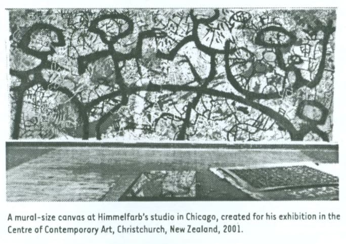
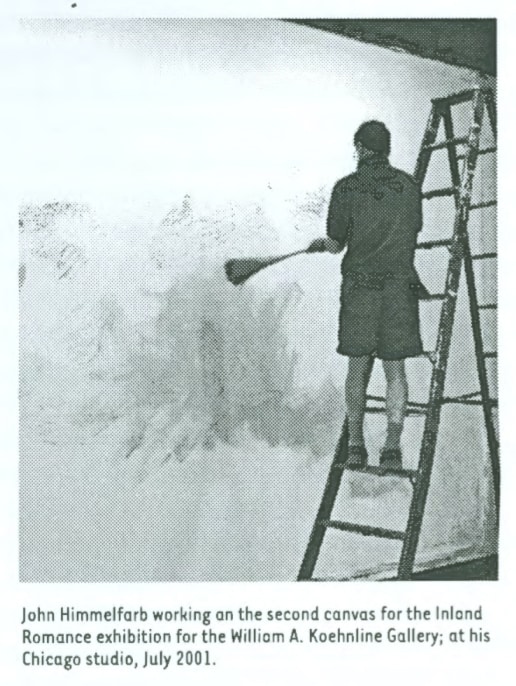
A Painting in the Mural Scale: Nonverbal Demonstration — Gerald Nordland, exhibition catalog essay for “Inland Romance,” Oakton Community College, William A. Koehnline Gallery, Des Plaines, IL (2001)
Visual art is a nonverbal language, which addresses the mind fully as much as it does the eye. It is both a language and an instrument of expression. It conjures objects and new worlds, and revivifies old ones with surprising vigor and strength, often greater than the novel or the film. The visual arts can shock and stir up lives, suggest new careers and encourage experiment. As Jean Dubuffet would say, “I believe that painting is more difficult than the written word, and a much more rich instrument for the expression of thought.”
John Himmelfarb is a Midwesterner, who comes from a family of artists. Born in Chicago, he was raised in the country near Winfield, Illinois. Both of his parents were painters, and his father also excelled in architectural design, supervising the construction of the family’s remarkable modernist home and studio. Himmelfarb drew and painted as a child and persuaded his father to permit him to work quietly in the studio. During high school he got away from the visual arts. He confronted Latin and French and applied himself to music. He studied piano and violin, and participated in the youth symphony. Early in his Harvard years, he reconciled himself that he would not make a significant addition to music, and he began to look toward other fields. He wanted to make a social contribution, so he entered a pre-architecture program that led into urban planning. During the second half of his junior year, he enrolled in an independent study program in drawing and decided that becoming an artist was his destiny. He later earned an M.A. in Education Arts. With his decision to become an artist, he reconsidered the social utility of art and upgraded its capacity to make life more livable for others.
Himmelfarb has been drawing, painting, and making prints for 30 years. His works are included in many private collections and more than 20 museum collections in 13 states, the District of Columbia and four foreign nations. Most observers of the art scene are sensitive to the gradual changes that take place in an artist’s work over time: phases evolve and proliferate; some ideas disappear, only to return later. Himmelfarb’s phases of change can be as short as two or three years or as long as nine or ten, and they sometimes overlap briefly.
His earliest personal work began with densely worked pen and ink drawings, patterned web like markings drawn from daily life, depicting neighborhoods, villages, or entire cities with roads and highways, bridges, houses; various new and outmoded structures, arches and ladders; and people and animals emulsified into an aerial overview. Closely worked sheets as large as 4 by 8 feet have been created—compulsive tapestries of fine-nibbed pen strokes, artfully dispersed patterns of black and white, near-abstractions of elemental drawing.
Himmelfarb accepts the descriptive word automatism to characterize his drawings. In their making, the artist moves from intuition to realization through a chain of subjective reactions. On close study, specific images emerge to be recognized and then fall back into the web as other images take precedence. In successive phases, quasi-human-animal figures made their appearance; floral black on white calligraphic works on unsized canvas presented themselves; a black and white, overloaded boatman showed up and later found a second stage of life in robust color. Ever-larger human heads, pushed forward out of a patterned field shared with an animalian figure, obsessed the artist for nearly a decade. The Non-Objective group derived from the natural patterns and interactions of trees, shrubbery, earth and rock formations, forming an important phase. The most recent period, Inland Romance, involves the superimposition of multiple lattice-screens over an organic ground, establishing shallow but active space with progressively larger-scale colored lattices interacting forward and backward in the canvas space.
Himmelfarb’s work is rooted in drawing and mark making. He is skillful without the wish to make it appear so. He draws simply, selecting aspects of our known world. He draws fluently, outlining, hatching—with a steady flow of ideas and transitions, and an overall senses of balance and rhythmic distribution of darks and lights—permitting his forms to spill out into a maze of observation, incident and anecdote, edge-to-edge. With another pen nib, another tool or a Japanese brush, he would find a new gesture and a proper grammar for the marker to produce distinctive things, permitting the tool and the medium to decide the form of the mark and the style of the image. “I get a little nervous when the narrative element becomes too important and the investment in medium and process becomes less so,” he says. “There is always a tug-of-war between content and abstraction, narrative and form.”
The painting grew out of the drawing process and the tension between figuration and abstraction. In an early period he drew on canvas in the same manner as he did on paper, only to systematically paint color into the descriptive forms and areas. His black and white gestural works on unsized canvas were truly large-scaled drawings. The huge human heads—The Meetings series—brought system to an overall pattern in which heads are almost as hidden as they are revealed by a pattern of drawing strokes. The Non-Objective works were expressions of a landscape sensibility, in tension with an abstract esthetic, on a large scale and with clear discipline. The Inland Romance phase takes similar pleasure in form, but pushes it backward in space by means of overlaying lattice-screens, and each is handled in its own distinctive palette, texture and breadth of line.
Himmelfarb acknowledges the influence of two 20th-century European artists: Jean Dubuffet (1901-1985) and Pierre Alechinsky (b. 1927). Dubuffet was French, and though drawn to art and painting in his early years, he rejected academic art teaching in Paris, only returning to painting in midlife. He questioned reason and logic, was impatient with museum art and leaned toward the ‘raw art’ of soldier and mental patients. He looked toward the “underground where the sap was much richer.” Alechinsky, born in Brussels, Belgium, trained as a book designer but gave it up to be a painter and printmaker. Alechinksy joined the COBRA group with Jorn, Corneille and Appel in 1949, believing with them in direct expression unguided by intellect, in spontaneous expressionism and unrestrained gestures.
Since Himmelfarb was born in 1946, he did not attend the Dubuffet exhibition at the Arts Club of Chicago in 1951-52, nor hear Dubuffet’s famous lecture. His parents did attend those events, and catalogs of the work of Dubuffet, Picasso, and Pollock were available at home. Himmelfarb became acquainted early with those sources, finding Dubuffet’s direct and unpretentious way inspiring. Dubuffet has had a wide influence, opening eyes to the arts of savages, ‘primitive art,’ ‘outsider art,’ the art of children and prisoner. His unapologetic directness, experimentation with unorthodox materials and childlike rendering have opened a door to the world, comparable to the influences of Picasso and Paul Klee. Himmelfarb acquired original prints by Alechinsky, whose embrace of spontaneous gestural drawing and deformation in depictions of figures, beasts and animals; coloring-in with paint of linear demarcations; and the use of marginal notations of collateral and supportive drawing have served as motifs in all his media.
It has been 30 years since Himmelfarb established his separate studio, first sought gallery representation, began to have works purchased, found his work included in group shows, and received occasional awards and honors. The odyssey has not been an easy or uneventful one, nor has it developed without risk, chutzpah and enterprise outside the studio. In early years the painter held private showings in his studio for prospective collectors and drove to various cities to hold weekend showings at friends’ homes for selected invitees. He would remove all art, replace it with his own and set out a rack portfolio. Income from these forays helped to maintain home, family and full-time studio practice until the galleries began to show interest. For a period, he made it a practice to write to curators and museum directors in neighboring states, introducing himself and his work. When invited by them to visit, he dropped by with a portfolio and a few paintings to provide a first-hand viewing of his new work, and to remind them of its variety and growth. These ventures have resulted in purchases of prints and drawings, and a few invitations to exhibit paintings within those same museums.
The exhibition of three mural-scale canvases at the William A. Koehnline Gallery, Oakton Community College, is inspired by the artist’s studio practice and the continuing tension between abstraction and figuration in his work. Nathan Harpaz, the Gallery’s curator, was in Himmelfarb’s studio to select works for an exhibition when he first saw a 30-foot canvas, at that time committed to a show in New Zealand. Harpaz inquired whether Himmelfarb would consider painting three canvases on such a scale for the Koehnline show. The two negotiated and Himmelfarb agreed to present three, quite large (12 by 30 feet) canvases, in the process of being painted, in that exhibition.
Two of the works were begun and developed to a point of preliminary satisfaction over a period of weeks. The third canvas, sized and ready to paint, will be untouched at the beginning of the exhibition, but will be developed during the period of the show. As Himmelfarb works on the new canvas, he will periodically re-examine the two earlier compositions. He expects to make adjustments and revisions to them, as he senses the need. In normal circumstances a painting may reach completion in a few days, but it might require many months to be solved, depending upon size and available studio time. The artist will maintain posted office hours at the Koehnline Gallery just as though he were a staff member, coming regularly and working his normal studio day.
This unusual collaboration between artist and the gallery at Oakton Community College makes it possible for students, faculty and local residents of Des Plaines to observe the progress of the three paintings from time to time and to gain an understanding of the visual artist’s creative process. Himmelfarb began the first two canvases in his Chicago studio, working boldly in an expressionist manner, with large brushes and a freer gesture than has been typical of his earlier work. He worked swiftly with strong colors in a rhythmic pattern he devised.
The third painting will relate to the first two canvases and will seek to achieve a unity of attitude, technique, gesture and openness with the others, as might three sections of one musical composition. There will be an openness in these works from the white ground, which is unusual in the artist’s work and which affords a welcome contrast for the strong color. Patterns of working in lattice-screens may recur, as will the constant tension between figuration and abstraction. In following the evolution of the three works, the audience may be perplexed, prompted to question the artist or be surprised by the outcome. Three large, colorful and related paintings will be seen in the process of being realized by one of the most skilled and thoughtful painters now working in the Chicago metropolitan area. Most significantly, observers will have the privilege through this showing to acquire a first-hand insight into the nature of the creative act and the process of improvisation, adjustment and revision which poets, novelists, composers, playwrights and architects face daily in the act of creation. Gaining an insight into one branch of the creative arts is of great utility, since it makes it easier to grasp the issues, efforts, risks and rewards of invention in all the other branches.
The Koehline exhibition is a special event. It is, to some extent, a controversial endeavor: risky and time-consuming for both the Gallery and the artist. Both are being challenged to take full advantage of a fresh situation. The great merit of it rests in its openness to possibilities for the spectators — students, faculty members and greater college public — for expanding awareness, encouraging imaginative risk taking, identifying the spirit of play and improvisation in the creative life, and recognizing that experiments in education can be valuable keys to the future. At the end of the show it is to be expected that a number of skeptical members of the academic community will be unexpectedly inspired by this experience.
Himmelfarb’s commitment to this “on site” painting display is a courageous expression of the confidence gained in his years of studio practice, the poise and experience he has found in posing creative problems for himself and his success in carrying them through to a professional conclusion. He once painted a 60 by 90 inch Meeting-period canvas for a bank in Iowa as people looked on, and he conducted an open-studio project in Sioux City, which is somewhat parallel to Oakton. In speaking of the Oakton experiment he said, “Intuitions must be paid attention to, not ignored. One has to listen to them. There will have to be something to see; one has to make decisions and go forward. One can’t stall or ‘put off’. If one goes ‘wrong,’ he will have to be able to catch it, correct it and make it work.”
To many in the lay audience the visual arts are inexplicable. Enormous respect is granted to such venerated overachievers as Leonardo da Vinci, Raphael, Michelangelo and Rembrandt, but only specialists have a clear idea of how those artists’ iconic works were conceived and brought to completion. To be sure, there were scattered onlookers when Leonardo painted The Last Supper (1495-97). Raphael was joined by a group of pupils and assistants, as well as attendants and emissaries of Julius II, when he painted and supervised work on The School of Athens (1509-1512). There were both clerical and lay observers of Michelangelo’s prolonged endeavor in the Sistine Chapel (1508-12). Rembrandt’s students learned from his studio directions and demonstrations, but there were few who kept notebooks or records on how the historic milestones were achieved, or troubled to communicate their knowledge to successive generations.
Comparatively, the isolated Vincent van Gogh (1853-90) is better documented, only because of his thoughtful and troubled letters to his brother. In parallel, one can imagine watching Pablo Picasso develop Guernica (1937) or Willem de Kooning’s process in making Excavation (1950), now at the Art Institute of Chicago. In the days of Franklin D. Roosevelt’s Works Progress Administration, it was common for public muralists to go about their creative work while citizens queued-up for stamps or to send a parcel. Anton Refregier (1905-79), the Russian American muralist, faced such an audience when he created his controversial murals for San Francisco’s Rinon Annex post office in 1946-48. The mural integrated images from the history of California, including shameful events as well as prideful ones, and some political critics expressed immediate disapproval of the artist’s choices.
In a more recent case Jon Schueler (1916-92), an American painter who divided his last years between New York City and Mallaig, Scotland, was invited to paint an exhibition at the Talbot Rice Art Centre, University of Edinburgh, while visitors looked on. He brought his worktable, paints, brushes, ladders and six canvases into a gallery measuring 50 by 50 feet and proceeded to develop a suite of paintings during August and September 1981. Schueler’s subject matter was drawn form the convulsive and stormy skies of the Western Scottish Highlands, where climatic activity is so tumultuous that the artist’s objective was to record his response to the constant dynamic change in the sky. Visitors followed the progress from the balcony, watching quietly, sometimes discussing matters among themselves and occasionally approaching the artist after hours. Some observers returned often, and others did so as their schedules permitted throughout the two-month period of the event. Powerful and distinctive images appeared in the paintings, then evolved, were revised and brought to completion. In other cases images dissolved and found new form and expression before completion.
The artist’s ‘performance’ — in Edinburgh or in Des Plaines — is never an entertainment, but a serious demonstration of belief in an educational principle that cannot be made clear in any other way. Through it the creative process is exposed to a new public in the most honest and forthright manner possible.
1. Jean Dubuffet, “Anticultural Positions,” a lecture given at the Arts Club of Chicago, Thursday, Dec. 20, 1951. (Xerox reproduction of the manuscript given by the artist to Maurice E. Culberg, Dec. 21, 1951.)
2. When asked to list his most rewarding experiences in the arts, Himmelfarb listed: (1-2) the first two of his five, one-man exhibitions at Terry Dintenfass Gallery, New York; (3) the Kalamazoo (Mich.) Institute of Arts exhibition because of its broad scope and its inclusion in three other museum exhibitions; (4) the Davenport (Iowa) Art Museum exhibition of all black and white works in drawing, prints and painting; and (5) the Sioux City Art Center (Iowa) exhibition which utilized all three floors and the Guggenheim-like atrium.
3. Interview with John Himmelfarb in his Chicago studio, July 12, 2001.
4. John Schueler, The Sound of Sleat: A Painter’s Life. Magda Salvesen and Diane Cousineau, eds. N.Y.: Picador USA (an imprint of St. Martin’s Press), 1999. The dimensions of the six canvases were as follows: two at 18 feet wide; three at 14 feet wide; one at 10 feet wide.
Expanses of visual richness — Christopher Moore, The Press, Christchurch, New Zealand (2001)
Despite the accolades of critics, artist John Himmelfarb seems more interested in the simple evolution of his work, finds Christopher Moore.
John Himmelfarb’s paintings continue to drive the critics into paroxysms of superlatives. “Vibrant colour, eloquent line, painterly brushwork. Dynamic composition on a grand scale,” say the catalogue notes for the Christchurch exhibition.
“Himmelfarb can be referenced to a fine pedigree of artists and movements illustrating a contextual richness and a highly ferocious visual appetite,” another critic writes.
The object of all this devotion remains unfazed by the dense thickets of artspeak.
Himmelfarb instead seems continually fascinated by the simple evolution of his work, the shifts in style and perception, the experiences and observations which become part of his artistic biography.
“Style seems to change rather rapidly. There are identifiable periods which can last for two months or two years,” he says.
“A sea-change began in 2000. It saw the paintings becoming less tightly controlled and more playful, more expansive.
“Something must have clicked which made me more confident to simply go at it rather than having everything buttoned down.
“My main concern is using a visual language rather than trying to tell stories or make profound political statements.
“I can intellectualise about a painting’s construction — how to create interest with a sense of form and resolution, but it is rare for me to have another message apart from an expression of exuberance, life, and communication.
“Over all, I am attempting to create a rich visual experience.”
John Himmelfarb was born near Chicago. His roots lie deep In the Mid-West soil. He grew up in Winfield, Illinois, where the tangled vegetation of the thick woods surrounding his home became a prime source of imagery in his painting.
His parents were both painters. On Sundays, his father would allow him into his studio “if I kept quiet”, he says.
Himmelfarb spent a childhood surrounded by painting. His parents were deeply interested in 20th-century art. Works by Picasso, Pollock, and Kandinsky became an integral part of their son’s emotional landscape.
“I guess that I was raised on abstract expressionism,” he says.
Music replaced painting for several years before he began to draw again while a student at Harvard University.
“I’d gone there as a liberal arts student with no intention of being an artist. Art was simply an adjunct.” Then a teacher suggested that Himmelfarb should take a design course.
“After a fortnight I decided that this was what I had to do. It took me a while to work out how to create a career and to survive. “
He did survive. As one of the young generation of American artists, he refused to search for and secure a bankable signature style.
Instead he experimented, changed courses, and explored new routes in unpredictable ways, surveying one idea after another.
It was not until the mid-1980s as he approached mid-career that Himmelfarb met the themes which would absorb and preoccupy him for the next two decades. A wandering line often weaved its way across the canvas, while his fascination with calligraphy led him to invent his own hieroglyphic and symbols.
Above all he was and still is inspired by the geographical environment in which he worked: Chicago’s sprawling, brawling, frenetic urban landscape and the gently swaying topography of the surrounding Great Plains.
“Working in a major urban centre like Chicago is extremely stimulating. I can draw on so many things, from the architecture to the mesh of bridges and overhead railway systems criss-crossing the city. Chicago contains an enormous number of bridges that I can echo in painting.”
Whenever Himmelfarb travels, he carries a small sheath of used and unused library catalogue cards to sketch on and use as a visual diary. The finished drawings are also used alone or arranged in rows to compose a larger work.
Often his quirky hieroglyphs are incorporated into a painting such as Turandot’s Riddles, with its Oriental icons echoing his childhood trips to Chicago’s Chinatown. “I’m not that much of a sketcher. I don’t do preparatory drawings for the paintings,” he says.
“I put some paint down and respond to the first stroke with another, putting down the background and letting the work evolve.
“If I had attempted to loosen my paintings 25 years ago, I wouldn’t have got it together. I’ve now developed a greater sense of composition. I’ve built up a vocabulary. Now I’ve got a full toolbox and can let it all out”
click thumbnail for larger image

Revelation Through Concealment: the Elusive Nature of John Himmelfarb’s Prints — John Brunetti (2000)
John Himmelfarb’s extended commitment to printmaking spans over thirty years. Throughout this time, Himmelfarb’s prints serve as a rich journal recording and providing links between the seemingly diverse pictorial investigations of shape and line, image and abstraction, that have preoccupied the artist in both his paintings and drawings.
Himmelfarb’s prints from different periods of his career, the early ’70s, late ’80s, and mid-’90s, when juxtaposed display a wide formal and emotional range, from the intricate and meditative, to the bold and galvanic. Yet on closer inspection, they nonetheless disclose a consistent and complex approach to image-making that locates meaning in a series of elusive and playful formal variations of concealment and revelation. What becomes evident is that for this very private artist the complexities of his formal language — labyrinths of original pictographs, typography, or totemic images — are a means of both evoking the richness of life experiences while inserting a measured degree of distance between the viewer and Himmelfarb himself. The artist seeks to immerse the viewer in the diverse dialects of his exotic fabricated languages until the artist’s identity becomes lost in the resulting cacophony of reverberating echoes that make it impossible to separate constructed myths from personal reality.
Himmelfarb’s creative process resembles that of an archeologist working in reverse. Where the archeologist sorts through and separates overlapping layers of civilization in search for scientific clarity, Himmelfarb acts as the evolving civilization itself — amassing its mysteries in the seemingly endless, pieced-together scaffolding of language, architecture, and icons erected on the foundations of previous decay to rebuild the present. The resulting formal characteristics of this conceptual philosophy are images whose compositions flatten space and direct movement from top-to-bottom or side-to-side in the picture plane, rather than front-to-back. As a result, Himmelfarb’s images resemble excavation sites where each layer of culture supports the other, physically and symbolically.
A seminal example of this formal approach is March, a black and white lithograph from 1974. In this elegant print, Himmelfarb uses the same weight of contour line throughout the composition to create a dense weave of interlocking geometric and organic shapes that results in a rhythmic, all-over pattern. Himmelfarb’s tumbling landscape of shapes is an enigmatic hybrid of objects, figures, buildings, and natural terrain. The shapes’ individual identities remain anonymous, but communally they imply the multiple relationships and hierarchies of a complex society. Giving the appearance that it has been created with a continuous line, March blends both the intimate detail associated with cartography with the improvisational spontaneity of Surrealist automatic writing. In this print, Himmelfarb suggests that the carrier of meaning lies in the network of relationships between different parts, parts whose identity is often deliberately obscured.
An expressionistic print such as Lava Flow, an etching & aquatint from 1986, surprisingly further investigates the network of “arteries” and “scaffolding” of early works. Lava Flow appears to take a small detail from a composition such as March and enlarge it, in the process immersing the viewer inside the hidden image of two grimacing, totemic faces. Dramatically heightening the intensity of his bold, interlaced brushstrokes by printing them in searing red-orange against a black background, Himmelfarb transforms the image through the emotional impact of color. What distinguishes Lava Flow is the fugitive nature of the two faces whose features emerge and disappear in the writhing, glowing channels of vibrant color. Resembling ancient reliefs who have been absorbed into the earth’s strata over time, Himmelfarb’s faces appear to come alive when their crevices are filled with molten magma—nature gives rebirth to that which it has previously swallowed up.
The process of concealment is extended to written language by Himmelfarb with meticulous obsession in his “alphabet” prints from the early ’90s. The layered formal vocabulary of pre-historic pictographs and hieroglyphs, where image and idea are fused with multiple, elemental variations of line and shape, have been a source of fascination for the artist since his earliest drawings. Providing a structured, yet open-ended format for his stream of consciousness approach to drawing, the non-verbal language of these invented signs are a successful means for Himmelfarb to build a complex syntax of communication that nonetheless retains its mysteries. Reminiscent of the work of Jasper Johns, Himmelfarb’s “alphabet” works understand the poetic and abstract implications of language to provide not just a linear approach to meaning, but a circular one as well.
In the eight color screen print, Note of Appeal, ’93, Himmelfarb critiques the differences between the acts of reading and comprehension. Designed to resemble an official letter of correspondence, the print’s vertical composition is organized into an asymmetrical grid, complete with heading, salutation, paragraphs, signature, and official seal. The language of the letter, however, is rendered in an elegant, indecipherable calligraphy of the artist’s own creation. One “reads” the letter following its familiar structure, but comprehension does not follow. The seductiveness of Note of Appeal is the hypnotic authority it wields in suggesting that any lack of comprehension lies with the reader. The impenetrability of the letter’s meaning is emphasized by ghostly impressions of several additional layers of text printed in blue-grays on a pink background, creating the paper’s subliminal, transparent texture. Himmelfarb implies that real meaning always exists beneath the surface of accepted propriety.
Maintaining the elusive quality imbued in his prints has been the challenge that has preoccupied Himmelfarb throughout his career. This has been made all the more difficult because of the artist’s commitment to a lean vocabulary of shapes and lines that would seem to leave little opportunity to disguise one’s personal meanings. That he has created a resonating language of impenetrable depth from such basic elements reveals his accomplishment as an artist. That he has found the medium of printmaking his most flexible tool in assembling this vocabulary speaks to the continuing importance of prints to the creative development of a distinctive contemporary voice.
click thumbnail for larger image


Drawing Through Writing / Writing Through Drawing: the Gestalt of John Himmelfarb’s Prints — John Brunetti (1999)
An accomplished artist in a full range of graphic mediums, John Himmelfarb has been an active printmaker throughout his career. The medium’s diversity is a perfect vehicle for the restless creative energy that fuels his search for meaning in non-western alphabets, ancient hieroglyphs, pictographs, and totemic iconography. Himmelfarb’s resulting abstractions are evocative gestalts of language, image, and thought.
Himmelfarb has always embraced the Renaissance notion of drawing as an extension of handwriting, closest to recording the immediacy of the artist’s observations and states of mind; a fusion of verbal and visual language. In his paintings, drawings and prints, recording the various intonations of his hand, (and by association, his thoughts) whether the bold fluidity of thick and thin brushstrokes, the edgy crispness of pencil and pen, or the smeary lushness of pastel and crayon, has been the essence of Himmelfarb’s oeuvre; a resonating amalgam of Surrealist automatism, the “writing” paintings of Abstract Expressionist Mark Tobey, the forceful bluntness of Art Brut, the mythical imagery of the CoBrA artists, and the saturated, emotional color of the Fauves. However, it is the particular nature of the printmaking processes which eliminate the scale and tactility of painting, as well as the palpable nature of Himmelfarb’s mixed media drawings, that perhaps provides the clearest guide to the relationship between drawing and language that is the foundation for much of his work.
Whether using lithography, etching, or screen printing, Himmelfarb focuses on several formal and conceptual concerns that have been rich sources for him: 1) line and contour as a primary formal element that directs movement and delineates space; 2) manipulation of positive and negative space (field and ground), as articulated by the open and closed forms of his alphabets and symbols; 3) an interest in the visual structures of languages to organize the pictorial field; 4) the complex relationships between the signified, signifier, and the interpreter that provides a guide to understanding unfamiliar icons, symbols and metasymbols.
One gets lost in the unusual beauty that is evoked in the rigorous discipline of Himmelfarb’s private languages. His voice speaks with complete authenticity, though his signs, symbols, and icons remain deceptive fabrications. Animal and human pictographs from Neolithic societies, fragments of religious symbols from diverse cultures, the earth drawings from ancient Peru, Asian and Arabic alphabets, are some of the sources suggested by Himmelfarb’s obsessively detailed cryptography. Creating compositions that resemble sacred scrolls, lost tablets and fragments of temple facades, Himmelfarb cultivates one’s curiosity for arcane languages and cultures whose mysteries remain seductive and elusive.
Himmelfarb’s prints can be grouped in several stylistic categories: “Rosetta Stones,” dense, all over images that fill a composition with horizontal rows of compact pictographs; “faux correspondence” of letters, notes, and invoices written in the artist’s own language and reminiscent of Leonardo’s sketchbooks; arteries—large, overlapping calligraphic images of bold color—resembling the enlarged excavation plans of lost cities; and intimate monochromatic images resembling Jackson Pollock’s totemic and mythological figures.
The fluency of execution and the complexity of design that characterize the animated hieroglyphs of several of Himmelfarb’s ’90s lithographs and screen prints, such as Tabula Tabula Picta,’93 and Just Follow These, ’98, are an evolution of his quirky and highly detailed grid-based drawings from the early ’70s. But, where the units of marks in these earlier drawings never relinquish their abstract design status, the components of Himmelfarb’s currents prints have a specificity that assigns them a functionality which elevates their seriousness of intent. Decoding his signs is not as important as the gestalt, or oneness, that is accomplished through the signature of gesture, compositional structure and distinctive pairings of symbols and marks.
The intensity of the screen prints Crinkum and Crankum, both from ’97, reveals Himmelfarb’s ability to elicit from calligraphy and symbols a timeless sense of place. Composed of a few wide, twisting and overlapping bands of saturated color that continue off the edge of the picture plane, these images, though abstract, have idiosyncrasies in contour and shape that recall the ancient organizational “arteries” embedded in the ruins of unearthed civilizations. Brought to life again by Himmelfarb’s bold use of color and line, these fragments of obsolete boundaries and passageways reveal the indelible physical and spiritual “signatures” left by anonymous societies.
Prevalent throughout all of Himmelfarb’s prints are the dualities that provide the richness to his work; spontaneity against structure, pattern juxtaposed with image, clarity versus indecipherability. With ease he composes with these contradictions, creating documents where language draws rich images for the eye, and images write beautiful, though unspeakable, languages that communicate directly to the soul.
click thumbnail for larger image


John Himmelfarb — John Brunetti, art critic, New Art Examiner (Dec 1996-Jan 1997)
Paul Klee was once quoted describing his approach to his work as that of “an active line on a walk, moving freely, without a goal. A walk for walk’s sake.” This quote is appropriate for describing John Himmelfarb’s drawings, paintings, and graphic work.
An established Chicago-based artist whose work is represented in major museum collections around the world, this was, surprisingly, his first solo exhibition in Chicago since 1988, providing local audiences the opportunity to experience the exuberance and complexity of a mature artist’s accomplishments in multiple media.
Himmelfarb’s works suggest several sources of imagination — the formal rawness of the Art Brut and CoBrA movements; the improvisational spirit of automatism; the magical properties of hieroglyphs and totems — channeled into a rich personal vocabulary. Line has always been Himmelfarb’s signature formal element and remains so. Bold contours are applied with both speed and deliberateness in his paintings, drawings, prints, and ceramics to articulate figure from ground, and, of special importance, to create and direct movement. His diverse body of work is unified by an acute sense for orchestrating a continuous rhythm in his compositions. The tempo of each work is carefully dictated through juxtapositions of several weights of line, whose application varies from the delicate, pencil-fine loops of handwritten notations to the bold, paint-dripping boundaries of a three-inch band.
Inland Romance: Passage Blue Island is a tactile, acrylic painting of dense, interlocking shapes and a snaking lattice-work of lines whose colorful patchwork geometry resembles the abstract and irregular plan of a mythic European city. Overlapping arteries of pale greens and faded blues unite and separate mosaics of yellow, steel blue, and dull red. The compact and dense topography leaves no breathing room as large and small shapes, organic and geometric, strain in an animated restlessness against the boundaries of the canvas.
The density of Inland Romance: Passage Blue Island contrasts the open compositions of Himmelfarb’s risk-laden works on paper, which provide a greater viewing challenge and reward. In works such as Xplosion of Transport and Xit Treble Clef, a raw and improvised surface is actually achieved through Himmelfarb’s intuitive understanding of the critical placement of each delicate doodle, meandering scribble, and bold contour that define the “color” and texture of these edgy black-and-white works.
Himmelfarb’s successful works have always encouraged one to experience them as a tapestry describing a journey. Guiding us through both enigmatic and familiar landmarks, a sense of order prevails as one understands that Himmelfarb’s confident line will aid us in maintaining our direction. Through his work, we are reminded that the journey is often more important than the destination.
click thumbnail for larger image


Samuel Himmelfarb, Eleanor Himmelfarb, John Himmelfarb: Three Painters — Rene Paul Barilleaux, catalog essay, Quincy Art Center, Quincy, IL (1994)
This exhibition brings together paintings by Samuel, Eleanor and John Himmelfarb — father, mother and son, respectively. While in the works of these artists there exist unique aesthetic sensibilities and highly personalized vocabularies, there are shared artistic concerns and common visual elements which unite the three beyond their family ties. One might investigate these paintings without regard for the actual kinship of their creators. This exhibition, however, offers the viewer an opportunity to make comparisons among these various works as well as among these artists.
Born in Latvia, Samuel Himmelfarb worked primarily in Wisconsin, New York and Illinois before he died at the age of 71 in 1976. Although his career as an artist began in the 1920s, in this exhibition he is represented by paintings executed in the late 1960s through the mid-1970s. The human figure was the primary and constant subject to occupy the artist throughout his lifetime. Samuel’s portrayal of the figure, generally in a narrative context/ developed from his early, straightforward realist works into more expressionistic approaches and eventually into abstraction. The individuals who populate these paintings are ordinary people engaged in ordinary activities. In Samuel’s hand, they are transformed into dynamically rendered and visually charged images.
Chief among the characteristics which typify Samuel’s mature works are the use of abstracted figures, subjects constructed with blocks of color to produce a patterned surface; paint applied in a cool, nearly mechanical technique and three dimensional space flattened to create ambiguous spatial illusions. In this exhibition, the painting Adriatic Ferry (c. 1975) offers a good example of these traits.
The driving force behind Samuel’s interest in exploring these scenes of ordinary people was his desire to celebrate everyday life. Through his choice of subject and unique approach, he directs the viewer’s attention to those aspects of life common to most individuals, allowing the viewer to actively and personally become engaged with the action depicted. We enter Samuel’s paintings not as strangers but rather as insiders, possessing an inherent understanding of the characters acting out these familiar narratives.
Eleanor Himmelfarb was born in St. Charles, Illinois and currently lives and works in Winfield Township. Included here is a selection of works from the past four years. These paintings evidence Eleanor’s Interest in nature—in particular the landscape. At times, by juxtaposing natural subjects with the human figure, she suggests the interaction between them. Saturated colors, gestural brushwork and free-floating imagery animate the paintings and enable them to transcend the sense of tranquil isolation often associated with traditional landscape painting. Unlike more traditional approaches to the landscape, these works are not replications or interpretations of a given place but rather they focus on the concept of landscape in a broader sense, carrying a message for the viewer to decipher.
In the two variations of Summertime and Wintertime (both from 1990), one can see how Eleanor’s investigations of her subjects produce highly personal and often surreal renditions of nature. As in each of Eleanor’s other paintings, dimensional space is dramatically altered to produce a fractured plane. Elements move freely throughout this artificial environment in a gravity-free world wholly of the artist’s invention. This freedom re-enforces each element’s function as a landscape “symbol” and the existence of these paintings as landscape “ideas” rather than renditions of real locales.
Like her husband, Eleanor Himmelfarb investigates the ordinary in life through these works. But rather than portray recognizable activities or events, she focuses on the more enigmatic aspects of her landscape subjects. Because her depictions of the world are centered less on specific locations or common human pursuits they are free to explore life’s cycles in a universal context. She uses the iconography of nature — coupled with the human form, architectural references and other elements — to illustrate and illuminate her conceptual approach to humanity’s place in nature.
Rural Illinois provided many formative experiences for John Himmelfarb which would prove to affect his approach to art. Raised near the town of Winfield, in relative isolation from an urban or suburban environment John left his native Midwest to study at Harvard, where he received a broad liberal arts education. There he spent much time in the Visual Studies program at the Carpenter Center. He eventually came back to Illinois and currently lives in Oak Park, maintaining a studio in the urban setting of Chicago.
Included in this group are works from 1992 to the present. In this selection, the viewer can readily see elements which John draws from the work of each of his parents. He combines this “inherited” vocabulary with his own unique iconography and personal techniques. Among the main characteristics found in John’s works are his use of animated, sometimes familiar subjects; flattened space and repeated forms which produce an overall pattern effect, and a limited palette within a given painting, often exhibiting tightly controlled color relationships. Particular subjects deal with the intense, complex urban landscape. Slag City (Inland Romance) and Gary’s Mill (Inland Romance) (both 1993) are excellent examples.
These new paintings, though open to personal interpretation, offer less opportunity for specific readings and provide a more indirect message than did John’s previous works. Reaching back to re-approach some of his drawings from the 1970s, John combines his current urban industrial surroundings with these earlier sources for inspiration. In these recent manifestations, the main subjects are human-crafted environments rather than the figures and foliage of his prior work. These new paintings also display some Midwestern regional influences as indicated by one of the new series titles — “Inland Romance.”
One can explore an artistic evolution as it is traced through the work of Samuel, Eleanor and John Himmelfarb. Immediately, a number of commonalities are evident. Paintings by each investigate what might be termed a “narrative of nature” — whether in a poignant human episode, a rural landscape or a concentrated urban scene. The narrative is observed and recorded through a formal, visual process which incorporates at various times any or all of the following: reorganization and reinvention of the subject’s actual dimensional space; employment of a selective, sometimes restricted color palette, and stylization of the imagery to produce a patterned, labyrinth-like effect.
Another and even greater mutual concern is the shared philosophy of visual aesthetics which is at the heart of the work of all three artists. Stemming from a fundamentally modernist foundation which focuses on the visual dynamics developed in the work, this philosophy is manifested here through each artist’s unique vocabulary and the common need for an integrated art work. Without betraying the intellectual or emotional content in their paintings, these artists display their commitment to creating visually compelling images.
Every artist, in one form or another, inherits something from the art of the past. In the case of these three, the legacy extends not only far backwards into the history of art but outwards into each other’s work as well. Whether speaking philosophically, conceptually or technically, the art of Samuel, Eleanor and John Himmelfarb finds a natural interrelationship, based not on chance but on a shared belief in the function of visual language.
René Paul Barilleaux
Director of Exhibitions and Collections/ Chief Curator
Mississippi Museum of Art
Jackson, Mississippi
SAMUEL HIMMELFARB
A $5 award in elementary school for a poster exhorting the townspeople to raise vegetables for the starving Armenians set Samuel Himmelfarb on an art-centered life, although even then he wasn’t sure how Milwaukee-raised tomatoes could help. He attended Milwaukee State Teacher’s College where his mentor was German-born artist, Gustav Moeller. Later he attended University of Wisconsin, Madison. For a time he taught for the WPA in Milwaukee, then went on to the Art Students League in New York and the National Academy of Design. For some years he worked as an architectural designer in New York before returning to the Chicago area.
Having lived through the Great Depression he did not feel secure enough to give all for art. He kept a rigid 3-day-a-week schedule for painting, devoting the other four to industrial design in his exhibit firm. After selling his business he spent full time at his studio in Pilsen until his death in December, 1976.
Many summers were spent painting at his cabin on Madeline Island in lake Superior. Music and travel occupied time away from work. At 19 he organized a dance band and played the drums on the President Line for shipboard dances and at stops in the Orient. Interest in music was always a primary focus. He began studying piano after selling his business.
Himmelfarb exhibited in Wisconsin Painters and Sculptors annual shows at the Milwaukee Art Museum for many years where several of his works are in the permanent collection. He showed also in the Chicago and Vicinity annuals at the Art Institute of Chicago in 1938, 40, 42, 43 and 51 where he won the James Broadus Clark award. His work was also included in the 5th International Water Color Exhibition at the Art Institute of Chicago in 1936. He participated in the members shows at The Arts Club of Chicago over a long period of years. His entry in the 60th Annual American Show, 1951, was selected for a circulating show through many museums in the U.S., and he was represented in a collection selected by Katharine Kuh which traveled to museums in Germany and France.
One-man shows took place at Milwaukee Art Museum, Allis Art Library, Milwaukee; Panoras Gallery, New York, as well as the Ryan Gallery, Chicago. Three-person shows included Rosary College, River Forest, IL; Judson College, Elgin IL; One Illinois Center, Chicago and Bradley Gallery, Milwaukee. Recently his work was shown at Fermi Laboratory Gallery in Batavia in a three-person show, along with the work of John and Eleanor.
ELEANOR HIMMELFARB
Eleanor Himmelfarb, a native of the Chicago area, presently resides in a deeply wooded area on the edge of a glacial moraine beside the west branch of the DuPage River. After her years at the University of Chicago and life and work in Hyde Park, in 1942 she returned to the rural setting near St. Charles, IL, where she was born. Here, she and her husband built a home, and their children Susan and John were born.
At the University of Chicago she had courses in art history and design but there no studio work was offered. Later, at The Morton Arboretum, under the spell of Mae Watts, her interest in art became more than philosophical and theoretical. In addition to working there, where she eventually taught for many years, she took classes at the Art Institute, the School of Design and studio work with Abbott Pattison, Claude Bentley and Morris Barzani, but the major part of her art training came from working in her husband’s studio.
In addition to her active painting schedule, Himmelfarb for many years taught courses in painting and design at Rosary College, Triton College and the College of DuPage. Currently she teaches exclusively for the DuPage Art League. In 1993, she was artist-in-residence at Illinois State University, Normal, Illinois.
Himmelfarb’s work is included in many corporate and private collections, including collections at the American National Bank, the Harris Bank, Kirkland & Ellis, and Deloitte & Touche, Continental Illinois Bank and Ideal Industries. Her gallery exhibitions include one-woman shows at the Jan Cicero Gallery, Chicago; Gallery 72 in Omaha, and Chicago Street Gallery in Lincoln, IL; Sven Parson Gallery, Northern Illinois University, University Club, Chicago, North Central College, and Riverwalk Gallery, Naperville, IL; College of DuPage, Glen Ellyn, IL, and IIT, Chicago. Two- and three-person shows featuring her work have been held at Johnson County Art Council Gallery, Iowa City; Rosary College, River Forest; One Illinois Center, Chicago; Bradley Gallery, Milwaukee; Judson College, Elgin, IL, and Barrington Center Arts Council, Barrington, IL. Her work has been included in many group shows including The Chicago and Vicinity Show at the Chicago Art Institute, 1985; The Chicago and Vicinity Show presented at the Chicago Cultural Center by the Art Institute and The Museum of Contemporary Art, 1990; the 32nd Illinois State Invitational Springfield, 1980, and in group shows at the Renaissance Society, University of Chicago, The Peltz Gallery, Milwaukee; Volid Gallery, Chicago, Evanston Art Center, International ArtExpo Navy Pier; Beverly Art Center, Chicago; the Norris Gallery in St. Charles, Il, and the Decatur Art Museum, Decatur, IL.
JOHN HIMMELFARB
John Himmelfarb, son of Eleanor and Samuel, was born in 1946 in Chicago, Illinois. He grew up in deeply wooded Winfield Township in a household of artists. John finished his undergraduate studies at Harvard University in liberal arts with a major in Architectural Sciences. He opened a studio in Chicago in 1970 and has worked primarily in Chicago since that time.
Over forty art institutions have his work in their collections including The Art Institute of Chicago; The Arkansas Art Center; The Baltimore Museum of Art; The Brooklyn Museum; Centre Pompidou Musee d’Art Moderne, Paris; The Cleveland Museum of Art; The DesMoines Art Center; The Fogg Art Museum, The High Museum; The Indianapolis Museum of Art, The Kalamazoo Institute of Arts, The Madison Art Center; The Minneapolis Institute of Art; The National Museum of American Arts; and The Toledo Museum of Art.
John has had one person shows at the Terry Dintenfass Gallery in New York regularly since he joined the gallery in 1977. In addition he has had one-person shows at Area X and John Nichols Gallery, both also in New York, and numerous one-person shows in cities across the country including the Brodys’ Gallery in Washington, D.C., Gallery 72 in Omaha, Spaightwood Gallery in Madison, Peltz Gallery in Milwaukee, Barbara Balkin and Dorothy Rosenthal Galleries in Chicago, and Graphics I & II in Boston. Forthcoming one-person shows are scheduled at Gallery 1756, Chicago; Terry Dintenfass, New York; The Chicago Cultural Center; and the Mindy Oh Gallery in Chicago.
Past one-person museum shows include Kalamazoo Institute of Arts, Davenport Museum of Art, Madison Art Center, Arkansas Art Center, Miami University Art Museum, the Huntington Art Museum in West Virginia, and the Illinois State Museum.
Beginning in 1968 his work has been included in many group shows throughout this country and abroad. He has received two fellowships from the National Endowment for the Arts and one from the Illinois Arts Council.
click thumbnail for larger image


Interview: John Himmelfarb — Susan Stewart, The Journal of the American Print Alliance (Fall 1994)
The interviewer is Susan Stewart, partner and graphic designer in Stewart & Stewart, printers and publishers since 1980.
John Himmelfarb earned his undergraduate degree at Harvard University with a liberal arts major in architectural studies. He returned to Chicago, where he had grown up in a household of artists, to open a studio. A painter and printmaker, he has worked with several master printers; in the last few years he has created a dozen screenprints in collaboration with Norman Stewart at the workshop in Bloomfield Hills.
Do you think that your reading influenced the calligraphic prints that you recently completed at Stewart & Stewart?
I got the idea for this series about two years ago, when I read Hardison’s series of essays* analyzing parts of American society and commerce in terms of the metaphor of disappearing. One example was banking. Fifty years ago one went to the bank with real money: paper banknotes and coins. The bank was built of stone. You put the money in the bank literally and they’d store it. Today, you have a plastic card and stick it into a machine in a wall. There’s no real bank there. Often, no real money. Yet all kinds of transactions take place. The bank has disappeared and the money has disappeared and electronic signals credit or debit your database. Hardison also talks about deconstructionism in literature, which advocated removing or weakening the meaning of specific words so they could be used in a more playful or plastic manner.
It seems somewhat humorous to me, if taken to its extreme. In removing the meaning of words, the possibility for verbal communication ends. But I thought, well, if you can take the meaning out of words, why not take the words out of the text? And be left with just the shell of the text. Even in college I was doing drawings that were a play on the alphabet, taking the letters and extrapolating, expanding, decorating. I had been drawing dense fields of lines and marks which, after a few years, started dividing into grids, and later into rows and columns. The format of rows and columns led naturally to the calligraphic works.
* O.B. Hardison Jr., Disappearing Through the Skylight, Viking, New York, 1989.
Were those college drawings influenced by an artist-teacher?
No. I think it was just stream of consciousness, playful. I was experimenting with a new Rapidograph pen and seeing what it could do. I don’t remember a specific influence. I certainly was aware of Mark Tobey and his “white writing.” I had seen a lot of 1950s and 1960s art that played with alphabets in both the print world and the drawing and painting world. While not a conscious impetus then, it was part of my background.
The tools in calligraphy are not Rapidograph pens and their nibs. So the technical aspect of the tool wasn’t important to you.
No, and I had never really worked with Western calligraphic pens. I did have an interest in Eastern writing from early childhood. We would visit Chinatown and I would take the newspaper home and just enjoy the way it looked. In high school, an exchange student gave me a Japanese dictionary and tried to teach me a little about how characters are made. In college, a friend of Chinese background tried to teach me to make characters using a brush. But I didn’t pursue it in any concentrated way. The calligraphic drawings that I did in the 1970s took the marks I had been making and organized them to form characters which filled an entire page comer to corner. They looked more like a Rosetta Stone or a tablet of some sort.
The Hardison book made me start thinking in terms of Western documents. In suggesting the possibility of words disappearing, losing their meaning, I imagined words disappearing from the text. This focused my attention on text. Then a literature professor who saw two of the calligraphic drawings sent me a note, saying that one struck her as a letter from a person of the Victorian age and the other from another period of English literature, another social stratum. That helped bring me to the letter format — it was one of those times when an idea suddenly snaps in your head.
From an artistic point of view, the idea of breaking down the page from an all-over tablet form to the text of a letter gave me some other things to work with in designing the page. I would have blocks of information and I could organize those blocks in the way that a graphic designer or a fine artist might organize a geometric composition of squares and circles and rectangles. I would have open areas of unarticulated space juxtaposed to specific shapes of text. It wasn’t that I was just trying to mimic a letter. It offered me a way to go on with calligraphic drawing in a new way rather than repeating tablet forms.
The images that came to my mind when seeing this series of your work were Egyptian hieroglyphics and especially the Limbourg brothers’ Les Tres Riches Heures du Duc de Berry [1413-1416] with calligraphy near the illuminated miniatures. Did any other historical materials influence this work?
Not on a terribly conscious level; in fact, the idea took off quickly on its own. But all those things are part of my background. From childhood I saw things like sculpture, books, objects at the Field Museum, and even as a child I saw a lot of work in museums in France and Italy. But it’s back a few layers in my consciousness. It’s the kind of thing that comes up now when one looks at the work, the same way one reads a work of literature, being aware of references and associations it brings to mind. That’s where it get its richness. How many of those echoes are similar to the author’s is not critical. The work is suggestive and leads one to make associations due to the way it’s written. Although I’d say that someone with a rich background in anything is going to bring more to bear on a work of art than someone who doesn’t have any other reference point. They’ll see only the art on the page. They won’t see it in other contexts.
Many younger Americans no longer read for pleasure. I wonder if this has a bearing on the disappearing words in the Hardison essays? Does this period of your work stem from the idea that reading will become extinct?
I don’t think that I was concerned with that in this work. Although it has crossed my mind. Here, the idea is that the words we see on the page aren’t necessarily the meaning contained in the letter. The meaning is more relevant than the form of the letter and the actual words we read are often merely a facade or even a mask for an underlying meaning that we can’t see. In order to read critically and to derive a richer meaning from what we’re looking at, we have to look at underlying meanings, hidden meanings, whether or not they are intended. A lawyer might write a very formal, polite letter to someone that’s full of flourishes, when in fact it’s a threat. And if you’re not able to understand or read between the lines, you’re missing the point.
Or missing things left unsaid.
Right. A reader is informed by the quality of the paper, the character of the type, the method of printing, the use of space on the page. A highly formalized presentation may undercut the message of an informal and friendly letter. When each typewriter had its own character, more personal letters were typed. Today’s computer printers leave less trace of individuality, and, after a brief jump in personal letters produced on them, today thoughtful writers are returning to the handwritten letter for family, friends and colleagues.
One book on the bestseller list, called Griffin and Sabine, actually requires you to take the letters out of envelopes to read and put them back. I wonder if that’s popular because this whole idea of the letter format is becoming a mass media concept.
One of my nieces gave me that book; I read it last year. There is a children’s book using the same concept. The academic world has long been dependent on the information left in letters. The art world has had a fascination with mail art and postcard art for more than a decade. In fact, with the Fluxus movement, mail art goes back considerably farther than that, so this fits into some of that dialogue. At the beginning of my series, I wasn’t really thinking about it, but I soon began to do letter drawings on postcards and mail them to people. The idea of some meaning being hidden underneath the text is consistent with contemporary literature, with analysts and critics tying to figure out what they call subtexts. Exploring the letter format in printing, I have been able to bring that in much more directly by printing layers of information underneath the surface message. But it’s used in terms of visual language. There is no intended verbal language in the work at all. It mirrors the idea of a subtext, but doesn’t actually function verbally as one.
Are you referring directly to the screen prints?
Yes, and also to a series of prints I made with Normal Editions Workshop at Illinois State University. The first image was an etching, staying strictly with a letter format. It was an imaginary letter to the master printer at Illinois State, Richard Finch, in which I was telling him about the prints that I wanted to do with him. It had four illustrations and notes, with arrows drawn to the illustrations to make it clear which text went with which work. But I was also pretending that I was a conceptual artist. So the illustrations of the artwork I was going to do had only words in them, in the way a conceptual artist might.
Are you talking about Jenny Holzer as a conceptual artist?
Yes, or Kay Rosen. In effect, I’d taken the words out of the text and put them into the visual art, which became a gentle joke. No mater how many words you put in visual art, if you look at it for visual language, then the bottom line is whether or not the painted word is visually interesting. Otherwise, it remains merely visual information and not visual art. These letters are part of a dialogue about the difference between visual information and visual art. Artists, critics and the general public sometimes get confused about which is which, and therefore confused about what they’re hoping to find in the work.
How did that conceptual letter work in the prints you made at Normal Editions Workshop?
We began with an etching. It was just a one-color etching. Then we transferred it to a litho stone and added additional stones to start bringing in some color. Finally, to give a sense of texture to the paper on which the image rests, I drew an entire stone in very small calligraphic patterns. We printed it in a very soft tan on a gray paper so that it would be difficult to read, then dropped the dominant calligraphic information over the tan. So the background is more interesting visually than just a plain sheet and it presents the idea of subtext. In addition to the concept of reading between the lines for hidden meaning, there is a reference to the stages of composition in creating finished work in either visual or language arts.
What about the sources for the new prints?
I began to look at many different kinds of letters and documents, at the purpose of letters from various sources and how they were laid out. The variety of stationery received brought the idea of letterheads and side bars with lists of board members. Some things weren’t letters at all, but legal documents, memo pads. You’re going to be looking at printed forms everywhere if it’s on your mind.
I showed one of the prints to a friend and she thought it was really a foreign language! She wanted to know what it said. I assumed it was invented and fantasy writing. Am I right?
You’re right, but many people have that reaction. Even after people know, are told that there is no language there, they continue to try to invent one to fit it, to find repetitive marks that for them take on symbolic meaning in the way that letters stand for a sound or a picture. Like a code, but it’s not there. The visual language communicates, but it’s fascinating that the human urge to find verbal meaning in it is so strong. It’s hard for many people to just let it go as visual art. It’s the closest I’ve come to realism in my work. At a distance, it looks like a pretty accurate picture of a letter. And it’s like the Janet Fish still-life, Leyden: at a distance, it’s a fairly realistic representation of apples and a bowl and flowers. But get up close, then it’s more and more obvious that it’s very abstract, gestural marks which add up to a suggestion of that life. These letters bring up a question about realism: if you look at the letters up close, they are gestural and expressionistic, but seen at a distance, they’re kind of a concrete thing seen as a replica of a document.
Line as mark as word …
Again, the concerns of the fine artist and the graphic artist overlap. Visual language has something to do with how well you communicate actual content. The way I employ line in these calligraphic drawings has a lot to do with the emotional content that you read into the work. One piece looks more playful, perhaps because its predictable regularity is broken periodically. Or because it is smoother, moves more rapidly, it might seem more lighthearted, jumping and dancing. Another might be denser, more angular, more unpredictable and end up conveying a greater sense of anxiety. Those feelings are left in place of words. With an actual text, you employ a typeface whose visual appearance conveys your message; it can give a sense of formality, tension or ease. The way the letters are spaced can do that too. There are a lot of parallels between designing text as a graphic artist and drawing these non-verbal texts.
Do humor, science, music, politics—being a commissioner, intellectualism or something else come into play in these particular works? The musical quality speaks to me, there’s a certain rhythm. I’m told that you played violin.
Yes, violin and piano. I spent a of time as a child and right through college until I started working as an artist. I listen to a lot of music. When I’m working, the rhythm of the music is often the driving force in the calligraphic composition. Other times I draw in total silence. Also, the visual document of music is a form of writing. There’s a history of graphic artists like Steinberg playing with musical notation, having fun with it as a drawing background. I have some blank music paper with staff lines and some original scores from a composer-friend lying on my drawing table. It looks like it’s something that’s going to happen.
John Himmelfarb, Proof Copy, 1992. Color lithograph, edition 30, 36 x 24″. Printed by Richard Finch at Normal Editions Workshop.
John Himmelfarb, Letter to Ray, 1992. Color etching and offset, edition 20, 11 x 8-1/2″. Printed by Larry Bemm at Normal Editions Workshop.
John Himmelfarb, First Draft and Note of Appeal, 1993. Color screenprints, editions 7 and 16, 29-3/4 x 21-3/4″ each. Printed by Norm Stewart at Stewart & Stewart.
click thumbnail for larger image


Three Painters: Eleanor Himmelfarb, Sam Himmelfarb, and John Himmelfarb — Fermilab, Batavia, IL (Spring 1993)
His artist’s statement is as follows:
My paintings are exceedingly friendly. Like me, they speak easily for themselves. Look at them from a distance and then move in. You’ll be amazed at how you become involved if you go along.
In a world wired for computerized, programmed probability patterns, I record the unprogrammed, the unglorified, the casual human scene. Essentially I’m a narrator developing intriguing ‘thing’ patterns formed unglorified, the casual human scene. Essentially I’m a narrator developing intriguing ‘thing’ patterns formed by overlapping ornamentation of people shapes, thing shapes, and color shapes. Together they form an active, vibrating, coherent narrative. The depiction of simple happening on a city street — in a beanery — on a bus ride — becomes a tune in praise of the unspectacular. Recording the happenings of unimportant people as people spaces and people as they perform daily rituals with artless solemnity — that’s my ‘thing.’ Creating a compelling interplay between people spaces and people things is crucial. Remove one form and the tense magic is broken.
I no longer permit myself the illusive luxury of dynamic brush work to express an intuitive impulse. Today I use the cool, deliberate terminology of the clean edge and taut surface to isolate and freeze a human moment in space; To imprint in on canvas in cool, studied, sensitive unity; To create from a visual episode forms that are precise yet complicated — lucid yet inventive — to reduce and expand that critical moment to a geometric synthesis of the literal scene.
From the time he began showing in Wisconsin Painters and Sculptors Exhibitions to the present, his work has been seen in exhibitions around the country, including the Chicago Annuals and the American Exhibitions at the Art Institute of Chicago, where he has been an award winner. His paintings have been in an American Federation of Art traveling exhibit and in a collection chosen from a Navy Pier show and sent to museums in France and Germany. He is represented in the permanent collection at the Milwaukee Art Center. He has been a popular speaker throughout the country, on design and contemporary concepts in art.
JOHN HIMMELFARB, son of Eleanor and Samuel, is a painter. He grew up in a household of artists surrounded by their art and the countryside that inspired them. John finished his undergraduate studies at Harvard University in liberal arts with a major in architectural sciences. He continued in the Harvard Graduate School in education. His intention was to teach elementary school in the daytime and paint at night. This proved to be too difficult. He now gives his full attention to painting. He draws and paints large whimsical pieces in which animal and human heads are hidden in gestural markings waiting to be visually discovered and pounce. His use of strong line focuses the viewer’s attention to the patterning and design. The work is in direct discourse with the work of his mother and his late father yet it takes its own turns and strong individual direction.
The Art Institute of Chicago, Baltimore Museum of Art, Illinois State Museum, Springfield, Madison Art Center in Wisconsin, Minneapolis Institute of Art, the National Museum of American Art in Washington, D.C., the Toledo Museum of Art in Ohio and the Vassar College Art Gallery in Poughkeepsie, New York are just a few of over forty institutions that have his work in their collections. John has had one person shows in private galleries in New York City, Chicago, Evanston, Washington, D.C., Milwaukee and other cities in the United States and one in the Tallers Josep Llorens Artigas in Gallifa, Spain. In addition he has had one person exhibits in the Miami University Art Museum in Oxford, Ohio, Huntington Museum of Art in West Virginia, the Kalamazoo Institute of Arts, the Blanden Museum of Art in Fort Dodge, Iowa, the Davenport Art Museum in Iowa, the Albrecht Art Museum in St. Joseph, Missouri and Illinois State Museum in Springfield.
Fermilab is most grateful to John Himmelfarb and Eleanor Himmelfarb for putting together this collection of artwork and loaning it to the Second Floor Gallery. The exhibit will be on display through March.
Artist draws purpose from painting — Renee Enna, North Loop News (Mar 1991)
The New York opening of John Himmelfarb’s latest paintings was only a few weeks away, but the Oak Parker had things other than painting on his mind during an interview earlier this month.
What other things? Garbage, for example.
A member of a west suburban solid waste commission, Himmelfarb has several trade magazines on waste disposal and recycling scattered around his Pilsen studio.
“I’m excited about the subject,” said the soft-spoken and eloquent Himmelfarb. “I find that the issues are very important. It’s nice to be able to try and solve some problems.”
Without dismissing the very real dilemma of excess waste, and the potential solutions in recycling, Himmelfarb generally solves problems in an artistic way. His career over the past two decades has steadily propelled his reputation to the upper echelons of the art world, and subsequently established him in a career far different from the one … continued on page E4
[ unfortunately, the remainder of the interview is unavailable ]
SIDEBAR
Getting to Know John Himmelfarb
Birthplace: Chicago
Occupation: Artist
Projects underway: “The Non-Objective Paintings” Exhibition at Terry Dintenfass Gallery, New York City.
Accomplishments: Reduced family’s garbage output by 50 percent volume in the last year by recycling.
Enjoys area because: Art galleries and the Museum of Contemporary Art.
Would like to see more of this in the North Loop area: Fathers quitting work to take care of the kids.
Would like to see less of this in the North Loop area: Mothers quitting work to take care of the kids.
Goals: To create a ceramic tile mural for Chicago.
Hobbies: Collecting baseball cards with my son.
Secret desires: To have secret desires.
If I could start my life over again, I would: I would rather not start over again; one life is just right.
click thumbnail for larger image
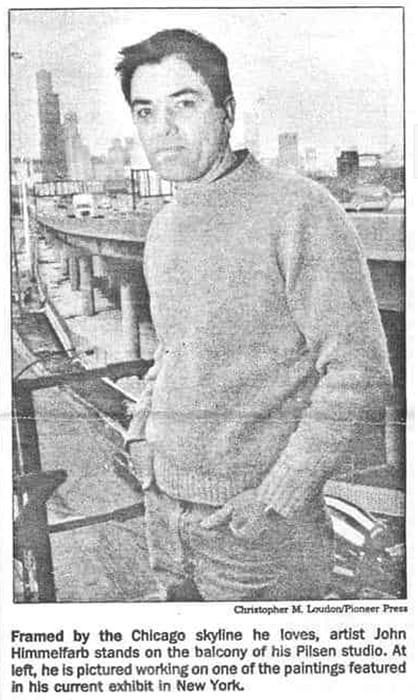
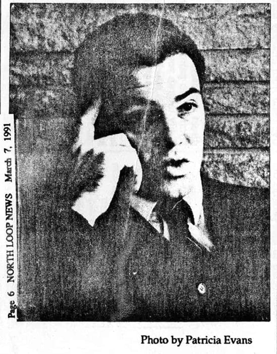
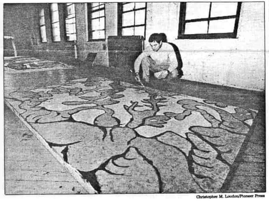
Diversity of Line: A Selection from the Permanent Collection — M. Jessica Rowe, Associate Director, Des Moines Art Center (1991)
Drawing and its voice, the line, have often been associated with the first inspiration of the artist. Because of this, drawing has been regarded as more pure in concept than other modes of artistic expression. In drawing, the artist can go directly from thought process to image, unencumbered by complex materials or extensive preparation. With this immediacy, drawing can accommodate all attitudes, whether an artist is reacting directly to forms in the physical environment, refining forms of the memory, inventing new forms, or even planning complicated relationships among forms.
Artists today have, with increasing intensity, seriously investigated the nature of the drawing. Major energies have been expended in a fundamental reevaluation of the medium and its usage. With this process of reevaluation and renewal, drawing has continued to move from the context of a support medium, an adjunct to painting and sculpture, to a major and independent medium with distinctive expressive possibilities altogether its own. In fact, as this exhibition demonstrates, drawing does not involve only pencil, pen, or brush, but also the various techniques and media of collage, assemblage, and painting.
The evolution of this attitude toward drawing extends back to the Renaissance when drawing was equated with invention, with the engendering of the idea or form of things. Regarded as both a poetic and scientific discipline, drawing acquired high intellectual credentials. Without drawing, it would have been impossible to describe the newly emerging disciplines of anatomy, geometry, and perspective, which were basics to achieving the Renaissance goal of scientifically accurate rendering of nature. At the same time drawing was a tool for expressing the Renaissance’s new found regard for human invention and imagination.
Contemporary artists such as Ada Medina, who sees drawing as a process for making ideas clear, build on this Renaissance beginning. Medina envisions unique drawings like Ejemplo (1984) with earth-like planes, primary forms, space, and light within imaginary sites. She states that her works “aspire to evoke inner states and not merely to define physical reality. I strive for drawings that can capture tension, unease, and quietude through the vehicle of unassuming elemental subjects.” 1
The 1972 charcoal and paint stick drawing by Richard Serra has an effect of opening thought beyond the habitual patterns imposed by speech. Velvety-rich darks give visual form to what may be impossible to put into words. Form is a constant metamorphic passage between one state and another. Serra’s drawing is characteristic of his means used to convey this sense of passage.
John Himmelfarb’s complex and calligraphic drawing heralds the notion of the artist as translator. A fascinating mixture of vibrant line and figurative distortions populate this large-scale brush and ink drawing of 1975-1979. Only after we have looked closely do recognizable forms emerge. Himmelfarb explains: “The image is a vehicle for getting on the page a design that reflects my energy map of the world. It’s a way of translating the way I feel about the world into a pattern. When somebody else reads it, even if they don’t see the imagery, they can respond to the energy of the design.” 2
Marvin Israel’s drawing from the Man Series is a harsh comment on man’s inhumanity to his own kind. This 1973 work is a tortured image of a half-naked man whose flesh is bruised and bound in metal, whose head and upraised arms are covered so that only his chin and a part of his mouth are visible. The physically degraded figure is disturbing and unsettling in the extreme. This effect is heightened by Israel’s placement of the image to the front of the picture plane, thus causing us to confront this sorrowful vision.
The purest mode of drawing is delineation which can be seen in Henri Matisse’s Head of a Girl (1944). In this brilliant use of line, different aspects of the figure have been reduced to contour image unmodulated by effects of light and shadow.
Study for Shift by Bridget Riley is a study for a 1963 painting. The best known of the English “Op” artists, Riley employed optical illusions and devices, such as that seen here. The repeated black and white triangles seem to shift so as to create an illusion that the paper is not flat.
Gustav Klimt’s 1895 untitled portrait of a bearded man and Lyonel Feininger’s Veiled Sunset (1945) present a mode of drawing wherein effects of light and shadow have been added to the linear contour. Robert Michel obtained tones in his Demonstration 2 (1920) by radiating lines. Michel’s work demonstrates that drawing does not involve only pencil or pen, but also the various techniques of collage and assemblage.
Color-value drawing, in which light and dark areas express the difference in tones, represents still another mode of drawing. Robert Arneson’s Clown (1978), Robert Henri’s Model in Red (ca. 1920), and Egon Schiele’s Untitled (Female Nude) (1913) approach as closely as possible the effects of light and form expressed by color-value drawings. Schiele’s use of color is identified with his artwork of this period. Color is used sparingly along the contours of the figure to heighten the interior definitions of the spine, edge of the buttocks, and shoulder blade. The touches of blue in the discarded garment are repeated at various places along the left side of the body: the shoulder and shoulder blade, the wrist, and the waist. This contrasts with the oranges which are also used to define contours. The color of the paper itself forms the basic color of the figure along with the faint washes of gray and pink. The resulting effect is a figure charged with energy, despite the lack of gestures or overt movement.
Nancy Graves’ drawing Archaeoninus (1980-81) is invigorated with elaborate patterns of vivid color, using acrylic, pastel, and graphite. Drawings such as this are difficult to distinguish from paintings; therefore, watercolors are generally considered a class of colored drawings.
Adolf Woelfli’s work was discovered by more experienced artists during the past half century. Woelfli suffered from schizophrenia and lived over half of his life in a mental institution. In his 1923 drawing Schaggi im Graas, flat, two-dimensional forms completely cover the surface of the paper as though the artist was reluctant to leave any of it untouched by his pencils or his presence. The decorative effect is embellished by masked faces which emerge throughout the composition and which apparently contained some personal symbolism for the artist.
What we can extract from this diverse group of drawings is a sense of the artist’s mind or the process of thinking and selecting. These drawings help us see the world of forms and our own environment in a new way and, possibly, inspire us to develop additional ways of seeing. They give us not only an intimate glimpse of the deep commitment of artists’ search and experimentation with ideas and form, but also insight into the distinguished drawing collection at the Art Center.
M. Jessica Rowe
Associate Director
John Himmelfarb (American, born 1946)
Untitled, 1975-79
Pen and ink with wash on paper, 48 x 96 inches
Purchased with funds from the Gardner and Florence Call Cowles Foundation, 1980.18
| 1 | John Hallmark Neff, Awards in the Visual Arts 2, edited by Terry Ann R. Neff, Chicago, Illinois: Co-published by Museum of Contemporary Art, Chicago and Southeastern Center for Contemporary Art, Winston-Salem, North Carolina, 1983, p. 51. |
| 2 | Michael Bonesteel, Meetings in the Garden: The Art of john Himmelfarb, Kalamazoo Institute of Arts, Kalamazoo, Michigan, 1989, p. 9. |
click thumbnail for larger image

There’s a Method to His Madness — Bryan Miller, Chicago Journal (1991)
With a nod toward Pollack and a wink at the art brut expressionism of Debuffet, Oak Park artist John Himmelfarb is drawing international attention for his modern masterpieces
John Himmelfarb is not a starving artist; a partial list of his exhibits, collections that contain his paintings (everything from the Musee d’Art Moderne in Paris’s Centre Pompidou to the Sioux City Art Center), grants and awards received and visiting artist/lecturer gigs fill the best part of five pages. His sixth New York one-man show just opened at the Terry Dintenfass Gallery on West 57th St. On the other hand, he says, “making a living as an artist is hard work. It lakes an enormous amount of time to keep organized enough to do business. Building a national career, to the point of feeling like you’re reasonably well rewarded, is a long, slow process.”
Himmelfarb, 46, and family — his wife, Molly Day, a reading specialist at the University of Chicago Lab School, son Forest, 11, and daughter Serena Aurora, 4 — came to Oak Park in 1984 from Hyde Park, “when we needed a house with a yard.” He’d had contact with the village for 10 years before that, thanks to exhibits of his paintings and a visiting artist program.
He grew up in exurban Winfield and his first impulse was toward music: he studied violin and piano, and played in community orchestras and the Chicago Youth Symphony. But the visual arts lured him: “I was raised in a family where they were important (both his parents were artists), and although I didn’t get a lot of formal training, I had examples all around me.”
At Harvard, he took a pre-architecture program — giving him a basic background in design — followed by an independent study in Drawing. “That was the fatal attraction,” he says with a laugh. His first national exhibit was mounted in 1968, his senior year in college.
Himmelfarb developed a distinctive style that remains recognizably his own as it evolves. “I started with very small-scale pen and ink drawings — lots of tiny marks that built up into large masses. Then the scale built up — there were still lots of small marks, but they added up into large-scale forms.”
At his current Terry Dintenfass Gallery Show, the works on display are all new paintings — produced within the last two years — ranging from smaller, 16×20-inch works to 8×12-foot compositions. “They all seem to have some sense of reference to landscape, but they’re all fairly abstract,” says their creator. “They have a sense of place, but they’re not realistic.”
There’s a difference between the kind of show one mounts at a gallery and a museum exhibit, he points out: “For a museum, you want to show a broad range over a period of time. For a dealer, you want a unified theme.”
Himmelfarb works primarily in two dimensions, in paintings and drawings. “l used to do some small-scale ceramic sculpture; more recently, I’ve done some bronze reliefs. I’m also working to get a commission for a ceramic tile mural.”
With their sense of form and shape, Himmelfarb’s images seem in some ways a logical evolution from the quasi-realistic regionalist Thomas Hart Benton’s complex visual rhythms, through Benton’s student Jackson Pollock, the latter among the artists Himmelfarb says have influenced him, along with Picasso and Kimura. “I grew up on the Modernist movement: I was not influenced so much by the mainstream art of the ’60s and ’70s.”
His recent paintings have all been in acrylics, rather than oils, but for a very pragmatic, rather than artistic, reason — at least at first. “l’ve switched hack and forth between acrylic and oils over the years. I gave up on oils last when I was still working in my house in Oak Park — I had to use the family room, in the basement, because oils are so smelly, and the fumes stink. It was a poisonous atmosphere.”
Usually, when he was still working at home, he painted in the living room, bedroom or den. “Once, I borrowed the attic of a friend in one of those giant Victorians over on Kenilworth — because was working on a drawing that was 32 feet long, and I just didn’t have a place to do it. So I relied on the graces of Oak Park architecture.” Now he has a separate studio in which to work, 4,000 square feet of loft space in what he calls “the no-man’s land between Pilsen, Bridgeport and Chinatown.”
But he’s still painting in acrylics — at least for the moment. “Because oils are slow drying, I was able to achieve colors mixes that I couldn’t working with acrylics. But I’m finding that the longer I work with acrylics, the more I can do what I want with them. Once you finish a painting done with acrylic, it’s dry, it’s stable and that’s how it’s going to look if it’s cared for. But with oil paints, you have to worry about it cracking and about the colors changing. If I paint in acrylic, no one’s going to have to debate in 200 years whether the colors were supposed to be that subdued, or if they’ve just faded. So I may not switch back.”
Along with artistic techniques, Himmelfarb experiments with promotional techniques. “I’m trying to create new ways to get my work out to the public. I’m not wedded to traditional methods — although an exhibit in a 57th Street gallery is a very traditional method! But I exhibit in out-of-the-way places. I do a lot of traveling. The business takes at least half of my time. But I’ve got the freedom to decide which time I’m going to spend on the business and which time I’ll spend working at the studio.”
Himmelfarb is, of necessity, self-taught in the arts business. “Some schools are beginning to teach courses in it. But some people don’t have the temperament to deal with the public, and they’re foolish to punish themselves by trying. I’m lucky; I get pleasure out of doing that well — but I’d still rather paint!”
The buyers of his work are, he says, “pretty evenly spread between museums, collectors and corporations.” Corporations? Yes, he avers; corporate buyers of Himmelfarb’s paintings and drawings include megafirms Jenner & Block and Peat Martwick. “Mine doesn’t conform to the stereotype of corporate art, but many firms are now trying to build serious collections — not just decorate the walls.”
Acceptance for an artist builds gradually, he observes, and comes at different levels. “Museums and collectors will start with buying small lithographs, and work their way up in size and scale. Typically, it takes many years to develop your work to the highest level and gain increased recognition.”
Does the artist have to worry about obsolescence — about finding his distinctive style suddenly out of style? “If you develop your image and particular style gradually, and build a large reputation on a national and international scale, you should be pretty safe. There’s a ripple effect — there are always a few more collectors who want to own that name brand.
“I’m not really painting for today’s trend — I don’t even know the name of the latest New York art fashion! Most of it just washes over me; sometimes it may color my work, but I don’t try to imitate it. Fashion is not something you can either aim for or successfully capitalize on for a long period of time if you’re doing your own work, if you develop your own style. And that’s what I’m doing.”
click thumbnail for larger image
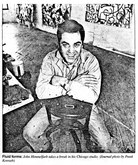
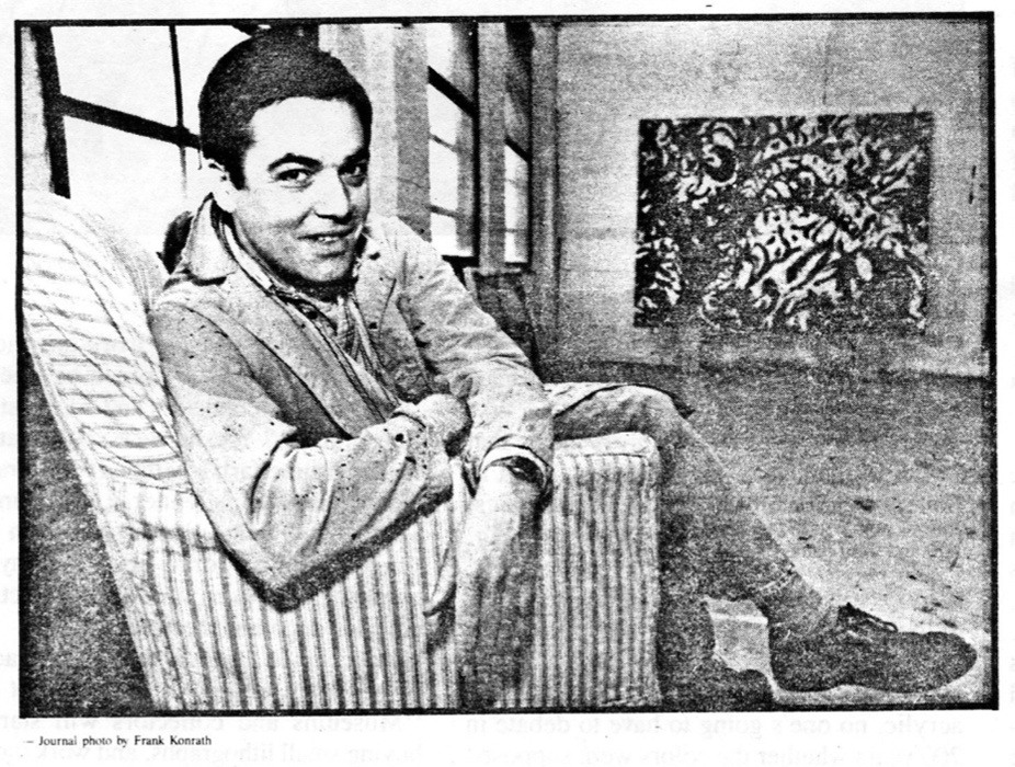
Artist’s rural roots color his work — Freida Gad, Daily Herald, DuPage, Illinois (Oct 1990)
Towering structures of stone and glass define the new DuPage landscape.
But it’s the hills, forests and farmland of an earlier time that Winfield native John Himmelfarb most often shares with the world.
An established and well-respected artist, Himmelfarb has produced work that can be found in the collections of 37 art museums, including the Art Institute of Chicago and the National Museum of American Art in Washington, D.C.
While Himmelfarb, 44, could have chosen the heady life of a New York artist — where his art receives higher acclaim than in Chicago — this soft-spoken, engaging man has decided to work in two rooms of a converted warehouse on Halsted Street.
The artwork that has won raves and spawned two books is stacked in rolls and on shelves in the cavernous studios. Some are still in cartons just back from a traveling show. A large canvas is spread on the floor. The paint he uses is thin and would run if the canvas were propped on an easel. So he paints from above, careful not to drip paint on his socks.
Today he lives in Oak Park with his wife, Molly Day, and children, Forest and Serena Aurora, but he was raised in a largely rural DuPage at a time when the county was more country than concrete. The experience still influences his work.
“In the woods, I never saw horizon lines,” he says. “When I looked up at the sky it was filled with something. The urge to fill up every inch with detail may have come from that.”
At first glance, many of his paintings and sketches appear to be just that — black lines hurrying to and fro or wrapping themselves around randomly placed colors. But on closer inspection, faces, forms or entire landscapes come into view.
“The borderline between image and abstraction fascinates me,” he says.
It seems to fascinate the art world, too, for Himmelfarb has displayed his paintings, sketches, wood prints and lithographs in more than 30 one-man shows and over 60 group exhibitions.
Surprisingly, he did not set out to be an artist, even though he was surrounded by art from an early age. His parents, Sam and Eleanor, were both artists, “but I didn’t take it too seriously because they were my parents,” he said. “In high school I concentrated on music. “
Had the term been in vogue then, Himmelfarb would likely have been labeled “gifted.” He studied both piano and violin and played the violin with the Wheaton College Orchestra, the DuPage Symphony Orchestra and the Chicago Youth Symphony.
Attending high school in a conservative DuPage also influenced his unsettled and challenging style.
“I went to Wheaton High School,” he recalls, “but I felt a little bit of an outsider, because I didn’t come from Wheaton. I came from a left-wing background in a right-wing society. At that time just voting Democratic was left wing. When Kennedy was elected, people wore black armbands. But being different had its advantages, too. I felt challenged by it. You see things from a different perspective and you question how things are.”
He entered Harvard — “still left of center, but no radical” — planning on a career in architecture. There he rediscovered art and, with the prodding of a professor, entered his artwork in contests.
“When I first started, I wanted to figure out if I had enough talent and ability to see if I could spend my whole life doing this. I gave myself certain things I wanted to do, like sell work to a museum and get good gallery recommendations.”
He has accomplished those goals and more.
Represented now by Roger Ramsay Gallery in Chicago and the prestigious Terry Dintenfass Gallery in New York, Himmelfarb finds his work is often sought by art collectors. “I feel successful; part of the purpose of my art is to communicate with people, and it is quite satisfying when a wider audience recognizes it.”
As a writer might choose and discard words, Himmelfarb fumes and fusses over the lines, shapes and colors on his canvas. He may spend weeks rearranging lines to fit a central shape, only to admit to himself that the focal point is not right and must go.
He is conscious of the effect his work will have on the viewer.
“I like people to engage themselves with the piece,” he says. “You want the eyes to keep moving throughout and not get stuck in one place.”
He also believes artists themselves should not get stuck in one place.
“I don’t think artists can be ivory tower people,” he says. He practices what he preaches and finds time to be on the Oak Park Solid Waste Commission.
He also communicates that concern for the environment in a series of paintings he calls “Boat Man.” One painting dubbed “Flotsam and Jetsam” shows a flood scene in the upper part of the picture, as if a boat had sunk and all the land-based objects were awash. In the lower portion of the painting, a man is throwing a bone to a dog.
Explained Himmelfarb: “The series shows a man in a boat, and as the paintings progress, the pile of his creature comforts — televisions, chairs, giant padlocks, dressers, refrigerators — grows, until his boat sinks.
“The idea is about consuming to the point of our own self-destruction, ‘a Noah’s Ark for the man who obeys the electronic thunder of the consumer god,’ one newspaper called it. The idea of the dog being thrown a bone represents not a real solution to the problem of solid waste, but simply one that gets you through to the next day.”
Usually though, Himmelfarb is cautious about explaining his artwork. “You experience life more fully if you question it rather than if you have all the answers,” he said. “There is a tendency in our society to label things as a substitute for experiencing them.”
Although Himmelfarb resists labels, his work has been described as a cross between post-war expressionism and surrealism. Both Picasso and Jackson Pollock have influenced his painting. Still, a John Himmelfarb painting is a creation all its own, that — in some small way — belongs to us, too.
click thumbnail for larger image
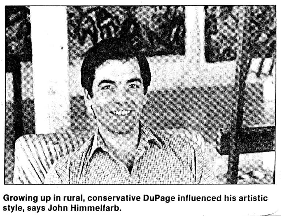

Broad Daylight Meeting — National Endowment for the Arts (1989)
John Himmelfarb
Born 1946, Chicago, Illinois; lives in Oak Park, Illinois
Broad Daylight Meeting, 1986
ink on paper
56 1/2 x 90 inches
The Museum Purchase Plan of the NEA and Virginia Bailey, 1988 88.23
Son of painters Samuel and Eleanor Himmelfarb, John Himmelfarb grew up in a household of artists in the surround of deeply wooded Winfield Township, Illinois, and made his first attempts at drawing in the corner of his father’s Halsted Street studio. Himmelfarb studied liberal arts at Harvard University, majoring in architectural sciences. In his freshman year, he enrolled in a two-dimensional design course, his first studio experience. Thereafter, along with academics, Himmelfarb was back in the studio every term of his undergraduate years. The artist remained at Harvard, this time to complete a masters program in teaching, but moved his residence to a sheep farm in Millis, Massachusetts, where he lived in a rent-free cabin in exchange for watching the sheep.
Broad Daylight Meeting (1986), more than 7 feet long and almost 5 feet high, features figures that seem gigantic in scale. Set in the tangled atmosphere that recalls the dense forests of the artist’s childhood, this ink on paper work evokes the human-to-animal kinship of the shepherd to his flock, as well as their mutual antagonism to lupine predators. Or is the affinity that between wolf and wolfman, overseen by tree gods? The ambiguity of players in this scene — colossal and close up, in a shallow space that multiplies the intensity but scatters certainty about the meanings of the confrontation — echoes in the formal elements Himmelfarb employs.
The childlike quality of images and independent identities of marks in Broad Daylight Meeting rub against one another in a sophisticated and intricate all-over composition. Recognizable representations and non-objective forms ascend in sequence. In this labyrinth that Himmelfarb has carefully constructed, complexity becomes complication, entanglement, and predicament. In its rich, knotty quandary, the monumental drawing is typical of the Meeting series, which Himmelfarb created throughout the 1980s. Himmelfarb’s art undergoes a relentless process of mining and a continuous reevaluation of content and form. A crucial part of an oeuvre that intersperses invention and reconceptualization, the oscillating procedure of walking forward and then retracing his artistic steps also knits Himmelfarb’s works together with extraordinary integration.
The artist has had a measure of success at mid-career. He has been included in group exhibitions throughout the United States since 1968, and has shown in New York since 1977. He received a fellowship from the Illinois Arts Council and two from the NEA. Still, he retains a personal distance from art centers, working in a studio in the Chicago area since 1970. And although his art is clearly founded on the compositional innovations of the Abstract Expressionists and the direct imagery of Dubuffet’s Art Brut and the Northern European CoBrAs, Himmelfarb has charted an independent and individualistic path that leads back to himself. Helen Sheridan, writing of Himmelfarb’s work of this period, called his storytelling “mythic.” The gnarled woodsman, Himmelfarb’s protagonist, is above all introspective, asking “eternal questions: Who am I? Why am I here? What shall I do?”
Note
l. Sheridan, in Meetings in the Garden p. 3.
References
Barilleaux, René Paul. Samuel Himmelfarb, Eleanor Himmelfarb, John Himmelfarb: Three Painters (exhibition catalogue). Quincy, Illinois: Quincy Art Center, 1994.
Sheridan, Helen, and Michael Bonestell. Meetings in the Garden: The Art of John Himmelfarb (exhibition catalogue). Kalamazoo, Michigan: Kalamazoo Institute of Arts, 1989.
click thumbnail for larger image

Biography — Helen Sheridan, exhibition catalog essay for “Meetings in the Garden: the Art of John Himmelfarb,” Kalamazoo Institute of Arts, Kalamazoo, MI (1989)
John David Himmelfarb was born June 3, 1946, in Chicago, the only son and second child of Samuel and Eleanor Himmelfarb. The family lived in rural Winfield, Illinois, in a house designed by Sam and strongly influenced by the prairie architecture of Frank Lloyd Wright. The comparative isolation of this location led John into close contact with nature, and many of his childhood games focused on the plants and animals he found in the woods surrounding his home. The self-reliance that these games provided, and the rich imaginative life they encouraged were to be important in John’s later work as an artist.
Because no public preschool programs were available, Sam and Eleanor Himmelfarb, together with a few of their neighbors, founded a kindergarten called Little Red Wagon. John recalls that the time spent here and his undergraduate years at Harvard were the “only exciting education” he ever received within the formal system. He studied piano and violin, and music was an important part of his life. He attended Michigan’s Interlochen Music Camp with his sister Susan during the summers following his fourth and fifth grades.
The Himmelfarbs lived outside any regular community. The closest school, Gary’s Mill, was a one-room country schoolhouse. After it consolidated, John attended West Chicago elementary schools, and then transferred to Wheaton for high school. Music continued to preoccupy him, and during high school he played violin with the Wheaton College Orchestra, the Dupage Symphony Orchestra and, in his senior year, with the Chicago Youth Symphony. John had no thoughts of becoming an artist, although the visual arts were always a part of his life. Both his mother and father were artists. His mother taught art and his father was a professional painter who also established a commercial design business. Art surrounded John in his home; he met artists who were friends of his parents. When the family traveled, they looked at art in museums and galleries. Drawing was natural to John as a small boy and, at an early age, he began painting regularly with his father every Sunday in his studio. But it never occurred to John to think of the visual arts as a career.
Far from knowing what he wanted to do with his life, he was even reluctant to go on to college because he thought high school was such a waste. (He certainly had no intention of going to a “rich boys’ school out East.”) In his junior year of high school, however, he went to Boston on his way to visit his sister Susan, who was attending Sarah Lawrence. He enjoyed what he saw of the Harvard campus and, when his mother showed him the undergraduate course catalogue, he was intrigued by the vast array of classes that were offered, and by the freedom of the undergraduate curriculum. He decided to apply and was accepted. During his first two years at Harvard, John enjoyed a wide range of classes and continued with his music by playing with the Harvard-Radcliffe Orchestra. He knew he would never be able to be a professional musician, at least of the caliber acceptable to himself, so music remained an important but purely personal interest. Meanwhile, the strong visual presence of the campus itself, as for example in Corbusier’s Arts Center, brought him back to the visual arts.
In his freshman year, John took his first studio course, a two-dimensional design class taught by Albert Alcalay; thereafter he took one or two studio classes per semester. But in his junior year John took an independent drawing class and, for the first time as an undergraduate, was able to work on his own art. While he was involved in this independent class something “clicked in” for John and he began to think seriously about becoming an artist.
A mentor for John at this time was Wil Reimann, a sculptor and teacher from whom John had taken a three-dimensional design class. Earlier, Reimann had talked with John about his career plans and asked if he had ever seriously thought of being an artist. It was Reimann who suggested and helped John design the independent study class. Reimann’s interest and confidence in him helped John make the decision to become an artist. After graduation in 1968, John enrolled in the M.A.T program in the School of Education, thinking he would need a job to support his work as an artist. He plunged immediately into team teaching, spending five days a week working in a special summer enrichment program for children at Newton, Massachusetts. Newton served as a lab school for the Harvard School of Education, and John’s day was divided between classroom teaching and graduate education courses.
For the first year of the two-year graduate program, John moved to a sheep farm in Millis, about 25 miles from Boston. He lived in a rent-free cabin in return for keeping an eye on the sheep. In the time he had between sheep-watching and commuting to Boston for classes, he was able to devote himself to making art. His first one-man show in 1969 was at the Millis Public Library, where (not coincidentally) the owner of the sheep farm was Director. The show consisted of the work he completed during his months on the farm.
The second year of the graduate program consisted of a supervised job in a field related to his subject area. John worked for General Learning Corporation in New York City, living with friends in Jamaica Plains for the ten month he was there. On the job he worked in space planning, translating performance requirements for classrooms into specifications for architects. He finished the M.A.T on schedule in 1970.
The year 1970 was important in several ways. In February he met Molly Day, his future wife. In June he left on a trip that took him to Europe, Crete, Turkey, and Tehran. Having decided against teaching in favor of concentrating on art, he cut short his travels to try to establish a studio.
In September he returned to Chicago, where he worked in his parents’ studio. In the fall of 1970 he had his first studio sale. The proceeds allowed him to begin to set up on his own. In December 1971, John and Molly bought a house on 19th Street in Pilsen, a Chicago neighborhood. In March 1972 they were married in New York City and, in the year that followed, remodeled the Pilsen house into a combination home and studio.
From the early 1970s John’s work has received attention and critical acclaim. He has participated in over 60 group exhibitions and has had over 30 one-person shows, an impressive number for an artist his age. In 1979 he received a Yaddo Fellowship, followed by National Endowment for the Arts grants in 1982 and 1985, and grants from the Illinois Arts Council and the Pollock-Krasner Foundation in 1986. The birth of his children, Forest in 1979 and Serena in 1986, enriched an already sound marriage. Although it may seem that success has come easily for him, the reality is that John has made his reputation with talent and very hard work. He has approached being an artist with the same discipline and focus he was trained to use as a musician. He has deliberately rejected the glitz of the New York art scene in order to develop at his own pace and in his own way in his native Chicago. There is a calm and balance to John’s life. What is remarkable is that there is also an intensity and determination in his artmaking that is unshakable.
IMAGE CAPTION
Low Intensity Conflict, 1987, acrylic on canvas 40 x 60
click thumbnail for larger image

Foreword — Helen Sheridan, exhibition catalog essay for “Meetings in the Garden: the Art of John Himmelfarb,” Kalamazoo Institute of Arts, Kalamazoo, MI (1989)
John Himmelfarb first came to my attention in 1987, during a routine review of slides from artists being considered for exhibition at the Kalamazoo Institute of Arts. I was immediately struck by the scale and intensity of his work and, frankly, intrigued by the curious, childlike images that populated his paintings and drawings. My interest increased after seeing the actual work, first during a visit John made to Kalamazoo and later during the several visits I made to his Chicago studio.
One point of fascination for me in John’s work is the control he is able to exercise in handling his very large brush and ink drawings. One tour de force piece extends to the remarkable length of 32 feet! Another point of interest is the tension he is able to create between the recognizable image and nonobjective form. Many of his works seem to hover on the verge of nonobjectivity and, only after the viewer has looked closely, do recognizable forms emerge. But these factors, engaging as they are, become secondary in importance to the ideas and vocabulary of forms that John has worked to articulate in his art over the past fifteen years.
John’s work is based on a curious amalgam of post-war expressionism and surrealism. He is strongly influenced, for example, by both the abstractionism of Jackson Pollock, with its emphasis on overall gesture and markmaking, and the art brut expressionism of Jean Dubuffet, with its use of childlike imagery to suggest directness and spontaneity. The fact is that John has drawn upon a number of influences from 20th century art history, but he has managed to move beyond these influences to develop his own powerful and personal voice.
There is a strong element of storytelling in John’s work, one reason for its broad general appeal. Even the early stream-of-consciousness drawings produced images that were strongly evocative of narrative. The drawings from the mid and late 1970s were even arranged in parallel rows, suggesting a “reading” from left to right much like a printed page. The grid form in a work like Early Riser suggests a picture book sequence in which each image contributes to the progression of the total narrative. The Boat Man series of the late 70s and early 80s deals in a protracted way with the story of the destruction of our materialist Western culture.
In the Meeting series of the 1980s, John most successfully joins the storytelling urge with his interest in an overall compositional unity. Working from the pure abstraction of a piece like Spring Green, a work which John describes as being one of the final statements in his Boat Man series, he gradually reintroduces the figure. These new figures, however, are limited in number, gigantic in scale, and generated out of marks that relate directly to the overall composition. The richly complex, undulating surface of a work like Spring Green is retained, seducing the viewer’s eye with its immediate, abstract appeal. Then, abruptly, figures emerge, confronting the viewer with an urgent and provocative drama.
This is storytelling of mythic proportions, and it draws its credibility from powerful forms that seem to ask eternal questions: Who am I? Why am I here? What shall I do? It is not accidental that the eyes of the central figure in each work, a figure that John has described as his “protagonist,” often gaze directly at the viewer with a quizzical expression or seem engaged in a perplexed introspection. In an interview with Matthew Rose, John talks about humor as an aspect of his work, one which helps him deal with “fears about being alive.” The high seriousness of the questions asked in the Meeting series is substantially leavened by the humor with which the artist describes his dramas.
An exhibition such as Meetings in the Garden would be impossible without the encouragement and assistance of many people. All of those involved in the efforts to put this show together deserve thanks. I must single a few out for special mention. First, thanks to P.J. Raskin, who first suggested an exhibition at the KIA and who has been consistently helpful and enthusiastic about the project. Thanks also to Tom Kayser, former KIA Director, who decided to expand the exhibition into a major retrospective for circulation to other museums. Thanks to the several collectors, listed elsewhere in this catalogue, who have generously loaned works for the run of the traveling schedule, and to Landfall Press and Tandem Press for lending major pieces. Thanks to Michael Bonesteel for his informative catalogue essay. Thanks to members of the KIA staff who have helped in the organization and installation of the exhibition, and especially to Jan Nesburg, KIA Librarian, who prepared the bibliography and helped with the editing of the catalogue. Finally, I must thank the artist, whose good spirits, attention to detail, and tireless cooperation made working on this exhibition a pleasure.
Meetings in the Garden marks the first time that the Kalamazoo Institute of Arts has organized a traveling exhibition built around the work of a single artist. It is significant evidence of our belief that John Himmelfarb is an artist of power and original vision. We trust that those who see this exhibition will share our opinion.
Helen Sheridan
Director, Collections & Exhibitions
click thumbnail for larger image


Interview — Helen Sheridan, exhibition catalog essay for “Meetings in the Garden: the Art of John Himmelfarb,” Kalamazoo Institute of Arts, Kalamazoo, MI (1989)
The following interview is drawn from a May 21, 1989, conversation between John Himmelfarb and Helen Sheridan
John, in your work there always seems to be a tension between the recognizable image and pure abstraction. Is one or the other a primary concern?
I like to achieve a balance between the nonobjective design quality of the work and images of narrative quality. It doesn’t often come out as a perfect balance.
Do you start with an idea that suggests a particular imagery?
Well, out of necessity more than anything else, I find that I am not able to generate totally nonobjective forms that seem significant, or that organize themselves in a visual pattern that is satisfying to me, unless I have in the back of my mind at least some specific imagery. My work cycles from imagistic to nonobjective over a period of many years and then back again. As I work with an image I gradually use it more and more familiarly and it becomes less and less representational until I’m finally into a mode where it is either very abstract or becomes nonobjective. Beyond a certain point I have to “recharge my batteries” with images again. I either slowly work my way back into imagery, or I just make an abrupt break in my work and begin again with recognizable images.
So those writers who describe you as a social critic or engaged in social commentary are just a little bit off the mark? You’re interested in ideas and in people and you need some of these ideas working for you as an artist, but it’s the mark on the paper that’s important?
The mark on the paper is probably paramount in translating my energy into something that’ll communicate energy to other people. But as long as I’m using narrative images, my social concerns are hard to keep out of it. They just slip in naturally. I’d love to be a political artist, but I never found a way of achieving that within my visual language. I intend my work to be open and sharing, and I’ve come to see that as a political statement in itself.
It’s hard for me to see you as a social commentator, except in a very broad sense. Particularly in the Meeting series, where your images are strongest. The protagonist in those large drawings seems to be engaged in a kind of interior dialogue, rather than commenting on the outside world. The individual is involved with himself. Like Jacob wrestling with the angel, the image suggests an interior struggle, an interior drama.
That’s true of the Meeting series. The images developed without an illustrative aim on my part. The original image came from the subconscious in a stream-of-consciousness manner of working. I believe I selected it to develop, and kept using it, primarily at first for its design value.
Was Arms Length the pivotal work in this series?
Arms Length was done at about that time, but the image I really used over and over again began from something that I call Meeting. I worked with it for almost a year. Then I began to interpret the image for myself because I was curious why I was so compulsive about returning to the same imagery. Of course, there were some technical reasons why I kept using it, but I felt that perhaps there were psychological or emotional reasons for returning to it. So I began to ask myself, “who are these characters and what do they mean?” For a time I tried to help other people interpret them by recounting my own steps of interpretation. I shy away from that now because I don’t want my reading, which came after the images, to be limiting to the people who want to experience the work for themselves.
But you go so far as to say that the frontal face is the protagonist and the profile view is an inner voice?
That’s an interpretation that I came up with for myself — one of many.
Your drawings of the 70s were composed of hundreds of small individual drawings. Each work appeared homogeneous when looked at as a whole; but when looked at closely, it was clear that each small drawing existed both separately and in relationship to adjacent images. As you look at a mid-70s drawing as a whole it appears a little like a field image; but as you look closer there are lots and lots of individual differences, and separate little entities exist both alone and in relationship to things on either side. Images are repeated and appear in variation. But in the Meeting series you seem to zero in on a particular image, and it is this image that is explored over and over.
In the earlier work, each piece was made up of many small marks. There was no single large image. Each mark was its own image. Sometime around 1984, the marks began to add up to larger images as I began the Meeting series. But the concern with filling the field with lots of marks is the continuity between the two periods.
How did your Boat Man series lead to the Meeting series?
JH – The Boat Man series began as an attempt to get a bolder image than I had been able to produce with the pen and ink drawings. By using a very liquid black acrylic, I was able to draw with a brush instead of a pen. Most of this work was done on raw canvas, as for example in Riding High, but I also did a group of brush and ink on paper works. After a bit of time away from that work, during which I reinterpreted the Boat Man series in a group of color paintings, I returned to the ideas begun in the brush and ink drawings.
If we push the narrative aspects of these works, in the Boat Man series you record the destruction of our technological civilization by flood. And in the Meeting series man reappears, alone, in the garden.
That’s right.
In the Boat Man series you seem to be concerned with the individual in the world and civilization as a whole, whereas in the Meeting series there is a concentration on the self that becomes paramount. There is a self-consciousness, a conscious effort to integrate or balance the disparate parts of the self that is what seems to me to be strong in your work in the 80s.
I never really saw the connection until now between the last of those black and white Boat Man paintings, which were purely botanical, and the Meeting works. Those paintings represented a resurgence of life, but not of animal or human life. In the Meeting series, the background is again foliage, but it’s only a background rather than the total subject.
Even though the garden is a background to the major image, it is still a powerful presence. Nature, as represented by the garden, is almost overwhelming. The protagonist, in spite of his gigantic head, seems barely able to hold his own against this teeming elemental world. I’ve wondered if the puzzled look that appears on some of the faces in the Meeting works doesn’t reflect this.
Perhaps. Or perhaps they are waiting for the conflict between the other elements to be resolved. At a recent show of my work at Ball State University, I talked about the self-portrait quality in a lot of my work and about how every artist’s work is a self-portrait. Whether it’s Broadway Boogie Woogie or Stella’s Protractor series, what the artist does is to some extent a self-portrait. Everything we do tells something about ourselves. My point is that doing self-portraits or work that helps an artist understand himself better is not mere self-indulgence, but is a vehicle for connecting to the rest of the world. If you can understand yourself better because of the work that you do, then you’re better able to understand, by association, other people. People can look at an artist’s work and not only learn something about the artist but, if they put themselves in the artist’s shoes as they look at the work and try to figure out what it means to them, they may learn something about themselves. That also allows them to become more understanding of the rest of the world. So, for the artist, the self-portrait can be a path to a larger vision.
It can also be a little scary. You might see a part of yourself you don’t know. That kind of discovery can be frightening, especially when you discover things that don’t fit your safe, comfortable, everyday image of yourself.
Your preconceived image of yourself. Well it all comes down to describing one’s self in another way and that’s with the visual design. The image is still for me just a vehicle for getting on the page a design that reflects my energy map of the world. It’s a way of translating the way I feel about the world into a pattern. When somebody else reads it, even if they don’t see the imagery, they can respond to the energy of the design.
That’s very true of your large scale works. Anyone seeing these works will be struck by the force of the total design, even though they might not immediately see the particular images. Obviously the composition engages the viewer on a very powerful emotional level.
Well that’s what I hope people take away from seeing the work. It’s not the specific interpretation of this image or that image which is important in enjoying the work. If a work doesn’t reach people just as a composition of visual elements, then it is not successful in my book. I don’t consider all of my work successful by this measure, but sometimes the work seems interesting enough to be allowed to stand in spite of its flaws.
As I look at your most recent works, they appear to be more abstract. Do you think you are coming to the end of the Meeting series and moving in a new direction?
I seem to be going in a couple of directions at once. One focuses on images from the Meeting series. For example, I may select the single face and concentrate on that in a large painting. Another group of images has popped up in monoprints and little drawings and etchings. In these there is a whole cast of characters. If you want to continue with our basic interpretation, you can call them additional inner voices.
Man beset by personal devils?
They could just be more of the inner voices, or you can say that they give a broader picture of the world. I’m also working on a large drawing, Forest Free Fall, in which I take that cast of characters up to a larger scale for the first time. I’ve been experimenting with this kind of thing over the last four years, here and there in a single work and always on a fairly moderate scale. This kind of work will probably continue. All of these works incorporate some kind of recognizable image. But some of the newer paintings take the markmaking from the large heads of the Meeting series and build a new vocabulary of forms. These forms don’t relate directly to the Meeting imagery in anything but the organic quality of the marks.
So the two directions you mention are exactly opposite, one is toward increased figuration and the other toward pure abstraction?
We referred to those divergent interests at the beginning of this interview, and it’s happened before in my work. The paintings that started the Boat Man series began as purely nonobjective markmaking. Then a story began to emerge with the figure in the boat. But even those paintings became almost nonobjective at certain points. I always wanted to go back to nonobjectivity but couldn’t find a way. Somehow working with a primed canvas and color gave me a way back without duplicating what I’d done before. My new studio has made a big difference. I’ve got the space to go in several directions at once. Here I can work on something that’s nonobjective on the same day that I’m working on a painting that’s still one of the heads or a drawing that incorporates seven or eight figures.
So you can begin a work and if you run into trouble you can let the ideas percolate for a while before you go on?
I don’t have to finish anything right away. In my previous studio I couldn’t work on anything else until I had finished what was out because I didn’t have any other space. If I put an unfinished work away I was afraid I’d never get it out again.
Do you find you’re doing more large scale things now that you have this big studio?
I’m doing more work, period. I think I’m also doing more large scale work. I’m certainly doing more large paintings than I did before.
Let’s talk about the paintings. Your large drawings seem to have evolved naturally from the kind of stream-of-consciousness markmaking you were doing at an earlier stage. How has painting changed your work? Have you lost spontaneity?
I try to maintain the spontaneous quality of the drawings. In paintings I did in the early 70s I would draw on the canvas in the same way that I draw on paper. I wouldn’t have a sketch. I would just start drawing whatever came into my head.
Can you give some examples?
Filming of Sunny Days is a good example. The small painting, Dobb’s Ferry, was done that way. Although the style’s quite different, Red Dog, Yellow Dog, is the same technique.
You draw the images and then fill in color?
Yes. My drawing style has changed, but the idea of filling everything up and keeping a flat design has been almost constant. Only in an occasional piece in the past is there an opening up, a willingness to allow open spaces. This is also true of the new paintings I call “Non-Objective.” There are recognizable images that can be identified, but there is no attempt to be illusionistic, or to portray light and shadow, roundness or depth. Through most of my work I make an effort to keep a flat design because I want to make it clear that, even though I’m using recognizable images, I’m not competing with the real thing. What I’m doing is creating designs, even though I need imagery to make those designs . Not only was the design flat, but I used the paint in a very flat way. I’d put down the line quality and then I’d fill in flat areas and color it much like pop artists.
This was in the early 70s?
Yes. Then in the late 70s I did some paintings where I didn’t draw things out first. In these I just began painting and the images developed as I painted. The color wasn’t so flat and it became much more developed on the surface. It was a pretty important group of works, even though it didn’t last for more than a year, because it led to the development of the large figures that later emerged in my drawings and paintings. I was drawing with the paint rather than using the paint just as a skin to fill in the structure.
And this painterly, gestural markmaking was very different from the fine linear quality of your 70s drawings?
Movements generated by the gesture became an extension of the color, whereas in the Meeting series I drew first with the darker value of the paint, such as a blue or black, and then built color out from that. The color is an extension of the gesture in the Meeting series. I try to build the color with gesture rather than having it just be a flat surface, but the gesture is controlled by the original drawing I’ve put down. It has to build upon the marks that I’ve put down. The first paintings I did in this way started out with a more systematic approach. I knew ahead of time that I was going to use dark blue first, and then yellows, and then oranges and reds, and maybe green. There was a working order in my approach, much as a series like Red Dog, Yellow Dog had a system where I drew and then filled in paint. In the paintings of 1976, like Red Dog, Yellow Dog, I drew with a pen. In paintings from the Meeting series, like Low Intensity Conflict, I put down the blue structure first and built up the color within that structure, even though I was making marks instead of flat areas of color. Now I’ve begun, as in 1978-79, to modulate the color more, rather than using color that comes right out of the jar. There’s also more development in the painting itself. I don’t always stay within the general structure that I had when I first painted the black or blue lines. In my recent “Non-Objective” paintings, the color is again like an architectural skin, but in these the color helps to define the drawing in a way that it had not in earlier works.
Do surprises emerge?
Yes. The colors change a lot. I have no preconceptions about color. One day the painting might be predominately red and yellow, and then I suddenly have the urge to move it in a different direction. One recent painting is a pastel pink and green, but I need to work on it some more.
So the image in your work provides the basic structure that informs the painting all through its development?
Yes.
Your work has always seemed energetic and intense, rather than reflective.
Well, in a Jake Berthot or John Dilg painting everything is underneath, and the surface is very calm and quiet. Once you stand and look at the painting long enough, that underlying energy comes through. It doesn’t hit you when you first walk by.
But with your own work, you’re impatient. You want to engage the viewer immediately.
That’s the way I am as a person. I’m much more likely to come up and speak to somebody immediately than I am to be cautious and wait to find out what a person is like before I open up at all. Of course, that gets me in trouble sometimes.
In another of your interviews, you said it was important for you to engage the public, to communicate with people.
I have bent over backwards to be helpful in giving some clues for people who are baffled by my work so they can more easily get something out of it. Yet I don’t want to take away the experience of coming to understand a work on one’s own. I try to find a balance between being open enough to help people take the first step, without providing so many clues that there is no mystery for the viewer.
Are you bothered by what might be called over-interpretation by people who really want to read your paintings as narratives?
I think that’s fine as long as people invent their own and don’t depend on me to provide them.
Or expect that there is one right interpretation of your paintings?
There is no one right answer. The same is true when we try to interpret the world at large. There are lots of different ways of looking at it.
But the images do have some connection with you?
Yes, but when I interpret one of my images I’m only somewhat better prepared to do so than anyone else because I have a few more insights into what is happening in my life. It’s an after-the-fact interpretation. I began interpreting the Meeting series only three or four years after I made the first one. I have no idea what I was thinking about back in 1982 when I did Meeting. I don’t remember exactly where I was or what I was doing. I could try to remember, but I’m not that curious.
Those childlike, rough-featured heads had nothing to do with your children’s drawings because they were in your work long before you had children?
I think they go back to my own childhood. I grew up with animals we kept as family pets, and then there were lots of animals out in the woods where we lived, and of course all the stuffed animals that I had. Children just have a natural fascination with beasts. As a child I drew lots of animals.
You aren’t trying to be provocative or to co-opt the energy of the primitive or art brut?
Well, those were certainly very strong influences on me, and I think that was the kind of energy I responded to — Masson, Jackson Pollock, and Dubuffet. I can understand the fascination of European artists with the so-called primitive arts in the early part of the 20th century. The work of Henri Rousseau, Mark Tobey’s white writing and his fascination with the calligraphy of the East were also early influences on me. These, together, describe the kind of energy in which I’ve always been interested. The public with whom I’m trying to communicate is a group of people curious enough to go to see art and anxious to integrate new ideas and experiences into their lives. Not necessarily people who are highly educated in the latest twist and turn of contemporary art movements. I’m not trying to speak exclusively to people who understand all the ins and outs of minimalism, postmodernism, neogeo, and all those things.
All you ask is a kind of openness?
Right. You don’t have to know a lot, just be curious and willing to look at new things without feeling threatened by them. If you can get something from it, that’s great. If you’re puzzled but you don’t turn it off, you might come back a few years later and see some of my work again. Hopefully, in your subconscious, it will have been absorbed somewhat so you can get a little more from it the second time.
What about collectors?
I’m not specifically painting for people who collect art history. There is an audience that is more interested in art as historical phenomena. They want to own art in the same way some people want to own stamps. They want to have an example of this or that in their collection because it is the first work to accomplish some task identified by an art historian. Whether it is a great work of art is beside the point for this collector. If my work takes on historical significance, that’s fine. I’m not trying to avoid that, but I’m not trying to figure out what the next step in contemporary art will be, or to do something that will secure me a place in history as the first artist ever to do this or that. That’s just not enough to drive me. I enjoy thinking about those things, and I have a million clever ideas in my head on ways to respond to changes and developments that would be fun if I had the time. Sort of light entertainment for myself. But that’s not what makes me get up in the morning. I don’t have this drive to figure out what is going to make me a famous artist. The drive I have seems to come from something internal.
I know how your early discipline as a musician has helped you as an artist because it instilled the habit of regular working hours. But I wonder if there are other influences. So many of your early linear drawings read like music. The viewer moves sequentially from image to image, from left to right. Was that deliberate?
Yes. Many were done in response to music. Very often I work with music as another way of translating energy. I pick up on a musical energy and try to move with that. The movement of my fingers in making the drawing becomes a kind of dance. Now, in the large scale work, the total body becomes involved in making a gesture.
All those individual marks that you were making in the early drawings are little notations that read almost like the separate notes in music. These “notes” could exist as separate entities, but arranged together in a particular way they make up the composition. In your recent works, however, you seem to be dealing with a very limited number of “notes,” exploring much more fully the various nuances that are possible. How do you achieve coherence?
Well, I do think two things are happening at the same time. There’s the motor-driven markmaking, and right behind it is the self-conscious voice evaluating what is happening and trying to inform the hand about what ought to happen next.
What many people don’t understand about the automatic writing technique is that while the conscious mind may not be controlling the hand, it’s right there and, at least, telling the hand when to stop.
It tells you when to stop, and it evaluates what has just happened and tries to influence what is about to happen, without interfering with the creative flow. It might be saying, “OK, that was pretty dense in there, relax and open up a bit. AII those marks seem to be arching upwards, you need something to pull it down again.” It happens so rapidly that interaction between the self-conscious artist mind and the hand that’s just trying to do its own thing.
How was making the early black and white drawings different?
That was rapid fire too. But because there was just a single line being dealt with at a time, I could just keep going and mistakes were more easily overcome. The separate marks didn’t have as large an impact on the total composition. If a line went off in the wrong direction, it wasn’t going to be a very large mistake because the size was so small. Now the marks are much bigger and I move more slowly. It takes a little more time for talk between the automatic movement of the arm and the rational response to the movement.
But if you make a mistake, it’s a big one.
Exactly. That’s a big difference. But I think that partly because of previous success and partly because of personal development that comes with age, I feel more self-confident and willing to take the risks involved with the larger marks and larger strokes. The new paintings are a kind of liberation from risk because I can keep redoing them. With the drawings, the esthetic is really dependent upon the idea that you don’t make any big mistakes.
Perhaps that’s why your drawings have such a marvelous spontaneous quality.
Making them is a little like a performance. You can play a violin concerto and muck a bar here and there and still have a great performance. That’s true of some of these drawings. If you really want to get finicky, as I usually do, there are little passages that aren’t quite right. The drawing may still be worth looking at, even though it’s not perfect. For instance, there was a big mistake in Big Boy, but I decided the drawing was so important to me that I would correct it artificially by using a white acrylic paint to cover up the mistake.
Do you discover your mistakes immediately?
Usually I’m quickly aware of them, but not always. Sometimes I have to put a piece up on the wall to find a mistake. The Big Boy mistake was such a big one that I knew it while I was making it. I was using my largest Japanese brush on the face and I just flicked my wrist the wrong way. I ended up with a huge geometrically perfect circle that popped right off the sheet because it was so different from everything else. I don’t know how it happened, whether I lost my concentration or got overly excited about the movement without considering the result.
What can you do to reduce the risk?
I sometimes take strips of black paper cut in the shape of marks and pin them up in areas where I think additional marks might be of some help. Then I stand back and look at the effect. It reduces some of the risk.
There would have to be some aids with a technique like yours. It’s interesting to hear about some of the tricks. It would be fun to have you work on a drawing right in the middle of the gallery during the exhibition.
I’ve done that a number of times as a visiting artist. I’ve gone into a classroom, rolled out a big sheet on the floor, and talked about what I’m doing while I do it.
We’ve talked a lot about your large scale works, but what about the works that go beyond large? For example, Meeting in the Attic is almost 32 feet long. Why so big?
I was interested in the sense of importance that is given to something by increasing its scale. The person looking at it says, ‘”Hey, look at this,” because you’ve made it so big. And, for me, working on that monumental scale brings up the level of adrenalin in a way that’s hard to duplicate on a smaller scale.
Any surprises in moving to that scale?
When I’ve been working with a theme in a particular way for a while, it’s helpful to make a change. Say I’ve been working with an image in the horizontal, and I turn it vertical or change the dimension in some other way. The changes that have to take place usually force a really creative solution. It forces me out of a set pattern of thinking about the image.
Such a change energizes your image?
Yes. I’m forced to reinterpret it in a radical way by the change in scale or dimension. Also, because I had worked with the Meeting theme for such a long time, I felt I was ready to make a major statement.
But you haven’t felt the need to do it again?
I think, in the last year or so, the demands of moving my studio and getting some new work done for shows have prevented that. But as I laid out the studio, I did it in such a way that it would be easy for me to work on that scale again. I certainly intend to. I have different ideas of images that I’d like to use, but I haven’t gotten to the point where I have to do it yet or where I feel ready to do it. In my studio I have the ability to do something that’s 50 feet wide and still put it up on the wall. I’ve also considered using several bands of paper, so that instead of a drawing that’s 7-1/2′ by 32′ it could be 15′ by 32′ on two sheets. I’ve also begun a shift to black enamel on canvas as a substitute for the very large drawings. This will remove some of the headaches of exhibiting such large sheets of paper.
It’s amazing how much continuity there is in what you did 15 years ago and what you’re doing now.
It’s particularly surprising because when I look at one piece at a time it seems like I’m going off in a million directions. But when I look at the work over a 15 or 20 year period, it’s instructive to me to see how much has remained the same.
One purpose of this retrospective is to show that continuity between your beginnings and the present.
I can show you drawings of plants and flowers that I was doing in 1968 that are very reminiscent of the foliage I’m doing now. To think that I’m coming back to that, although on a much larger scale and with different tools. Sometimes at my mother’s house I discover something I drew as a child, say on a tile I did in kindergarten. I look at it and suddenly say, “Oh, I’m still making those shapes.” It’s just incredible to me.
click thumbnail for larger image


Tracking the Backtracker: John Himmelfarb in the Garden — Michael Bonesteel, exhibition catalog essay for “Meetings in the Garden: the Art of John Himmelfarb,” Kalamazoo Institute of Arts, Kalamazoo, MI (1989)
The wooded area where John Himmelfarb grew up in Winfield, Ill., had a profound effect on the artist’s work. In that tangle of branches and leaves — and critters moving about within it — Himmelfarb found a primal source for imagery that would turn up again and again as a leitmotif in his compositions. Whether abstract, figurative or some mysteriously ambiguous place in between, his subject matter continuously threatens to revert back to nature, as if the artist were merely a gardener tending a temporary landscape that might turn wild and savage the minute he turns his back.
“Meetings in the Garden” is an apt title for the present exhibition, not only because it refers to Himmelfarb’s most prominent body of work, but because it really can be applied to the artist’s entire oeuvre. Long before the two Titans confronted each other and the toothsome hound in the forest, Himmelfarb was creating a variety of pictures with many of the same elements in them: verdant surfaces and, when present, odd, quizzical figures.
Like the aesthetic woodsman that he is, we find him backtracking throughout his career, moving forward into new territory, then retreating to an old trail; blazing that one a bit further, then returning to the first path any number of years later.
What the artist is stalking is generally unknown, even to himself. Early on, his only philosophy was to make a mark and react to it. Today he know a bit more about what he wants to do beforehand, but once he starts (and this, naturally, is true of most artists), he’s never quite sure where he’ll end up.
Upon examining the numerous directions in which Himmelfarb has taken his art, one is struck by the variety of work and the versatility of the artist. Contrary to the laws of the artistic jungle, he refused, as a young artist, to search out and secure a bankable signature style. Instead, he experimented, changed his mind, took up new routes in completely unpredictable ways, exploring one idea after another.
It wasn’t until the mid-80s, as the artist approached mid-career, that he came upon a theme that was to hold and challenge his, by now, virtuosic capabilities. With the Meeting series, he pulled out the stops backtracking over the same fertile terrain, employing the many facets of his skill—facets that may recall his greatest inspirations (expressionism a la Appel, abstract expressionism a la de Kooning, surrealistic classicism a la Picasso, art brut a la Dubuffet), but inspirations recombined and transformed into Himmelfarb originals.
A 1971 lithograph like Ether Ore is basically an orchestrated jumble of doodlings, and yet, however abstract, it appears to be something. Certainly it’s organic; perhaps a topographical view of a jungle or a slice of mud on a microscope slide. The punning title indicates that it is a precious component of a transcendent dimension. Moving ahead 11 years to an acrylic painting such as Spring Green, we find the artist has developed a more lyrical style and his vocabulary has become richer, more voluptuous. And yet there is the same feeling of looking at essentially nothing that appears to be something — like thick tendrils and floppy leaves, maybe. Or maybe just a bunch of non-representational designs.
Looking at two other examples, there is the 1975 four-color lithograph, Home, and the 1988 monoprint, Sunlight Dialogue. Home looks for all the world like an all-over scribble pattern of aimless marks, a sort of compulsive Cy Twombly without a break. Only the occasional and seemingly random appearance of a recognizable image — a face or a house — breaks up the piece. Sunlight Dialogue, executed 13 years later, utilizes a similar approach. Again we have a four-color composition, each color represented by a mark, but here the marks are thicker, more expressionistic. Nothing figurative can be absolutely pinpointed, but with a little imagination, the viewer can easily fabricate a face or some other form out of the controlled thicket of brush strokes.
In both of these comparisons, Himmelfarb has created a contemporary work by backtracking, consciously or unconsciously, to a previous work and picking up where he left off with an approach that is ostensibly abstract, but figuratively teasing.
From 1976 to the early 80s, Himmelfarb experimented with grids in his drawings and prints. The grid idea originally grew out of a need to solve the problem of making large-scale prints in two sections without betraying the dividing line. By breaking up his image into columns or grids, he could disguise the break that divided the piece.
He eventually became so enamored of the grid approach that he began making drawings of densely inscribed bars or rectangle with little or no white space between them. The spaces gradually became more pronounced and, at the same time, the abstract markings within the bars and rectangles began to reveal figurative elements. In a work called Early Riser (1977), he pushed the grid pattern into outright cartoon panels — closed frames around figurative line drawings. The cartoons don’t really tell a story, but certain figurative shapes reappear, sometimes extending into the surrounding panels adjacent to it on all four sides.
In 1979, he made a foray into the realm of “bad” art with a piece called Where Have I Been? — as well as a brief exploration of a spare, almost minimalist approach in a continuous line drawing titled A Peep into the 20th Century. Still, before the year was out, he had backtracked to his dense grid pieces with a work called Elements. He also would backtrack to his “bad” art phase with Physical (1983), as well as to his spare line drawing approach in Tell Tale Tall Tale (1984).
The year 1982 was a momentous one for Himmelfarb as he settled on several themes that were to occupy him for the rest of the decade. Bone (1982) is a rather remarkable lithograph picturing two figures, presumably a man and a dog. Both are so elaborately decorated with patterns and details in a manner reminiscent of the so-called “personnages” by the artist Maryan, that it is difficult to decipher, yet it’s fairly clear that the creature with the gritted square teeth is throwing a bone to the other creature with the sharp, pointed teeth. That same year, he completed Meeting, a brush and ink piece which depicts another man and dog, and the profile of a third figure hidden in the undergrowth. He would later return to these pieces as models for his Meeting series, but first he would complete his Boat Man series begun the previous year.
The Boat Man works are less expressionistic and more cartoonish in execution. They show a man in a boat weighed down by hundreds of personal possessions, to the degree that the boat sinks and, ultimately, so does the man. This rather grim scenario gave way to a more subtle enigmatic one with the Meeting series.
When Himmelfarb backtracked to the Meeting drawing in 1984, he simply felt that it was a strong composition that he wanted to elaborate upon. Like Meeting, Two Heads (1984) contains the same full-faced and profiled heads, plus a dog (and one or two birds). The composition is a little clearer since Himmelfarb dispensed with most of the background foliage. After that, he made September Meeting (1984) which developed the three characters further by giving them the kind of full-lipped, bug-eyed demeanor that they came to possess in later renditions. A slight hint of Picasso is introduced in September Meeting as well: the full-faced figure on the left has a double mouth which is sort of split in half, like Picasso’s dual profile/full-faced portrait of Marie-Therese Walter (“Girl Before Mirror”). Moreover, both heads have a kind of man/beast quality, a larger-than-life machismo redolent of Picasso’s pen and ink drawings of bulls, matadors, horses and women in the 1930s.
With each new Meeting painting, the figures take on added significance. In April Meeting (1985), Himmelfarb includes a rendering of his own hand with a brush working on the scene. As the series continues, the full face looms larger, crowding out the profiled face and dog; or the full face and profile reverse positions (but the dog always faces the profiled face). Sometimes there are two full faces alone or just a full face and a dog. Most recently, the full face has been pictured by itself, but with that curious Picassoesque dual full-face/profile.
Some of the works are very large, such as Giants Meetings (1985). One panoramic piece, Meeting in the Attic (1986), takes up an entire wall. Various mediums are tried: acrylic and oil paintings, monoprints, etchings, woodcuts, even cast bronze reliefs. Midway through the series, black and white are abandoned for a number of daring color experiments. Lava Flow (1986) is an aquatint etching of two heads in red and black that actually resemble rivulets of burning lava against black volcanic ash. Sexuality Meets Aggression (1987), depicting a man and a dog, fairly bursts with manic shapes and high intensity red, yellow and green colors, while the three familiar figures in Listening In (1986) are expressed in such calm, cool blues and aquas that it reminds one of an underwater mosaic.
Himmelfarb may have been backtracking over the same ground, but he was doing more than just rearranging figures and adding new colors. The very fiber of his compositions changed year by year. In 1984, figure and foliage are one organic entity, lips are leaves, and eyes are knot-holes. By 1986, the figural forms have hardened into gnarled grains of cracked, aged wood. Then suddenly (with Lava Flow) they become liquid, melting coagulating, waxen and undulating; or (in Listening In) crystalized into chips of inlaid stone. In 1987, the forms catch fire and break into sharp, glassy shards. And so it goes.
What was it about this tableau that obsessed Himmelfarb for so many years? The artist has mentioned an interest in playing around with dualities: black vs. white; figuration vs. abstraction; profile vs. full face; whole personality vs. parts. The dog adds another duality — man vs. beast. If one includes the vegetation, there is a fourth element to contend with. Himmelfarb admits that he tends to identify with the figures and sees them, at least subconsciously, as self-portraits. Some, he confesses, remind him of his father.
The late Samuel Himmelfarb also was an artist. Not unlike his son, Samuel moved between abstraction and figuration in his work. He had a studio on Chicago’s Halsted Street and John first began seriously making art in a corner of that studio. They even exhibited together. John’s mother, Eleanor Himmelfarb, is an artist as well. Like both her husband’s and son’s, her work straddles abstraction and figuration. More telling, her work emphasizes the relationship between man and nature.
There’s no point trying to look for Himmelfarb in his work — or for that matter, his parents, the dogs he grew up with, or the woods he roamed in his childhood. Nevertheless, they’re all there. One might just as well search for them in his latest series of abstract works titled, appropriately, Non-Objective. Here the same veil is thrown across the landscape that we encountered in Ether Ore and Spring Green. Nothing is strictly identifiable. Except, of course, the methods of the artist, backtracking in the garden again.
click thumbnail for larger image


 | 1984 . brush & ink . 29.25×41.25″")

Meetings in the Garden — Forum newsletter, Kalamazoo Institute of Arts (Sep 1989)
“Meetings in the Garden” is a circulating retrospective of 50 paintings, prints, and drawings produced by Chicago artist John Himmelfarb between the early 1970s and the present. Organized by the Kalamazoo Institute of Arts, the exhibit will occupy the KIA Main, West and North Galleries from September 5 through October 15. It will later circulate to three other museums.
The show’s title is taken from a multi-media series Himmelfarb began in the early 1980s describing a close confrontation between two or three people and animals in a wild area. Typical is Himmelfarb’s painting, “Low Intensity Conflict” in which the onlooker is confronted by the snout of a wild boar, poking through dense and prickly foliage. Large human eyes seem to float in the corner, perhaps belonging to the omniscient artist. Brush strokes are strident, pulsing everywhere on the painting’s surface, setting up conflicting energy fields. The colors are raw: red reds, synthetic blues and greens, undiluted yellows. The painting seems to devour the onlooker with its primitive ferocity.
But Himmelfarb is not a primitive. He was born in Chicago in 1946 to two artists: Samuel Himmelfarb, a professional painter and designer, and Eleanor Himmelfarb whose own art work explores the relationship between man and nature. Samuel Himmelfarb designed their home in rural Winfield, Illinois, in a location surrounded by woods. Strongly influenced by Frank Lloyd Wright’s prairie architecture, the home was filled with paintings, books, and art conversations. Himmelfarb’s parents took him with them whenever they went to look at art. Later Himmelfarb went to Harvard University, receiving an A.B. degree in 1968 in urban design, and a M.A.T. degree in art education in 1970.
Where then did his preoccupation with animals in the wild come from? Himmelfarb speculates, “l think they go back to my own childhood. I grew up with animals we kept as family pets (a donkey, goat, and dog), then there were lots of animals out in the woods where we lived, and of course all the stuffed animals that I had.” Because of the relative isolation of their home, for play Himmelfarb relied a lot on himself, his animal friends, and the woods.
But aside from this situational familiarity with animals, Himmelfarb believes they “represented my fears and the fears of everyone — whether they’re on the surface or deep down fears that are awesome, fears about being alive.”
For balance, Himmelfarb tries to combine humor with fear. He explains there is a kind of humor “if you stand far enough from the human predicament.” There is also a complexity to Himmelfarb’s work. Typical is “Heavily Laden” done in 1982. It’s a large drawing done with black acrylic paint on raw unsized canvas. It teems with incongruities: hands thrusting from waves, office furniture, birds, watering pots, and stairways all intertwined and portrayed from diverse points of view. One feels the modern world is caught up in swirling flood waters. It is a complete statement, not a preparatory sketch for something else. Says Himmelfarb, “The drawings are always done as finished works of art in their own right. They stand in my mind as the paintings; neither one is more important to me.”
One could add “prints” to this statement. “Up Front” is a woodcut done in 1986 that measures 31×42-1/2″. The scale, the strong undulating lines, and the ambiguity of perspective all contribute to a feeling that Himmelfarb’s prints hold their own alongside his paintings.
His work is in the collection of over 35 museums including the Art Institute of Chicago, the Fogg Art Museum of Harvard University, and the High Museum in Atlanta. Himmelfarb’s honors include National Endowment for the Arts grants in 1985 and 1982, and an Illinois Arts Council fellowship in 1986.
click thumbnail for larger image


Too Hot for New York and Warming Up the Winter Season Here: John Himmelfarb: The Artist As Translator — Davenport Art Gallery newsletter (Jan-Feb 1986)
Ready or not — the winter season at the Art Gallery opens with an exhibition that invites your imagination to explore the orchestration of large scale black and white drawings, and acrylics on canvas by Chicago artist, John Himmelfarb. For the viewer, the works may at first appear bewildering and whimsical in content, but do not be surprised to find yourself engulfed in a veritable symphony of visual imagery with countless scores of symbols and fantasy stories. Himmelfarb’s works herald the notion of the artist as translator, supporting many of the art dictums that motivated abstract expressionism and the arousing energizing forces of art brut with immediacy and rawness, each magically symbolizing a theme, but the metaphor is left up to the individual observer to decipher.
Himmelfarb graduated from Harvard in 1968, where he took some basic design courses and independent study related to art within his study for urban planning. He stayed on at Harvard to complete a masters of teaching degree in 1970. His commitment to his art led to the mastery of painting, printmaking, drafting, ceramic sculpture, and book illustration.
By 1976, he had participated in 50 one-man and group exhibitions, gaining considerable recognition throughout the United States with his work in the permanent collections of corporations and prominent museums, notably the Art Institute of Chicago, the art museums of Baltimore, Brooklyn, Cleveland, Atlanta, Indianapolis, Minneapolis, Portland, the National Museum of American Art in Washington, D.C., and Harvard’s Fogg Museum. He is recipient of the Yaddo Fellowship for work in the New York artist’s colony (1979) and a National Endowment for the Arts Fellowship (1982.)
Besides enjoying the sheer size of Himmelfarb’s works, his creativity makes a moral judgment, which should momentarily relieve those who deride today’s art for its lack of moral values and its narcissistic point of view.
click thumbnail for larger image
Himmelfarb: Black on White — Frederick Ted Castle, exhibition catalog essay, Davenport Art Gallery, Davenport, IA (1986)
The first artist I ever met was Raphael Beck. My parents had just moved into a new house on Willow Street in Lockport, New York, the county seat of Niagara County. On the same block of relatively large houses and within easy tricycling distance lived Mr. Beck. This was 1942 and I was four years old and Mr. Beck was about 84, he was even older than my grandmother. Both my grandmother and my mother had known him since they were born. The house had huge verandahs almost covered with bushes. It was the only somewhat run-down house in the neighborhood. In back of the house was a big barn where I often met Mr. Beck tottering around among thousands of canvases, looking for something. He wasn’t painting much in those days, right before he died, but he was still active and people were still buying his work, so he would often have occasion to look for one or the other. While I was there, he showed me his work. I seem to remember large historical scenes (but I may have seen these later in the Bank where there were his murals about the opening, in 1828, of the Erie Barge Canal), a number of portraits of women and some children, quite a few still lives, and a number of self-portraits and landscapes, such as Willow Street in the Snow probably painted in about 1895. The man was a legend in his own time, a man whom his daughter later told me never had to take in students except once in the middle of the Depression, and always supported himself on his work as a fine artist. He also designed commemorative placques the most famous of which was minted for the Pan-American Exposition in Buffalo in 1901. He maintained his studio for many years in Buffalo, about 25 miles due South, and it was often hailed as the best studio between Chicago and New York. I knew him for the last four years of his life and during that time I became a student of Olivia McConnell, one of his students, a practice I continued every Saturday morning for several years, engrossing myself in the smell of varnish and turpentine and discovering the mysteries of linoleum cutting and clay modeling. Mr. Beck’s father was a famous artist in Philadelphia and so was his aunt, but none of his children or grandchildren ever took brush in hand.
Forty years later, I met John Himmelfarb who is about eight years younger than l, but who reminds me of Raphael Beck. John Himmelfarb is also an hereditary artist, since both of his parents were artists and the family pasttimes involved art and aesthetic discussions and the family vacations were spent in museums of modern art in this country and abroad. Since my childhood, I have met a few hundred artists, a few of whom are children of artists, but none of these, even, put me in mind of the first artist in my life as strongly. I met John Himmelfarb through my acquaintance with the brother of a close friend of mine who met John when John was at Harvard or at any rate when he was still around Boston. Relatively few artists have ever gone to Harvard since they have no fine arts program. John thought he wanted to go into city planning or architecture and perhaps even teach anthropology. Then one of his teachers asked him if he had ever thought of becoming an artist:
And I said, “No.” To myself I said, “Well, you don’t decide to become an artist. Becoming an artist is something that happens to you. It’s out of your control. You hear voices from above and trumpets and somebody taps you on the shoulder and says, ‘You’re an artist.’ …. The fact that he brought it up made it seem like a possible choice, like “Why not?” I wrote a proposal for the department in design language on the suggestion of this same teacher and was in my junior year (1967), able to draw several hours a day and get credit for it …. I was being taken seriously by someone other than my family. I was being critiqued on an adult level. I found I was extremely happy spending my time that way. It clicked. That was the bell as far as I was concerned.1
From then on, Himmelfarb has been working steadily and relatively consistently as an artist, not becoming a professional teacher, but being a professional artist. He has showed and sold his work on an onward and upward scale since his first show the first year in Millis , Massachusetts where he was working part-time as a shepherd. He has also chosen to stick to his native Chicago, although he lives in Oak Park, the first Western suburb rather than out in the woods where his parents built their house and did much of their work. While he has sold and showed consistently, according to his own report in a wonderful interview by Matthew Rose published in Arts, he has consciously had a long-term strategy. Accordingly, he makes it his business to cultivate the vast and often overlooked reaches of the provincial art centers, having shows in Davenport and Omaha as well as in Chicago and New York, keeping his hand in wherever he’s welcomed. His position in Chicago, near the center of the United States, makes it relatively easy to stay in touch with everything, but even so he doesn’t do it all the time. He could probably have many more shows but he feels that he’s proceeding along well and getting more and more attention all the time. This exhibition in Davenport is the largest show of his works ever mounted, and although it is not complete (since there are no pictures with colors in them, whether drawings or paintings) it does provide a view of Himmelfarb’s production over a period of about ten years as a mid-career survey of a very interesting artist.
In preparation for writing this essay, I talked with John Himmelfarb on tape and transcribed his part of the conversation:
I can remember the Museum of Modern Art as a young child. My parents tended to go for the contemporary art rather than go through all the Renaissance paintings …. Kandinsky, Picasso, Matisse, DeKooning, Pollock, Dubuffet, Appel …. In the last fifteen years one of my favorites is Philip Guston after he came back to his imagery. I like the work of a friend of mine out at the University of Iowa, John Dilg. I like Tom Otterness’s sculpture, but I don’t keep up with the art magazines …. For most of my life I’ve been committed to things being formally organized. I tend to like eccentric art, like Dubuffet, who has his own structure, his own way of doing it. 2
His art can, and sometimes is, also described as eccentric in the sense that although he is aware of the whole history of modern art, he doesn’t precisely follow in anyone’s footsteps. He is a loner, possibly an echo of his largely solitary boyhood in rural Illinois, but more importantly an indication of his essential independence of mind. Himmelfarb makes art that is evidently good, and while one is occasionally reminded of another artist, it is usually more coincidental than it is important. For example, his line treatment reminds me strongly of Saul Steinberg’s but when I asked him about this he remarked that his parents must have had a book of Steinberg around the house. Actually Himmelfarb’s line is his own. “For years I only trusted my intuition, ” he said in our talk, “I didn’t think my rational powers of thought were up to snuff for a national level of work and I only trusted my work on an unconscious level.” In a sense, this exhibition of his black drawings and paintings is a mark of a new maturity, a time when Himmelfarb feels confident to pursue one idea instead of simply exploiting his intuition in what he refers to [as] a stream of consciousness or automatic writing mode in which much of the work in this show was done — “If I make a squiggle that looks like a nose, then I may make the rest of the face.” This is not to say, however, that the “automatic” work is inferior to his “rational” work. It is really all of a piece, and if there is a break in the work, it is more a mere anecdote than an indication of a radical change. Artists usually become more confident as they grow older, and Himmelfarb is no exception in this respect. The way in which he is exceptional is that he has been doing consistent, good work for more than ten years without being drawn into the commercial vortex in which so many young artists have either flourished or perished during the same period of time.
As we look at this large selection of genial drawings and paintings we are bound to acknowledge intelligence and wit and persistence, as well as good craftsmanship, but if that’s all there is, then there are artists in every small town almost who are just as good. But that’s not all there is. Like a poet who’s very good, a work of Himmelfarb’s can sum up existence in a few hundred lines. I am thinking particularly of the mute and not even narrative series of 1979 including such works as Patterns Linked, Thought Without Words, or The Actuality. Here is a kind of luscious brickwork forming walls that approximate the suggestiveness of spoken words without imitating or implying any other language than their own. Then there are the huge mural-like works such as Stream on Streamers of 1978, and other smaller ones which have a tendency to look big because they contain so much precise detail. “In making my big eight foot long pieces,” he said, “I was consciously jealous of novelists because they can get my attention for days, I never come up for air. You can walk past a painting in thirty or forty seconds or less. I wanted to create something that you could look at for a long time.” What’s interesting in this large body of work, is the persistence of the illusion that there is a story behind, within or in front of the picture; but even with great care, in most of these pictures there is a large statement of the multiplicity of everything, but no story, plot or ready reference.
In about 1971, Himmelfarb made some dogs that look a bit like Keith Haring’s designs, done with thick brush and ink (Haring started work in about 1980 with thick white chalk on black). And in the ’80s Himmelfarb turned to brush with ink — he uses India ink mixed with water in various proportions — to make pictures that bear no relation to current fashions and which, however, clearly do tell a story. In ’81-2 he made a long series which has only an informal title “Boat Man or the History of the World.” I asked him to tell the story in a sentence:
It’s life emerging out of the sea, beginning life forms, the coming together of social life forms of some sort, male & female, Adam & Eve, establishing a household and then somehow the beginning of civilization, and man sets out with a bunch of his possessions on an adventure of some sort, with exuberance, and it could be read on a personal level also — it’s being produced on a personal level — he acquires more and more and more, the boat gets weighed down more and more in the paintings, gradually, here’s the boat and here’s the figure with all the stuff from my studio, cameras and ladders and junk, often there’s somebody in the water who doesn’t find space on the boat, he’s going down, there’s his head and his hand but he’s weighed down so much that he’s below the picture plane, it’s dark and stormy, he’s bobbing in the water looking back at his boat, then several pictures of just flotsam and jetsam then the clearing of the skies after the flood or whatever catastrophe, and finally a biological resurgence, flowers, no animals, life without the implication of human life.
This epic series, meaning that in some sense it includes almost everything there is, sums up Himmelfarb’s earlier, more tacit, drawings, but it does so in a resolutely non-verbal way. Even if you know the story you may miss parts of it and you will almost certainly bring to it bits of the story of your own life which the artist did not know he knew. It doesn’t affect the view of the work to know the story — you still see a density of line and stroke that remind one of the growth of jungles, perhaps, or the eternal motion of the sea — experiences, I feel bound to remark, that not all Americans have shared. Finally these works remind one of whatever one knows of the world in its multifariousness.
The latest works in the show present an obscure figuration, a face or two, maybe a dog or bird, but the artist tells me that these are “a story of inner voices. There’s a protagonist who’s staring straight out and there’s a profile which is a critical inner voice and there’s often a dog which is a more positive inner voice, my inner dog.” These works have a baroque brashness appropriate to these times, and they share something with Himmelfarb’s new paintings, a freer yet more premeditated style. One hopes that the inner voices counsel him to courage and perseverance.
Black marks are often used by artists who are searching, who haven’t time to play with colors. As in black and white photography, shape and line predominate the seductiveness of color. This is not to say that black and white works are tentative or immature — almost all artists do work in black, often at the height of their artistic powers. But as a palpable sign of searching, Himmelfarb’s still youthful blacks on whites display much mastery and the promise of large future developments. It is good to summarize part of one’s life from time to time, and this exhibition in Iowa provides a wonderful overview of John Himmelfarb’s work so far.
Frederick Ted Castle
New York, November 24, 1985
Notes
1 Matthew Rose, “An Interview with John Himmelfarb,” Arts Magazine [1985].
2 All other quotes in this essay come from my otherwise unpublished interview with John Himmelfarb, New York, November, 1985. F.T.C.
Frederick Ted Castle is a poet, philosopher, novelist & art critic living in New York. His first book Anticipation is available from bookstores and another novel, Gilbert Green, will be published in April 1986, both from McPherson & Co.
click thumbnail for larger image


John Himmelfarb: Black & White Meetings — Matthew Rose, Art Gallery International (Sep-Oct 1986)
Few artists working today command the authority of orchestrating large scale drawings of black on white. John Himmelfarb, a Chicago-based artist, is one exception. Himmelfarb can draw and continues to do so even while the bulk of the art world views the ancient activity as “studies” or “sketches.” And while many artists do come to drawing to work out visual ideas, few have given the medium a concentrated effort. Perhaps because drawing, like writing, is a deceptively difficult means of communication. Simplifying form and composition in strict black and white has been left for those with both patience and endurance; most have left the black and white world for one built out of color, for things bright.
Himmelfarb has built a substantial part of his career as an artist on drawing and painting black on white. While he also paints (in color) as much as he draws, his most recent work concentrates on large scale brush and ink drawings on paper, two of which are included in the Monumental Drawings Show at the Brooklyn Museum this September (Giant’s Meeting, 1985, and Dream Meeting, 1986.) In addition, his drawings, paintings, prints and monoprints will be shown at the Terry Dintenfass Gallery and John Nichols Printmakers (New York City) this October. The work has marked a period in Himmelfarb’s career where the lines of his earlier work have found a major presence in what has become known as his “Meeting Series.”
Himmelfarb began drawing as a child in the rural suburbs outside of Chicago. With both his parents artists, he grew up in a house full of art and a sense of visual possibility. He wandered the woods surrounding his home. He had animals as both friends and confidants, and perhaps it was there in the forest he discovered the variety of patterns in nature — its peculiar architecture that has translated into a major presence in his work, the overlapping and shifting lines and shapes of plants and animals (and their natures) moving over and against each other, creating a kind of secret language. And while there has always been a narrative element, Himmelfarb’s work contains no beginnings, middles or ends.
In the late 1970s, Himmelfarb created a body of large eight-foot drawings composed of row upon row of sweeping calligraphic characters and scenes (Stream On Streamers 1978). The work reads as an epic social satire on the course of civilization, but without plot, narration or clear direct reference. Like Joyce’s Ulysses, there is the consciousness of translator in this body of work. The microcosms are like phantasmagorias spilled from a child’s hand, but laced with both a clear steady vision, and a mastery of pen and ink. Himmelfarb’s concern for language led to an elaborate visual vocabulary much like hieroglyphics. What followed in the next several years, however, was a slow thickening of his imagery into a faster and more direct art.
What was once millions of characters emerged into a meeting of two — usually animals or people — in confrontation. A third — often a protective, sometimes snarling dog — intercepted. These became the “Meetings;” Himmelfarb pushed the image into paintings and prints as well as drawings. The series probably found its impetus in the small brush and ink, Arms Length. This is an “automatic” drawing of two animals in confrontation; one, a sitting dog protectively guarding what appears to be a tunnel, while in the foreground a dog-man figure extends an arm, entreating passage.
Himmelfarb, who now lives in suburban Oak Park just outside Chicago, in some ways foreshadowed the neo-expressionistic lines of graffiti writers working in the streets in the 1970s and early 1980s. He makes a generational bridge (Himmelfarb is forty) between artists like Alichinsky, DuBuffet, de Kooning, Kline and Pollack and people like Haring, Basquiat and the German A.R. Penck. Himmelfarb’s work, however, has always been complex and full unlike the latter artists, combining both representational worlds with abstract ones all washed in a dream complex.
His middle 1980s work included Jungle Tonight and Sealed Lips, both “automatic” in execution, both in brush and ink and closer to a more charged and enlightened visual field. What makes these pieces special is the balance struck in the mesh of black lines on a white ground. There is no painting over and no rubbing out. A mishap in the execution ruins the work; in some ways the works become direct reflections of that part of the brain that meets the hands and the eyes. And in this sense they bear relation to Japanese brush drawings. Here, too, there is satori.
Giant’s Meeting was drawn on the floor of Himmelfarb’s studio. In talking about making such a large brush and ink drawing, Himmelfarb said he had to be careful he didn’t get ink on his socks. The piece, like its sister, Underwater Meeting, portends similar imagery — a full-faced figure within a wooded space confronted by a profile — an intruder — as a dog intercepts. What is accomplished, besides the remarkable control of the medium, is the ability to unify both idea and image in scale. His theme of confrontation suggests aspects and problems that are of and bigger than the self. Self-portraiture has always taken on meaning in scale, but here sheer size and energy of line combines both aggression and a sense of humor. Thick lips and wobbly pointed teeth seem to be gateways to the unconscious. The skin is rough, the sensuousity primitive and yet quite self-aware. In all of the “Meetings,” the dog functions as a guardian but also as a keeper of the middle; he is a mood indicator as well as best friend and worst enemy. In Underwater Meeting, the dog is something of a wild boar, its teeth pointed forward and menacing, almost by force of its breath. The profile is always the target of this reception, and one is led to believe he embodies the darker and less obvious set of negatives in this dynamic polarity. And there are other polarities here too: the tension between animal and vegetable, nature and culture, concentration and distraction, black over white. In many ways these characters with their teeth and vibrating sense of being-in-the-world also seem to be at once in and of the forest, facing off, poised somewhere near the juncture of nature and spirit.
The confrontations also imbue a continuing perception of language. These dramatic one act meetings speak as silence and noise rush in. There is a calm anxiety permeating the field while at the same time a heightened sense of being follows. Like most explorations. the “Meeting” series slowly turns over each and every stone along the way. And in that sense, the series insures Himmelfarb’s adjustment, focus and careful probe of that anxiety.
click thumbnail for larger image


John Himmelfarb: Prints and Drawings 1970-1985 — Tom Butler and Marilyn Laufer, Sioux City Art Center (1985)
The exhibition of prints and drawings by Chicago artist, John Himmelfarb, spans from 1970 to 1985. What is particularly gratifying is to be able to observe the subtle growth in an artist Is work whose first mature pieces already bore his unmistakable signature. He has maintained his enthusiasm over this 15-year period and still novel concepts emerge to surprise us.
Himmelfarb is an original thinker and a prolific maker of art. His Oak Park, Illinois home is literally filled with his paintings, ceramics, prints and drawings. Himmelfarb cannot be classified as an advocate of any particular medium, but more in the role of a Renaissance artist who would be comfortable working in many techniques. However, it is his prints and drawings that are the subject of this retrospective examination.
The immediate impact of Himmelfarb’s work might be interpreted as untrained, an unsophisticated attempt at image making. Nothing could be further from the truth. When we examine even the earliest drawings in this exhibit, it is apparent that an aware-sensibility to the power of visual communication is present.
It is even more confirmed when some biography is revealed. Himmelfarb comes from a family of artists; his father, Samuel, and mother, Eleanor, both being painters. Eleanor Himmelfarb is still quite active in the arts; her colorful and energetic canvases show the lessons learned from the Abstract Expressionists as well as insights shared with her own family. Her advice and experience are essential tools to John and her counsel continues to assist in providing feedback and criticism. John himself began at quite an early age to exhibit his own artwork and through family trips to museums and galleries both here and abroad he developed a sophisticated sensibility towards line and shape.
His training at Harvard was a complete liberal arts education rather than the unbalanced approach of concentrating on one area of expertise and ignoring all others. One of the areas John studied was urban planning with the youthful intent of improving the world he inhabited. As Derek Gutherie so aptly notes in a foreword to The Family Dog, A Book of John Himmelfarb Drawings (1973), “(the) movement from macrocosm to microcosm and back again is essential to Himmelfarb’s vision and demands a corresponding agility from the viewer.” We can readily see this attitude of encompassing the whole versus the singular again and again in the work. It comes from an overwhelming interest in the world and all of its many aspects. John has a myriad of interests — Chinese calligraphy, Norse mythology, 20th century literature, and classical music, to name a few. He is a prolific reader, and often his titles betray his literary sources, one such book being Malcom Lowry’s Under the Volcano. The power he imbues to his line drawings arises from the different influences on his thinking, and his expanded sense of the world.
It is this awareness of the power of line that is first revealed in these earlier works where the recognizable outlines of the rocky landscape become manifest. These were the scenes from the family’s annual summer trips to Madeline Island in Lake Superior. They were also the seminal sketches which would take on even greater importance in his work in the next few years. The drawings and prints done in 1975-1978 can best be likened to the ancient cuneiform writings of the Sumerian empire, or even to the hieroglyphics of the Egyptians. In both cases, the pictures displayed on the clay tablets or on the walls were about a specific narrative which made up a larger social history. Similarly, with Himmelfarb’s work at this time we try to link one image to the next to develop a definition or saga, but we find the meaning obscured in our inability to break his code and translate it. The visual message does become clearer as we cease to impose a known system upon it and allow the work’s complexities to reveal the art to us. The language of such pieces as 3/22/76 and Early Riser, are interdependent and draw from one another. There is energy in Himmelfarb’s line. It is subconscious, drawn from his life experiences, but it is always controlled.
There is unmistakable humor in his work. One cannot look at his busy drawings and prints without smiling or sometimes even laughing. In truth, the inner relations of these complex drawings show “creatures” revealing themselves again and again, as well as intentional scenarios being acted out in the most innocent of situations. Tilted cities and undefinable urban environments take form. His characters, who might be the subject of a pictographic drawing, are part of the modern world or even of a separate world of their own. In one of the exhibited drawings from the mid-1970’s, 2/28/78, this hieroglyphic alphabet is done in a series of vertical columns which must be read as a book and then deciphered for a full understanding. Other pieces, such as 7/15/76, seemingly show a world gone haywire. This urban map explodes with activity as action occurs with no real sense of order. It necessitates that the viewer be willing to develop order from this chaos, and that means one must be willing to take their time to “see” the work from edge to edge.
As the work demonstrates, the viewer’s time was an essential element when dealing with the work up to 1979. In this next critical period Himmelfarb was preparing for his first one-person show in New York at the Terry Dintenfass Gallery. This event was a major and long-awaited debut in his development as an artist. Faced with dealing with the demands of an audience rather than the truth of his vision, he produced a group of stark, black paintings and drawings. These are intense works which show frustration and tension, but are also growth towards a shift away from the playfulness of his earlier pieces. After 1980, Himmelfarb’s work takes on a seriousness which had not yet truly been seen. In 1981 he took some time off to deal with the past two year’s occurrences and in 1982 he made a new series of prints and drawings, such as Bone, a lithograph which depicts a rather suspect mongrel wanting possession of the remaining bone from a prime rib.
This is a masterful print which combines the elements of his work prior to 1979 in line and humor and links them with a more primal direction developing in many artists’ work at this time. It has overtones to the intentionally primitive works which were beginning to appear in Soho in the late 1970’s and early 1980’s. This print and others, like Under Way (1982) or Physical (1983), indicated that Himmelfarb had gone beyond the 1980 dark period and had made huge leaps toward a new vision of the world where social situations and moral allegories were instrumental to the subjects of the work. The sheer energy expressed upon the surface of the paper did not diminish in the translation to the etching plate or stone — prints and drawings were equally effused with this enthusiastic line. Formal qualities asserted their presence, but emotional issues had now assumed a secure footing in his image making.
In 1983 John Himmelfarb took his family to Dickerson, Maryland for a hiatus from the Chicago urban life, and here, in a rented farmhouse, he worked on new thoughts and realized new potentials. A self-portrait ink drawing from this year shows a confident and optimistic artist who looks fully upon himself for both inspiration and self-actualization. The work done upon his return to Oak Park in 1984 reveals a completely new direction. His new silkscreens, as in No Danger, No Delay (1984), are a bravura orchestration of color, pure and primary. Like in his earlier pieces, there is a sense of what could become chaos, but with the artist’s control a veritable symphony develops.
The most striking development in Himmelfarb’s latest work is the large-scale brush and ink drawings done on the 40×60″ Arches paper. These drawings are reactions to imagery seen in the Museum of Modern Art’s Primitivism exhibit as well as in the native clay masks which were evident in Irving Penn’s 1984 photographic retrospective at that same museum. These sources for imagery have provided remarkable inspiration and the immediacy and rawness of these large drawings engulf the viewer. The confrontation of the mask-like personages in November Meeting (1984) presents an interesting treatment of two themes. One, the primitive jungle environment suggested by foliage in the drawing is the setting for the chance meeting of two primordial beings. The other theme, and the one which also must be taken seriously, is the interaction of the artist who has discovered for himself the overwhelming power of these non-western artifacts. The actual confrontation is subliminal as well as physical. This is a positive meeting where a sophisticated artist well into a 15-year career is challenged by ideas and imagery that stimulated and inspired generations of artists before him. The meeting is more a gathering of old acquaintances, and we, the viewers, are the beneficiaries of this event.
This exhibition is one of 3 concurrent exhibits of John Himmelfarb’s work. There will be shows at the Area X Gallery in the East Village in NYC as well as at the Brody Gallery in Washington, D.C. The NYC show will showcase a ten-year overview of his paintings and ceramics (1975-1985) while the Brody Gallery will show his recent paintings. This retrospective of prints and drawings completes the examination. John Himmelfarb’s work can be found in the collections of many national and regional museums, among them the Art Institute of Chicago, the National Collection of Fine Arts, the Minneapolis Institute of Art, the Cleveland Museum of Art, the Des Moines Art Center, the Sheldon Memorial Gallery of Art and the University of Iowa Museum of Art. Besides these institutional collections, his work can be found in many private collections nationally.
John Himmelfarb: Prints and Drawings, 1970-1985 is made possible through the generosity of Aalfs Manufacturing of Sioux City. Additional funds are provided by the Institute of Museum Services and the Sioux City Art Center Association.
Tom Butler, Assistant Director
Marilyn Laufer, Education Curator
click thumbnail for larger image


")

An Interview with John Himmelfarb — Matthew Rose, Arts Magazine (1985)
You were born in Chicago after the war?
Yes, in 1946. Our family, though, immediately moved out to the country, They had just designed and built a house in the woods. I mention that because growing up in an isolated spot was very important to my artwork as a child and also as I grew up. A lot of the images I continue to use come from my early experience in the woods: the play forts, tree houses, the little bridges I built.
Were you alone most of the time?
I had an older sister, but I played a lot on my own in the woods. There were a couple of other children who lived a mile or so away, but a lot of the time was by myself. I anthropomorphized the animals in the woods, and to a great extent I was sure they were all conscious beings that spoke the language and had feelings.
Did you own a dog or a cat?
I had a donkey, a goat, and a dog — a Saint Bernard. And for a while, a German shepherd-collie mix. Animals keep popping up in my work, both the domestic ones and the wild ones.
How do you explain them to yourself?
Well, at that time I invested them with personalities and then, later, my exposure in college to various other cultures through anthropology sort of reversed it. You see animals as spirits of people, or at least as a metaphorical spirit of people.
Are the animals, say, in your brush and ink Jungle Tonight, hostile?
They are not hostile. All of my work, say 90% of it, has two aspects to it. One is anxiety, fear …
Do the animals represent your fears?
I think they represent my fears and the fears or everyone. Everybody has — whether they’re on the surface or deep down — fears that are awesome, fears about being alive.
And what’s the other side of that?
The other aspect is a sense of humor. I try to put these two things together. It may be awful but from a certain point or view, it’s also funny. I remember Harry Golden’s article about why he never bawls out a waitress when his soup is cold. He starts thinking about how big the universe is, how many stars there are, how many plants there are, and says, “What difference does it make if my soup is cold?” That’s the kind of humor — if you stand back far enough from the human predicament — where there’s a certain drama to it.
How long were you living in the country outside of Chicago?
I lived there until I went away to college, to Harvard, in 1964.
And you studied architecture?
Yes, but I was basically trying to get a liberal arts background. My major was architecture with a lot of design and studio courses. I also took literature, history and anthropology, trying to get as much of everything, rather than specialize.
In preparation for what exactly?
At the time I thought I was going into urban design or architecture or possibly urban government policy; then later, I thought, education.
Did you spend much time in the Fogg Museum? Did their collection interest you at all?
I got in there some, but it wasn’t too exciting to me. I didn’t have much background in art history. My art background comes from looking at European galleries a kid. My real excitement was with contemporary art. Most of my time was spent in the Le Corbusier Building at Carpenter Center doing these design and studio courses. I went over to the Fogg but it wasn’t a place where I took courses or dug around in their print and drawing collections,
What kind of exposure did your parents provide? Did they take you to galleries, show you books … ?
My parents took me wherever they went — to New York, to Chicago — to see art. My house was full of art. There were paintings and art books all over. They collected a certain amount, and breakfast, lunch, or dinner conversation often had to do with visual ideas … either about a painting in particular or about ways of describing what we were seeing out the window. They were always thinking in terms of what they saw as material for other work. They were both artists.
What kind of work did your father do?
He always had subject matter. He was abstract in a more technical sense of the word. It wasn’t non-objective … and his paintings were always about people in one environment or another — people looking out a window, people at a concert, people at a sporting event, musicians. He was actually a musician himself. As a sort of young starving artist in New York, he had played drums in vaudeville for Jimmy Durante and supported himself that way … he did portraits in Greenwich Village. But that wasn’t his real thing, just something he did to make money. So his work, at first glance, might strike you as abstract, but you stand in front of it a little while and it all becomes quite clear exactly what the imagery is about, what it is.
Did he work in oils or acrylics?
He worked in oils for many years. I’d say the last ten years he switched to acrylics.
You work almost exclusively in acrylics and ink (brush and ink).
I’ve used oils off and on. I started with oils and switched back and forth depending on which seems best suited for what trying to do — if I’m trying to get certain qualities of color that you can only get with one or the other. With oils, it stays wet longer, of course.
Getting back to your exposure to art, how interested were your parents in the “new” art and what did that mean to you in your home?
My parents were following the explosion of Abstract Expressionism and the new work coming out of Europe after the war. Picasso was highly accepted in my home and it wasn’t as if I had to overcome a cultural block. Dubuffet, Alechinsky, and Appel are artists I can remember being exposed to early … also people like Mark Tobey, Jackson Pollock, and …
Motherwell?
Yes. He and Franz Kline were artists who made an impression on me as a kid. Then, as I was about college age, the Pop artists had become international news. I was exposed to a lot of that in the ’60s.
What did you think of that work? It doesn’t seem to be anything like what you’re doing.
I didn’t really care for it as much [as Abstract Expressionism]. I mean I was excited because it was “new” but most of it didn’t speak for me in the same way that the Abstract Expressionists and the Europeans did. Although I do think I was very influenced by the Pop artists. My first paintings after college were quite flat and brightly colored.
You went to school during a pretty tumultuous time (the Vietnam War). Do you think that had any kind of effect on your work? Or the scene at Harvard with all the shifting around?
I think that my work reflected the lack of calm, yes. At that time my work was extremely complex — a lot of detail and everything jammed in — kind of a view of a world that’s at least in some ways very chaotic. Although there was an order to it; it was an order seen from a distance, not an order that was built out of logic seen at close range. In other words, my work took on a field quality.
Were you creating “automatically”?
Yes, pretty much. I worked spontaneously. I usually did not have a set idea when I’d start. I’d just put pen to paper and begin drawing. That automatic writing idea would come in, and then the ideas would flow out of that.
Could you describe the process?
Sometimes it would be images and sometimes not. Sometimes it would be texture and form. I would start with a pen on canvas and begin drawing. I felt committed to everything that went down as being final — not making a lot of changes and corrections. I would draw something on the canvas with the intensity intended for those lines to be the final demarcation of the painting. There wasn’t a preliminary sketch that I could keep erasing and scratching out.
So in terms of studies, you did your preliminary study right on the canvas.
Yes; I was just creating a skeleton and then worked the color right into it in a fairly precise way.
What kinds of colors were in these early works?
Primary colors, straight-out-of-the-tube colors. They were fit like jigsaw puzzles; everything was jammed up against each other. There was no sense of depth through perspective or through overlapping. Everything fit together on a frontal plane.
What were you trying to do with the first paintings you attempted?
I don’t think I had a fixed idea.
Did you say “I’m going to be a painter” and start painting?
In college I had a teacher in the design program who asked me what I was going to do. I was a sophomore and was just about done with all the studio courses there. I listed all the professions I was considering. He asked me, “Did you ever think about being an artist?” And I said, “No.” To myself I said, “Well you don’t decide to become an artist. Becoming an artist is something that happens to you. It’s out of your control. You hear voices from above and trumpets and somebody taps you on the shoulder and says: “You’re an artist’.”
You never heard those voices?
I hadn’t even seen the possibility. But the fact that he brought it up made it seem a possible choice, like “Why not?” One could choose to do something like that.
How did that change you?
I wrote a proposal for the department in design language on the suggestion of this same teacher and was, in my junior year (1967), able to draw several hours a day and get credit for it. I had already taken most of the studio courses, so I was doing my work and not taking time away from my studies. And I was being taken seriously by someone other than my family. I was being critiqued on an adult level. I found I was extremely happy spending my time that way. It clicked. That was the bell as far as I was concerned. I never even thought that choosing to be an artist at that time was a moral choice, because being an artist in an age where social needs were so great was self-indulgent. Yet I found that was the thing that clicked for me, that made me really content in an inner way. There was no point in trying to be a do-gooder for other social needs if I’m going to be unhappy at the same time. I wouldn’t do a good job at any of those things if that was not what satisfied me. So the decision happened in about a two week period. My other teachers told me, “You can’t do that. You can’t make a living doing that.” But I’m still doing it …
So there were no emotional barriers for you.
No. Certainly my parents had nothing against it. They didn’t tell me I’d starve; they didn’t fight it. They didn’t say it was going to be easy either, but they thought it was a fine thing to do with my time if that’s what I wanted to do.
But after you graduated Harvard you stayed and got a masters in education.
Yes, but in that process I was exposed to the classroom, practiced teaching, and realized it was not for me. I wanted to finish the degree (I was getting some credit for painting in graduate school). I was also getting paid and living out in the country again, in a small cabin on the edge or the Bogostow Pond, about 30 miles outside Boston. I got the cabin free in exchange for taking care of the sheep on the property, so that’s one of my past jobs: shepherd.
Did you live out there alone?
Yes, but I’d commute in frequently to do my coursework.
Were you a loner in those days?
I wasn’t totally asocial. I had some friends.
Were they artists?
No. Harvard was not a place brimming with artists. They didn’t have an art department, so painting was a fairly solitary activity in terms of getting feedback.
And you were content to spend that time alone?
I’d had the experience growing up in the country of being more or less on my own, deciding what to do on my own. I had learned a lot of self-discipline as a child, studying violin and piano. I had to discipline myself to get in the number of hours every day necessary to practice … I took it pretty seriously.
How long was it, after you decided that you were going to paint full-time, that you had your first show?
Not too long. The first show I had was in this little town where I had the cabin. Millis, Massachusetts has a very nice modern public library. The people from whom I got the cabin were on the board of the library. They were just starting an art exhibition program and invited me to show my drawings. That was my first opening, my first exhibition. The library even bought a painting, which still hangs in the entrance area. That was my first “big” sale.
Did that change anything for you?
There was a feeling of excitement. I got some press coverage in the local paper, a photograph. I knew it was small time but it was a nice start. It helped me get going. I can’t remember what came next, but various small things came along, and then I moved back to Chicago. I started doing prints and going around to talk to galleries, and getting some galleries to take my work on consignment. I moved around from one gallery to another quite a bit before I knew where I was going.
Now after fifteen years of painting and drawing and printmaking, you’ve sold to some pretty impressive collections and museums. Where do you see yourself in five years?
In five years it’ll be 1990. I’ll be 44. I’ll be in a few more museum collections, have had a few more shows in New York, a little more press coverage in the magazines. I’ll be selling about twice as much as I’m selling now if things continue to improve at the same rate as they have. I expect, I hope my work will be considerably better. I’m not trying to program myself to be on the cover of Life magazine or in the centerfold of Vogue — it’s just not my style.
Your development has been long-range, then. The recent show at Area X is only your fourth in New York and your third one-man show [Terry Dintenfass Gallery: 1979, 1983].
I have in a way tried to prove to myself that it was possible to survive and build a decent career as an American artist without worrying about New York very much, so I’ve put a lot of energy into showing in other parts of the country and less energy into developing an audience in New York. I did prove to my own satisfaction that it was possible. Now I feel I don’t have to prove that anymore and I am spending more time in New York and enjoying it.
New York is the center; its gravity must have effected you. How did you survive as a full-time artist without plying your art in New York?
I assumed, at the very beginning, that New York was a major feat, a major roadblock to becoming the kind or artist I wanted to be, surviving long enough to do what I wanted to do. So in the very beginning I took a year off from my painting and bought a very cheap building in a slum in Chicago. I tore it apart, put it together, and made it habitable so in a very rough way I’d have a studio and a place to live that would be all mine. It was cheap enough that I could just buy it outright. That really gave me my base from which to start. I’ve always tried to keep control of my life and not get too dependent on one source so that I could make it for the long haul. I’ve always had a very long-term strategy about how to survive.
One popular painter I heard about is “painting for dollars.” What do you think about that?
He’s not the first. Winslow Homer claimed that he only painted when he had completely run out of money. That’s what got him motivated. If an artist needs that to get him going, but still produces good work, then that’s fine. If he’s only catering to what he thinks will sell, it doesn’t interest me. I’m committed to doing what I’m doing regardless of remuneration. I’ll always find a way to do it. Naturally, I find (just like everybody else) that I do better when paid well. If I’m completely torn up in knots because I don’t have money to buy the paint, I don’t work as well. So yes, I like money too. But I never expected to make a fortune from my work.
Do you feel your work is reaching out to the art-going public?
Reaching out in what sense?
Are you trying to reach out to a common visitor to art galleries and museums? Are you trying to tell them things when the main problem of artistic expression is obtaining an audience in the first place? What do you tell these people, these strangers?
I’m not trying to be esoteric. I’m not painting for art historians or art scholars. I’m not making clever quips about Rauschenberg or somebody else to score points with art scholars. I’m just trying to share my feelings and attitudes about life with the rest of the world. It’s hard to say who they are.
Your work has almost always contained little marks, things like Chinese calligraphy or animals or “things” piled up or spread out. Your recent work seems less chaotic, the figures fewer and more dominant. Do you see these as narrative in some form?
Not really. One could project into them but there’s not a story line. I don’t have a subtitle that indicates a particular story going on. I think that they’re more personal than narrative — they’re not out of the comic book tradition. Everybody has to ask themselves who these characters are. I can’t say this is my inner psyche or this is your inner psyche.
Your work in the last few years and the work at Area X seem to deal with ideas in large, thicker brushstrokes — the brush and ink drawings — and yield more central characters. The characters do seem cartoon-like and repetitive within a series of drawings if not in the individual piece.
At some points in my work characters have become quite cartoon-like. When I was doing pen and ink drawings the figures were very linear and at times they got cartoon-like. There was a piece here at Area X last summer (1984) that was 8 feet high and had just rows and rows with each row filled with calligraphic marks and little figures of animals. Now I’m working with much larger images instead of millions and millions of things. There are two dominating figures in the whole piece and it’s 40 by 60 inches. I would have had to have a million images in a piece that size a few years ago.
Does that mean you’ve resolved certain things about your vocabulary of images?
Well, think I feel a lot more self-confident.
If you feel you’ve made a breakthrough in your work, what was it and when did it occur?
My work has sort of evolved in a slow steady way. I’ve always had the idea that I didn’t think I was going to be a gift to the world the moment I started producing. But I’d say, in terms of a point of transition, that these large brush and ink drawings are very different because rather than being totally shoot-from-the-hip, they started from a smaller drawing. September Meeting is an example of that. I was doing a lot of smaller brush and ink drawings a year and a half ago, and I found that when I tried to go up to 40 by 60 inches I wasn’t pulling it off.
What weren’t you pulling off?
I couldn’t get them organized well enough. So I said maybe I should change my approach and take some of the smaller ones that I’ve done, where I could do ten or fifteen small brush and ink drawings and then pick the one that really worked …
Was it technique that kept you from working with the larger size?
I think I was intimidated by the size of the paper. And it was expensive. If a sheet of paper is a dollar and it doesn’t turn out right, that’s one thing. If it’s $25, I’m just not wealthy enough that I can spend $250 on paper just to get one drawing. For me, going to an earlier work that was smaller — not as an exact diagram but as a starting point — suddenly gave me a tremendous amount of freedom, and I gave up this idea of being a totally automatic, stream-of-consciousness-oriented artist. It was at the same point that I made that change in my painting. I gave up the totally spontaneous approach and began to start paintings with quite a specific idea and to execute that idea from start to finish without any major changes.
How did you deal with the paintings?
With the paintings I do a little thumbnail sketch in a pad. I’m not working from a finished piece; I’m just roughly sketching something out that will never be exhibited—it’s just a raw idea.
Other pieces seem to fit into the series with September Meeting, pieces like Jungle Tonight and Sealed Lips. These pieces all exude a strong sense or being in life, a sense of nature …
Again, Jungle Tonight and the brush and ink drawings come from a period last year when I left Chicago with my wife and son, Molly Day and Forest; we lived on a farm in Maryland. We were surrounded by animals. In fact, my studio looked out on a bird park. During the winter there would be 50 or 100 birds out there all the lime, We bought 50 pounds of bird seed at a time so whenever it would snow, the place was jam-packed just beyond my window. I wanted to be able to write off the cost of the bird seed [laughs] so I started putting some birds in my pictures so I could prove the tax-deductible nature of my purchases.
What about your method? You paint and draw at the same time …
I go in cycles. I’ll do a big series of drawings and then leave the drawings alone and get back to painting; sometimes both go on at the same time, so I might work four hours in the morning on a painting and four hours in the afternoon on a drawing. But they are separate activities. The drawings are always done as finished works of art in their own right. They stand on the same level in my mind as the paintings; neither one is more important to me.
Many artists use drawing as a stepping stone.
Yes, to work out thoughts, but subservient in some way to the painting. To me, drawing has always been as major an art form as painting. To some extent I’ve had to bear the burden of the fact that the rest of the art world, and the rest of the world in general, doesn’t have that attitude toward drawings. They’re usually considered second-class citizens.
Well, how do you feel about your paintings? They’re obviously more worked on.
I did some paintings for a long time that were fairly tight. I’d draw out a specific structure and then paint it in, sticking to the original drawing on the canvas. But just before my first show in New York, I started painting very loosely … I tried painting more loosely a few times, but I kept going back to the old structures. The painting where I really broke loose was called Egos. There are two large figures, sort of a wild man and a beast — it’s both aggressive and humorous. It’s kind of an internal struggle with a character who is dealing with his alter ego, or with some part of himself represented by the bird figure.
The human figure is red. That seems to be important in your paintings, the color red.
I tended to use bold bright color much more than softer subtler ones. I worked on that series in 1978-1979 for what was going to be my first show in New York (Terry Dintenfass). However, none of that work was accepted for the show. Instead, they showed a series of my drawings. These paintings might now be looked back on in some way as “Neo-Expressionism” except the term, as far as I know, hadn’t been invented yet and …
Six years later …
None of the work coming out of Germany or Italy at the time had reached either New York or, at least, the art consciousness of where I was. And when I tried to show these works in New York, I found it was too early. Everybody was afraid of them — they could not make any sense out of it.
Where did you draw the emotionalism from?
It was purely internal. Again, I was working on a lot of these same characters that have been in my drawings in miniature form over the years, and I suddenly went to a large scale, large tools, big buckets of paint and just relaxed with it. These were still spontaneous in the sense that I did not have a specific idea about what I was doing until the brush hit the canvas.
Your work vacillates between a representation and an abstract sensibility. Do you feel you have to bring your characters back to something more representational rather than abstract, or is it the other way around?
I’d often start with the characters but they got obliterated in the process of the painting. I didn’t feel the need to try to recover them. If the painting went abstract, then I’d stick with that. I don’t think I have any of those in the show. These concentrate on the non-abstract pieces. I’ve had more of an opportunity to show the abstract ones at other times. This is the first chance to show this work in New York with the characters in it. I was extremely crushed I wasn’t able to show those paintings at the time. After that first show I went into a very sort of private mode. I gave up color. I looked for some very private way of painting.
Why was that?
For a number of reasons. I felt more and more anxious about the state of the world; I was more anxious personally; I had a child. I was excited about it but also felt a lot of pressure, so I chose black paint only. I felt at that point that color of any sort was too festive and I didn’t feel festive myself. I didn’t use white, gray, or any of the other values off of black. I worked on raw canvas — just sort of really bare bones. Part of it was that I was completely broke and I could get tons of black paint at low cost.
Like Motherwell?
I’d never heard that until recently but I could certainly understand his doing that. But many of these black paintings were unresolved because I didn’t paint anything out — I didn’t use white. I worked them to a point where there was no way out and they had to be tossed. Actually I gave them to a friend who is very skillful in working with fabrics. She cut them up and made coats out of them, which were fabulous. Once they were cut up, pieced together again, and put into three dimensions, they became very exciting, but they hadn’t worked as flat paintings.
Do you have any of these “black painted” coats?
I’m hoping there will be one here for the show.
Getting back to your imagery, it seems you go from representational to abstract very easily.
There’s sort of a sine curve in my work that follows my work from its beginning to the present and a certain core to it. Just how I get to the core varies. My work goes out toward imagery, becomes quite precise, and the imagery gradually comes back toward a center; then my work goes out in the other direction and becomes more and more abstract.
How do you make sense of all this?
I’m fascinated with that line of just where it turns, where there is a specific imagery and yet it is also quite abstract. One of these black paintings, Flotsam and Jetsam — I did this whole series of paintings that told the story about the origins of life on earth and civilization — shows this. In the series man sets out in a boat and gradually accumulates so many material possessions that he sinks. There is a biological resurgence after the sinking. But after the boat sinks there are several paintings that are just flotsam and jetsam — things floating around in the water. It’s a very specific image. Yet when you first looked at that painting it would look like a very Abstract-Expressionistic painting, but there’s a very definite, almost illustration quality to it.
Your extremes, abstract and representational, seem kind of signposts along the way. You are synthesizing …
Yes, that’s a good way to phrase it. The bottom line for me on either kind of work, abstract or more specific imagery, is composition. I’m not an anti-formalist. Even the most cartoon-like or imagistic work either stands or falls on how well it’s resolved as a composition in terms of color, structure, form, line, and all those other games we’re taught.
Composition, then, is key to telling you when a piece is finished?
That’s when I consider a piece resolved — when everything is in its proper place and either well balanced or not balanced for a very good reason. The reason I believe in that strongly is because, for me, art is not just a personal working things out for myself — it’s an attempt to communicate with a group of people. I don’t feel in writing music or in literature or in painting that you can communicate with people if the structure isn’t right. People are not comfortable with a piece if they can’t understand the structure. They’re not going to look at a piece long enough to get my message if the structure isn’t there. It’s not that I believe in rules for the sake of rules; I just believe in certain rules that have been learned about what it takes to communicate with the common man or anyone.
If there is a problem in your mind with the direction of “modern art,” what is it?
I feel that of what remains of the 20th century, the major task that art faces is to free itself from freeing itself. In the last 30 years the primary concern has been throwing off the chains of the past.
The chains of the past seem to last six months.
Well, that’s it. Everybody says, “Okay, paint and canvas have been used; let’s go on to using glitter and glow paint.” And once somebody’s done a piece with glitter and glow paint, somebody says, “That’s old. Let’s go on and do neon.” Not that one can’t make beautiful art with neon. I’m not putting down neon art: I’m just saying the shackles are clearly off as far as I’m concerned and it’s time to develop all the wonderful opportunities that people have shown are available and not worry about … trying to prove that it’s possible. Everything’s possible.
So new for you is not necessarily better.
I’m not of the school that says new technology is better by itself. I feel an awful lot of movements of the recent past are comparable to somebody saying, when Don Quixote was first written, “That’s the end of the novel.” It would be too bad if nobody else ever wanted to write another novel because it had already been written. So if artists can get away from that hangup without trying to come up with a new trick every week … I’m not saying there aren’t new tricks to come up with. I’m happy that innovation and experimentation go on and I’m not saying everybody needs to go back to painting canvas either. But I don’t think art will be defined by the new alone.
Are you disappointed that you are still the struggling artist in your own way?
In a way I think different personalities survive differently. It certainly would have been destructive to me if had by some fluke been hyped excessively five years ago.
Like Boswell?
Yes, I think he is certainly somebody who had some facility with materials, but absolutely nothing to say with them. He started off having some basic skills with composition and things too, but was hyped so excessively and forced to turn out so much work so fast that he never bothered to check to see whether he painted things correctly by his own standards or not. I think he was ruined by all that pressure corning on at an early age; maybe he’ll be able to back off, hole up someplace for a while, and come out again on his own terms. I think he just got run over by the art machine—people trying to cash in on something and make a lot of money. He was the victim.
How do you deal with the art machine?
Well, the art machine hasn’t tried to run me over yet. I claim that I’m trying to keep ’em away from me; I’m just glad I haven’t had to make a choice about that.
click thumbnail for larger image

 | 1984 . brush & ink . 16×21.75″")
Catalog: Introduction — Florine L. Carter, Sheldon Memorial Art Gallery, University of Nebraska-Lincoln (1978)
John Himmelfarb looks at things from a point outside chronological time where he can play evolutionary games with images of plants, animals, and man-made forms. He delineates his visualizations in a number of seemingly contradictory ways, trusting his intuitive sense to guide him.
In this series of recent drawings Himmelfarb worked alternately within three compositional modes. They developed from dense, open-ended “topographies” (the major body of this group), to more formalized grid frameworks, and finally to the row structures, which evolved from the idea of separating the grids into their components. Each mode, he feels, was a release from the others. “From work to work, a particularly controlled or restrained piece evoked a response in the form of a wilder one. So after a grid [or a row drawing] I would often go back to an open format without the predetermined understructure.”
The lines that circumscribe half-familiar, transient shapes in Himmelfarb’s grid drawings are relatively uniform, favoring no particular area. The topographies contain irregular linear networks, laboriously constructed with an assortment of minuscule penstrokes. Although the topographies are dense, the lines rarely hid the paper’s surface. In fact, much of the perceptual excitement that can be enjoyed while looking at Himmelfarb’s drawings comes from studying the charged, ambivalent spaces within and between forms.
The earlier grids in this series were derived from Himmelfarb’s method of plotting the spread of a topography. He realized that he had always intuitively divided the page into a grid by blocking out with his hand areas of light and dark, direction and flow. His exercises with the grid framework defined this automatic procedure, and the row drawings represented an even more stylized investigation of structure. Within the boundaries of the rows, however, Himmelfarb was free to cover the surfaces with bands or columns of forms in a rapid process similar to writing.
The open forms that circulate in his row drawings move in different ways. Some resemble pictographic Stonehenge alphabets whose characters tumble across the page in a primitive anapestic rhythm. In others, fluid columns of dots and short curving strokes recall the elegant characters of Chinese calligraphy which had fascinated Himmelfarb since his youth. “Sometimes,” remarked the artist, “there are immediate subliminal influences. Images of a house, an animal with legs, a building or a car will pass through my mind and they come out in the drawings as an elaboration on a basic block form to which appendages are added to make it go in one direction or another.”
Himmelfarb drew a topography dated and titled 7/15/76 (illus.) when he was vacationing on Madeline Island in Lake Superior. Some of the oldest rock formations to have surfaced in this country are located there. The artist started his drawing in a corner of a 2×3 foot sheet of rice paper and worked outwards until the meandering lines swelled to the margin’s edge. After the major areas were sketched in, he went back and reworked them, building up texture and darkness. The completed drawing reveals a shifting diagonally oriented mosaic which threatens to slide off the page. Dark masses slowly crawl like surface-cooled lava into areas of least resistance and blind crystalling structures extrude from hidden cracks in the indeterminate ground. Interspersed among architectural and animal forms (so densely packed they are barely discernible), startling patches of white protrude from the surface like random juttings from a cave wall.
His grids portray jumbled cities and atavistic hinterlands that support a peculiar mixture of inhabitants. In primordial environments such isolated human artifacts as mushroom-shaped huts, stranded automobiles, and railroad bridges, share their space with fish heads and animated bones. Strange hybrid creatures — part plant, part animal — stare up at totemic cacti. In these dreamlike settings a dinosaur might, at any moment, wander into a deserted community and trample a few squat dwellings.
Even Himmelfarb’s topographical cityscapes look like industrialized versions of a revivified Yellowstone Park. Sleepy reptiles, fragile birds, predatory water and land beasts navigate the artist’s free-form architectural forests better than the cars. Piled upon one another with total disregard for their normal positions in time and space, buildings, machinery, and organisms constantly fight a losing battle for stability. These chaotic scenes evoke the disturbingly visceral experience of a weekend gardener who, having shoved his spade deep into his compost heap, uncovers a shockingly turbulent jungle whose primitive ecosystem has not yet sorted itself out.
Himmelfarb’s drawings map an interior world in which the real and the imaginary jostle for a foothold. Each element of his panoramic topographies, boundaried vignettes, and successions of hybridized forms relates to a rationally unexplainable whole. Within these unstable environments, chimerical shapes flow into one another and perform a dance of continuous mutation.
Florine L. Carter
Boulder, Colorado
click thumbnail for larger image
The Family Dog: drawings by John Himmelfarb — Preface by Jane Allen and Derek Guthrie, Darryl Licht Transport (1973)
The strength of John Himmelfarb’s drawings lies in his use of line — a use that goes back to the dawn of civilization when cavemen thought to capture the life force of animals by delineating their moving silhouettes on rock walls. The line that the cave artist used was a magical line; when it came close enough to the characteristic rhythms of the animal, the cave people thought it acquired the animal’s powers. Hence the marvelous sensibility of the cave drawings to nuances of shape, gesture, and movement.
John Himmelfarb also believes in the potency of line — in its ability to confer on drawn images more power than their existence as two dimensional marks on a flat surface would seem to warrant. Like the cave artist he has studied his subjects for every nuance of gesture, body movements and attitudes. But instead of choosing the isolated living being for his subject, he has chosen to portray modern man in his environment, in all its chaotic complexity.
These drawings exist on three levels of perception. At first one notices the line itself, moving, twisting, turning back on itself in myriad configurations. It’s a bit like looking down at a box of swarming larvae. One has an impression of teeming life, but no individual image stands out. At this stage Himmelfarb’s work is reminiscent of Surrealists such as Masson and even post-Surrealists like Pollock who used techniques of automatic drawing. The hand moves over the page restlessly, unconsciously and its energy is transferred to the line, creating charged linear fields. Some of the landscape drawings in this book remain at this stage of particularity. They depict no identifiable place or objects but vividly recall the experience of landscape. Nature to Himmelfarb is synonymous with rhythms of life, not with discreet structures.
The drawings of the urban scene also contain these driving rhythms. But in these works, Himmelfarb faces up to the Surrealist’s dilemma: how to create readable images through automatic techniques. As one looks at the drawings, gradually patterns emerge. Figures briefly separate themselves from the environment only to be reabsorbed as the eye moves on. Directions of movement carry the eye from one figure to another. Order appears in the chaos, but cannot be tied down.
This movement from macrocosm to microcosm and back again is essential to Himmelfarb’s vision and demands a corresponding agility from the viewer. Before he became an artist, Himmelfarb studied urban planning at Harvard with the goal of changing man’s behavior by changing his environment. But gradually he became convinced that before the environment could be changed, man himself must be changed by education. He took courses in education, in anthropology, in primate behavior and finally moved by this circuitous route to his present occupation — the concrete visualization of modern man in the world. In this respect, the urban drawings are his most complete statement.
But the third level of perception, that which focuses on the individual figures in these drawings, could be the one which gives the clearest indications of Himmelfarb’s future as an artist. The humor of the small vignettes springs from their very apt and precise delineation of gesture and response, from a wry sense of proportion, and a humanity which sees man as futile but brave.
Himmelfarb likes to cite ancient Norse mythology. The Norse believed that man had his own gods which were good. But they also believed that back in night and time were the evil gods who were much more powerful and that one day the evil gods would return and plunge the world into night again. The way you got to Valhalla was to die fighting for the good, but knowing that evil would prevail in the end.
This philosophy underlies Himmelfarb’s work. But in these drawings it is brought very much into our time. Man’s loss of confidence in his ability to manage his affairs and his environment has never been more graphically presented. But unlike many other pessimistic visions of Armageddon, his humanity is preserved.
Jane Allen and Derek Guthrie
click thumbnail for larger image
Thoughts — John Himmelfarb (undated)
What I really like is putting ink on paper, putting paint on anything, making marks, moving, changing things, reusing my daily experience to create a sense of order about my chaotic world. I enjoy the chaos of life, even the nonsense of our experience, but it gives me comfort to make something of it all while doing something I enjoy. Of course the struggle to organize everything into a compelling visual statement isn’t any easier for me than for anyone else, and I admit to some anxiety when that sense of order eludes me too long on a particular canvas, but it creates less anxiety than staying away from the canvas altogether. Children sort out the world through play activities, and what I do is not dissimilar. Of course I hope that my efforts to draw something organized out of my interactions with literature, music and industry; trees and language; numbers and maps; and everything and everybody else that bumps into me during the night and day will resonate with a few other people because they recognize their own bumping into and being bumped into. I am not too concerned about whether my work contains images or not. Sometimes it does. Sometimes it doesn’t. But I admit that the shape, line and form (if they are any good) are always drawn from something, even when I can’t really tell myself what. And the color is always the color of the paint itself. Though it intends to have a subjective effect on people, it is not representational. So much for process. To describe what my pictures look like, I’d like to quote from John Brunetti because he writes so much better than I do:
Paul Klee was once quoted describing his approach to his work as that of “an active line on a walk, moving freely, without a goal. A walk for a walk’s sake.” This quote is appropriate for describing John Himmelfarb’s drawings, paintings, and graphic work. Himmelfarb’s works suggest several sources of imagination — the formal rawness of the Art Brut and COBRA movements; the improvisational spirit of automatism; the magical properties of hieroglyphs and totems — channeled into a rich personal vocabulary. … His diverse body of work is unified by an acute sense for orchestrating a continuous rhythm in his compositions. Himmelfarb’s successful works have always encouraged one to experience them as a tapestry describing a journey.
Guiding us through both enigmatic and familiar landmarks, a sense of order prevails as one understands that Himmelfarb’s confident line will aid us in maintaining our direction. Through his work, we are reminded that the journey is often more important than the destination.
When I’m not walking, l’m restless.
click thumbnail for larger image