John Himmelfarb & Percussionists — Rural Musicians Forum press release (Sep 2019)
A new piece of music, composed and performed on John Himmelfarb’s working truck sculpture named “KB-3,” will be performed Sunday at the Wyoming Valley School Cultural Arts Center in Spring Green.
Rural Musicians Forum closes the 2019 summer season with a multi-media performance showcasing an exciting collaboration between percussion performers, composers, and the celebrated American visual artist John Himmelfarb. This one-of-a-kind concert, taking place on Sunday, September 22, is the only performance that begins with the musical instrument being driven onto the stage.
Earlier this year, the award-winning Northern Illinois University students and faculty visited Mr. Himmelfarb’s vehicular KB-3 sculpture to build a collection of sounds through striking, scraping and bowing every part of the artwork.
For this special event, the RMF audience will witness a world-premiere of dozen works using Mr. Himmelfarb’s sculpture KB-3 as a musical instrument. This is also a unique opportunity to meet Mr. Himmelfarb and get familiar with his idiosyncratic, yet modernist-based work and his 5th artistic period called “Trucks.”
To add to the fun, some pieces will call for audience participation.
Bring your picnic chairs/blankets and join the Rural Musicians Forum for an unforgettable outdoor concert at the beautiful Wyoming Valley School Cultural Arts Center, located at 6306 State Hwy 23, Spring Green. Grounds open at 2 PM and music begins at 2:30 PM. Drinks and food will be available for purchase.
Please visit ruralmusiciansforum.org for tickets. Free entry for students with valid ID and children 12 and under. Rain shelter available if needed. To learn more about the Himmelfarb Project, visit himmelfarbproject.com. This project is made possible in part by funds provided by the Spring Green Area Arts Coalition and the Wisconsin Arts Board.
click thumbnail for larger image
 | 2014 IHC truck (1947) . with welded steel salvage . 137x220x102″ (photo by Rick Graves)")
Among Friends: Ferguson, Himmelfarb share more than a space in their MAM exhibit — Janet L. Farber, The Reader (Dec 2018)
In the realm of the gallery exhibition, the two-person show is a tantalizing proposition. It suggests an opportunity to compare and contrast, not simply within a single artist’s output, but in the reflected light of another’s. Done well, this method amplifies our understanding of each artist by putting them into an interesting, relative context.
The current exhibition at Modern Arts Midtown hopes to do just this. Entitled John and Catherine, it features recent work by Chicagoan John Himmelfarb and Omahan Catherine Ferguson and runs through December 28.
The two are not only represented and shown regularly by MAM, but are also longtime friends. Hence the informality of the show’s title, suggesting that we viewers are welcome to share in a connection beyond happenstance.
At first, this may seem a little difficult to suss out. Himmelfarb is known primarily for his paintings, Ferguson for her sculptures and installations. Himmelfarb is a retro-modernist, plying motifs from daily life in the service of reawakening the formal pleasures of painting and the aesthetic rewards of seeing. Ferguson tends toward the conceptual, inviting the transformation of space and material into carriers of spirit and memory.
The exhibition itself also features work that initially feel a bit disparate. Himmelfarb’s big, bright and jaunty truck paintings contrast against Ferguson’s small-scale vector drawing-sculptures. Ferguson’s large-scale wire wall and floor sculptures, with their open volumes and shadow play, are more ethereal than Himmelfarb’s molten and welded truck sculptures under their burdens of cargo.
Yet, there is much rewarding commonality to be found in their creative endeavors. Each has shown an inclination toward eliciting degrees of whimsy, investing their forms with distinct personality. Both are essentially draftsmen at heart, displaying a distinct preference for the ways in which line creates shape, movement, volume and descriptive character. And despite Himmelfarb’s label as a painter and Ferguson’s as sculptor, each works across a variety of media. Himmelfarb works in bronze, steel, wood, lithography, etching and drawing. Ferguson’s media stretch across steel, wire, wood, hair, glass, willow, light, sound and found materials.
In fact, each new exhibition of Ferguson’s work reveals her in the midst of exploring some new thematic or material pursuit, and this show is no different. Debuting here is her fresh series of portrait heads collectively entitled All My People. Ferguson has turned quick vector sketches of individuals’ heads into laser cut relief sculptures and grouped them into small vignettes on steel shelves.
Whether the drawings are caricature or portraiture is ultimately a characterization made by the viewer, as the artist reveals little. Each may have a name — Harold, Lucy and Rhoda. Or be cast as a type — Adriatic Man, Beach Guy, Purple Scarf.
Inspired by a paraphrased quotation that “we all have 100 people inside us,” Ferguson has created a cast of characters reflecting the myriad of folks that have passed through both her life and imagination. It’s a world that certainly encompasses family and friends, yet this population of voices may also include those of writers, artists, fictional characters from art, theater, opera, film and literature, among others. There may also be those recalled from random encounters. And then there are those who inhabit our dreams.
Ferguson groups her figures together in pairs, trios and even quintets, encouraging our curiosity about their relationships — itself a kind of microcosm of this dual-artist exhibition. Her folks are quirky and charming. “Purple Scarf, Spike, Henrietta, Rhoda and Olga in Pink Hat” could, for example, all be part of a book club or serve on an arts committee with Ferguson. Or they could be totally arbitrary. It is our inclination is to fabricate a story that would connect them all to her, or even to us. They appear colorful and knowable, even with the economy of the artist’s drawing style.
Additionally on view are a pair of large scale sculptures created in powder-coated galvanized steel. Adapted from an older installation into discrete and now blue-colored sculptures, each stands on its own. “Del Castillo: Dancing” is in the form of a teardrop shape extended vertically into space, the stacked steel rods narrowing toward the center and expanding toward the top. With the suggestion of its title, the form takes on the animation of a person, bending slightly at the waist, with motion additionally implied by the play of lines on the floor and wall by cast shadows.
In Himmelfarb’s work, matrices of anxious line are more robust, sometimes pressed into service of bold expressionism that threaten to obscure the forms they describe. Among his ongoing series of truck images are the Puerto Vallarta paintings. Earlier examples consist of bright, two-color images inspired by an auto-driver’s eye view of the backs of semis and other rigs. The stylized patterns of lines gave the pieces an appealing graphic quality. Newer works from that series are denser and more painterly, as in Puerto Vallarta No. 89, with color palette more fiery and foreboding. The change in temperament may be interpreted as an attitude change about the vicissitudes of traffic. But for Himmelfarb it is just as likely to represent another turn in the leveraging of the simple motif into a vehicle for changing formal exploration.
A certain weightiness also appears in his large clear-coated steel sculptures. All the Names is a flat-bed trailer filled with neatly stacked load that comprise various sizes of cylinders, cubes, rectangular and triangular prisms. What the sculpture achieves with its industrial hue and hefty bulk is consciously offset by the toy-box whimsy of its cargo and the fantasy of irregularly ovoid tires and intentionally casual welds and cutouts.
Truly, what awaits the viewer in the main is the humorous side of Himmelfarb, who has recently added some new conceits to the sophisticated-naïve charm of his images and the word play of his titles. Check out The Gaze Returned, a large, prismatically colored canvas in which a truck is seen as a model on a pedestal in the studio, waiting to be incorporated by the artist into a landscape painting on an easel. In addition to all the other still life and studio tropes this describes, Himmelfarb has collaged a mirrored surface onto the truck’s windshield—literally returning the viewer’s gaze. Similarly, a vintage rearview mirror has been mounted atop the canvas of Ferry. “Come close and you can see yourself in the picture,” it intones, as if calling out our selfie-obsessed culture.
Equally clever and satisfying is Himmelfarb’s word/image play with Palette Truck. It depicts a flatbed semi with a precarious and colorful load of cargo spilling off its top and sides. Take another look—the wood on which this is painted is shaped and the back wheel of the semi is hollowed out, all in the form of an artist’s palette. This is Himmelfarb acknowledging literally that the truck is his springboard for artistic transformation, not a study of interstate transportation.
Just as some of Himmelfarb’s recent paintings demonstrate a return to a more formal simplicity, his new Icon sculptures are yet more restrained. These thin standing sculptures, made of powder coated steel or veneered plywood appear as totems built of graphic blocks or pixels—in a way, archetypes of a modern communication. They are the spiritual heirs to his prior works involving an invented vocabulary of symbols and hieroglyphs, out of which the truck motif originally arose. With titles like Architect, Leader and Local Hero, the sculptures aspire to be portraits, or at least frameworks for describing aspirational citizens.
So, what then to make of the pairing that is John and Catherine? It is a study in two artists dealing with issues of scale and line, of description and abstraction. It engages a duo who are rigorous and curious with their media, with the formalities of representation and the presence of the viewer. Who understand what is serious about their art but leave ample room for humor, as well as create the kind of play that engages the senses and the mind. Maybe that’s what friends are for.
John and Catherine continues until December 28 at Modern Arts Midtown, 3615 Dodge Street. For further information, contact 402/502-8737 or visit www.modernartsmidtown.com.
click thumbnail for larger image
 | 2018 welded steel 48x72x24″")


Postcard from Venice: Bridges, Bottles, and Madonnas — Matthew Rose, Artblog (Mar 2017)
Matthew sends us a postcard from Venice, where he spends time with artist John Himmelfarb and explores the inspiration offered by this magical place. —Artblog Editor
Venetian Retreat
Venice is a Byzantine labyrinth of water, stone, and brick and some 400 bridges criss-crossing a myriad of waterways. Getting lost is one of the special offerings of Venice. Wending your way through its intricate web of narrow, tapered streets, you are left with the sound of your own footsteps echoing through the centuries.
While John had never met Emily Harvey, the Fluxus art dealer who passed away in 2004, Emily created a foundation that would speak to artists for decades to come. “The opportunity to come and work in Venice—a city that is empty of cars, trucks, and wheels in general is a real gift,” said Himmelfarb.
“Much of my work had to do with urban materials—bridges, ironworks, construction cranes—a bird’s eye view of the city,” he explained. “When I applied to the EHF, I wrote that my work was architectonic with a nod to the idea of map making.”
Chicago-based painter and sculptor Himmelfarb’s recent projects consist of drawing, painting, and assembling trucks—both toy-sized sculptures and actual vintage pickups loaded with an assortment of rusted objects and found detritus. His works are a kind of history on wheels, sojourners in time. And Venice, with its pronounced absence of cars—and wheels in general—proved an interesting place to uncover the essence of our attachment to motion and John’s current interests.
In his studio near the Mercati di Rialto and the Pescheria (the fish market), Himmelfarb had produced a small truck painting that mimicked, in its patterning, the Venetian sestiere (districts) as they are sliced up by the network of canals that spiderweb through Venice. Traghetto (2017), a 9×12” acrylic on paper, employs Himmelfarb’s signature line work and riffs off the pushcarts the city employs to ferry the garbage from the streets to waiting trash boats.
Peggy’s House
I asked Himmelfarb what he’d seen in his first few weeks. A tour of the Peggy Guggenheim Collection yielded, he said, a 20th-century view of Modernism and Conceptualism. Guggenheim was an American icon in Venice for decades. She famously launched the Art of the Century gallery in New York just as World War II cast its pall over Europe, and she created an aesthetic home for most if not all the Surrealists in New York. Her home in Venice features a world class art collection that attracts tens of thousands of visitors annually.
In one of the galleries, John said he was particularly drawn to Tony Cragg’s “Bottles on a Shelf” (1981). Known for his reclamation of objects washed by time and sometimes the oceans, Cragg placed five plastic bottles on a painted wooden shelf. It’s all quite simple and direct, and probably puzzling to the average viewer, but Cragg helped to rewrite the book on sculpture, oftentimes arranging bits of washed up plastic spilling off a wall to the floor. His innovations echoed movements in the 1950s and early 1960s that removed the pedestal from sculpture, embraced life in the use of ordinary objects and focused on immediacy.
“The Cragg reads very flat,” said Himmelfarb, almost like the Ellsworth Kellys in the next room. “The bottles were most certainly washed up along some shore; I’ve used things that have been cast away and moved through the cycle once. I see this piece not as just a concept about recycled work, but a stab at realism in primary and secondary colors.”
Miracles & Madonnas
I had to take John and his wife, Molly, who accompanied him on this trip, to one of my favorite churches in Venice the Chiesa di Santa Maria dei Miracoli (1481), the marble, box-like structure designed by Pietro Lombardo (c.1435-1515) to house and protect a single painting—an icon of the the Virgin Mary with Child. This prime example of Venetian Renaissance architecture is one of the more severe of Venice’s 139 churches. It is empty of much of the Christian objects one finds in other churches here, though the vaulted ceiling is decorated with portraits of religious prophets. The “Church of Miracles” was the object of a 10-year “Save Venice” campaign to keep it from bursting apart from salt, a constant worry in a city that is regularly inundated by rising sea waters, a reality exacerbated by global warming.
Sitting in a lagoon in the north Adriatic, Venice is a work of art in itself, but it is also surrounded by other islands that were once more important historically and commercially. Himmelfarb told me about a visit to Torcello, an island some 40 minutes from Venice by vaporetto (boat) to see the ancient basilica there. First constructed in 639 and enlarged several times since, the church was once the capital of Christianity in Northern Italy before Venice’s San Marco drew both commerce and the faithful. Within the main apse of the medieval basilica, a standing 11th-century mosaic of the Virgin with child overlooks the congregation.
“The Madonna consists of thousands of mostly dark blue tiles,” said Himmelfarb. “And she is like a giant Giacometti surrounded by an enormous, minimalist field of tiny gold mosaic tiles. It’s hard not to be fascinated with the workmanship. Great works of art are always religious experiences.”
If not a religious experience, walking in Venice, though ordinary, provides a unique kind of awareness. The hundreds of foot bridges everywhere are each “a little sculpture,” Himmelfarb noted. “Venice forces you to really consider construction, movement and urbanism in its most basic manifestation; the bridges and their design and their site specificity—changing elevations, odd angles — gives breadth to notions of measurement, material, direction, and intimate and public spaces.”
“You can’t get around Venice very easily without looking at maps. And scale is different here, of course. But in Venice you’re on foot and walking here is like wandering around inside a sculpture — moving from open and closed spaces. Endlessly interesting — the pavement, the water, smooth and rough textures of the brick and stone — you feel as if you’re in a work of art.”
click thumbnail for larger image

John Himmelfarb at Sioux City Art Center — Sioux City Art Center (2016)
Himmelfarb is one of the most respected artists of the Midwest. His work spans virtually all mediums, including painting, drawing, and printmaking, as well as sculptures in metals, ceramics, and found objects. His current and continuing series of works focuses on trucks as a subject. In Himmelfarb’s own words, “These works are not about trucks but about us, our histories, skills, coping mechanisms, ambitions and character.” The Atrium will exhibit a number of his larger sculptures, while the 3rd floor galleries will present smaller sculptures and wall-mounted work. The exhibition will also include one of Himmelfarb’s “life-sized” truck sculptures, such as Penelope Awaiting Her Chamberlain, a 1946 Chevrolet farm truck that has been converted into a mobile sculpture.
The show will be complemented by the 124-page book, John Himmelfarb: Trucks: Recent Works, published in 2014. This exhibition has been sponsored in part by the Martin/Seamster Fund.
click thumbnail for larger image
 | 2013 Chevy truck (1946) with welded steel salvage 137x300x102″ (photo by Rick Graves)")
Trucks take over the Sioux City Art Center — Ally Karsyn, Sioux City Journal (Jul 2016)
At first glance, maybe it looks like a jalopy broke down in front of the Sioux City Art Center, but that’s just Penelope — and her creator wouldn’t be too happy if someone hauled her away.
John Himmelfarb, a Chicago artist, converted the teal-cabbed 1946 Chevrolet 2.5-ton farm truck into a mobile sculpture, heaped high with a rusting pile of junk.
Penelope Awaiting Her Chamberlain is the most visible work in his exhibition, Trucks, which opens with a free public reception from 5-7 p.m. Saturday at the Sioux City Art Center, 225 Nebraska St. Himmelfarb will give a gallery talk about his paintings, drawings, prints and sculptures at 6 p.m.
Several of his larger sculptures will be displayed in the atrium while smaller sculptures and wall-mounted works will be in the third floor galleries through Oct. 23.
Here’s what you need to know before you go:
1. Himmelfarb is driven by the captivating visual qualities of trucks.
Himmelfarb has been making art for nearly 50 years. His earlier works varied in style and subject matter, featuring abstracts, pictographs and calligraphic marks. Around 2003, trucks became the central focus of his new works and he began making more sculptures.
“I’ve drawn trucks since as long as I can remember,” he said. “I came across a drawing I did when I was about 8 years old, and it had trucks in it. In the past, a lot of my works have had a variety of objects in them, but there were lots of them and small. So there might be a plane or a cup of coffee or a house and a cloud. A lot of different things. There were trucks among those, but the truck was never the main subject.”
2. You can think what you want.
“People want to know what my work means,” he said. “I just go with my gut feeling and worry about what it might mean, if anything, at a later date.
“I want people who look at my work to feel free to think about it on their own terms and figure out what it might mean to them. What they bring to it and what they take away from it is a personal matter. There’s not a right or wrong answer. They don’t have to figure out what I was thinking about because I wasn’t thinking about anything, except the forms and the shapes and the colors and some visual excitement.”
3. The truck outside the Sioux City Art Center came with a name.
Penelope Awaiting Her Chamberlain is the third life-size truck sculpture created by Himmelfarb. When he purchased the Chevy, the previous owner told him that the truck’s name was Penelope and she would run better if he talked to her.
Like taking home a traumatized pound puppy, Himmelfarb figured he better not change the name. Penelope’s life had been tough enough. Her name wasn’t all bad, either. In Homer’s “Odyssey,” Penelope is the clever, virtuous wife of Odysseus, who waited over 20 years for him to return home. The second half of the sculpture’s title gives a nod to the late John Chamberlain, a famed sculptor who often used scrap metal auto parts as a medium.
4. The truck sculptures are fairly eco-friendly.
Himmelfarb works with found objects and uses details of those objects to determine a color palette. For example, Penelope came with a teal cab and he didn’t change it. Instead, he brought more pops of the deep blue-green into other objects stacked onto the truck.
“I like using things that have been used before,” he said. “The less energy and toxic materials that are needed to make the whole thing, the better it is from my point of view.”
5. There are four other trucks like Penelope.
Penelope is actually part of a series of life-size sculptures built on real trucks.
The first, Conversion, was built on a 1949 International pickup. Marc LeBaron, chairman and CEO of Lincoln Industries, and his wife Kathy bought the piece and installed it on the company campus in Lincoln, Nebraska.
The second, Galatea, started with a 1948 REO Speedwagon. Contemporary art collectors Robert and Karen Duncan, also from Lincoln, bought this one and installed it in their sculpture garden. Penelope is the third truck, and there are two more, KB-3 and Remains.
6. Penelope still runs.
Himmelfarb took the engine out of the first truck, thinking museum curators wouldn’t want to deal with gas and oil leaking on their floors.
“I’ve since realized it’s a lot easier to leave it in,” he said. “Even if it’s going to be shipped on a trailer, at least you can drive it onto the trailer and off the trailer without having to tow it.”
She’s a little top-heavy, but Himmelfarb drove Penelope about 30 miles from his art studio in Spring Green, Wisconsin, to an outdoor exhibition site for Fermentation Fest, where farmers, chefs, artists, poets and cheese makers converge in the beautiful working lands of Sauk County with a series of tastings, demonstrations, cooking classes and art events.
7. Himmelfarb had a solo show at the Sioux City Art Center in 2000.
The exhibition, Floor to Ceiling, featured a lot of abstract works with an urban quality. He was inspired by city infrastructure like the iron work on bridges, cranes and railways. He experimented with layers of colors and patterns to create a series called Inland Romance. “It began to look like if you had built something elaborate out of Tinker Toys and taken it apart and left those parts around,” he said.
click thumbnail for larger image
 | 2009 IHC KB-1 (1949) with welded steel salvage 132x300x120″")
 | 2010 REO Speedwagon (1948) with welded steel salvage 174x300x102″")
 | 2015 Chevy truck (1953) . with welded steel salvage . 138×254.2×103.2″ (photo by Rick Graves)")
Honk for Himmelfarb: Auburn’s new art exhibit — MiKyle Crockett, Opelika-Auburn News (Feb 2015)
Pushing the limits of artistic mediums, Chicago artist John Himmelfarb brings a new art exhibit, TRUCKS, to the plains. Consisting of sculptures, paintings, drawings and an actual truck, his exhibit is diverse and engaging for all ages.
One of the main eye-catching pieces from the exhibit is titled, Penelope Awaiting Her Chamberlain. It is constructed out of a 1946 Chevrolet truck, along with additional materials, and currently positioned in front of the Jule Collins Smith Museum of Fine Art.
“The first time I drove Penelope at any distance was about 35 miles on rural roads, up big hills. I’ve driven through snow and ice to deliver the sculpture,” said Himmelfarb, according to ocm.auburn.edu.
“Truck drivers would come over to see what I was hauling pretty much everywhere I went. It generated a lot of conversation. People would stop and say ‘my grandfather had a truck like this one.’ People loved to have their pictures taken with it and would bring their kids.”
To demonstrate his techniques and passions, Himmelfarb was welcomed back to the Plains to complete another main piece located inside of the museum. The 35 feet long mural is titled Grace.
“These works are not about trucks,” Himmelfarb said. “But about us, our histories, skills, coping mechanisms, ambitions and character.”
According to RoGallery.com, Himmelfarb “has occasionally incorporated truck imagery in his work, usually in an ancillary role, or as a single character in larger, more complicated pieces. In more recent years, he has been using the image of a truck as the central organizing principle in his paintings, drawings, prints, and now in sculpture.”
To compliment the exhibit TRUCKS, the museum will pair it with a film series called FILM@JCSM: American Transport. This series will take place Thursday, Jan. 29 from 4 pm to 5:30 pm.
The second series linked to the exhibit, K-12 Art Club: Keep on Truckin’, will take place on March 15 at 1:30 pm.
Complementary tickets available and reservations are encouraged for each event. This exhibit will be held at the Jule Collins Smith Museum of Fine Art from January 24-May 10, 2015.
click thumbnail for larger image
")
Auburn second graders talk “Trucks” — Katherine Haas, Opelika-Auburn News (
One group of second-grade students had a truck-themed school day Tuesday; however, there was no exhaust to smell, there were no horns to honk nor were there engines rumbling.
Second graders from the Auburn Early Education Center had the opportunity to visit Auburn University’s Jule Collins Smith Museum of Fine Art to meet and interact with artist-in-residence John Himmelfarb , whose exhibition “TRUCKS” began Jan. 24 and will be on display through May 10.
In addition to asking Himmelfarb questions about his work, students watched as he worked on his 35-foot by 12-foot mural, Grace, in the museum’s Bill L. Harbert Gallery. Himmelfarb will be working on his installation mural in the gallery through Friday.
“To help the kids see the process of being an artist and see that art is important,” said Lauren Duncan, art teacher at AEEC. “It’s important in our community, and it’s meaningful in our society.”
Himmelfarb’s “TRUCKS” features works both two-and-three-dimensional works made from a variety of mediums including clay, lead, wood, steel, iron, acrylic paint, ink, crayon and unconventional materials, with trucks as an American icon at its core. Rather than depicting literal translations of trucks, Himmelfarb’s works evoke the individual personalities and purposes of trucks in an expressionistic style. The size of his works ranges from small drawings to life-sized actual trucks, such as his Penelope Awaiting her Chamberlain, created from a 1946 Chevrolet truck and found objects.
Penelope, currently situated for viewing on the museum lawn, was one of several works that students were able to view on Tuesday as they visited the museum.
“They’ll be going through all our exhibitions. We also have some works from our permanent collection on view,” Charlotte Hendrix, print and digital media producer for JCSM, said Tuesday. “And our docents will walk through with them and really encourage a conversation-style tour as opposed to just one person talking the entire time. It’s really a give-and-take, and that’s somewhat what John’s artwork is about. He enjoys engaging conversation, so that’s one of the reasons why he was able to come here and paint in public.”
Hendrix added that trucks are a relatable subject matter for the children.
“You’ll see a lot of the line and color — it’s very whimsical; it’s very fun,” she said. “And it’s something that they have a great familiarity with. Many of them play with trucks, or maybe their dad has a truck, or they’ll see them on a road trip. For the viewer, there is some kind of connection to truck, and that’s one of the reasons John has said he has chosen this as his subject matter, because it’s such an American icon.”
Himmelfarb, who is based in Chicago, said his decision to focus on trucks in his work was twofold.
“I think initially it was because they’re visually interesting,” Himmelfarb said. “The shapes, the colors, the textures—there’s a huge variety. When people think of trucks they tend to think of a tractor-trailer and a box behind it and they say, ‘What’s interesting about that?’ But when you actually start to look at the variety of vehicles out there, there’s a lot of lines and textures and colors, even if you just look at the back of the truck—all the old signs on it, lettering, hinges and door locks. You begin to find patterns and shapes that are interesting.”
In addition to being visually interesting, Himmelfarb explained how trucks are also a metaphor for people.
“After I worked with them for a while, I realized there was a hook of some sort that was more of an emotional hook to it,” he said. “Then I realized that handled in a certain way, they’re a metaphor for us. These works are not really about specific trucks. These are stand-ins for people for our experiences. So the variety in these trucks reflects the variety in our experiences.”
Duncan echoed Himmelfarb’s idea of trucks as a metaphor, adding that Himmelfarb’s expressionist style appealed to students.
“They love the theme of the trucks, they love the bright colors, and also I think they relate well to the way that John Himmelfarb works with his loose brushstrokes, very expressionist, lots of energy in his artwork,” Duncan said. “But the truck is so cool because it symbolizes more than just trucks. The truck is symbolic of people, and the things that are inside of the truck are symbolic of the things we carry with us and the burdens of all these different things. So it’s cool because it’s got the layer of fun, whimsical, colorful truck, but it’s also got a layer of very, very meaningful art.”
Himmelfarb painted Tuesday while students watched and asked questions. He said he intended to teach students about colors and lines and how they play into an overall design.
“I’m also trying to share with some of them the idea that in order to make something good, you have to be willing to make mistakes,” Himmelfarb said. “Otherwise, things don’t develop without making trials and errors. So I’m hoping they learn from that not to get frustrated if they’re making something and it’s not going right. They shouldn’t feel like they’re a failure. They should just keep going—just keep at it.”
Sarah Clark, 8, said that her visit to the museum did teach her that mistakes do not necessarily ruin an art piece.
“I enjoyed learning that John Himmelfarb doesn’t know what he’s about to paint,” Clark said. “He just starts painting, and then if he doesn’t like something, he paints over it.”
Andrew Hamner, 8, said he enjoyed the variety of truck elements that appear in Himmelfarb’s mural-in-progress.
“My favorite part was seeing all the different paintings crafted and knowing what they’re made of,” Hamner said. “I really liked how it had all sorts of different kinds of trucks features, like the ladder and the firetruck—all sorts of other things.”
Both Duncan and AEEC Principal Shelley Aistrup said that they were excited for the chance for their students to be able to interact with an artist first-hand and know that the art world is more accessible to them than they may think.
“Sometimes I think that when we talk about artists and poets and authors, children think that that’s something that’s unattainable to them, so I hope that this allows them to see that painters are real people, and this is something that they could strive for and accomplish in their lifetime as well,” Aistrup said.
“I just think the Jule Collins Smith Museum of Fine Art is a fabulous resource in our community, and I love getting to plan a trip to get my kids inside the museum, so they see it not as this marble building on a hill, but a place where they can come interact and learn and play,” Duncan added. “For them to interact with a real artist is a huge opportunity. So not only are they in the museum; they’re seeing this process, so it’s really cool.”
click thumbnail for larger image
Unique art exhibits roll onto campus — Victoria Bruick, Valparaiso University Center for the Arts, Valparaiso, IN (Jan 2014)
Why’s there a truck outside the Valparaiso University Center for the Arts? The Brauer Museum of Art opened three new exhibits last week including “Trucks: Recent Work by John Himmelfarb.” The teal truck piled high with old cans and barrels is entitled, “Penelope Awaiting Her Chamberlain” and is part of the multi-medium art exhibit located in the museum’s Wehling and McGill Galleries. Additionally, Gallery 1212 currently houses “Mr. Imagination: Chicago Self-Taught Artist,” and the Education Room contains “Modern Vision: Japanese Prints from the Ruth A. Ruege Collection.”
Himmelfarb’s exhibit features sculptures, prints and paintings all depicting abstract trucks. The titles of his pieces often lend to deeper threads of inspiration such as, “Wisdom,” “Mesa” and “Sweet Surrender.”
In a note from the artist, Himmelfarb wrote, “My primary driver as a visual artist is to create form that is exciting visually and that suggests content ripe for interpretation through association, metaphor, and implication. I am not concerned with illustrating what we see.”
Additionally, director and curator of the Brauer, Gregg Hertzlieb included, “Through Himmelfarb’s treatments, the truck becomes a carrier of meaning, a vehicle for representational approaches, that speaks to its humble utilitarian nature at the same time it showcases the artist’s considerable and diverse skills.”
The full size truck sculpture outside the vehicle is drivable, according to Hertzlieb. It will be housed on the lawn between the VUCA and the Harre Union until the exhibit closes in April.
Senior communications major and theater minor, Rachel Abbinante works at the museum’s front desk. “I think [the truck] is really awesome because it will get people into the gallery to see… what we have to offer both in our permanent collection and the Mr. Imagination collection that is also on display,” Abbinante said.
Art collectors Sherry Siegel and Robert Alter generously allowed the Brauer to showcase the work of Mr. Imagination (Gregory Warmack, 1948-2012). The native Chicago artist is known for his use of found materials and sandstone sculptures.
Siegel said she and her husband began collecting Mr. Imagination’s work around 2000, and they now own 100 of his pieces that range from small jewelry to sculptures several feet tall. Not only did the couple collect his work, they also were personal friends of the artist.
“He was very, very, very generous,” Siegel said. “He was always giving gifts to everybody. If I had an aunt that had a birthday she got a gift. If I had a mother that was sick, she got a gift. Everyone in my family has a present from him. He was a just a generous soul, and he did that for everybody, not just for me.”
The artist referred to himself as “Santa Claus, all year round.” The exhibit captures not only the artist’s talent, but his love for others and his special relationship with Alter and Siegel. Included are gift boxes personally signed from Mr. Imagination himself to family members of the collectors.
“I think his generosity is really important, and I think it’s why so many people all over the world loved him,” Seigel said.
The third exhibit, “Modern Vision,” features Japanese Prints from the twentieth century and is part of the Ruth A. Ruege Collection.
Hertzlieb provided context to the collection.
“Ruth Ruege is a retired librarian who collects Japanese prints… She’s been collecting Japanese prints for many years, and she’s developed a really top notch collection,” Hertzlieb stated.
In collaboration with curator Dr. Sandy Kita from Washington D.C., the Brauer showcases prints that contrast the older, more traditional Japanese prints with which most people are familiar. The modern prints reveal much about the effects of World War II on Japanese artists. More information about the exhibit and the artists is provided by the curator in the Education Room.
All three exhibits through color, creativity and imagination welcome visitors to stop and explore each of their distinct perspectives.
“Art is usually serious, but it doesn’t have to be super serious. It can be fun,” Hertzlieb said. “When you’re going to college, it’s the time and opportunity to experience and see new and unusual things so you can learn. We hope people will look at this and say number one, ‘It brings a smile to my face and I like that,’ and number two, ‘I’ve never seen art like that before and even if I don’t like it, at least it’s new and I gave it a try.’”
The Brauer Museum invites all students, faculty and Valpo community members to check out the spring exhibits as well as the museum’s permanent collection. Hours are posted online as well as on the museum’s door.
Upcoming events at the Brauer include a Gallery Talk with John Himmelfarb on Wednesday, Jan. 22 at 7 p.m. and a Student Coffee Hour with Mr. Imagination Collectors Robert Alter and Sherry Siegel on Wednesday, Feb. 5 at 7:00 p.m. Additionally, a birthday celebration commemorating the life of Mr. Imagination will take place in the Brauer on March 30. All three exhibits will be featured in the Brauer until April 6.
click thumbnail for larger image
 | 2007 cast iron 14x41x19”")

 | 2007 . ceramic . 9x14x6″")
New Foundation to Focus on Publishing Art Books — Patricia Cohen, The New York Times‘ Art Beat blog (Jan 2014)
Art books, monographs and catalogs are essential for historians, collectors and artists, but they rarely make money. Often oversized and lavishly illustrated on high-quality glossy paper, they are expensive to produce for the relatively tiny number of institutions and individuals who buy them. Enter the Artist Book Foundation, a new nonprofit organization dedicated to publishing fine-art references that otherwise would not be seen. Next month, it will release “Trucks: Recent Works by John Himmelfarb,” to accompany a new traveling exhibition of that Chicago artist’s work that opened last week at the Brauer Museum of Art at Valparaiso University in Valparaiso, Indiana.
“Think of the Artist Book Foundation as a museum in print,” said the New York artist and printmaker Tom Slaughter. Smaller institutions often cannot afford to publish exhibition catalogs. The foundation plans to document and distribute a visual record of work that would otherwise hardly be seen. Ten percent of each print run will be donated to public, art and university libraries, said Gibb Taylor, who founded the foundation with Leslie Pell van Breen.
“Trucks” is part of the foundation’s inaugural publishing roster. In the past six weeks, the organization has released two other books: a series of interviews with 14 master furniture makers and a monograph of the painter and printmaker Robert Kipniss. And in June, it is releasing its first catalogue raisonné — a definitive and comprehensive inventory of an artist’s work. This inventory, priced at $150, is devoted to the sculptor and furniture designer Wendell Castle, whose creations can be found at the Metropolitan Museum of Art in New York, the Smithsonian American Art Museum in Washington and the Victoria and Albert Museum in London.

Artful Amusement — D.A. Wolf, DAILY PLATE OF CRAZY (Aug 2013)
Do you go to museums? To art galleries? Do you expect to be entertained as if you were at a movie or a theme park?
I haven’t attended an exhibition in some time, much less wandered through an intriguing space, be it a gallery or museum. I’ll offer my usual excuse — no time — but I find it’s a poor one, especially in this circumstance.
If I believe in supporting the arts (and I do), then I need to act on that conviction by seeing art. More importantly, if I believe art is healing, inspiring, consoling, energizing — why wouldn’t I want to partake?
The visual arts provide me a meditative space — stress relief, if you will — that I find in few other activities. At times it’s pure (easy) viewing pleasure. At others, I’m afforded intellectual challenge along with an enjoyable experience.
And I don’t expect it to be explicitly “interactive.”
Can We Open Our Eyes?
The New York Times tackles the issue of art as amusement park or rather, the ways in which our museums are compelled to “activate” their exhibition spaces. In “High Culture Goes Hands-On,” it’s clear to see how our societal slide into “busyness” over thoughtfulness is expressed in our cultural endeavors.
Judith Dobrzynski writes: “…cultural institutions are changing, too, offering more of the kinds of participatory experiences available almost everywhere else. Playwrights now turn theatergoers into participants or let them choose the ending. Botanical gardens are adding skywalks that let visitors traipse through treetops. Museums stage sleepovers in the galleries and dance parties in huge atriums…”
Is there anything wrong in this? I think some of it sounds like fun, don’t you? Why not transform some portion of our highbrow hallowed halls into happenings?
But note … I said … some portion.
Busy? Bothered? Bombarded?
Whether we take the Great Adventures approach to acquainting ourselves with abstract expressionism or some more conventional method, I’d say the appropriate process is a matter of degree. And that’s the dilemma: When is the entertainment factor going too far? When does it hamper rather than enhance the agreeably solitary and leisurely experience of viewing art?
And so we bump into our “busyness” quandary — our need to schedule, to score, to check off our accomplishments without necessarily finding meaning or pleasure in them.
Isn’t this tendency already prevalent in too many areas of American life?
Are we so accustomed to going-going-gone that we don’t know when to say stop, or for that matter — not this, not here, not in this space? Aren’t we bombarded by enough interactive venues as it is, and consequently under-engaged in what is soothing, private, and possibly more profoundly felt?
We’re so invested in staying (seemingly) productive, we schedule and scurry and slide along, convinced we’re “experiencing” and equating that with a big Thumbs Up. But it seems to me that as we do so, we’re thinking less, we’re feeling less, we’re absorbing and retaining less — or certainly less thoroughly, less intensely, less viscerally — as if without the “doing” we’re not certain of our “being.”
Where is the delight that we can hang onto? Where is the savoring?
Why We Need Art: Humanizing, Healing
Art is humanizing and connective. Doesn’t it help us heal as well as providing not to mention pleasure? Doesn’t it recall memories, make us grin, lift us up?
In the wake of my most painful moments, art has always been a source of extraordinary comfort. I could lose myself in color and form, the texture and movement of layers of paint, settling into a place where no words were needed —a t least for a short time. I could forget my troubles, and my distress was lightened.
When possible, as solace or celebration, I view the real thing: modern and contemporary masterpieces displayed in my local museum and occasionally elsewhere. When this isn’t an option, I rely on books or the Internet — not quite the same effect of course, but wondrous all the same.
Doubting the positive impacts of art on emotions? Consider this: “Art Can Be Good For Mental Health” by Michael Friedman, LMSW. He writes: “Art can help a person reach into largely unconscious parts of the mind and experience dimensions of self otherwise buried and voiceless. It can also help a person get a handle on emotions that are, to borrow a word from T.S. Eliot, “undisciplined,” and therefore inarticulate. Through the arts people can find voices to express dimensions of self usually left in silence. And through art, people can shape their own identity. Art is not just self-expression; it is also self-creation.”
Has “Museum” Become a Dirty Word?
A jaunt to the art museum?
It used to be a privilege and a pleasure. These days it seems like a dirty word — a “must do” on the checklist of items when you tour a foreign city or visit a friend across the country.
I remember being startled a few years ago when my teenager asked if our family membership to the art museum was current. He wanted to attend an exhibition with a friend, and naturally, I was delighted. I told him yes, just go, give our name, and pick up two tickets.
But I kick myself that I didn’t bring my children to museums more often, though they frequently joined me in galleries long before I began reviewing art. At the time, on my “off hours,” these were my soul-filling rest stops. My sons have also been surrounded by my own little collection and a sizable art library, so they are, at the very least, visually aware.
And no, a collection doesn’t require a fat wallet (though it doesn’t hurt); it only requires curiosity, educating oneself (even lightly) and training the eye — all reasonably satisfied via the Internet.
How to Interest People in Contemporary Art
As a child, I visited Boston’s many art museums and also the Science Museum, which was more hands on than most, and of course, I loved it. But it was the exception at the time, not the rule. That made it a memorable experience for its distinctiveness. As for the art museums, I would look and absorb, occasionally my mother might explain something, but generally we needed few words. We looked. We experienced. We enjoyed.
As for encouraging interest in contemporary art, or modern art, or more classical periods that are, for some, easier to understand?
What if we ask the viewer what he or she sees? What if we encourage relating emotions to our impressions of art? What if we provide a small amount of information as needed—to guide the viewer in appreciating color and line, composition and materials, and the artist’s process?
What if we propose that it’s okay to smile, to laugh, to enjoy the wit in the artist’s viewpoint? What if we open doors to creativity and interpretation just enough to allow the individual to experience the art as he or she sees fit? What if then, and only then, we suggest explanations of an artist’s intention — or sooner, if asked?
And what if we actually funded the arts programs in our schools?
Why We Need Art? It’s Some Kind of Wonderful…
When I’m fortunate enough to visit New York, I hightail it to the Museum of Modern Art where I set myself down in front of a Willem de Kooning, or I pop by a gallery to enjoy the glyphs and gambols of John Himmelfarb.
In San Francisco, I indulge in Richard Diebenkorn or Arshile Gorky. In Paris it’s Georg Baselitz or Paul Klée at Centre Pompidou, or days among the galleries of the Marais for those who push the boundaries of classification like Fred Deux and Michel Macréau.
These are all artists whose works hold me in their thrall — with quiet, with questions, with raw energy and vitality. For me, this is relaxation, amusement, sanctuary, joy. If you muddle my spaces with “activity” then you ruin the very sacred quality of the experience — viewing and feeling the art itself.
PV 29 (2013), A Moment of Silence (2013), Daemon (2009), Down By The River (2004)
Special thanks to artist, John Himmelfarb, for permission to reproduce his works here. His career spans 40 years of remarkable drawings, prints, paintings, sculpture, murals and installations, held in public and private collections across the US and overseas.
click thumbnail for larger image


Still Abstract After All These Years: John Himmelfarb — Edward M. Gomez, Art and Antiques (Feb 2013)
Based in Chicago, John Himmelfarb is another artist for whom abstraction’s inherent ambiguity is its own reward. “My interest lies in the pure use of visual language without the baggage of imagery or narrative,” he says. As a result, some of his works appear to be primarily essays in expressive mark-making. Others, semi-abstract, are vigorous formal workouts that start with recognizable subjects — a face, an old camera, a swirling sea of everyday objects — whose shapes the artist reduces, contorts, explodes or obscures in rhythmic compositions or distorts with gusto.
Both of Himmelfarb’s parents were artists. His father was a regionalist painter who had studied at the Art Students’ League in New York; his mother focused on nature and architecture and, after a trip to Asia, produced images based on Arabic writing. “I grew up with books about modern art on the kitchen table,” Himmelfarb says. Jean Dubuffet and Mark Tobey are among the major modernists whose work interests him.
Himmelfarb has also been influenced by anthropology and calligraphy. “I respond to different kinds of mark-making systems,” he says. Like the epic novelists of the 19th century, he feels an urge to tell big stories through his art but also wants it to remain abstract. If that sounds like a conundrum, for Himmelfarb it also proposes an ambiguity-flavored solution. “Stories require settings,” he says, noting that his work may simply be seen as offering “a setting in which something happens.” Tiptoeing on the edge of figuration while driven by — and steeped in — an unshakable abstractionist’s impulse, Himmelfarb’s is an art of imminence and ever-shifting focus.
Juggernaut (2010), Riding High (1982), South Bank (1994)
click thumbnail for larger image


Blue Motive — unsourced (2012)
John Himmelfarb’s distorted doppelgängers of old trucks are almost painterly, belying their gravitational solidity. There seems to be a celebration of the workaday, the blue-collar, a lack of “fine” aesthetics. The barnacle-like forms, the weightiness, and the encrusted patina all reference an old worn-out vehicle. His work — like a truck that has outlived its use remains obstinately immobile, stubbornly useless. By comparison, the plywood sculpture Blue Motive is light and airy, as if leaving a window open to admit a warm summer breeze carrying the visual pun of the title and materials.
click thumbnail for larger image
 | 2011 . woodblock prints mounted on wood . 21.5x44x15″ ed. 9")
Keep on Truckin’ — Artist Himmelfarb returns to Omaha via new ‘vehicle’ at MAM — Janet L. Farber, The Reader (Oct 2012)
Artists from outside Omaha have always had a presence in the local art scene. They help to keep the artistic landscape varied and lively, enhancing the conversation about how regional artists partake of a national or even international dialogue. Some of these “carpetbaggers” are shown but once, while others become returning favorites.
Among the latter, Chicago-based artist John Himmelfarb has been exhibiting his lively, retro-modernist flavored paintings, prints and drawings in Omaha for so long that he’s no longer thought of as an outsider, but more like a visiting relative who never truly outstays his welcome. It is with anticipation that the nationally recognized artist rolls into Modern Arts Midtown with his latest works in tow: John Himmelfarb: Paintings and Sculpture runs from October 2-27, with an opening event on October 5 from 6-8pm.
Even fans familiar with Himmelfarb’s art will be pleasantly surprised by new works featured in the exhibition. For about the last nine years, Himmelfarb has centered his work around a new motif: the truck. Also driving his creative impulses is a swing to the three dimensional; small and large scale sculptures are additionally highlighted here.
For those frequent travelers in Omaha’s art circles, it’s a given that there are merely one or two degrees of separation between participants. That Himmelfarb’s orbit came to interweave local collectors, Gallery 72, UNO, and the (then) Sheldon Memorial Art Gallery was predestined.
It began with the friendship that his mother-in-law had established as a college student with Omaha native Kop Ramsey, a connection that continued through their adult years and passed over time and equally by chance through their respective daughters. At the time, the young artist Himmelfarb was expanding his out-of-town patron network by showing his work in other people’s homes, and was invited by his friends to bring this experience to Omaha.
After several successful private events in the early 1970s, his hosts introduced him to Bob Rogers, proprietor of Gallery 72, who along with his wife, Roberta, had made it their mission to bring in a variety of national and international contemporary arts to what was then a limited gallery scene. Himmelfarb had his first solo show there in 1979, a heady prelude to his solo debut in New York. He quickly became a favorite and was featured there a dozen times through 2008 before Rogers’ retirement.
He was also introduced early on to Norman Geske, who exercised his affinity for Himmelfarb’s ink drawings with an exhibition at Sheldon. He’s been an artist in residence at UNO and a visiting artist at Joslyn; public works of art can be seen adorning the exteriors of Conestoga Elementary and the Omaha Public Schools Teacher Administrative Center. It seems fair to conclude that anyone who has not seen his work in the area has not been paying attention.
The truck as a motif in the current exhibition is rich in visual, cultural and economic associations. These omnipresent, hulking beasts of burden take on relic-like qualities in Himmelfarb’s art through his characteristically jaunty linear rhythms, bright color palette and lively anthropomorphism.
His route to this vehicle was more circuitous, as can be seen in strongly calligraphic drawings such as Say Some Words. This elegant ink on paper has columns of ciphers that hint at a legible text of unknown dialect. It is in fact Himmelfarb’s invented language of gestures and figures, whose rhythms dance delicately across the page. Such works metamorphosed into more hieroglyphic pieces, including the bronze relief Wax Eloquent, in which symbols seem to tell a story; they are Himmelfarb’s Rosetta Stone.
For an artist who works along the edge of abstraction and figuration, this is natural, comfortable territory. Why shouldn’t a distinct abstract form, perhaps in connection with other such shapes, be capable of communicating ideas, information, emotions and the like in the same way as fully representational art? For example, there’s no specific reason that a stop sign must be red and octagonal, but through years of repetition, it is a convention that is understood globally by sight, regardless of any word printed on it. And by inventing and playing with shapes and forms, somehow the truck popped into Himmelfarb’s view and became a recurring icon.
He used the opportunity of an artist’s residency at the Kohler company, the international maker of bath and kitchen fixtures, to cast a series of trucks in bronze. These craggy, lumpy works seem to describe both the molten nature of their casting and the heavy industrial lugs that they represent. Though reasonably small in scale, they are dense and massive and gloriously imperfect. They bear weighty titles, such as Fortitude or Fidelity, all assigned after their making and in response to a sense of the human qualities they communicate.
Lighter, even joyous in spirit, are Himmelfarb’s wood sculptures Blue Motive and The Road to Herron. They are constructions of jigsawed pieces of plywood to which woodcuts or silkscreen prints have been adhered. Almost immediately, they call to mind the wooden toys of childhood and the happiness of play. That they are brightly colored and rendered with an intentionally naive charm makes them even more attractive. And do not miss their big brother, The Road Ahead Leaves a Trail Behind, a large orange work in steel, on the plaza outside Modern Arts Midtown.
Himmelfarb’s paintings are, in a manner related to the Kohler trucks, more expressionistic and, like his drawings, emphasize the movement of line as well as form. Dug In is an energetic exercise in continuous line drawing; deep violet lines of paint fill the blue canvas from edge to edge. The truck is not entirely legible in this tangle of twisted form, but can be recognized by its cab and wheels.
Conversely, Hero is felicitous, with its truck chugging across a pink landscape, with a red and blue mass of stuff springing out of its bed in every direction like a bad hair day. Himmelfarb’s animated drawing and brushwork accentuate the precarious balance of its cargo. It partakes equally of cartoon animation as it does, say, of early twentieth century Fauve painting.
It’s hard to be disconnected from Himmelfarb’s work. It contains imagery that is so familiar and speaks about the ways we work, the materials we use (and discard), and the sturdy motion of labor. It looks back, often nostalgically, at grand old machinery, as well as trying to bring the past into the present by revisiting aspects of Modernism to find the life remaining in its approach to picture making. It’s a journey Himmelfarb is making; if there’s room in the cab, the viewer is welcome to hitch a ride.
click thumbnail for larger image


 | 2010 bronze 7.5x16x9″ ed. 3")


 painted steel 72x120x36″ (6x10x3′)")
 | 2012 . silkscreen on paper mounted on wood . 22.5×30.5×21” ed. 15")

Exhibit features artwork built around paper — Adam Testa, Southern Illinoisan, Carbondale, IL (Sep 2012)
A new exhibit at the Southern Illinois Art and Artisans Center showcases artists’ abilities to use an everyday object as a crucial part of their work.
Eighty items from 71 artists using paper as a creative contributing element or foundation are featured in “On and Of Paper,” highlighting selections from the Illinois State Museum Collections. The exhibit includes paintings and drawings, photography, digital art, woodblock, lithographs and etchings and more.
Paper has been used for centuries as a versatile, readily available, and relatively affordable material for the artist. Folded, molded, painted, torn, glued, or otherwise altered, it becomes an element in the creation of a finished piece. Its texture, weave, and color contribute significantly to the final image.
“On and Of Paper” reflects the many artistic uses of paper by historical and contemporary artists. Featured artists include Buzz Spector, John Himmelfarb, Gertrude Abercrombie, Julio de Diego, Misch Kohn, Ellen Lanyon, Robert Lostutter, Bert Menco, Bea Nettles, Hollis Sigler, Julia Thecla, Claire Zeisler, Carolyn Plochmann, Charles Swedlund, Bill Branson and Barbara Crane.
The exhibit remains on display at the gallery, off Interstate 57 exit 77, through January.
John Himmelfarb at Luise Ross Gallery — Stephen Maine, Art Critical (Mar 2010)
The veteran Chicago painter and printmaker John Himmelfarb has recently turned to sculpture in a variety of mediums. Several delightful examples of his foray into the third dimension are now on view in a rousing show entitled “Geared Up,” at Luise Ross Gallery. Himmelfarb’s ostensible subject is that most utilitarian of vehicles, the truck. The choice of motif might seem puzzlingly prosaic but in the hands of this artist, now in his seventh decade, becomes a funny and poignant metaphor for our knack for accumulating emotional baggage — psychic freight — and the increasing unlikelihood, as years go by, of finding a suitable place to dump it.
Himmelfarb’s flat work is restlessly graphomaniacal, as a lithograph titled Double Negative (2009) demonstrates. A timeworn but sturdy flatbed truck, its deep wheel wells and streamlined hood of pre-War vintage, is piled absurdly high with not-quite-nameable items that might conceivably include plumbing supplies, inflatable rafts, aircraft parts and/or semiabstract garden sculpture (but that’s just a guess). Graphically simpler, though still plenty convoluted, Drift Ice (2009) is a relief print in jet black and snow white in which the play of shapes takes on narrative and conceptual shades of gray: the rig and its cargo are either falling apart or coalescing, depending on your outlook.
In the exhibition’s namesake, Geared Up (2010), Himmelfarb draws with his jigsaw, summoning from sheets of plywood a repertoire of well-honed shapes and rhythms. Cobbled together with spots of glue and a handful of nails, the piece is a lively heap of interpenetrating planes sitting astride unmistakably tire-like disks and surmounted by a trio of enigmatic protrusions that might be ladders or crane arms. The ad-hoc quality of its formal buoyancy has an unlikely elegance: Red Grooms meets Isamu Noguchi.
The beautiful, somber Mesa (2008), a three-and-a-half-foot-long bronze, is a hybrid of the eroded landform the work’s title indicates and a loaded lorry as if it broke down while making a wide right turn, lost a tire or two, and merged with the geography. The windshield and grille take on a physiognomical cast as it is easy to read them as wide, hollow eyes and gritted teeth.
Himmelfarb’s work has little to do with the spirit of the convoy, that fluid confederation of cross-country tractor-trailer drivers that became a sociological phenomenon and pop-cultural touchstone (“Good buddy, put the hammer down!”) by making Middle America aware, in the mid-1970s, of the existence of subcultures in its midst. It’s more existentialist and individualist than that, as in the 16-inch-long Fortitude (2010), a smaller truck inexplicably equipped with a distinctly simian front end, a huge gearlike tire, tanks and canisters galore, and a number of mysterious protuberances such as a wing or huge comb on the front fender, possibly deriving from outmoded or reinvented agricultural equipment. and other and possibly outmoded farm implements what looks like a reinvention of the ladder.
The spikey Knowledge (2009) looks at first like a collection of barnacle-encrusted boomerangs and banana peels. It is set upon a plinth that brings it to eye level, enabling the viewer to get to know the nooks and crannies. In the manner of the sculptor William Tucker, the work is abstract from a great many angles; only its vestigial tires and bonnet, seen from three-quarter view, give away its vehicular origins. Visitors to the gallery should be sure not to miss Lander (2008), displayed in a back room. It is a small and tidy, slab-built ceramic work with a beautiful polychrome glaze keyed to dark gray and neutralized pastel colors.
Back in the 1980s, Himmelfarb did a series of drawings called “Boatman” in which mounds of prosaic junk, accoutrements of the everyday — stepladders, cigar boxes and the like — are piled high in a raft, threatening to sink it, and the anxious fellow piloting it. Just as his overburdened rafts struggle to remain afloat, Himmelfarb’s straining rigs somehow keep a-rolling. Perseverance (2006) is an eleven-foot-long painting keyed to orange-red, black, and pale blue-green. Through the loose, exuberant paint-handling the viewer discerns a barreling semi nearly filling the frame, filled to bursting with tubs, spools, coils and cartons of unnameable, unknowable stuff. The truck is fully loaded, like the brush it was painted with. When art is so witty, self-aware and bemused emerges from an artist’s accumulated experience, that load proves to have been worth schlepping, after all.
click thumbnail for larger image


 | 2009 bronze 27x31x22″")


Luise Ross Gallery Presents John Himmelfarb: Geared Up — BWW News Desk (Apr 2010)
In the past, John Himmelfarb — the Chicago born, bred and based working artist — has occasionally incorporated truck imagery in his work, usually in an ancillary role, or as a single character in larger, more complicated pieces. In more recent years, he has been using the image of a truck as the central organizing principle in his paintings, drawings, prints, and now in sculpture. The latter comprise the predominate work in this exhibition at Luise Ross Gallery.
In Himmelfarb’s world — somewhere between abstraction and figuration — the three bronzes, one large plywood sculpture, and the one wall-filling painting in the show are clearly identifiable as trucks. Rather rickety and tired from countless trips and loads, perhaps, but Himmelfarb captures the very essence of trucks. And with artistic wit and inventiveness in the line and form of his depiction, the truck imagery morphs into almost human physical attributes and attitudes in the viewer’s imagination. The artist’s titles for some of the pieces — Fortitude, Knowledge, Perseverance — suggest human virtues dating to the Aristotelian and Platonic tradition, and are clues to his intended anthropomorphism.
And what do trucks do? They carry stuff, and Himmelfarb’s are loaded. Perhaps a truck aficionado other than the artist will recognize a crane arm at rest, or the suggestion of a crank shaft, but most viewers will be content to categorize the cargo as a collection of forms suggestive of impedimenta, of “stuff” acquired and accumulated over time and experience, just in case. And for the Heads out there, it’s OK to assume that Himmelfarb’s wonderful work in this exhibition is a fitting nod of homage to “Truckin’.”
click thumbnail for larger image
Review: John Himmelfarb / Finestra Art Space | RECOMMENDED — Dan Gunn, Art Editor, New City Art — Visual Art Culture of Chicago and Beyond (Sep 2009)
For an artist whose name roughly translates from the German as “the color of the heavens,” there isn’t much color in John Himmelfarb’s exhibition at Finestra Art Space. Himmelfarb’s mostly black-and-white drawings are primarily about texture, both of the textual and implied variety. The major work in the show is a large ink drawing on paper titled Protest. The work is comprised of vertical rows of darkly inked quasi-symbolic, pictographic marks. The gestures in Himmelfarb’s “writing without words” are a series of improvised calligraphic strokes that never rise to the level of legibility. Instead, half-formed images appear and disappear as one reads up and down the row. Other smaller works on paper accompany the much larger Protest. In the etchings Plot Outline and Night Life, layers of delicate lines lay in piles contained within sectioned grids. Each square of the grid is darkened by an accumulation of meandering lines. Taken together they resemble dimly lit waves or folds of fabric. The imagery in the works hearkens back to the beginnings of modernism and its embrace of “primitive” symbol systems. As well-crafted and thought-out as these works are, they would be better served if Himmelfarb’s historical influences were mitigated by some contemporary element. There simply isn’t much necessity nowadays for an illegible protest, especially one so informed by the past.
click thumbnail for larger image


Chicago artist showing works at Carthage gallery — Bill Robbins, Kenosha News, Kenosha, WI (Oct 2009)
Trucks a popular theme for John Himmelfarb
Trucks have rolled into an art gallery at Carthage College — in an aesthetic sense.
Paintings, sculptures, and vessels by acclaimed Chicago artist John Himmelfarb — who has an abiding passion for trucks — are on display in the college’s H.F. Johnson Gallery through Oct. 17.
Fanciful and abstract renditions of tow trucks, firetrucks and pickup trucks are common themes in Himmelfarb’s works, said gallery director and Carthage art professor Diane Levesque.
Among Himmelfarb’s styles are hieroglyphic-type paintings featuring images that also appear in his vessels and sculptures.
“The paintings are very simple, with a basic black background and organic shapes on top of that,” Levesque said.
“Within those organic shapes are iconic, almost hieroglyphic images. In some of them you can trucks, human figures and animals suggested.”
Trucks navigate their way into Himmelfarb’s paintings and metal sculptures, some of which are in the shape of old vehicles that give the appearance of decades at the bottom of the sea.
Their rough, bulging textures make them look as if they are covered by coral, like a long-sunken ship.
In contrast to the rigidly defined iconic paintings, Himmelfarb also enjoys letting go and creating riotously colored and densely configured paintings that are almost cartoonish.
And, naturally, many have trucks tooling through them.
When the University of Chicago library switched from card-catalogues to a data-base system, Himmelfarb bought several huge oak cabinets containing index cards listing books.
“The cards suggested tantalizing subject matter,” Levesque said.
Himmelfarb began randomly picking cards out and drawing on them. That’s where the idea for this show’s name came from: “Circulating Library: Selected Recent Works by John Himmelfarb,” Levesque said.
Himmelfarb occasionally uses the tiny illustrations on the cards as a basis for larger artwork such as paintings.
Over the past four decades, Himmelfarb has built a complex and compelling set of approaches to creating abstract works that are outside conventional stylistic impulses, Levesque said.
“The complex vision that unfolds is a rich dialogue of color and themes that together form a ‘library’ of resonant images,” she said.
Himmelfarb counts among his influences Jackson Pollock, Pierre Alechinsky and Jean Dubuffet.
He has shown his work in nearly 90 solo presentations and in major museum collections throughout the United States and overseas.
Those include the Art Institute of Chicago, the British Museum in London, Chicago’s Museum of Contemporary Art, New York’s Museum of Modern Art and the Milwaukee Art Museum.
His paintings have been likened to calligraphy and include images that could be figurative or abstract — or a combination of both, said Levesque, who co-curated the show with Geoffrey Bates. He is the director of the Nathan Manilow Sculpture Park at Governors State University in University Park, Ill.
PHOTO CAPTIONS:
John Himmelfarb’s “Deep Green Sea” is one of the pieces on display at Carthage College.
John Himmelfarb’s “Hope“
click thumbnail for larger image


Artist’s truck sculpture finds home at Lincoln Industries — Micah Mertes, Lincoln Journal Star, Lincoln, NE (Jun 2009)
Head out of town west on Rosa Parks Way and look left, and you’ll spot a curious bit of not-quite-fire-engine red.
Sitting out on the green of the Lincoln Industries campus is a truly unique work, a 1949 International KB-1 pickup truck converted to sanguine sculpture. The piece, aptly titled Conversion, has shovels, picks, pitchforks and other pointy what-have-yous poking out of the truck’s old frame.
In the truck, there’s an 8mm film projector and several 8mm prints of old Mack Sennett comedies. There’s a drop-down screen outside the windshield for any passenger who gets a hankering for some golden-age slapstick.
The work’s artist, John Himmelfarb of Chicago, said he got the idea for the piece when he’d spot utility vehicles piled as high as possible with stuff. Sometimes all that junk would have this gorgeous composition to it. Using found objects, buckets, trash cans and old scrap, Himmelfarb went looking for beauty in the arrangement of old, mangled metal.
The symbol of trucks has popped up in Himmelfarb’s work for the past 30 years. “It’s something left over from childhood,” he said. “I’ve just always had a fascination with them.” There’s just something about them that’s so easy to anthropomorphize, he said. They’ve got a personality, a soul. “It’s kind of like how some kids relate to Transformers,” he said. “I tend to see trucks as characters.”
Marc LeBaron, chairman and CEO of Lincoln Industries, and his wife, Kathy, bought the piece, so Himmelfarb brought “Conversion” to Lincoln early last week. Here, he gave it a few final touches before heading back to Chicago, where he’ll get back to work on his next projects.
And many of them will involve trucks.
click thumbnail for larger image
 with welded steel salvage 132x300x120″")
 – 2009 IHC KB-1 (1949) with welded steel salvage 132x300x120″")
John Himmelfarb at Flatfile Gallery — Mike Pocius, art critic, Lumpen Magazine, vol. 17, iss. 1 (Jan 2008)
The work of John Himmelfarb has a frank openness and approachability that will engage the most inflexible audience. His colors and stroke disarm the please centers and wit grips the intellect. The abstract paintings capture us in a web of entanglements. The paintings display a youthful agility which can be disconcerting to some, with its carefree attitude, and conceal his deft cleverness and graphic abilities. Some of his works, particularly, his sculpture and tapestries feature a kind of invented alphabet akin to Chinese calligraphy imbued with his own personal symbolism. John also does loose figurative work extremely penurious of line and detail. The paintings feature toy-like vehicles quick of shape and execution, anchored to a most abstracted background. His style and temperament at times reminds one of Raoui Dufy, but still an original of his own time and design.
John Himmelfarb at Luise Ross Gallery — Jonathan Goodman, Art in America (Apr 2008)
In his tenth New York show, including works of three decades, Chicago artist John Himmelfarb showcased what he does so well: schematic mark-making that suggests different image languages and systems of thought. Indeed, the show’s title, “John Himmelfarb: Ideographic Sequence,” prepared the viewer for a series of highly abstracted visual idioms whose intelligence constitutes a large part of their charm. The results of his investigations into calligraphic abstraction are remarkably varied, both imagistically and in terms of materials — Himmelfarb works with pencil, acrylic and ink, as well as printmaking and sculpting in aluminum and bronze. And while the results do not necessarily look alike, it is clear that Himmelfarb has a unifying theme, in which the ideograms demand to be read as a language even as they are experienced as pictures.
In the acrylic-on-linen Gooze on Oakley (1995), three large ideographs, more or less resembling Chinese characters, are painted in gray outlined with bright orange. The background is a crowded mélange of blue and black abstract strokes, which may also be seen through the small openings in the ideographs themselves. Treading a line between abstraction and figuration, the three forms might easily be read as two figures and a head. The acrylic-on-canvas Inland Romance: Getting Through the City (2004) consists of black gestures on top of lighter colors — orange and slate blue predominate. Here the influence of Abstract Expressionism comes into view, as well as the schematic vernacular of German artist A.R. Penck, with whom Himmelfarb shares a restless intelligence if not stylistic symmetry. These two paintings underscore Himmelfarb’s search for a vocabulary that would do justice to urban experience in all its complexity and drive.
Some of the more overtly calligraphic pieces, such as the ink-on-paper works Townsend (Roslyn Place), of 2002, and 5/30/79 (1979), resonate as exquisite studies of gesture; in 5/30/79 he has written his marks in horizontal rows, plainly establishing the existence of a text, no matter how abstract its language. The relatively large (50 by 34 inches) acrylic-on-canvas Poem of Prospero (1998) plays with what might be seen as Korean or Chinese seal script; large ideographs are arranged in rough rows over a field of busier brushstrokes. Finally, the small sculpture Proposal (10 by 10½ inches), from 2003, represents in bronze what might be two pictographs joined in the middle or, read more as an image, one person proposing to another, seemingly on bended knee. The ambiguity of the piece’s formal relations, at once figurative and abstract, gives a remarkable allure.
click thumbnail for larger image


 | 2002 . drawing . 26×20″")
Art Business: Building Your Own Printing Press — Daniel Grant, ArtistsNetwork.com (Sep 2008)
Painter John Himmelfarb had been making prints for almost 40 years, but it wasn’t until Hudson Hills Press produced a catalogue raisonné of those prints in 2006 that the artist realized prints were an essential part of his career, generating 10 percent of his income selling art. A year after the catalogue was published, Himmelfarb bought a $17,000, 7′-x-4′ etching press that occupies a large portion of his Chicago studio.
“Now, when I have an idea or inspiration, I don’t need to rent a shop or wait to get invited by a publisher or university to do a print edition,” he says. He no longer has to pay $300 or more each day and be “creative on demand” during shop hours. “I’m on my own turf, and I can control the process more,” Himmelfarb explains. If sales continue as they have in the past, he figures, the printing press will pay for itself in one year. In the 1990s Chicago artist Tony Fitzpatrick bought a printing press for a few thousand dollars, and the cost was recouped within three months.
Sales of artist printing presses have increased sharply in the last decade, and a variety of factors are driving the move. There are fewer fine-art print studios, and those that remain are more expensive. “Many artists want to make prints in their own studios, rather than traveling somewhere to do it,” says Amber Millen, a saleswoman for Ettan Press Company, in La Jolla, California. Additionally, printmaking used to be associated with hazardous chemicals, but the new generation of materials features water-based inks and nontoxic solvents that make home-studio use less worrisome. For all artists, control is a major consideration.
Because most artists don’t want to deal with the massive presses used by commercial print publishers, manufacturers are producing lighter, less expensive machines. “I started out as a printmaker and engineer,” says Mel Whelan, the president of Whelan Press, a printing-press manufacturer in Santa Fe, “and I got tired of moving 1,800-pound presses through windows and doors.” Putting his engineering know-how to work, he developed a line of smaller presses that create full-size prints (22″ x 30″) and range from under 100 pounds ($1,495) to 396 pounds ($6,000). Whelan sells approximately 200 printing presses per year, and about half of those sales are to artists.
Artists represent only about 25 percent of the customer base of Takach Press Corporation, a manufacturer in Albuquerque, New Mexico, but that is up about 50 percent over the past decade, according to salesman David Takach Jr. The bulk of Takach’s sales are large costly models to commercial printers and university print studios, but the company also makes smaller, lighter machines, such as a 250-pound press (18″ x 36″ and $3,875) that is a favorite of artists.
Dean Clark, the president of Printmakers Machine Company and Graphic Chemical & Ink Company, both based in Villa Park, Illinois, says his printing-press sales to individuals have also increased significantly. Many buyers make their purchases online, ordering tabletop and small table presses, the most popular of which weigh 55 pounds (9″ x 18″ for $675) and 90 pounds (12″ x 24″ for $1,405), as well as larger models weighing 270 pounds (18″ x 48″ for $2,840) and 550 pounds (27″ x 48″ for $4,400).
“We redesigned our presses a few years ago to be smaller, more stable and economical, suitable for someone’s home,” says a spokesman for Dick Blick Art Materials, the Galesburg, Illinois-based catalogue art-supply company, adding that the most popular presses are the most portable—one weighs 38 pounds (9″ x 18″ for $464) and another weighs 26 pounds (12″ x 24″ for $432). Similarly, just more than half of all printing-press sales for Jack Richeson & Co. in Kimberly, Wisconsin, are for its two “baby” presses—a 69-pounder manufactured in Brazil (12″ x 19″ for $475) and a 45-pound model made in Italy (71⁄4″ x 121⁄2″ for $350), according to Colleen Richeson, the company’s vice president of sales and marketing.
Daniel Smith, the Seattle-based catalogue art-supply company that sells Ettan, Jack Richeson & Co., and Whelan printing presses, as well as printmaking supplies, have many customers who want a lightweight press for use outside of their studios, particularly at art fairs or workshops. “Artists in the educational market are interested in safety and durability for multiple-use instances, such as with students who have never done printmaking before,” says Christopher Ramsey of Daniel Smith’s educational services department. “Lightweight design and portability are also concerns in the educational market, where presses may only be used a couple of times a week.”
Of course, not every artist who purchases a printing press has a success story to tell. After purchase one must learn or know how to etch or make a lithographic image on a printing plate, operate a printing press, and find buyers. The inability to master any of these skills may make it difficult for the printing press to pay for itself in the future. However, the affordability and design of the new presses makes it possible for all artists to further develop their skills.
John Himmelfarb at Flatfile Gallery — Alan G. Artner, art critic, Chicago Tribune (Oct 2007)
John Himmelfarb’s exhibition at FLATFILE galleries is said to be the first the veteran Chicago artist shows examples of all the media he works in. It presents, then, paintings, prints, works on paper, tapestries, ceramics and bronzes that indicate the development of a language that has proven remarkably adaptable.
Central to this language is a veritable “alphabet” of forms that seems derived from hieroglyphs or Asian calligraphy. Some of these forms look more representational than others, seeming to depict such objects as a cup, boat or grenade. But others are purely abstract, and it is the combination, with each black “letter” set in colored geometric or biomorphic surrounds, that builds up the widest variety of works in a way that is distinctly personal. The sculptures of individual glyphs are as successful as more elaborate tapestries and paintings.
Himmelfarb also shows paintings that have an all-over pattern reminiscent of Abstract Expressionism. These sometimes suggest landscapes, both urban and rural. Skeins of color have been set down in a dense overlay that suggests a rawness counterbalancing the order of the “alphabet” works. But these paintings do not declare themselves as personally as the others. Their antecedents are clearer, whereas Himmelfarb’s signature works occupy the more interesting position of seeming to have few antecedents and no followers.
The Borrower’s Name — Phyllis Stigliano Gallery press release (2005)
The exhibition, John Himmelfarb: The Borrower’s Name, card catalog drawings, is scheduled from April 8-30, 2005 at Phyllis Stigliano Gallery, 62 Eighth Avenue, Brooklyn, New York. The show will consist of an installation by John Himmelfarb of approximately two hundred drawings on library card-catalog cards, each measuring three inches by five inches. The works are dynamic, self-involved drawings from the collective unconsciousness that illuminate enormous diversity in the artist’s personal American abstract style. Each diminutive work revels as Himmelfarb’s diary entries of the moment using a surprising range of painterly treatment. At times, his drawings reference other artists’ work, organic art forms, or printed words on a card. The library catalog cards are loosely, sensitively, and powerfully drawn fragments, pictograms, entities — all souvenirs of the artist’s journeys.
Matt Freedman, who has written an insightful essay for an accompanying exhibition catalog, states ” … the artist is slyly having it both ways, for while Himmelfarb’s cards announce their presence as effluvia of a winsome and active imagination, then their collective appearance on a gallery wall reifies that imaginative play in this installation … “
John Himmelfarb has a concurrent exhibition, Gary, Indiana, a selection of his large abstract paintings, scheduled at Salena Gallery, Long Island University, Brooklyn, New York.
click thumbnail for larger image
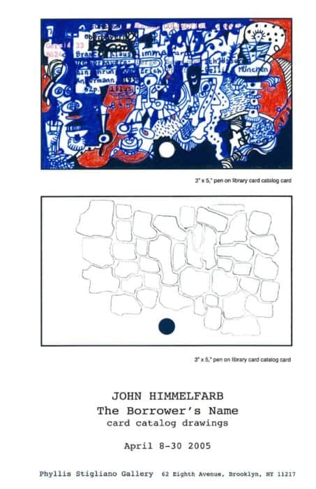
John Himmelfarb at Jean Albano Gallery — Alan G. Artner, art critic, Chicago Tribune (Feb 2005)
John Himmelfarb’s recent paintings, drawings and prints at the Jean Albano Gallery present two distinct manners, both successful in terms of optical sensation, but one more pronouncedly individual than the other. Himmelfarb’s larger canvases are all landscapes, brilliantly colored and set down in layer upon layer of linear notations. The effect is decidedly expressionistic but relaxed, doodle-like and upbeat rather than anguished. They might be homages to French Fauve painting of a century ago or the primitivism of a later artist such as Karel Appel. They give the eye a workout.
Smaller paintings, drawings and prints float biomorphic shapes on a field of black. In each shape is a single mark akin to a pictograph from some prehistoric language. The forms suggest more than they depict, and this allusiveness beautifully conveys a sense of wonder. One wants to add them up into coherent verbal statements, though of course we cannot. One of Himmelfarb’s drawings is more detailed, including within each biomorph little representational scenes rather than abstract or semiabstract shapes. This higher degree of specificity, however, involves a loss of mystery without having achieved added clarity. I much prefer the small, comparatively stark, paintings in what the artist calls his “Icon” series. They are as satisfying as anything Himmelfarb has exhibited.
John Himmelfarb’s One-Man Renaissance — Lisa Stein, special to the Chicago Tribune (Mar 2005)
More than 35 years into a career devoted to painting and drawing, veteran Chicago artist John Himmelfarb is enjoying something of a personal renaissance. Suddenly his works seem to be everywhere. His dizzying schedule over the span of two months includes the installation of two monumental paintings at Boston’s Logan Airport, the opening of four solo exhibitions in Chicago and New York and the unveiling of his recently completed ceramic-tile mural at the Kedzie Station on the CTA’s Blue Line. By the end of 2005, Hudson Hills Press will have published a catalogue raisonne of his prints.
Chicago viewers have the chance to check out two local Himmelfarb exhibitions, one at the Robert T. Wright Community Gallery of Art at the College of Lake County (CLC) in Grayslake and another at the Jean Albano Gallery in Chicago’s River North (recently reviewed by Tribune art critic Alan Artner).
Such far-flung exposure befits an artist whose works reflect an ongoing infatuation with abundance in their subject matter, style and media. Himmelfarb’s artworks at the CLC and Albano exhibitions fall into two general categories: larger acrylic paintings (roughly 4-1/2-by-12 feet) that burst with irrepressible, edgy lines and bright color, and smaller paintings, drawings and prints from his “Icon” series that present against a rich, black background what seems to be a complete, encapsulated pictographic language that invites interpretation.
“One of the strengths of John’s work is his incredible creativity and imagination in mark-making,” observes Debora Wood, senior curator at the Mary and Leigh Block Museum of Art. “He can use almost any media to advance his vision, in his prints, drawings, paintings and in his more recent tile work.”
“I think of John as a draftsman first and foremost,” adds Mark Pascale, associate curator of prints and drawings at the Art Institute of Chicago. “He has this ability to synthesize a lot of different things, including anthropological and archeological forms. … He also borrows heavily from his delight with the world.”
Much of that delight focuses on Chicago, in particular the industrial landscape surrounding his studio on the near South Side. Echoes of the city’s hard-edged forms show up in the Kedzie Station installation and in his larger, abstracted landscapes, whose titles often refer to specific Chicago neighborhoods that Himmelfarb explored as a young man. In paintings such as Canaryville in the CLC exhibition, for example, one can discern the shape of a ladder and the form of a sculpture by Juan Miró emerging from the jumble of jagged lines and fields of color.
“Form for me is never something abstract. It is always a token of something I’ve seen,” Himmelfarb explains. “The descriptive part is a way of generating forms. In the end, if it’s not recognizable that’s not my primary concern. To start something new I have to be thinking of things in the world. If I just try to be gestural I don’t get very far.”
The son of two painters who took part in the evolution of modernist art in Chicago, Himmelfarb grew up in the woods of Winfield. He recalls the household being fixated on Abstract Expressionism, which he emulated in his work. He was also interested in Art Brut and later adopted Pop Art’s use of flat color. He went on to study architecture and design at Harvard University, where he earned a bachelor’s degree and a master’s in education.
Even as Himmelfarb’s work refers to major 20th Century art movements, much of it has a childlike, playful quality to it, making it accessible to the novice viewer. This expansive approach mirrors his attitude toward life. “I want my art to show a thankfulness for just being here. I think there’s a human need to be thankful for being alive,” Himmelfarb says. “A celebration of life is what I’m trying to share, which doesn’t mean life is all roses,” he adds with a wry smile.
click thumbnail for larger image

Coast of Chicago: Public Mosaics by John Himmelfarb as seen in Kedzie Pink Line Station, Chicago, IL — Wescover website (2004)
Legendary midwestern artist John Himmelfarb was commissioned to do Coast of Chicago (custom-shaped painted tiles; 2004) for the windy city’s Kedzie Pink Line station.
The neighborhood surrounding the Kedzie station is full of bustling activity, and these ceramic tiles reflect the strength of community as a whole and the uniqueness of its individual parts.
Many of the design elements are drawn from architectural details of nearby homes, schools and commercial buildings, as well as structural details associated with Chicago’s transit system. These sources reflect the current community and give reference to the history of the neighborhood. Combined with this imagery are design elements inspired by connections of heritage to Mayan, Aztec and African cultures.
click thumbnail for larger image
 | 2004 . ceramic tile mural . 108×144″ (Kedzie Pink Line Station, Chicago, IL)")
 | 2004 . ceramic tile mural . 108×144″ (Kedzie Pink Line Station, Chicago, IL)")
Wet Paint — Westword (Mar 2004)
Originally published by Westword (New Times, Inc.), Mar 18, 2004:
Bill Havu, director of his namesake William Havu Gallery, has taken an interesting observation and turned it into an excellent show. After noticing that many mid-career artists across the country were creating paintings inspired by abstract expressionism, Havu came up with Wet Paint, a marvelous group effort that examines the work of a trio of these neo-abstract expressionists.
Wet Paint could easily have been handled as three separate but related solos, and I do wish that Havu had done it that way. He would have only had to hang the space at the bottom of the stairs and opposite the information desk slightly differently, because otherwise, the three artists’ works are hung separately.
The show begins with visually luscious monochrome paintings by Denver’s Jeffrey Keith installed in the entry and the spaces immediately adjacent. Keith has had a long and successful career that goes back decades. In the 1980s, he was known for his funky found-object assemblages, but beginning in the ’90s, his abstract paintings came to the fore and those are what he’s best known for now.
The paintings in the Havu show represent a direct continuation of the things Keith exhibited a couple of years ago at Rule Gallery. In both bodies of work, Keith used rectangular shapes in essentially the same color arranged to form subtle mosaic-like patterns. This monochrome effect is something of an illusion, though, because Keith includes a rainbow of shades used sparingly as accents. For example, the oil-on-linen “Race Day” looks like a field of purpley gray, but there are also dashes of red, yellow, blue and other shades throughout.
In the spaces immediately adjacent to the Keiths are paintings by John Himmelfarb of Chicago. Though the two artists’ pieces are distinctly different, their styles work wonderfully together. In the window space is a group of Himmelfarb paintings jn which vaguely plant-like shapes are crowded across the picture plane. The palette is dominated by strong, clear colors.
In the space at the bottom of the stairs are the latest Himmelfarbs, which are more elaborate in composition than the earlier ones. In them, the artist has laid cartoon images of figures and inanimate objects on top of an abstract background. These newer paintings are very cool; in them, Himmelfarb consciously refers back to Philip Guston’s watershed work of the 1970s, which also combines cartoons and abstraction.
The last of the three artists in Wet Paint js New Yorker Michael Rubin, the most doctrinaire abstract expressionist of the group. Rubin’s paintings are all-over abstractions made of what appear to be thousands of evenly spaced brush strokes. The paint has been thickly applied and rises high off the canvases in a regular pattern of juicy pigment mounds. Milton Resnick, a New York School abstract expressionist, is an important source of inspiration for Rubin; in fact, the two were paired in a show a couple of years ago at the Singer Gallery. Like Resnick’s, Rubin’s compositions have no particular point of attention, instead giving the entire surface the same pictorial value.
Almost all of the paintings by Keith, Himmelfarb and Rubin are brand-spanking-new, and as I walked around the Havu gallery, I could smell the not-yet-dry oil on the paintings. I guess that’s why the show’s called Wet Paint.
Originally published by Westword (New Times, Inc.), Mar 25, 2004:
Best Abstract Ensemble: Wet Paint, William Havu Gallery
Abstract-expressionist painting has miraculously held on despite the onslaught in the last decade of “new media,” a field that includes installation, performance, video and digital. These forms were supposed to make painting look out of date, but, as Wet Paint proves, that’s not what happened. The exhibit, which is open through April 10, showcases three artists covering new ground by riffing on classic ideas. And that’s a national trend, as the show also proves, because the three artists live in different big cities across the country: Jeffrey Keith is from Denver, John Himmelfarb comes from Chicago, and Michael Rubin hails from New York.
Wet Paint — Troy Briere, Eye Level, issue 5, Denver, CO (2004)
In 1986 Frank Stella wrote Working Space. In it he said: “Abstraction has the freedom to be large without magnification, the ability to be small without miniaturization. In a sense, abstraction gains its freedom, its unfettered expandability, its own working space by eluding the spatial dictates of the real and ideal image. Clearly, abstraction today works to make its own space.” That was twenty-years ago, and one is left to ponder the credence of such a statement in today’s art world. Does abstraction make its own space anymore, or is it jammed up in a box, lidded with the weight of its own sizable reputation? Have we seen it all before? Does an abstract vocabulary resonate in a contemporary dialectic or has it said its piece beyond surface, color and composition?
These questions have as many answers as there are artists and critics. Painting has been declared dead all too often, only to rise again, and is constantly revitalized by an influx of new talent that chooses to operate within that particular idiom. But is it enough just to be concerned with process and without concept? Or is painting abstractly a concept all its own? More questions to be answered. The fact that uncertainties and arguments still arise from non-representational work signifies its continuing vibrancy and holds to the fire the feet of those who take issue with abstraction’s ability to convey concrete concepts and lump it wholly into the decorative arena.
Jeffrey Keith, John Himmelfarb and Michael Rubin, in their group show Wet Paint at William Havu Gallery, take up the flag for abstraction with mixed results.
Mr. Rubin creates work that attempts to rebuild the gallows upon which Jackson Pollock tried to hang the ghost of Thomas Hart Benton — drip paintings, to the edge of the canvas and over — and the pieces are moderately successful, but more as homage than as individual statements. They seem of their time, with respect to their acrylic paint film, but recall Abstract Expressionism at its most Greenbergian. Despite their rather new age, touchy-feely titles, the work doesn’t progress beyond the 50-year-old, muscular painting we know so well from a bygone, albeit wrecking ball, movement.
In his most ambitious painting, Water, Mr. Rubin covers a large (48×96″) canvas with drips of varying shades of blue, interspersed with flashes of red and green. The painting is successful, and quite beautiful; but it also leans too heavily on the shoulders of Pollock and Sam Francis. One wishes to find at least a shadow of Mr. Rubin, even ironically, lurking in this man-made pond, but, unfortunately, it is too shallow to hide him or his references, which leaves the viewer remembering their art history and not their time spent with the work.
John Himmelfarb is far more adroit at inserting himself into his painted world. Spinning lines, overlapping each other and then disappearing behind swaths of intense color, whiting out, patterns that follow no pattern, figures that appear and then become linear experiments, are the stuff of which these paintings are made. They owe a debt to the likes of Jean DuBuffet and mid-career Phillip Guston. but there is also a distinct time stamp on these paintings, which brings them current (as far as abstraction can be current).
In Inland Romance: Intermodal Transfer, Mr. Himmelfarb goes on a linear primitivism screed filling the canvas with imagery that is at once foreign yet familiar. While the notions depicted do not hold significant weight, they do read as expressly personal, and some are repeated in other canvasses. There is an air of redundancy surrounding these exertions, but there also exists within them a recalcitrant individualism. In this manner, Mr. Himmelfarb overcomes his references and not only presents satiating paintings, but also lends the viewer a glimpse beyond process and into ideation.
Jeffrey Keith is a wholly different mascot at a whole different ballgame. Although Abstract Expressionism is the main course, and Diebenkorn’s palette the dessert, Mr. Keith outstrips the obvious allusions to arrive at a specificity of purpose. Large paintings scraped with large knives, which make large gestural marks are not exactly a panacea far the superfluous nature of modern abstraction. However, Mr. Keith infuses his surfaces with a resplendent, jewel-like quality. Small peeks at the substratum are allowed through buttery, confident strokes. Gray ochres sublimate pulsating reds. Sour yellows are tempered by antacid blues. There is a joy found in these pieces, and this joy is enough to elevate the work beyond its root origins. These canvasses are decorative and Mr. Keith is not so presumptuous as to attempt a critique on modernism with this grouping. He appears content to leash his intentions with an unbridled attention to the business of painting.
Even here, amidst these accomplished paintings on linen (which holds its own set of preconceptions), Mr. Keith takes a successful stab at recontextualizing his efforts. Two paintings on Mylar, JCK03-11-8028 and JGK-11-8029 abandon his palette and chosen supports, but not his process. Thickly applied aluminum paint flashes across the translucent mylar, leaving most of it exposed, thereby creating not only a reflective surface, but shadowy attendants which complicate and complete the composition. They appear simple, but act as weighty testaments to Mr. Keith’s willingness to experiment. One hopes these experiments continue.
This is not merely an exercise in name-dropping, but a discussion of recontextualization in lieu of re-creation, an adding to the narrative process. Paint on canvas, be it random patterns or carefully orchestrated fits and starts, carries with it the burden of comparison. We have seen it all before and in order for contemporary abstraction to be valid historically, beyond as a decorative exercise, it must transcend these comparisons to reveal something deeper, more abstract if you will, about the artist’s intention/motivation/concept, Mssrs. Keith and Himmelfarb, while still crowded by history are working to make their own space.
click thumbnail for larger image
Hyde Parker’s paintings displayed downtown — Cara Glatt, Hyde Park Herald (2003)
Talk about big, talk about colorful, and one must mention blotches of blue, green lattice, red bursting forth everywhere, with swatches of black and orange for good measure. These powerful hues and tints apply to John Himmelfarb’s two huge paintings on the first floor of the Cook County Administration Building at 69 W. Washington St.
Himmelfarb’s paintings are based on representational forms found in the urban landscape. Things such as arches, ladders and bridges are piled on top of one another until they lose their specific references. They become elements in a densely packed composition that evokes by turns paintings by the German Expressionists, calligraphic fantasies of Paul Klee and the Art Brut of Jean Dubuffet. Franz Kline’s paintings are also alluded to here. As befits a former musician, Himmelfarb’s diverse body of work is unified by an acute sense of orchestration. The rhythms of the work become more important than any other element in moving the viewer to enter into the painting. The tempo of each piece is carefully dictated through juxtapositions of several weights of line whose application varies from delicate, pencil-fine loops to bold paint-dripping boundaries of a three-inch band.
Christopher Moore, writing in the Christchurch, New Zealand, Press, saw more than line at play. He said Himmelfarb’s paintings hurl themselves from the wall with a loose-limbed, exuberant, cock-eyed American happiness which demands attention. There is nothing reclusive or broodingly Calvinist about his art. There are usual references to improvisational jazz, overhead railways and stained glass. Above all, there is color. Himmelfarb is firmly established as one of the world’s foremost contemporary American abstract expressionists.
Himmelfarb’s father, who died in 1976, was also a painter, and his mother, at 93, lives alone and still paints. Hyde Park has played a part in their lives, since they all lived there at various times and John is living in Hyde Park now.
John Himmelfarb’s work appears in collections of The Art Institute of Chicago, Center Pompidou in Paris, London’s British Museum, Milwaukee Art Museum, Harvard’s Fogg Art Museum and many more. He also has a long list of one-person exhibitions to his credit.
Speaking of his two paintings at the Cook County Building, Himmelfarb states, “I’d like to get six more in that space, two for each of the four seasons.” Sounds like a great idea to me.
click thumbnail for larger image

Art Beat — The Press, Christchurch, New Zealand (Oct 2003)
EXCERPT:
The Centre of Contemporary Art is featuring a quartet of new shows to celebrate spring. Catherine Brough, Chin Hsiang Chang, and Matthew Ayton display panache and spirit in their individual exhibitions, while upstairs two expressionists, separated by geography but united by art, join forces to produce a joint show that explodes energetically from the Mair gallery’s chaste walls. The combination of American John Himmelfarb and New Zealander Philip Trusttum is a union made in heaven, or in this case the United States Embassy, which is sponsoring the exhibition. Himmelfarb and Trusttum might approach their art from different directions but they share a commitment and discipline that has produced one of Christchurch’s best shows of 2003. See it and rejoice.
Doubly expressive — Christopher Moore, The Press, Christchurch, New Zealand (Oct 2003)
Christopher Moore finds a common view in artists from opposite sides of the world.
They are two men widely separated by geography, background, and experience but united by a shared vision of their art.
Chicago-based John Himmelfarb is one of America’s most acclaimed abstract expressionists; a painter whose prime concern is to create a visual language rather than trying to tell stories or make profound cultural or political statements.
“It is rare for me to have another message apart from an expression of exuberance, life, and communication,” he said during his last exhibition in New Zealand in 2001.
New Zealander Phillip Trusttum shares Himmelfarb’s passion and commitment. Expressionism has also preoccupied Trusttum for decades. Vivid and energetic, his paintings have been described as outward looking and assertively international.
Himmelfarb and Trusttum have now come together at Christchurch’s Centre of Contemporary Art in an exhibition sponsored by the United States Embassy.
It is an absorbing meeting of minds, different styles, and personalities where a forthright and extroverted Trusttum meets the calm and considered Himmelfarb in a moment of shared sensibilities.
Both artists have been recipients of the Krasner-Pollock Award, a prestigious international art award funded from the estate of American artist Jackson Pollock and his wife. And both continue to create art imbued with a sense of joy and optimism, a rare thing in contemporary art’s world of brooding angst.
The original proposal for a joint exhibition was put to the two artists shortly after Himmelfarb’s first exhibition in 2001. The idea was halted during the months after September 11 but later resurrected.
“Our works may look different on the surface but they work pretty well together, ” Himmelfarb says. He describes his and Trusttum’s work succinctly as “very active”. Trusttum agrees. “These days painting is for old people. There are a lot of artists around but very few painters. I’m a 60-year-old painter at a time when many younger artists see painters of my age has-beens.
“Often all these younger artists have is anger but they still lack confidence.”
John Himmelfarb ponders the point.
“While there are painters and artists who are highly competitive, most of us regard the world as a collegial place where we can work together to create a world of art.
“You simply have to create space for yourself by denying everything else.”
Sound and Vision: John Himmelfarb and Philip Trusttum, Centre of Contemporary Art, until October 31. COCA director Warren Feeney will give a floortalk on the exhibition at 1pm tomorrow.
click thumbnail for larger image

Postcards: Christchurch — Sally Blundell, Art News (Oct 2003)
EXCERPT:
The eclectic curatorial programme of Christchurch’s Centre of Contemporary Art continues to straddle the role of the gallery as both vehicle for regional art and showcase for national and international exhibitions.
In October, two recipients of the United States Krasner-PoIlock award — Christchurch-based Philip Trusttum and Chicago-based John Himmelfarb — came together for an outstanding exhibition of paintings. The result was a triumphant clash of United States urban jazz and European classical folklore, myth and history.
Himmelfarb’s work is close up and lineal, colour and form twisting and stepping into the vertical grids and structures of high rises, railways and motorways. Bursting out of an industrial toolkit of loose springs, coils, dispensers, bolts and nuts, these angled lines and coloured blocks climb up the canvas like exuberant, celebratory urban road maps.
The larger works by Trusttum are slashed with the figures of the musician, the troubadour, the chronicler. Asian masks, towering gates, great oxen — flashes of history rolling along in complete mastery of colour, form and visual narration. In Women Gossiping, the words fall from the mouths of the characters with all the multifarious versions of meaning. In Scream they explode in a controlled riot of angled lettering. Trusttum denies these works the stillness of history — the words twist, turn, pile up, filling the air with voices. In Lumbering Oxen you can almost hear the wheels creak in revolution, the effort of the oxen pulling its huge weight into the ground. It’s a compelling, passionate show, a victory of colour and form over the great sprawling soundtrack of human myth-making.
Good Questions, Good Answers — L. Kent Wolgamott, Lincoln Journal Star, Lincoln, NE (May 2003)
Ceramic tile mural part of state’s art projects for buildings
John Himmelfarb put on bright orange gloves, climbed three steps onto a scaffold, picked up a trowel, loaded it with grout from a bucket and went to work filling in the gaps between tiles on a wall in the University of Nebraska-Lincoln’s new Teachers College building.
For Himmelfarb, a veteran Chicago artist with strong links to Nebraska, grouting tile was a new experience Drawing, painting and printmaking are his forte. But he’d always wanted to make a ceramic tile mural and, having done so, he got his hands dirty putting up the piece.
Himmelfarb’s mural, titled “Good Questions, Good Answers,” is one of a pair of projects commissioned for the building under Nebraska’s 1 percent for art law. In place since 1978, that law has generated $1.2 million for artwork in state buildings, state colleges and the University of Nebraska system, according to Nebraska Arts Council figures.
The art projects have ranged in cost from $8,000 to $150,000, with an average cost of $53,000. Because projects under $60,000 are advertised only to artists in Nebraska and surrounding states, much of the money stays in the state.
That’s even the case with Himmelfarb’s mural, which was fabricated at Omaha Wilson Tile Co. Personnel from that company also were helping the artist install the piece earlier this month. Himmelfarb obtained the commission through his Lincoln representative, the Haydon Gallery, which also receives some of the money for the work.
The mural, which is a continuation of work Himmelfarb has done for the last three years, is made up of odd-shaped tiles of varying colors glazed with black figures and icons.
The mural began as two large wall drawings in Himmelfarb’s Chicago studio. He said he draws the shapes of the tiles first, then puts in the icon, then [ … ] Himmelfarb said as he pushed the black grout between the odd-shaped tiles. “I’ve tried it the other way around, and it gets stale pretty fast.”
Some of those icons are instantly recognizable. A school bus provides the most obvious tie to the mural’s location. But there’s a protractor and compass included among the black-lined images along with a ball player of some sort and all kinds of lines and shapes.
That use of marks comes out of Himmelfarb’s ongoing exploration of language in his work. That exploration includes a drawing with plenty of writing in it in the nearby Kaufman Center. But it gets boiled down to basics — icons, symbols and signifiers — in the Teachers College mural.
“I didn’t want it to be an academic piece, but it’s there,” Himmelfarb said. “The foundation of education is communication. How we communicate is a core element of education. Another core element is questions. This work raises questions about what is visual. Maybe it can cause people to look more closely at their surroundings.
Himmelfarb’s two-part mural is in recessed spaces on a curved hallway wall of the Teachers College building at 14th and Vine streets. That space was designed for passersby to see the artwork said architect Woody Haecker, who is the chair of art selection for all of UNL’s 1 percent for art projects.
Art, Haecker said, is a positive addition to almost every new building. “Art adds interest and color,” he said. “Maybe ambiance is a good word. It sort of enlivens the space.”
click thumbnail for larger image
")
PSC hosts Himmelfarb art — Southtown Star, Tinley Park, IL (Dec 2002)
Prairie State College’s Christopher Art Gallery is exhibiting the prints of world-renowned artist John Himmelfarb.
The exhibition, “A Visual Language: John Himmelfarb’s Prints,” continues to Jan. 23.
Himmelfarb’s artistic works, with their curvilinear graphics, bright colors and rich, dense patterns, pay homage to Modernism, Abstract Expressionism, Art Brut, Picasso and Joan Miró.
“John is an established Chicago artist whose work is in numerous museum collections across the world,” said Jan Bonavia, gallery manager.
“We are very excited to have the opportunity to host this traveling exhibit, which brings together selections of his print work from the last decade.”
Himmelfarb’s hometown of Chicago has influenced the abstract shapes, forms and strong linear markings that are characteristic of his work.
Schooled in architectural design, he has taken his inspiration from the region’s steel industry, the city’s elevated tracks, highways, bridges, railroad tracks, junkyards and cranes.
Another influence is Himmelfarb’s interest in maps and the way things are laid out. His works also blend elements of calligraphy and hieroglyphics.
One of the dominant characteristics of his work is rhythm, which comes from years of studying piano and violin.
Himmelfarb lives and works in Hyde Park. He graduated from Harvard and credits his parents, both artists, with influencing his work.
His paintings and prints can found in more than 40 institutions internationally, including the Art Institute of Chicago.
click thumbnail for larger image

Wall to Wall interest — Idelle Rosenbloom-Kerzner, Gary Post-Tribune, Gary, IN (Oct 2002)
Giant canvas mural is centerpiece of IUN exhibit in-progress
Normally, the Savannah Art Gallery at Indiana University Northwest is spick-and-span, with polished wooden floors.
Lately, this has hardly been the case. Those passing by see paint containers spread around on a plastic tarp as an array of brushes stand ready to be used. One might expect Ann Fritz, art director, to be frazzled over such a mess, but the opposite is true.
“I am so excited; this is something we don’t see. We only see the work hanging on the wall,” said Fritz as she watched artist John Himmelfarb create a mural on a canvas covering a wall more than 60 feet long.
Himmelfarb is engrossed in his work as part of an exhibit titled “Wall to Wall.” Fritz and Himmelfarb feel it is vital for visitors to understand what an artist experiences from start to finish in the creative process. Consequently, they answered questions while Himmelfarb worked.
“Bump, bump, bump” he said, humming a few bars as he followed the bright blues and reds of his colossal creation.
With glasses that slid to the tip of his nose, Himmelfarb thought for awhile, painted a bright-gold cloud, thought some more, then moved his ladder down a couple feet and painted another cloud.
“Each color will have its own movement throughout the canvas,” said Himmelfarb, adding that the change in balance and dissent helped give the piece harmony.
Unlike artists of the impressionist period, when paintings copied detail, Himmelfarb called his work abstract expressionism, which demands interpretation from the viewer.
Rahsaan Taylor, 23, of Gary gazed at the mural. “I think it is interesting, interactive and colorful. To me, one sees the different views of Gary. Some people might look at it as a chaotic composition, but Himmelfarb’s emphasis is on meaning, rather than style.”
Fritz has noticed that those who normally visit the campus a couple times a week have stopped by more often to follow Himmelfarb’s progress. She said he doesn’t know the title or when the mural will be finished. He said he just follows his gut feeling and intuition.
“The colors are so striking and it looks like someone’s imagination was flowing,” said Ernestine Johnson of Merrillville, who passes through Gary daily. “There are the smoke stacks and the heavy-duty machines. Oh, and there is U.S. Steel and the cranes. It is the different dimensions that made Gary what it is today.”
click thumbnail for larger image
 | 2002 acrylic on canvas 101×774″")
John Himmelfarb at Normal Editions Workshop — Normal Editions Workshop newsletter (Fall 2002)
John Himmelfarb, a painter from Chicago, had a one-week visiting artist residency at Normal Editions Workshop in February 2002. This program was partially sponsored by a grant from the Illinois Arts Council (IAC), an agency of the State of Illinois. Mr. Himmelfarb collaborated with the N.E.W. staff during his stay to produce a color trial proof (C.T.P.) impression of a multi-colored lithograph. Xerox toner washes on grained mylar and hand drawing by the artist were utilized in creating the image. The color trial proof was hand printed by Richard Finch and Veda Rives with assistance from Chad Collofello, Yoko Kawazoe, Meda Rives and Chris Shepherd. The 22×30 inch image is printed on Arches Cover, buff paper. We would like to take this opportunity to express our appreciation to the IAC for the support of this project: John Himmelfarb at Normal Editions Workshop, Illinois State University.
click thumbnail for larger image
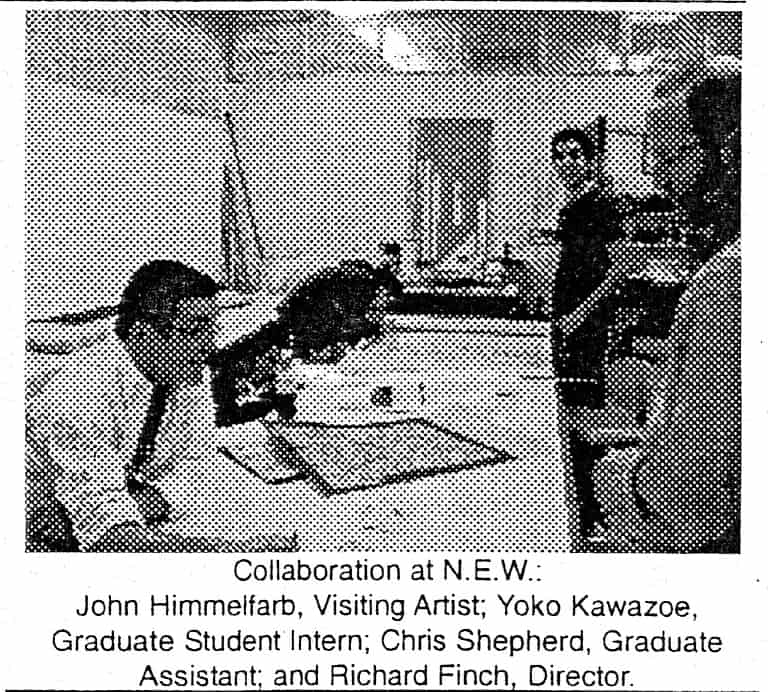
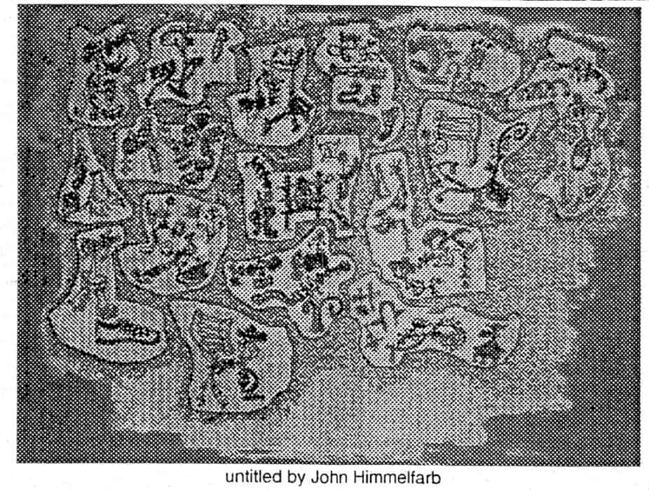
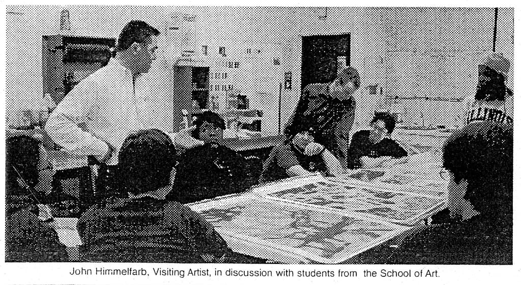
Surveying the Chicago style — Sara Burrows, Lerner Times (2001)
Is there a “Chicago” art? That’s a question that’s been debated and discussed, but not nearly as much as it should be, says James Yood of North Town, lecturer and assistant chair of the Department of Art Theory and Practice at Northwestern University. “Men and women of goodwill will argue on both sides of that question.”
“I think there is an indigenous, local style,” he says, adding that it isn’t as clearly defined as a movements like Impressionism or Surrealism were. He also says that not every artist or every work has all or even any of the characteristics of that style. “But in general, there is an interest in the figure, slightly less interest in abstraction than you find in New York, and Chicago art is often on a relatively smaller scale, done with great attention to detail and finish.”
One reason that a “Chicago style” cannot be easily defined is the nature of Chicago artists. “Chicago is a place of extraordinarily independent artists who are not part of any national or international movement. We have often rewarded those with an idiosyncratic, personal vision,” he says.
Yood dates the history of Chicago’s active art community to the 1920s, and Ivan Albright. “He lived into the 1980s, and there have been nationally and internationally known artists in Chicago ever since. For instance, there’s H.C. Westerman, who just had a retrospective at the Museum of Contemporary Art, Ed Paschke, Richard Hunt, Chicago produces some very fine artists.”
Yood would also like to see Chicagoans get over that slight vestige of Second City syndrome. “We still have a bit of a cultural inferiority complex. There’s still some idea that if art doesn’t come from Europe or New York, it’s not good art,” he says, “But our history shows otherwise.”
Chicagoans also tend to overlook the native art community because it doesn’t make headlines. “The real surprise here is that the art community is so big. It’s just that it all happens under the radar screen,” he says.
“But many artists prefer to stay in Chicago because life is more manageable here. There are galleries, museums. curators and collectors interested in your work. There are at least 100 galleries now. Maybe people are flying in from Minneapolis to buy art, but somebody is buying it,” he says.
He says there’s no reason to worry that people don’t visit galleries, either. “Most people are intimidated by them — they don’t know how to act, they don’t know the jargon, or they feel they’re expected to buy something. But it doesn’t matter. People do go to the shows at the Cultural Center, where they can see a lot of Chicago artists’ work, and the Museum of Contemporary Art and the Art Institute. Chicago is the cultural capital of the Midwest.”
In honor of Illinois Arts week, here are profiles of a few of the artists currently carrying on the tradition of Chicago art.
JOHN HIMMELFARB
John Himmelfarb sees no reason to leave Chicago, and plenty to stay. Though he grew up outside the city, he now lives and works here. He’s always gotten a lot of inspiration from the city and surroundings. “l did a painting of the Gary steel mills when I was 10,” he says.
“I have pretty deep roots here. And I’m a contrary person. When people told me, ‘you can’t make a living as an artist in Chicago,’ and ‘you have to go to New York,’ I said, “Oh yeah?'” Himmelfarb says.
Since 1993, Himmelfarb has been working on a series of paintings called “Inland Romance” that reflect his attachment to the city and the Midwest. At … see ART, Page 2
[ we regret that the remainder of the article is unavailable ]
click thumbnail for larger image
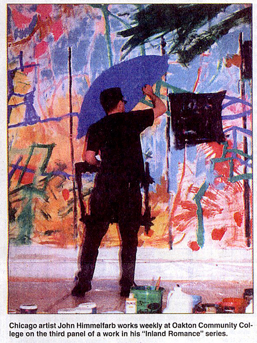
Art inspires production at college — Dean Geroulis, Chicago Tribune (Oct 2001)
Oakton features abstract murals
An upcoming performance at Oakton Community College will be something that director Karol Verson hopes will challenge the audience.
“I’m trying something I’ve always wanted to try, which is shake the audience up, make them do a little work,” said Verson, an adjunct faculty member in Oakton’s performing arts department and a frequent director for the college’s Performing Arts at Oakton series.
Using a current art exhibit as a backdrop and inspiration, Verson and cast members have created “Inland Romance,” a performance piece of several segments, including readings of widely known Chicago writers, original skits, improvisations, satire, audience participation and even a singalong. Authors whose works will be read include Mike Royko, Studs Terkel, Nelson Algren, Carl Sandburg and David Mamet.
The central theme is a celebration of Chicago’s past and present and a tribute to the city’s residents.
“What I want the audience to do is connect the verbal images with the visual images,” Verson said.
“Inland Romance,” which will be performed over the next two weekends, was inspired by Chicago artist John Himmelfarb’s series of murals by the same name.
Some of Himmelfarb’s works are on display the college’s Koehnline Gallery, which will serve as the stage for the performance.
Himmelfarb has been working on his “Inland Romance” series for nine years and has produced more than 70 pieces that are on display or in private collections around the country.
The selection in the Koehnline includes two wall-size murals and a third mural he is finishing in the gallery. Art students and other spectators can watch him paint and ask questions.
Working on-site is rare for Himmelfarb.
“It’s very different, and different is often because it forces you to think differently and break habits,” Himmelfarb said. “I don’t think I’d want to do it all the time. I’m enjoying doing it on this project”
The exhibit of boldly colored abstract shapes is inspired by shapes and scenes the artist experienced in Chicago.
Himmelfarb was not involved in the preparation of the performance piece, but Verson visited his gallery and interviewed him to get ideas.
Himmelfarb said he is excited and curious to see the finished product and hopes it introduces more people to abstract art.
“It may bring in a different audience and help them interpret work that they might have not taken the time to look at,” he said.
“Inland Romance” will be presented on Saturday, Sunday, Oct. 20 and 21 in the Koehnline Gallery at Oakton’s Des Plaines Campus, 1600 E. Golf Rd.
Saturday performances are at 8 p.m. and Sunday shows are at 2 p.m. General admission is $8, but $5 for students and senior citizens. Tickets may be bought at the door or in advance by calling 847-635-1900.
Himmelfarb usually can be seen at work between 10 a.m. and 2 p.m. Tuesdays and Thursdays.
click thumbnail for larger image
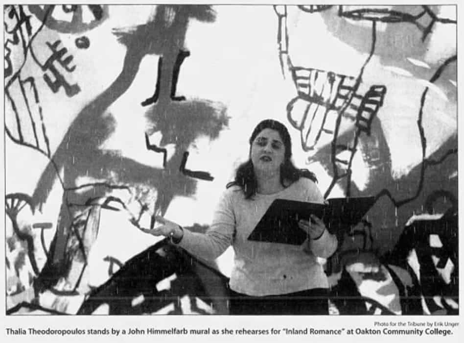
 | 2001 acrylic on canvas 136×303.5″ (~11.33×25.5′)")
John Himmelfarb — Mair Gallery press release, Christchurch, New Zealand (Aug 2001)
Out of expressionism comes the vibrant and vivacious, stylized works of John Himmelfarb, which, in their inventiveness and diversity, refuse to be pigeonholed by particulars. Paying confident homage to Modernism, Himmelfarb can be referenced to a fine pedigree of artists and movements, including Abstract Expressionism, Art Brut, Paul Klee, Joan Miro and Picasso, illustrating a contextual richness and a highly ferocious visual appetite.
Unfailingly Himmelfarb’s potent works trumpet a response to the artist’s experience, Even at their most abstract they echo something visceral in the human condition — maybe a mood, perhaps a thought, possibly an occurrence — and Himmelfarb has developed his work sufficiently to know that the encapsulation of this does not require explanation. Entrée to the works can be found, though, in the little biographical details of life that act as markers of personality. A strong involvement in music matches the lyrical, rhythmical qualities of Himmelfarb’s paintings and drawings. Improvisational jazz can be heard and felt among a myriad of tones that could conceivably run from classical to hip-hop. Some are coolly composed while others an orchestrated frenzy, which in large scale provides works not only to walk past but also, perhaps, to whistle to.
The figurative concerns given form by Himmelfarb’s hand are thematically and visually eclectic, drawn from his realm of experience, both conscious and unconscious. Cartoon-like phalluses hover rocket-like while numbers and letters appear alongside Himmelfarb’s own intriguing visual icons that in their pared down simplicity symbolize, and are stylisations of, his natural and built environ. These elements weave through the works, making brief appearances here or dominating a strong linear composition there. Our innate desire to define, interpret and understand ensures these works are, by virtue of each other, both endlessly inviting and perpetually frustrating. They resist clear cut interpretations of intent and refuse to be emphatically deciphered. Suggestions are offered, possibilities allowed and narratives glimpsed. That is all. Mark making, however, is a constant, reigning supreme as a sensuously tactile reward. More than a by-product of image the surface qualities are a further exploration of line and tempo and a tantalising reminder of the creative act.
Himmelfarb was born in Chicago in 1946 and currently fives and works there. He graduated from Harvard in 1968 and has been involved in more than 110 solo and group exhibitions and has received a number of awards including the Pollock-Krasner Foundation award and two from the National Endowment for the Arts. His work is included in more than 40 institutions internationality including the National Museum of American Art, Washington, D.C., the British Museum, London, and the Centre Pompidou, Museum d’Art Moderne, Paris. This is the first New Zealand exhibition of Himmelfarb’s work.
Sponsored by the Embassy of the United States of America, Wellington New Zealand, and AB Annand & Co Ltd
ACCOMPANYING IMAGES:
Inland Romance: Halsted North Branch | 1994 acrylic on canvas 67.5×83.5″
Shopper | 2001 drawing 40×60″
click thumbnail for larger image


American Beauty — Christopher Moore, The Press, Christchurch, New Zealand (Aug 2001)
John Himmelfarb’s paintings hurl themselves from the wall with a loose-limbed, exuberant, cock-eyed American happiness which demands attention. There’s nothing reclusive or broodingly Calvinist about Himmelfarb’s art. There are instead visual references to improvisational jazz, overhead railways, and stained glass. Above all there is colour — eye-trapping panoramas of the stuff, rich tapestries and luminous shards of joyous paint.
These are paintings that cause spontaneous smiles on the faces of the most jaded of gallery visitors raised on a diet of sombre introspection and contemporary angst. At 54, John Himmelfarb is firmly established as one of the world’s foremost contemporary American abstract expressionists.
The painter is in Christchurch for an exhibition of his work at the Centre of Contemporary Art, one of the rare occasions when contemporary American art has been shown in New Zealand. “It’s exciting. I’m at a very happy phase of my career right now,” he says. “I’ve realised that I can do this after trying for 30 years but never quite having the vocabulary.” Himmelfarb is the antithesis of his paintings, a quietly spoken Mid-Westerner with a laconic sense of humour, a keen eye, and a personality with instant reminders of Jimmy Stewart at his most charmingly diffident.
Last week, CoCA filled with 300 guests for the opening of the Himmelfarb exhibition. For many, American Graffiti was an entirely new experience. Most eyes gravitated to the focus of the exhibition, Inland Romance: Nino Rota in Chicago, 2001. As a work of art, this could never be described as virginally demure. This is up-front, in-your-face and sock ’em in the eye stuff. Measuring 3.65m by 9.14m, the acrylic on canvas is a pyrotechnical display painted in his Chicago studio, says Himmelfarb, using two ladders and an extension pole adapted to fit brushes. As he clambered up and down, he was accompanied by Rota’s score for the Fellini film Juliet of the Spirits, “music which always reminds me of the circus.”
A man of many parts, page 34
[ we regret that the remainder of the article is unavailable ]
click thumbnail for larger image
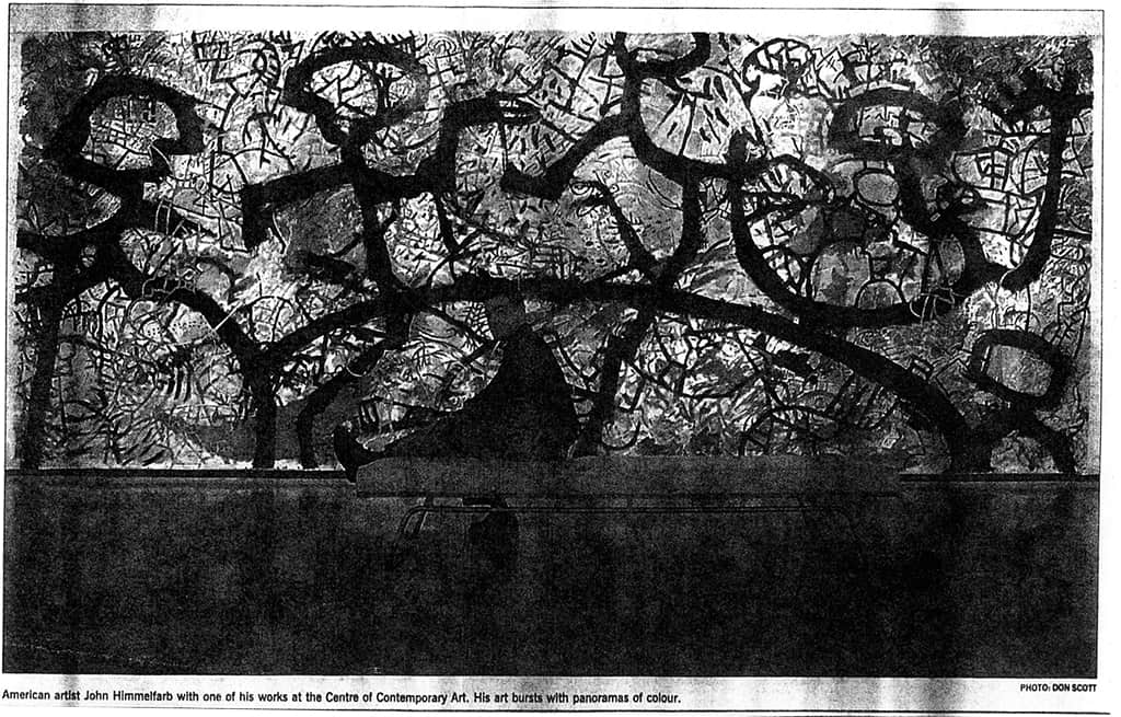
")
Smorgasbord of Glorious Images — Robyn Peers, The Press, Christchurch, New Zealand (Aug 2001)
American Graffiti: paintings by John Himmelfarb …
EXCERPT:
Chicago artist John Himmelfarb’s exhibition is a celebration of the joyous possibilities of abstract expressionism.
With overt references to many of the big names of American post-war art, there is not great innovation in the work, but the monumental scale and energetic use of line in works such as Inland Romance: Nino Rota in Chicago involve the viewer in the process and pleasure of paintwork.
In Hello Again and Metropolitan Swans, Himmelfarb creates multiple layers of paint, and inventively uses calligraphy and mock hieroglyphics to create appealing works that reward close reading.
click thumbnail for larger image


Uzzle — Working Proof, Art on Paper Magazine (Sep-Oct 2001)
John Himmelfarb, Uzzle (2001) an etching and woodcut in an edition of 30, 25 of which are Arabic numbered and five Roman numbered, plus three artist’s proofs. It measures 24×20 in. and was printed on Rives Buff paper by Gary Day at the UNO Print Workshop at the University of Nebraska Press, Omaha.
For years, John Himmelfarb has been fascinated with writing, both with its variety of character and the way it can move the eye through a composition. Often his imaginary hieroglyphs proceed along fairly orderly lines, unified by whatever gesture he establishes at the top left. This print, however, recalls the irregular, engraved stones of ancient civilizations: a pile, in fact, of brown (woodcut) interlocking stones (the puzzle of the title) with an irregular border, each section of which is etched (in white, red, and black) with a variety of images: stick figures, spaceships, plant forms, architectural vignettes, even an ink bottle and envelope, as if to underscore the linguistic content.
The etching is mainly in black with some red characters (following these, says the artist, is one way of moving through the piece), and, for the first time, the artist’s name is part of the composition in this red, with the final “b” on the back of a tiny envelope. The woodcut is the ground, printed in a brown ink that transforms to beige over the greenish paper; around the border is a black aquatint, a graininess that adds a nighttime quality.
click thumbnail for larger image

Artist occupies three levels in art center — Jennifer Sanderson, Argus-Leader, Sioux Falls, SD (Nov 2000)
Himmelfarb’s paintings hang in Paris, Chicago
John Himmelfarb’s curvilinear paintings are as much fun to look at as the artist’s last name is to say. Large, vibrant canvases filled with meandering lines and dramatic color schemes this week dominate the three tiers of circulating hallways in the Sioux City Art Center’s atrium.
Born and raised in the Chicago area, Himmelfarb has works in the collections of more than 40 art museums, including The Art Institute of Chicago, The Baltimore Museum of Art, Centre Pompidou Musée d’Art Moderne in Paris and the Minneapolis Institute of Art.
The exhibition is underwritten in part by an anonymous friend of the Iowa art center.
PHOTO CAPTION:
What’s “curvilinear”? Here’s a hint: See the above painting, by John Himmelfarb. His works are on display in the Sioux City Art Center Through Jan. 28. This piece is called “Inland Romance: 41 South Side.”
click thumbnail for larger image

Astronomer — Working Proof, Art on Paper Magazine (May-Jun 2000)
John Himmelfarb, Astronomer (1999), an etching with sugar lift and aquatint in an edition of 40 plus four artist’s proofs. It measures 12×10 in. (paper) and 7-7/8×5-7/8 in. (image) and was printed on Arches Cover White paper by Jessica Gormula-Colvin assisted by Jessica Benjamin, Richard Finch, Mike Hornyak, and Veda Rives at Normal Editions Workshop at Illinois State University in Normal, Illinois.
John Himmelfarb has completed a number of small-scale prints over the past few years at Normal Editions, and all are worth a look. Like the others, this one crowds faces and shapes into dense, trippy composition. Deep blue ink creates a thick, pooling line that does an optical seesaw with a mustard-yellow ground. Very Art Brut in feeling.
click thumbnail for larger image

John Himmelfarb at Jean Albano Gallery — John Brunetti, Art Now Gallery Guide (1998)
John Himmelfarb’s current exhibition of lush, calligraphic drawings and paintings at the Jean Albano Gallery, June 5-July 10, continues this established artist’s rich investigation of his Modernist roots. Himmelfarb’s accomplished works have always been driven by an unceasing devotion to line. In his second solo exhibition at the Jean Albano Gallery, Himmelfarb reasserts the poetic voice that is at the emotional core of his long commitment to this formal element.
Consistently blurring the boundaries between drawing and painting, Himmelfarb revels in line’s evocative potential to create a synthesis of graphic sign, text and elusive image that challenges one’s ability to interpret visual language. In the process, he initiates inward journeys whose rewards are not measured by reaching specific destinations, but by the experiences of the chosen path.
Uncompromising in their directness, Himmelfarb’s works are in a constant state of movement. His rough, yet elegant, images are indebted to his Modernist predecessors — the bold, interlocking shapes of Jean Dubuffet, the raw brushwork of the Cobra artists, the rhythmic Hebrew alphabet paintings of Ben Shahn — yet are distinct in their own identity. Maintaining an uneasy balance between the positive and negative spaces of his dense, lattice-like compositions, Himmelfarb pushes the formal and conceptual elasticity of his marks, allowing one to see that in life what is often worth discovering is hidden between the lines.
FEATURED IMAGES:
Inland Romance: Movie Lights | 1998 acrylic on canvas 30×45″
Poem of Prospero | 1998 acrylic on canvas 50×34″
click thumbnail for larger image

John Himmelfarb at Jean Albano Gallery — Margaret Hawkins, Chicago Sun-Times (Jun 1998)
John Himmelfarb’s new work at Jean Albano Gallery carries on his intense conversation with himself in the language he has made up. This invented text of symbols looks to be nonsensical yet meaningful, a mix of Egyptian hieroglyphics with the Hebrew alphabet.
The drawings and even the paintings are all about the suppleness of line and the nuance of expression in its meanderings. Himmelfarb has organized his made-up symbols into rows and columns, making them look like pages from ancient religious texts. Even the paintings feature these interlaced symbols, appearing to be calligraphic road signs in a foreign language in a place where English is not spoken.
Himmelfarb’s work tends to be layered. Below each layer of text appears to be another, perhaps in yet another invented language. They suggest codes beneath puzzles, inviting the viewer to become a linguistic detective and figure them out. Some even break into plain English, like modern graffiti on some ancient tablet.
Himmelfarb’s paintings and drawings, particularly, seem to be about communication, about the effort and elaboration involved in that essential human act. That they are fundamentally unreadable yet brimming with meaning seems to be part of the artist’s point.
Printworld Directory of Contemporary Prints & Prices (~1998)
JOHN DAVID HIMMELFARB
BORN: Chicago, IL; June 3, 1946
EDUCATION: Harvard Univ, Cambridge, MA, BA, 1968, MAT, 1968-70
AWARDS: First Prize, Western IL Univ, 1979; Yaddo Fel, 1979; Nat Endowment for the Arts Grants, 1982,85; Pollock-Krasner Found, 1986; Illinois Arts Council Award, Chicago, IL, 1986
RECENT EXHIB: Chicago Cultural Center, IL, 1995-96; Illinois State Univ, Normal Editions Workshop, IL, 1994,95,96,97; Sioux City Art Center, IA, 1994,95,96,97
COLLECTIONS: Chicago Art Inst, IL; Fogg Art Mus, Cambridge, MA; Baltimore Mus of Art, MD; Nat Coll of Fine Arts, Wash, DC; Minneapolis Inst of Art, MN; Brooklyn Mus, NY; Cleveland Art Mus, OH; Univ of Iowa Art Mus, Iowa City, IA; Illinois State Mus, Springfield, IL; Minnesota Art Mus, St Paul, MN; Elvehjem Arts Center, Univ of Wisconsin, Madison, WI; Sheldon Mem Art Gallery, Univ of Nebraska, Lincoln, NE; Univ of Minnesota Art Gallery, Minneapolis, MN; Portland Art Mus, OR; Albrecht Art Mus, St Joseph, MO; Univ of Oregon Art Mus, Eugene, OR; Des Moines Art Center, IA; Smithsonian Inst, Wash, DC; Indianapolis Mus of Art, IN
PRINTERS: Will Petersen, Evanston, IL (WP); Cynthia Archer, Evanston, IL (CA); Plucked Chicken Press, Evanston, IL (PCP); Timothy Berry, San Francisco, CA (TB); Teaberry Press, San Francisco, CA (TP)(OB); John Nichols, Printmakers & Publishers, NY (JN)(OB); Veda Rives, Normal, IL (VR); Larry Bemm, Normal, IL (LB); Richard Finch, Normal, UIL (RF); Normal Editions Workshop, Illinois State Univ, Normal, IL (NEW); J Nebraska Gifford, NY (JNG); Warren Nisley, Chicago, IL (WN); Four Brothers Press, Chicago, IL (FBPr); Arz Nova (AN); David Jones Chicago, IL (DJ); Anchor Graphics, Chicago, IL (AnkGr); Proto Grafix, Ltd (PGL); Eric Robbins (ER); Full Court Press (FCPr); Arthur Blake Pearce (ABP); Griffin Etching Press (GEPr)(OB); Edward H Shay, Carbondale, IL (EHS); Allyn Print Shop, Southern Illinois Univ, Carbondale, IL (APS/SIU); Jack Lemon, Chicago, IL (JL); Jerry Raidiger, Chicago, IL (JR); David Keister, Chicago, IL (DK); Ronald Wyffels, Chicago, IL (RW); Stone Roller, Chicago, IL (SR); Landfall Press, Chicago, IL (LPI); Norman Stewart, Bloomfield Hills, Ml (NS); Joe Keenan, Bloomfield Hills, Ml (JK); Corey Stewart, Bloomfield Hills, MI (CS); Susan Stewart, Bloomfield, Ml (SS); Stewart & Stewart, Bloomfield Hills, Ml (S-S); Andrew Rubin, Madison, WI (AR); Tandem Press, Univ of Wisconsin, Madison, WI (TanPr); Rudy Pozzatti, Bloomington, IN (RP); David Calkins, Bloomington, IN (DC); Echo Press, Bloomington, IN (EPr)(OB); Artist (ART)
PUBLISHERS: Balkin Editions, Chicago, IL (BE)(OB); John Nichols, Printmakers & Publishers, NY (JN)(OB); Landfall Press, Inc, Chicago, IL (LPI); Stewart & Stewart, Bloomfield Hills, Ml (S-S); Tandem Press, Univ of Wisconsin, Madison, WI (TanPr); Arz Nova (AN); Chicago Board of Options Exchange, IL (CBOE); Allyn Print Shop, Southern Illinois Univ, Carbondale, IL (APS/SIU); Normal Editions Workshop, Illinois State Univ, Normal, IL (NEW); Four Brothers Press, Chicago, IL (FBPr); Full Court Press (FCPr); Echo Press, Bloomington, IN (EPr)(OB); Artist (ART)
GALLERIES: Landfall Press, Chicago, IL; Gallery 72, Omaha, NE; Spaightwood Galleries, Madison, WI; Peltz Gallery, Milwaukee, WI; Stewart & Stewart, Bloomfield Hills, MI; Jean Albano Gallery, Chicago, IL; Normal Editions, Illinois State University, Normal, IL; Quartet Editions, New York, NY
MAILING ADDRESS: 2400 S Oakley, #2-R, Chicago, IL 60608
click thumbnail for larger image


Print Collaboration John Himmelfarb + Stewart & Stewart = New Screenprints — Journal of the Print World (Fall 1998)
Stewart & Stewart, printer and publisher of fine art prints since 1980, announces a pair of new screenprints by John Himmelfarb. The American painter recently revisited Stewart & Stewart to collaborate on Gizmo and Whiz-Bang. Exhibited globally, Himmelfarb works in his Chicago loft and resides in nearby Oak Park, Illinois.
Both abstracts are full of twisting and turning passages. The fresh images achieve greater depth than those previously completed in Himmelfarb’s recent series of interlocking paths. Now layers of playful road-like lines overlap, rather than interlock, floating shapes. Gizmo is hand printed in blue, green, beige and black. Whiz-Bang is yellow-orange, red, blue, and black. The Rives BFK 100% rag paper measures 41″ high x 28.5″ wide, and both vertical images are 36″ high x 20″ wide. Both four-color screenprints are limited editions of 38. … The Stewart & Stewart website features the new Himmelfarb editions plus additional information on the artist.
Born in Chicago, Illinois, Himmelfarb grew up in a household of artists surrounded by their art and the countryside that inspired them. An alumnus of Harvard University, he returned to Chicago in 1970. Over forty institutions have Himmelfarb’s work in their collections. Numerous solo exhibitions have featured his unique imagery in private galleries internationally.
Stewart & Stewart is a member of the International Fine Print Dealers Association (IFPDA). Transparent colors, rarely seen in screenprints, and painterly printmaking techniques characterize its prints. Curators and collectors appreciate the full documentation that accompanies each print. Masterprinter, Norman Stewart and his partner and spouse, Susan Stewart, have collaborated with artists since 1980. The new Himmelfarb screenprints were created in the historical country setting of what originally was the gardeners quarters of the Book Family summer estate, built in 1923 and once owned by Edsel Ford. Stewart & Stewart also features select consigned prints.
click thumbnail for larger image


Public can watch artist at work — Sioux City Journal, Sioux City, IA (Jul 1997)
Chicago-born artist John Himmelfarb will develop his latest piece during a two-week residency at the Sioux City Art Center, Tuesday through July 19.
The public is invited to watch him work in studio 205/206 from 2 to 5 p.m. Tuesdays through Saturdays. A Meet the Artist reception is set for 5 to 7 p.m. Thursday.
Himmelfarb is known for enjoying interaction with students and a number of groups of children are already scheduled to watch him work, said Linda Hartje of the Art Center staff.
“He will share why he’s doing what he’s doing and what it’s like to be an artist,” Hartje said.
Himmelfarb completed his undergraduate degree in architectural sciences at Harvard University, eventually returning to Illinois, where he works in a Chicago studio. His work can be found in the permanent collections of more than 40 institutions and has been displayed across the country.
Himmelfarb’s style takes viewers on a visual journey, channeling them into a vast array of lines, creating movement but at the same time separating figure from ground.
Artistically, he gets around! — The Daily Herald, Chicago, IL (Sep 1996)
We’re talking about John Himmelfarb, an artist whose work bas been in collections at the Art Institute of Chicago, the Centre Georges Pompidou in Paris, the Brooklyn Museum and Harvard University to name a few. What’s he up to now? With an exhibit titled “Mixed-Media,” Himmelfarb’s art can be seen at Jean Albano Gallery, 215 W. Superior St.Hours are 10 a.m. to 5 p.m. Tuesday to Friday and 11 a.m. to 5 p.m. Admission is free! call (312) 440-0770.
IMAGE CAPTION:
Catch “Spoon River” by John Himmelfarb at the Jean Albano Gallery.
click thumbnail for larger image

Chicago Calendar — Monday: “Crafty Folk” | Mary Daniels, Chicago Tribune (Jan 1996)
Crafty Folk: Original, hand-painted platters by artist John Himmelfarb are among the creations by local artists available at the new Shop at the Cultural Center. Hours: 10 a.m. to 6 p.m. Monday through Friday, 10 a.m. to 5 p.m. Saturday, to 5 p.m. Sunday. Chicago Cultural Center, 78 E. Washington St. Call: 312-744-6630.
click thumbnail for larger image

Quick picks: Culture Shop — Nancy Maes, Chicago Tribune (Jan 1996)
A new store on the first floor of the Chicago Cultural Center, called Shop at the Cultural Center, features items that reflect the city’s artistic life. They include works from local artists such as designer Alice Berry, who makes clothing in a unique style that resembles patchwork; the artist who goes by the name of Lilian, who combines gemstones and beads from around the world to create unique jewelry, and John Himmelfarb, whose abstract and representational designs adorn dinnerware and T-shirts. The shop also includes items from the city’s cultural institutions such as the Lyric Opera of Chicago, as well as jazz and classical recordings by local groups. Store hours are 10 a.m. to 6 p.m. Monday through Friday; 10 a.m. to 5 p.m. Saturday: and noon to 5 p.m. Sun-day. Call 312-744-6030
click thumbnail for larger image
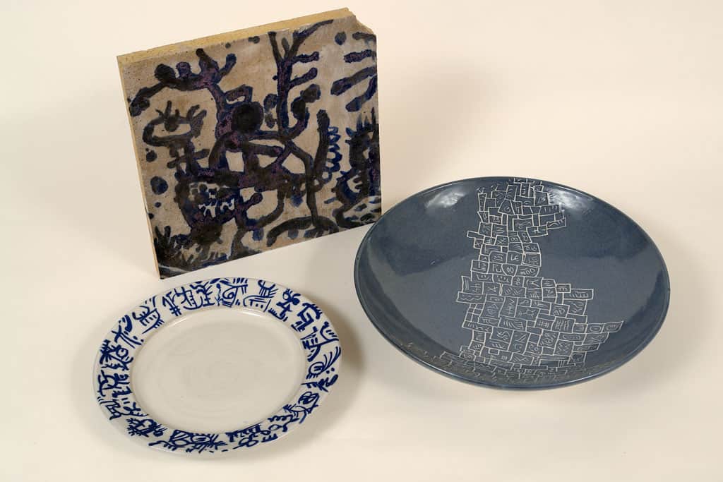
Group exhibit a sampler of Albano wares — Barbara B. Buchholz, Chicago Tribune (Aug 1996)
EXCERPT:
A little bit of this and a little bit of that can be found at a group show at the Jean Albano Gallery.
Chicagoan John Himmelfarb’s mixed media on paper, “Cake and Coffee,” is a visual treat. Against a soft yellow background, the artist has combined difficult-to-read pencil markings. Atop these are larger forms outlined in pink. All meld beautifully.
click thumbnail for larger image

John Himmelfarb at the Chicago Cultural Center — Alan G. Artner, art critic, Chicago Tribune (Jan 1996)
The veteran Chicago artist long has been interested in a kind of abstract mark-making that resembles calligraphy, and his prints and drawings built from layers of such “writing” are successful enough to tempt viewers into attempts at translation.
Here he has presented such data in the familiar form of bills, receipts and business letters, which encourage the idea that they convey precise meanings and are not just a visual language derived from ancient alphabets and the calligraphic fantasies of masters such as Paul Klee.
Himmelfarb’s paintings are, by contrast, based on representational forms found in the urban landscape, such as arches, ladders and bridges. But these, too, he piles on top of each other until they lose their specific references and become elements in a densely packed composition that evokes, by turns, paintings by the German Expressionists and the Art Brut of Jean Dubuffet.
In his prints, drawings and paintings Himmelfarb occasionally will magnify some of his calligraphic forms and heavily outline them on a field of multiple patterns. The paintings, with thick impasto and lyrical drips, successfully evoke works by Abstract Expressionist artists such as Franz Kline.
Cultural Center shows work of three Chicago artists — Art Review, Chicago Tribune (Jan 1996)
EXCERPT:
Three outstanding exhibitions are on view at the Chicago Cultural Center, each representing a different aspect of visual arts. John Himmelfarb displays painting, John Buck shows sculptures, and Jeanne-Marie Head presents photographs. All three bring a fresh inventiveness and compelling presence in their art.
Inland Romance: Paintings by John Himmelfarb shows large-scale colorful abstract paintings along with selected works on paper, all subtly referring, in varying degrees, to the urban landscape.
In the Inland Romance series, Himmelfarb renders his vision of the city in labyrinthine complexity with a flattened special plane that emphasizes pattern. Himmelfarb’s modernist heroes are Paul Klee and Jean Dubuffet.
The paintings appear as delicately balanced puzzles or roadmaps, with a strong rhythmic current reflecting the artist’s passion for music. The paint is often thickly applied and imparts an architectural quality, with vivid colors overlapping like buildings on a hill. One work evokes the greenery of a landscape while another could be a dizzying roller-coaster tracks.
In addition, the artist includes prints and drawing created with an imaginary hieroglyphic language.
Himmelfarb is a Chicago-area artist, who inherited a rich visual vocabulary from his parents, established artists Elean-
[ we regret that this part of the article is missing ]
works from the mid-1980’s to the present.
click thumbnail for larger image

John Himmelfarb at Jean Albano Gallery — Barbara B. Buchholz, Chicago Tribune (Sep 1996)
Oak Park artist John Himmelfarb’s show at the Jean Albano Gallery presents his use of varied media — paint, drawing, lithography and ceramics — and ability to work abstractly and representationally. The urban landscape and musical rhythms inspire many of his patterns.
The large acrylic paintings Inland Romance: Passage Blue Island and Inland Romance: Chicago Breaks, are frenetically filled in with vibrant colors. Heretofore the Only Answer, another mixed media on canvas, looks like giant jigsaw pieces fussily decorated with the artist’s personal alphabet. The pieces float against a serene white background, adding a calming influence to the cacophony.
Most interesting is 21 Days in Spain, a group of 21 3-by-5-inch drawings and paintings of city scenes, animals, still lifes and purely imaginative designs done on library catalog cards when Himmelfarb spent 21 days last summer in Gallifa, north of Barcelona. He made one artwork each day.
Himmelfarb has left intact the words of “Library of Congress,” the holes to place the cards in a file and some typed words. He gives us some information but not a complete “book,” in the same way that postcards tell a bit about a traveler’s journey but can’t replace the actual trip.
click thumbnail for larger image


Chicago Calendar — Tuesday: High Marks: John Himmelfarb at Gallery 1756 | Mary Daniels, Chicago Tribune (Jan 1995)
High Marks: A new exhibit at Gallery 1756 highlights the calligraphic works of Chicago artist John D. Himmelfarb. Gallery hours: Noon to 6 p.m. Tuesday through Saturday. 1756 N. Sedgwick St.
click thumbnail for larger image
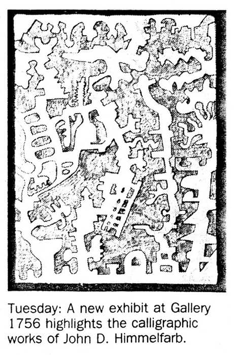
John Himmelfarb at Catalyst 95 — Charles Osgood, Chicago Tribune (Feb 1995)
PHOTO CAPTION:
John Himmelfarb is not exhibiting his acrylic-on-flesh work, but his pieces on canvas are currently at “Catalyst ’95: 16 Contemporary Oak Park and River Forest Artists,” at the Oak Park Art League, 720 Chicago Ave., Oak Park, through Feb. 25.
click thumbnail for larger image
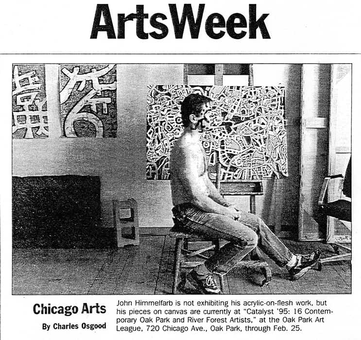
Sculpture’s siting consummates flirtation — Kevin Lynch, The Capital Times, Madison, WI (Apr 1994)
SIDEBAR:
Most of these [same] qualities are also evident in the print work on display in the galleries. However, [Joan Gardy] Artigas may be more fully explored in June, when Spaightwood will present a completely new one-man show of recent paintings, drawings and sculpture to celebrate the placement of the outdoor sculpture.
The current show is shared with Chicago artist John Himmelfarb, a neo-surrealist and aesthetic compatriot of Artigas.
Himmelfarb is a major talent. He delves into conflations of teeming form that brim with jungle fever, something that Artigas’ art savors but is never consumed by. Yet Himmelfarb has recently experimented with a witty new context for his agitated visual vocabulary. He compresses his gestures into microscopic ink etchings that become evocative personal hieroglyphics set in the format of a letter. If these are secret love letters, they are written directly to the inner psyche of the beloved.
Five New Prints by Artist John Himmelfarb — Journal of the Print World (Winter 1994)
Stewart & Stewart, printer and publisher of fine art prints, announces five new releases by Chicago artist, John Himmelfarb. The five screenprints are Note of Appeal in eight colors; Short Order, in six colors; Fax Appeal, in three colors; First Draft, in two colors; and White Out, in one color. The prints are approximately 30×22″ in limited editions of seventeen impressions or less. This work continues Himmelfarb’s playful exploration of letterforms and their changing meaning in our culture.
When asked about his inspiration for these screenprints Himmelfarb recalls, “I got the idea for this series from some reading I’d done about two years ago. I read a book by O.B. Hardison, Jr., a series of essays called Disappearing Through The Skylight. He analyzed various parts of American society using the metaphor of disappearing. Hardison talked about deconstructionism in literature in which certain parties advocated removing or weakening the meaning of specific words so they could be used in a more playful or plastic manner. That seems humorous to me, taken to its extreme. Does removing the meaning of words end the possibility for communication? But if you can take the meaning out of the words, why not take the words out of the text and be left with just the shell form of the text?
Like Picasso and Calder, Himmelfarb is the son of artists. Born in 1946 in Chicago, Illinois to Eleanor and the late Samuel, Himmelfarb grew up surrounded by art. Once a violinist and pianist, Himmelfarb often listens to music when he is painting. After graduating from Harvard University, Himmelfarb did calligraphic drawings in the 1970’s that were free form streams of consciousness. His paintings are “based on a curious amalgam of postwar expressionism and surrealism,” cites Helen Sheridan, Director, Collections & Exhibitions of Kalamazoo Institute of Arts, Kalamazoo, Michigan. Well-read and articulate, Himmelfarb is now concerned with Western documents and how, in our particular culture, words are disappearing, losing their meaning and disappearing from text.
The November 1993 visit to the studio of Stewart & Stewart was Himmelfarb’s third collaboration with the Masterprinter, Norman Stewart and his partner and wife, Susan Stewart. These screenprint editions were created in the country setting of what was once, in the 1920’s, the gardeners’ quarters of the Book Family summer estate once owned by Edsel Ford in Bloomfield Township. Since 1980, transparent colors and painterly techniques, rare in screenprinting circles, characterize the print collaboration between Stewart & Stewart and American artists.
click thumbnail for larger image
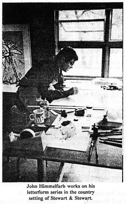


Five New Prints by John Himmelfarb — The Print Collector’s Newsletter (Mar-Apr 1994)
John Himmelfarb, Fax Appeal, First Draft, Note of Appeal, Short Order, White Out (1993), five color screenprints signed and numbered by the artist in editions of three to 17. Each print is 26×18 in. (image size) and 29-3/4×21-3/4 in. (paper size) and was printed on Rives BFK paper by Norman Stewart assisted by the artist at Wing Lake Studio in Bloomfield Hills, Michigan. Each presents calligraphic drawing in the form of a document or letter. Note of Appeal looks like a standard request for a charity donation, replete with list of board members and official stamp. First Draft looks like more personal writing on a legal pad, and so on. Complicating the picture, Himmelfarb has layered more than one drawing in all of these prints except White Out, which, printed white on white, is as elusive as the others. The calligraphy is at first convincing as rows of verbal information, but it proves to be deliberate expressionistic gibberish dense with an emotional reality. “The actual words we read are often masked or merely a facade for an underlying meaning that we can’t see. That’s where in order to read critically and to derive a richer meaning from what we’re looking at, we have to look at underlying meanings, hidden meanings,” he explains, in an interview with Susan Stewart. “l think these letters are part of a dialogue about what is the difference between visual information and visual art; and visual information about visual art and visual art about visual information!” In other words, look further. Price: $750 each. Published by Stewart & Stewart, Bloomfield Hills.
click thumbnail for larger image
Tabula Tabula Picta — The Print Collector’s Newsletter, vol. XXV, no.2 (May-Jun 1994)
John Himmelfarb, Tabula Tabula Picta (1993), a black and white lithograph signed and numbered by the artist in an edition of 24. Each print is 40×25 in. and was printed on Rives BFK paper by Veda Rives with assistants at Normal Editions Workshop/Illinois State University in Normal. Himmelfarb wrote on a lined aluminum plate with a technical pen filled with diluted lithographic etch. This plate was first used as “a low-level subtext,” printed in pale orange, for a 1992 print, Proof Copy. The plate was then processed so the etch would not take ink and printed in black for a negative image. Himmelfarb seems most pleased with Proof Copy, “a letter to my master printer with a deconstructed text” that is heavy on puns. But sometimes less is more as with Tabula Tabula Picta. …
click thumbnail for larger image


Exhibition of Japanese artwork snaps stereotypes — Harvey Hess, Waterloo Courier (Sep 1993)
John Himmelfarb at Kamerick Art Center Gallery, University of Northern Iowa
Stereotypical impressions of Japanese art mislead us — as stereotypes are wont to do — into assuming that the art of that tradition is only mystical, feudal, esoteric and no fun.
Wrong!
Even the rarified and aristocratic Noh drama has its farces — kyogen — and the refined court poetic form, waka, its daffy side, kyoka, or “mad verse,” somewhat in the spirit of the film “Tampopo.”
Roger Shimamura, professor of art at the University of Kansas at Lawrence, taps into this rich vein of humor in an exhibition of acrylic-on-canvas works, “Return of the Yellow Peril” as outrageously bold in utilizing (and transcending) racial stereotypes as the Fox Network comedy tour de force “In Living Color.”
On display at the UNI Gallery of Art and cleverly installed by Gallery Director Julie Nelson, this “kyo-e” of Shimamura spins off of ukiyo-e, pop art, genre painting and go-see-for-yourself in a bittersweetly endearing series of tributes to Shimamura’s friends in Lawrence. The works form a visual diatribe against racism.
“Roy Lichtenstein’s and Franz Hals’ Bogus Journey to Edo” might be a reasonable sub-title for the exhibition. Happily, Shimamura, himself — also a performance artist — will be on hand to present his multi-media theater piece, “Campfire Diary,” at 8 p.m. Sept. 21, in the Bertha Martin Theatre, free and open to the public.
Every bit as whimsical, but with very different visual purport, are John Himmelfarb’s works in pen and ink, lithography and etching which consist of the artist’s personal glyphic and graphic orthography — or, definitively speaking, “idiopseudocacography.”
Himmelfarb gives us specimens of post cards, not-for-profit letterheads, rosetta stones, etc., that — in terms of most linguistic limits — remain unlettered, indecipherable. A closer look, however, yields up a communications world of subtly suggestive messages of high visual elegance.
Finally, Neva Krohn, who attended Iowa State Teachers College from 1929-31, has presented artworks to the university represented in an exhibit that includes works by Picasso, Braque, Chagall and Albers, to name four biggies. This generous gift is a welcome and significant addition to the artistic life of the metro area.
Art lovers who stay away do so at their own peril, whether yellow or either of the other two primary colors.
Himmelfarb drawings at Arts Center — Iowa City Press-Citizen (Sep 1993)
Drawings by Himmelfarb are included in the exhibit “Vehemence and Query” in the Large Gallery at The Arts Center.
More than 40 institutions include his work in their collections, including the Art Institute of Chicago, Baltimore Museum of Art, Illinois State Museum in Springfield, Madison (Wis.) Art Center, Minneapolis Institute of Art, National Museum of American Art in Washington D.C., Toledo Museum of Art in Ohio and Vassar College Art Gallery in Poughkeepsie, N.Y.
Himmelfarb has had solo shows in private galleries in New York City, Chicago, Evanston, Washington. D.C., Milwaukee and other U.S. cities, as well as in Gallifa, Spain.
PHOTO CAPTIONS:
“Seed” is one of several drawings by John Himmelfarb now on display in the large Gallery at The Arts Center.
“Eastern Preparations: Tall Man, Thin Man, Short Man, Thief” by John Himmelfarb.
click thumbnail for larger image


Juggler and Juggler on Stage — The Print Collector’s Newsletter, vol. XXIV, no.1 (Mar-Apr 1993)
John Himmelfarb, Juggler and Juggler on Stage (1992), two screenprints signed and numbered by the artist, Juggler in an edition of 11 with two artist’s proofs and Juggler on Stage in an edition of 24 with three. Each print is 36-3/4×25 in. (image size) and 41×28-1/2 in. (paper size) and was printed on Rives BFK paper by Norman Stewart assisted by Joe Keenan at Wing Lake Studio in Bloomfield Hills, Michigan. Himmelfarb has been working with biomorphic forms in his recent paintings, but nothing so figurative as these jugglers, who emerged quite unexpectedly as he doodled on mylar at Wing Lake Studio. First was the Juggler, the linear figure comprised of loose forms and printed in two blacks. But Wing Lake mylar is lined to show two sheet sizes. As Himmelfarb worked, the smaller guide suggested an interior stage, so he worked off that, introducing a sense of scrim and backdrop for the action. “It ended a kind of self-portrait of the artist, juggling elements. Sometimes the artwork takes the lead, and you take what comes.” Juggler on Stage was printed with two blacks, two yellows, and orange. Price: Juggler $1,000; Juggler on Stage $1,250. Published by Stewart & Stewart, Bloomfield Hills. Available in New York at Terry Dintenfass Gallery.
click thumbnail for larger image


New Prints by John Himmelfarb — Art Business News (Jun 1993)
Stewart & Stewart, Bloomfield Hills, Mich., has hand-printed and published “Juggler on Stage,” shown, by John Himmelfarb in an edition of 24. The 5-color screenprint on Rives BFK 100 percent rag paper has a 36-3/4- by 25-inch image and an opening price of $1,250. Other new works by the artist include “Juggler,” “Stolen Glance,” and “Yellow Rose.” The company also offers Janet Fish’s latest release, “Waimea,” a 13-color screenprint. The image, measuring 36 by 24 inches, is hand-printed on Rives BFK 100 percent rag paper. It has an $1,800 opening price.
click thumbnail for larger image


Peltz Gallery: John Himmelfarb — Tom Hoffman, unsourced (1991)
John Himmelfarb has a resume as long as both your arms. For decades this highly seasoned and accomplished artist has been hard at work investigating, interpreting, inventing, and reinventing paintings, prints, and sculptures that express his feelings and views of the world around him. Chicago based and collected by a voluminous bunch of notable museums and institutions, his art is both visually playful and rife with content.
His work reflects a host of influences. Traditional Modernist abstraction, ancient hieroglyphics, comic book cartoon, and cartography to name just a few. I also see a bit of Jackson Pollock and Philip Guston as well. With a keen interest in pattern and symbol his presentations are playful and decorative without sacrificing a sense of purpose that keeps you returning to the work. His paintings speak of the cacophony of the modern world and the frenetic pace of life in ways that wink and do not overwhelm. There is an underlying sense of humor that (like the spoon full of sugar) helps the medicine go down. They are visually seductive and once they’ve got you hooked they slip a message under the back door of your mind so that you walk away just a little bit different, but you’re not quite sure what just happened. There are a number of recurring themes that act as strains of thought. These are clearly ongoing narratives in his life and work. They provide through lines that document his evolving and shifting point of view.
I’m all for the excitement and energy of emerging artists but it’s also nice to occasionally bask in the glow of a consummate professional. This is John Himmelfarb. The rough edges and occasional miscues are gone. What is left is the sureness, confidence, and professionalism of an artist at the top of his game. Clearly still passionate about his mission.
click thumbnail for larger image

Dreamscape — Inside Chicago (Sep-Oct 1990)
Floating images spiral with force. Energy, drama and inner conflict fill huge, panoramic canvases. Forms undulate, monsters grow, and cool greens meet with fiery reds. Chicago native John Himmelfarb challenges us to peer into the stream-of-consciousness landscape of his dreams, a landscape deeply influenced by his childhood in the wooded area of Winfield, Illinois. After a close look, his barely recognizable forms become intertwining trees, running dogs and wild birds flying among overgrown foliage and thickets.
Himmelfarb’s work has been described as a cross between post-war expressionism and surrealism. His paintings are influenced by both the abstractionism of Jackson Pollock and the art brut expressionism of Jean Dubuffet’s childlike imagery.
His new work is inspired by a recent visit to Gallifa, Spain, where he attended the J. Llorens Artigas Foundation on a grant from Chicago Artists Abroad. Himmelfarb, who continues to paint in his Pilsen studio, is represented by Roger Ramsay Gallery in Chicago and galleries in New York, Washington D.C. and Omaha, Nebraska.
click thumbnail for larger image


Animal Magnetism: Living Large with John Himmelfarb — Tom Laskin, Isthmus, Madison, WI (Aug 1990)
The enormous human heads, snarling dogs and dense foliage that populate John Himmelfarb’s psychologically charged artwork appear to be symbols of some inner or outer conflict. But the Chicago-based artist is reluctant to interfere with viewers’ perceptions of his brush-and-ink drawings and vividly colored paintings.
Himmelfarb (whose paintings, drawings and prints can be seen in the retrospective “Meetings in the Garden” at the Madison Art Center through Sept. 9) is wary of offering much more than hints about how to read his most potent pieces — a reluctance that stems, in part, from his manner of working. Even at the beginning of his career, as a young Harvard graduate inspired by Jackson Pollock’s energetic mark-making and “energy fields,” Himmelfarb took an intuitive approach to the execution of the closely packed, electric doodlings that vibrate on the surface of his 1971 lithograph “Ether Ore” and the carefully organized cartoons of his 1977 etching “Early Riser.”
When, in the early ’80s, Himmelfarb began incorporating animal and human imagery into his work, he was still attempting to maintain a sense of organic energy. But the dangers associated with working on a very large scale led him to seek a template in his earlier drawings, which in turn led to the imagery that would preoccupy him for nearly five years.
“I was doing some small brush-and-ink drawings in ’82 and I wanted to enlarge those,” explains Himmelfarb. “But the small drawings had been done very spontaneously in a stream-of-conscious method of working. When I started to go up quite a bit in scale, I got stage fright, I guess, just because of the cost of the materials and the amount of time necessary. On the small scale I could do 50 pieces and select five that really worked and throw out the rest. But when I was dealing with large, expensive materials and all the time it takes to do a large-scale piece, I didn’t seem to be able to just wade right in there in the same way. And so I looked back through some small ones I could use as a model — not as an exact model but as a starting point — so I wouldn’t be starting with a complete blank in my head.”
One of the two models Himmelfarb selected, “Meeting,” is included in the retrospective. “The original image just happened in a stream-of-conscious drawing,” he says. “I don’t think I was thinking about anything. I was just making a drawing out of an intuitive mark-making process, so there’s no way to tap into what was the psychological base for that. … All the artist can do is read back into it after it’s already there, and try to analyze it visually and psychologically and analyze it in literary terms or whatever.”
The one recurring image in the “Meetings” series that Himmelfarb has no difficulty explaining is the tangled garden that presses to the margin of each piece. Throughout his career, Himmelfarb has been fascinated with foliage as a subject. He grew up out in the country in an environment of dense woods, where “the horizon was not visible and the sky is always occluded by branches and leaves”; later, as a young artist he lived in an inner-city neighborhood where architectural detail, human events and industrial bric-a-brac formed a fecund, palpitating landscape.
Impressed by these natural energy fields, Himmelfarb began using gardens and dense woods as actors in his more narrative works. “I think it’s easy enough to become very self-centered and involved in what’s happening to human beings as a group or to each of us as individuals,” he explains. “But when you compare us to the total environment, then we become fairly insignificant. … I think that the garden may serve a role in determining scale or reminding us that we’re small potatoes.”
These days Himmelfarb, who is largely self-taught and belongs to no particular artistic movement, has moved away from the recognizable objects and characters that loom forbiddingly in his mid-’80s work. As he’s done periodically during his 20-year career, Himmelfarb is now abandoning representation for nonobjective imagery. The biomorphic shapes that seem to drift purposefully through the blue background of “Non-Objective No. 1,” a large painting from 1989, have all the energy of his lush foliage, but they belong to a world that apparently only exists on the canvas. As Himmelfarb puts it: “It looks like there’s something living in these things, but you can’t really say what.”
click thumbnail for larger image
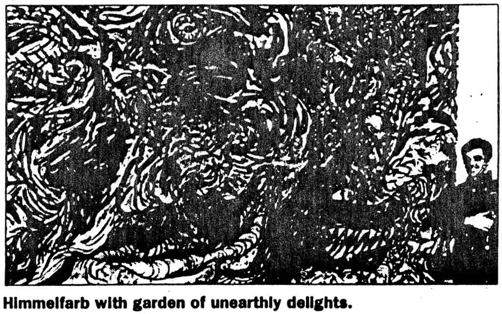


Artist paints turmoil — Kevin Lynch, The Capital Times, Madison, WI (Aug 1990)
To enter John Himmelfarb’s “Meetings in the Garden” exhibit at the Madison Art Center is to be drawn into a place overgrown with lyrical foliage and wild whorls of paint. The eyes are danced with, then engulfed, and finally confronted with menacing images.
At face value, the traveling retrospective of paintings and drawings organized by the Kalamazoo Institute of Arts is one of the most unadulterated celebrations of painterly expression to hit Madison in a long time. The gifted Chicago artist is working in a region bounded by heroic-scale abstract expressionist painting, the modern primitivism of Jean Dubuffet and the more postmodern cartoon puckishness of Red Grooms.
What intrigues is how the swirling painting pulls you in and then says, “There’s something in here!” The title of the show, which runs through Sept. 9, refers to close encounters between people and animals on the shadowy edges of a wild forest.
And sure enough, they’re in there — if you stand back to look from across the room.
The show’s centerpiece is a stunning black ink painting on paper titled “Meeting in the Attic” in which the claustrophobic tension of people trapped in an enclosed space with a wolf expands to a monstrous scale — at 7-1/2 feet high and nearly 32 feet long — and compares in sensory impact to a major Jackson Pollock painting.
This work contains what must be one of the largest images of the human face in recent art history. A mass of crashing black and gray waves forms the face, as if the human has merged with some great earthly energy.
With his scale and engulfing imagery, Himmelfarb sticks us right into the strange drama. His men-with-wild-animals scene is repeated in a number of variations, like the controlled tumult of red, orange, blue and black acrylic in his “Sexuality Meets Aggression” and “Low Intensity Conflict.”
Himmelfarb’s concerns are quite primal and grow from a distinctly Midwestern experience.
“I think the animals go back to my childhood,” he has said. Many wild animals inhabited the woods near his home in rural Winfield, Ill. Himmelfarb cultivated an uneasy coexistence with the animals that evolved into this artistic perspective.
Beyond that, Himmelfarb feels the paintings “represent my fears and the fears of everyone — whether they’re on the surface or deep down — fears that are awesome, fears about being alive.”
What perhaps helped him cope, and what relieves his work’s intensity, is his humor.
The images are rendered in a rather comical, crude style. The humans, with huge gnarled teeth and whirling eyeballs, almost seem wilder — or at least crazier — than the animals. His almost obsessive energy and detail overcome what might otherwise be glib visual trickery.
Some smaller works from the early ’80s comment on the modern society with pointed wit.
In “Heavily Laden,” an unclothed man rides in a low-lying boat piled surrealistically high with a mountain of his creature comforts — TVs, chairs, giant padlocks, dressers, refrigerators.
This is Noah’s Ark for the man who obeys the electronic thunder of a consumer god. A hand reaches up from the waves to be pulled aboard. But there’s no room for another human, who probably would jump back into the water if he saw what we do.
Less arresting but still effective are his smaller prints which retain his droll social view. “Early Riser” and “Hoarding Romance for Sale” are images of human life boxed and processed in gridlike compositional patterns.
Himmelfarb feels his dark social commentary emerges best from the human energy of his abstract expressionist “field painting” style.
“The mark on the paper is probably paramount in translating my energy to other people,” he says. “But as long as I’m using narrative images, my social concerns are hard to keep out of it. I intend my work to be open and sharing and I’ve come to see that as a political statement in itself.”
Yet beneath such benign words is what Himmelfarb really shares — a tense and rather fiendish perception. It reveals one of our greatest fears — that the things which most horrify us can inhabit us somehow, and become us.
click thumbnail for larger image


Painter Himmelfarb Moves in New Direction — Kyle MacMillan, Omaha World-Herald (Mar 1990)
The work of Chicago artist John Himmelfarb is a frequent sight on the walls of Midlands collectors.
“I think I’ve probably shown more here than any other single place,” he said.
After holding shows for a few years in a friend’s home, the 43-year-old artist began to regularly exhibit his work at Gallery 72 after it opened in 1972.
He sold so many pieces from one set of his work that he now refers to it as his Omaha Series.
No Exception
“I often show work here before it’s seen anyplace else — before it’s exhibited in New York or Chicago or Washington. It’s a preview town,” he said.
His current show at Gallery 72, 2709 Leavenworth St., is no exception. Among the 18 works on display are two lithographs that he just completed.
Himmelfarb is represented by Terry Dintenfass in New York; Brody’s Gallery in Washington, D.C.; and the Roger Ramsay Gallery in Chicago.
A nationally touring exhibition of his work, titled “Meetings in the Garden,” was organized by the Kalamazoo (Mich.) Institute of Arts and will open April 5 at the Arkansas Arts Center in Little Rock.
“John’s work is based on a curious amalgam of postwar expressionism and surrealism,” wrote Helen Sheridan, Kalamazoo’s director of collections and exhibitions.
“He is strongly influenced, for example, by both the abstraction of Jackson Pollock, with its emphasis on overall gesture and markmaking, and the art brut expressionism of Jean Dubuffet, with its use of childlike imagery to suggest directness and spontaneity.”
In much of his work of the 1980s, Himmelfarb hid his figures in a dense floral or junglelike abstract background.
“When there’s imagery, it is often masked like that,” he said. “I like it when the work reads as something non-objective or design oriented for the first reading and then later the imagery sneaks up on you.”
In his most recent work, his images have become completely abstract and much more open. The largest work in the show, a free-hanging canvas about 4-1/2 feet tall and 12 feet wide, provides an example of Himmelfarb’s new direction.
It consists of gestural patterns of black strokes of acrylic painted on the floor in the style of Pollock. Certain parts of the canvas were then filled in with the primary colors of red, blue and yellow.
“Relatively speaking,” he said, “compared to a lot of my work, that work gets executed more quickly because it’s quite simple in construction. You see everything right there as opposed to a painting, which is built up over many layers.”
While it is quick to execute, he said, “It took 20 years to get there.”
Gallifa, Spain
During the early stages of any new development in his art, Himmelfarb said, he tends to use primary colors and move into more complex ones later.
This new work was inspired by Himmelfarb’s recent visit to Gallifa, Spain, a town near Barcelona where Joan Miró created his ceramics. Miró traveled there over several decades to collaborate with world-renowned ceramicist Josep Llorens Artigas.
Artigas’ son established a foundation in the town, which offers residencies to artists from around the world. Himmelfarb was among the first to take advantage of the program.
During his stay, he was immersed in the world of Miró. He visited the Miró Foundation and saw works by the artist he had never seen before.
No matter what an art work might depict, Himmelfarb said, it always serves in some way as a self-portrait of the artist.
“I imagine that’s why we are interested in art, music and literature in the first place, because it’s a way of knowing another person in a different way than we know people through conversation,” he said.
Himmelfarb’s exhibition will continue at Gallery 72 through April 7.
click thumbnail for larger image

John Himmelfarb at Miami University Art Museum — Cynthia M. Kukla, Dialogue (1990)
John Himmelfarb’s “Meetings in the Garden” displays the artist’s love of the calligraphic line and his preference for working on the responsive surface of paper. His ink drawings and prints are more successful than his half dozen acrylics on canvas and one timid oil on canvas. There are 31 works in all, several from as early as 1971, to show a stylistic cohesiveness that has characterized Himmelfarb’s career, (as well as a full representation of the of the 1980s).
There is a clear impression that we are given but a glimpse of tremendous investigative energy in this show of etchings, woodcuts, small ink drawings, paintings on canvas, and tour de force ink paintings on paper which are up to 32 feet long. The works present several interesting contradictions. Himmelfarb’s work is steeped in the memory of childhood fears, and in fact much has been made of his upbringing in the wooded area of Winfield, Illinois. It is easy to detect the crude figures of man or boy and dog, wild birds, thickets, and foliage in the images he creates sometimes in cartoon style and at other times in an art brut abstraction. What Himmelfarb does to give force to what could be too simple imagery is to increase the work to literally monsterous proportions.
Another contradiction is the play between work developed in a cartoon style, particularly the “Boat Man” series, and work handled in a brutish abstraction such as the large-scale “Meetings” series. The work rendered in a cartoon style can be seen as relaxed and intimate, but it is also perilously close to easily digestible imagery.
The major works, the “Meetings” series, show Himmelfarb in full command of his vision and methods. The works are dizzyingly abstract, the forms undulate, light flickers over barely recognizable forms. Enormous expanses of soft gray washes suggest terrain. The soft paper is whipped with confident black lines. No pencil tracings chart the course. Monsters grow in the perils of his methods, yet they are protected by growling canines. Together, man and beast, face the intruder, usually only partly seen and usually on the right side of the piece. Even the powerful woodcut, Lumber Street Meeting, was drawn with the hero or protagonist on the left and intruder or antagonist on the right. It is merely the nature of printmaking that has caused the reversal of Himmelfarb’s formula. This woodcut is 30×62 inches, but contains the same vigor as the large ink paintings which range from 90×144 inches to 90×381 inches.
Some smaller works merit attention. Bone is a raw and direct lithographic image of man and dog. Neither creature is dominant; they are drawn together by a primal interrelationship of which the bone is a symbol. The rough figures are drawn against a stark black ground. Lava Flow, 1986, and Summerlight Meeting, 1988, are two distinctly different prints developed from the same plate. There is a powerful abstraction achieved by the careful balance of figure and ground. Lava Flow shows two highly abstract heads facing each other in black and cadmium red. The color combination is aggressive. In Summerlight Meeting an entirely different image is created by using aqua blue instead of black and clear chrome yellow instead of red. Here the figures facing each other look sunstruck and in love. The results are hypnotic. These small etchings are beautifully abstract and show that Himmelfarb can create powerful imagery in any scale.
Cynthia M. Kukla is a painter and associate professor of art at Northern Kentucky University
click thumbnail for larger image


Muncie: "Impressive Ball State Gallery does sound show" | Steve Mannheimer, Indianapolis Star (1989)
Impressive Ball State Gallery does sound show — Steve Mannheimer, The Indianapolis Star (Jan 1989)
Only an hour away, the Ball State University Art Gallery is the most overlooked exhibition venue open to Indianapolis visitors.
Despite a thorough grounding in pre-modern art, an intellectual foundation which many find too cozy to build upon, Gallery director Alain Joyaux in the past several years has revealed an increasing sympathy for art of the last 40 years. He does what he can with the budget he has — impressive enough with not very much.
He has acquired some respectable paintings by the likes of second-rank, first-generation abstract expressionists Norman Bluhm, Michael Goldberg and Alfred Leslie in his pre-figurative days, not to mention a striking large-scale diptych by Italian neo-expressionist Mimmo Paladino. This growing modernist collection alone is worth the drive.
At the same time, he has put together a series of small caliber yet accurate shows aimed at the oft-overlooked quadrant of the art firmament between the modern saints and its most recent stars — an area lacking the luster of big-name exhibitions but containing the majority of artists.
Most careers, either artist’s or curator’s, are built brick-by-brick with small, creditable shows like this — another line on the resume. The process tends to select for safety, but safety with an edge, a familiar razor.
New Yorker Richard Hennessy and Chicagoan John Himmelfarb are not the sort of artists who boldly go where no one has gone before. Both are technically competent, relatively sedate in their formal ambitions, ultimately more interested in intellectual challenge than aesthetic shock. It’s a good show, and in a funny way, sort of a sad show.
Hennessy is the less-polished of the two. On first look, his technique appears raw, perhaps unfinished, and almost offensively casual. (Can he get away with so little work?) Broad areas and simple shapes are washed over in broad, simple brushwork, perhaps even sponge work. His color does not really describe forms: it filters and obscures them like layers of colored Cellophane over funky, abstract structures with no particular resemblance to anything other than new-wave furniture in some vague, science-fictionish landscaping.
The works do not invite close scrutiny. Much like theater flats, they look as good as they’re going to from 10 feet away. The artist apparently recognizes the obviousness, the artificiality, the theatricality of their illusions in their titles: Blue Theater, El Teatro de la Grandeza (The Theater of Grandeur).
If there is an inhabiting spirit it is cynicism. Like Guardi In 18th-century Venice, Hennessy sees the world as a dance of appearances. Like Guardi, Hennessy’s paint, too liquid to pass as flesh, merely coats or veils his substanceless subjects. The eye gropes to focus and grasps nothing.
Grandiloquent doodles, they are tinged with maniacal innocence, insistent yet ultimately aware that it’s all much ado about not much. There is some pathos in this.
Some note of short-circuited innocence also informs Himmelfarb’s art. In six large-scale, brush and ink drawings, his consistent cast of characters is a large, gnomish face, often In combination with a snarling, feral creature and another grotesque face, all seen interwoven with forest foliage.
The faces are filled with calligraphic brush strokes. He touches over every square inch of surface, creating a whole cartography in a face. Like the whole world, the images are almost impossible to see, spilling out to the edges, escaping vision.
The calligraphy might only be understood as a jungle of lines, vines and leaves, an explosion of hair and wrinkles. These are elusive creatures that hint of some fairytale source, perhaps the long-buried, medieval theme the leaf-clad “wildman” who became over the centuries the “boogeyman” of childhood fears.
Similarly, the obsessive mark-making harkens back to medieval manuscripts elaborated in every crevice in a style dubbed horror-vactui the fear of the void.
But, Himmelfarb’s characters are not scary. They’re really kind of goofy. The artist seems not the least bit afraid of losing himself in the meandering under- and overgrowth. The path goes nowhere but into its own unknowable depths. Himmelfarb attempts at least a heroic scale in works like Meeting in the Attic, 32 feet long, but succeeds only in multiplying the complexity.
In that, Himmelfarb and Hennessy both suspect that frustration may be unavoidable, the frustration of needing to say something but suspecting the impossibility of pronouncing it right. They embrace introversion as some remedy, coloring or weaving it to suit their formal purposes, but there remains some wistful pathos in outward aspirations spiraling inward.
Mannheimer is an associate professor of painting at the Herron School of Art, Indiana University – University at Indianapolis.
click thumbnail for larger image
Exhibit planned — The Daily Chronicle, De Kalb, IL (Sep 1988)
Eleanor Himmelfarb, John Himmelfarb and Vera Klement will present a three-person exhibit through Oct. 2 in the Swen Parson Gallery at Northern Illinois University.
Regular gallery hours are 8.30 a.m. to 4 p.m. Monday through Friday, 7 to 9 p.m. Tuesday and Wednesday, and 1 to 4 p.m. Saturday and Sunday. Further information may be obtained by calling the gallery at 815/753-1936.
In their works, all three artists show concern for both nature and man, a concern sometimes revealed and sometimes implied. While these concerns offer similarities, their methods — painting, printmaking, collage — provide diversity. Use of color also adds contrast.
John and Eleanor Himmelfarb reside in the Chicago area, and Vera Klement is a professor at the University of Chicago. She is represented by the Roy Boyd Gallery.
Funding for the exhibit was provided by the NIU School of Art with additional support from the National Endowment for the Arts and the Illinois Arts Council, an agency of the state.
John Himmelfarb at Evanston Art Center — Andy Argy, New Art Examiner (Mar 1987)
Andersen and Grimm stories terrified me as a child, especially the illustrations of child-eating giants and snarling wolves. Apparently Himmelfarb had the same problem and decided to work it out of his system as an adult. He does the old illustrators one better by drawing the giants life-size (about 9×9 feet for a head), making his forests even scarier, and lining up the wolves’ teeth like gleaming stars on a cold winter night.
The exhibition includes ten works, mostly brush and black ink drawings, the largest being 9×32 feet in length. It consists of two giants’ portraits, with a snarling dog between them, against a background of an ominous forest — his most frequent theme. The subject is both humorous and scary, in the same way that a child smiles to ward off fear. His form is an all-over rhythmic pattern of brushstrokes suggesting a calligraphic version of an Abstract Expressionist gone haywire.
Stylistically the repeated brushstrokes recall Himmelfarb’s 1970s work with calligraphic characters, and they camouflage the image. They function well as form alone, full of energy, with an oriental respect for the elegant continuity of beautiful marks. Still, clarity of concept is firmly established, setting up an intriguing play between form and image. The drawings can be seen as serenely decorative or as dramatic visions with expressionist intensity. This duality is further extended by having the image look childishly naive (the giants have full lips and bulging eyes) while the formal resolution has the earmarks of a very sophisticated and well-educated draftsman.
Himmelfarb’s art is original. Although he is cognizant of what’s going on in the art world and in many ways has been responsive to it (his evolution from Cy Twombly-like calligraphy to trendier Neo-expressionism cannot be purely coincidental), he seems to follow his interests outside the context of -isms. His unabashed immersion in graphic art, emphasizing drawing above painting, has earned him an important place among artists who make drawings into major aesthetic statements. Himmelfarb’s current choice of subject matter is entertaining and timely; just don’t take any children under 12 to see his work.
Price range: $650 to $15,000.
Challenges by Himmelfarb — Eliot Nusbaum, The Des Moines Register, Des Moines, IA (May 1987)
Something of the child is retained within the psyche of John Himmelfarb. It manifests itself in several ways — some charming, some anxiety-laden — in the small collection of works on exhibit in his one-man show through June 14 at the Blanden Memorial Art Museum here.
The most obvious manifestation is perspective. Himmelfarb, who lives in Chicago, where he was born in 1946, often works on a vast scale, so vast, in fact, that in many cases the viewer is reduced to a childlike perspective relative to the painted images. (The largest work in this exhibition, “Meeting ‘in the Attic,” is 90 by 381 inches).
The images themselves are a thicket of fast, free-flowing, ink-wash brush strokes, applied as if by a child unafraid to explore every inch of surface and then some. That “and then some” refers to Himmelfarb’s all-over painting technique, which gives the impression that even the largest piece of paper or canvas isn’t quite large enough. Figures are crammed into spaces, often appearing “cropped” at painting’s edge.
Like his all-over technique, Himmelfarb’s subject matter is created through the sophisticated manipulation of line. Covered as the canvases are with brush strokes, the viewer must sort out the images, separating flora from fauna, and flora and fauna from stray marks.
There is a tension, springing from uncertainty, that permeates these works, leaving the viewer to further sort out whether these forceful characters — human, animal and anthropomorphic — are friend or foe, and in either case whether their personas are deliberate or a matter of viewer interpretation.
It’s as if you — placed in the role of a child — must confront a larger-than-life situation that consists of uncertain characters and then determine whether you are at risk. It’s an interesting role for the viewer that works time and again for Himmelfarb.
Himmelfarb achieves a similar quality in his smaller works as well. Painted like the large canvases, the smaller pieces present the same kind of challenges to the viewer but in a way that suggests that we viewers are stealing a small view of a larger scene. It’s as if the canvas were a window to the crowded world beyond.
Also included in the exhibition are 12 stoneware sculptures that add to the impression of childhood charm in Himmelfarb’s work. The sculptures, all of them of peculiar-looking animals, look like a cross between Pre-Columbian and kindergarten figures: elongated dogs with a variety of peculiar appendages.
While I’m completely convinced of the quality of the paintings, the clay figures are a little less convincing. It’s not that they aren’t appealing in their way, it’s just that they don’t seem to lead to anything much beyond their immediate presence. Are we supposed to read something more into them? Is there some broader purpose behind the technique? Whatever the answers, you won’t find them within the works.
I’m even more puzzled by a small grouping of what appear to be illustrations, though no text or context is offered. As drawings by themselves, they leave me cold. Each of the three relatively simple illustrations takes some aspect of dogs as its focus, but none of the works leads anywhere. They look like cartoons with the captions left off.
There are several very successful prints in the show. The lithographically produced images have much the same feel as the show’s few watercolor paintings. The heavily outlined images and lightly washed bodies of color are pulled together to create an image that is greater the sum of its parts, though not in the same league as the large works, which alone make the exhibition worth attending.
click thumbnail for larger image

A fine graphics show at Fort Dodge — The Des Moines Register, Des Moines, IA (Jan 1987)
In keeping with the standard they set with “New Talent/New York” while still at the Sioux City Art Center, Tom Butler and Marilyn Laufer have done an admirable job of pulling together a vast range of works to form “Recent Graphics from American Print Shops.”
The husband and wife team of Butler and Laufer, now with the Mitchell Museum in Mount Vernon, Ill., selected 60 works by 53 artists working with 18 print shops and publishers to be included in the show, which will run through March 4 at Fort Dodge’s Blanden Memorial Art Museum.
Although not quite large enough to be considered encyclopedic, “Recent Graphics” does cover a lot of territory, literally and figuratively. In addition to heavy representation from shops and publishers on the two coasts, there’s a small selection of inland shops such as Vermillion in Minneapolis, Echo in Bloomington, Ind. and Shark’s, Incorporated in Boulder, Colo.
Artistic styles run the gamut, from the Abstract Expressionist splatters of Peter Voulkos (better known for his ceramic work) to the elaborately posed nudes of Philip Pearlstein’s etching “Models With Mirror.”
What is so notable in this wide-ranging survey is the uniform quality of print work being done in this country today.
Whether subject is Ames native John Buck’s energetic woodcut “Red Jesus” or Red Grooms’ entertaining, three-dimensional lithograph, “Subway,” or John Himmelfarb’s darkly threatening “Grand Street Meeting,” clearly a premium is placed on the quality of the printmaking process itself.
Two works in which technical quality really shines are Donald Farnsworth’s “Counterpoint/Gothic III,” a unique print, and Anthony-Petr Gorny’s “Centers of Power.” They are two of the happiest surprises in this exhibition.
Printed by his own Magnolia Editions, Farnsworth’s “Counter Point/Gothic III” layers architectural renderings of Gothic structures with examples of Japanese calligraphy on handmade paper in such a way that the two are seen in juxtaposition. The colors of the bottom layer are delicately muted by the upper layers, and the whole thing is adorned with gold leaf. It’s a beautiful metaphor.
“Centers of Power,” printed by Echo Press, is a large (36-by-55 inches) double-sided lithograph and woodcut printed on translucent paper. The two sides present the same landscape—on one side the landscape is ruined by man, on the other it is loved by man. Both sides are drawn in black ink, creating the impression of a dream vision. Beneath the image is a woodcut text printed in red. It’s an outstanding print in every respect.
All in all, “Recent Graphics” tackles an almost hopelessly large task with great aplomb and comes up doing a very credible job.
click thumbnail for larger image

John Himmelfarb at Terry Dintenfass and John Nichols Galleries — Frederick Ted Castle, Art in America (Dec 1987)
In his fourth and fifth solo shows in New York, Chicagoan John Himmelfarb presented large brush-and-ink drawings on paper. At first glance the drawings might seem abstract, by which I mean unreadable as representational scenes; this is due in part to Himmelfarb’s brushwork that moves quickly all over the picture space. February Meeting, 1985 (40 by 60 inches), shown at Dintenfass, is typical of Himmelfarb’s recent work in that it uses heavy strokes of ink (sometimes diluted to produce watercolor effects) to depict gnarled and disfigured faces and a fierce, snarling dog. But the drawing was not made solely for the purpose of portrayal: it is also an occasion for filling up the paper with highly gestural marks so that there’s practically no white showing through. February Meeting doesn’t come close to having a pattern or a purely formal design — even in its foliate ground — yet the ink strokes that enliven its larger-than-life-size subjects suggest a formal symmetry even in their engagingly human messiness.
Himmelfarb’s largest recent work, Giant’s Meeting, 1985 (90 by 144 inches), was included in the recent “Monumental Drawings” exhibition at the Brooklyn Museum. As in February Meeting, an enormous face, consisting mostly of lips, nose and eyes, encounters a fiercely grinning profile which looks like it’s about to bite a dog (although Himmelfarb doesn’t actually own one, dogs frequently appear in his drawings). The puffy cheeks of the giant on the left are awash in brushstrokes. The giant is strangely impassive, but his eyes are clear, like those of a businessman making a deal. As in other drawings, the lips of the giant are very elaborately rendered; twisting vegetation forms the ground; and the teeth of the dog are bared for action.
Another quite large work, a monotype called Underwater Meeting, 1986 (90 by 138 inches), shown at Nichols, has a rather “pretty” turn to it: floating vines and seaweed (or whatever the sinuous ink lines represent) make the gigantic faces look calmer, though not nicer; or perhaps the pressure of the water makes their features more serene. In any case, Himmelfarb’s images tell the human story of how we are with each other in the world.
I first saw Himmelfarb’s large drawings at the Municipal Art Gallery in Davenport, Iowa, in January ’86, part of a selection of his black-on-white works from the past ten years. Himmelfarb’s drawings have become more realistic over time, even as they turn to more elaborate and larger formats. While he is not the only artist observing a truce in the war between representation and non-representation, Himmelfarb is one of the best.
click thumbnail for larger image


John Himmelfarb will create drawing next week at Toy National Bank — Marcia Poole, The Sioux City Journal, Sioux City, IA (Apr 1987)
Siouxland residents will have the opportunity to watch an artist at work when John Himmelfarb sets up a temporary studio Monday and Tuesday at Toy National Bank, Fourth and Nebraska streets.
Using brush and ink, the Chicago artist will create a large drawing,possibly as large as 4 by 8 feet, on the first floor of the bank. Spectators will see coffee cans containing ink, brushes of varying sizes and a stocking-footed artist making marks on an expansive piece of paper. When he’s not crawling around on the floor, Himmelfarb will be sitting in a chair contemplating his incipient images.
“It won’t be like Jackson Pollock — constant action. But if people want to come down and see what’s going on, then maybe come back in an hour or two, they’ll see something happening,” says Himmelfarb who had an exhibition at the Brooklyn Museum last September and who has a work in the permanent collection at The Sioux City Art Center.
The artist will discuss his drawing with visitors during work breaks. But he asks that people not disturb him when work is in progress. “This is a risky kind of art process. When you put ink down, there’s no taking it back. It’s do or die. So I can’t talk when I’m actually working.”
Working in public is new for the Winfield, Ill., native. During the past week , he ventured into that territory when he created a drawing in Omaha with spectators looking on. He will use the same basic images in Sioux City that inspired him in Omaha: one large face staring out at the audience on one side of the paper and a face in profile on the other. (Although he works in a variety of media, including watercolors and sometimes ceramics, he has chosen pen and ink for these occasions.)
Discussing his images, he refers to one as a beast and the other as a human form many people see as Everyman. The artist makes it clear he will not attempt to achieve the tranquility of a landscape. Vigorous activity colors this work and conflict dominates its theme.
“I hope people will be challenged by the images, but also come away with the beauty of the design and theme,” says Himmelfarb who will have a show in May at the Blanden Art Museum, Fort Dodge, Iowa.
Spectators must work to see that conflict and beauty. At first, they may see only a dense field of marks and believe the work is completely abstract. “I’ve watched people look at the drawings. They see pieces, then all of a sudden they see the images,” says the father of two.
The brush and ink drawings Himmelfarb is doing today are closely related to his early style when he was a student at Harvard University. “I’d start on one side and begin to fill up the page with tiny marks. It was fairly abstract, although sometimes it developed into images that looked like landscapes.”
Himmelfarb had virtually no formal art training as a child. His mother, Eleanor, and father, Samuel, both artists, purposefully avoided the academic foundation that his father had. (His late father also owned an industrial design business.) “In fact, he leaned over backwards not to teach me. He said people had to unlearn a lot of their academic background in order to come up with something original.”
But Himmelfarb was not shielded from the books, paintings and conversations about creativity that took place in his home. He and his two sisters were taken along when their parents vacationed and art museums were high on the list of attractions. On Sundays, his father let young Himmelfarb watch him in his studio and allowed him to paint. Although the elder Himmelfarb’s work became increasingly abstract, it always was concerned with groups of people, such as spectators in the stands at a baseball game.
During high school, Himmelfarb’s interest in painting and drawing faded while he seriously pursued instrumental music. At Harvard, he sought a liberal arts education. He declared a major in pre-architecture which was designed to prepare students for a graduate level program in the profession. “I didn’t have any thoughts about going into art at that point. The studio courses I took were all design-oriented.”
During a semester in his junior year, however, he had completed all the design courses that were offered. Without a class in the studio building, he found the semester lacking. A professor suggested an independent study in which Himmelfarb wouldn’t receive an assignment, but simply would draw and be evaluated periodically. It was a freedom he had never been given before.
“All of a sudden it was night and day. Within a couple of weeks, I was taking drawing seriously. I said to myself, ‘This feels right.’ Up to that point I didn’t think art was a moral choice: I considered it self-indulgent in a social action age. This was in the early ’60s. But then I felt this is what I have to do.”
Himmelfarb’s work is at the Art Institute of Chicago, the National Collection of Fine Arts, the Minneapolis Institute of Art, the Cleveland Museum of Art, the Des Moines Art Center, the Sheldon Memorial Art Gallery, and the University of Iowa Museum of Art.
click thumbnail for larger image

Artist teases imagination — Quad-City Times, Davenport, IA (Jan 1986)
‘Scores of images suggest symbols and fantasies. Some works are 4 by 8 feet in dimension.’
EXCERPT:
People who need a diversion from the winter woes may find just the right remedy in a bold art exhibition that invites viewers to explore the orchestration of large scale drawings and paintings by a Chicago artist, opening this Sunday at the Davenport Art Gallery.
John Himmelfarb’s work heralds the notion of the artist as translator, supporting many of the dictums of American abstract expressionism and the eye-catching forces of Art Brut.
The viewer is engulfed in a symphony of shapes and rhythms with countless scores of images that suggest symbols and fantasies.
The artist will be present at Sunday’s opening, and will conduct a gallery talk at 1 pm.
Eighty works, many of them four by eight feet in dimension, span a decade of art production by Himmelfarb.
His early works from the mid-70s are both calligraphjc and resembled cuniform writing forms. His works of the 1980s are magic themes, but the metaphor is left up to the individual viewer to decipher.
All the works selected for this showing in Davenport are black and white in format.
[ … ]
Himmelfarb graduated from Harvard in 1968, where he took some basic design courses and independent study related to art within his study for urban planning. He stayed on at Harvard to complete a masters of teaching degree in 1970.
His commitment to his art led to the mastery of painting, printmaking, drafting, ceramic sculpture and book illustration.
By 1976, he had participated in 50 one-man and group exhibitions, gaining considerable recognition throughout the United States with his work in the permanent collections of corporations and prominent museums, notably the Art Institute of Chicago, the art museums of Baltimore, Brooklyn, Cleveland, Atlanta, Indianapolis, Minneapolis and Portland, the National Museum of American Art in Washington, D.C., and Harvard’s Fog Museum.
He is recipient of the Yaddo Fellowship for work in the New York artist’s colony (1979) and a National Endowment for the Arts Fellowship (1982).
Besides enjoyment from the sheer size of Himmelfarb’s works, his creativity makes a moral judgment, which should momentarily relieve those who deride today’s art for its lack of moral values and its narcissistic point of view.
Bigger is better — The Print Collector’s Newsletter (Jul-Aug 1986)
Bigger is better — at least according to curators J. Nebraska Gifford and Cathy Weiss in their show Blockbusters: The Big Impression, at John Nichols Printmakers, to July 26. Following the successful Intuition and the Block Print: A New York Obsession of 1984, Blockbusters features woodcuts and linocuts all 3×4 ft. or larger in size. Among the 21 artists included for bigness and boldness are Edward Brezinski, Richard Bosman, Red Grooms and Clayton Patterson, as well as non-New Yorkers Eric Averv, John Himmelfarb, and Joseph Raffael. Gifford finds that large-scale work is In tune with the times: “Ours is not exactly a period of nuance,” she notes in her essay for the accompanying catalogue. To order the illustrated catalogue, send $5 to J. Nebraska Gifford, 4 Great Jones Street, New York, New York 10012. To see these creations of inspiration and perspiration yourself, visit John Nichols, 83 Grand Street, New York. Tuesday-Saturday, 12-6.
John Himmelfarb: It’s all there in black & white — Julie Jensen, The Rock Island Argus, Rock Island, IL (Jan 1986)
The drawings and paintings of Chicago artist John Himmelfarb, “The Artist as Translator,” on exhibit through Feb. 16 at Davenport Art Gallery, put the viewer in the driver’s seat. It’s all there in black and white, and what you see is what you get.
The huge drawings and acrylic paintings in the show represent a decade of work by the Oak Park artist who went to Harvard with thoughts of becoming a city planner, an architect or an anthropology teacher.
Harvard has no fine arts program, but it does have a faculty sensitive to artistic possibilities. A teacher asked Himmelfarb if he had thought of becoming an artist, and that made all the difference.
Himmelfarb is involved with shape and line to the point of excluding seductive color. In this retrospective, black and white does it all.
Many of the works are large but composed of myriad small images. They resemble cuneiform writing in some cases, and in others, they are comic strips of pulsing meaning or even avant garde wallpaper designs.
The images are humans, sharp-toothed beasts, fierce-beaked birds, industrial objects, over-loaded arks, all in a steamy surging tangle that speaks of the complexity of life.
Stand before “May-August,” a large pen and ink drawing, and you’ll start focusing on a television set, a nude with outstretched arms, a traffic light, a face that resembles Teddy Roosevelt, and a giant seal. What does it all mean? In a word, Summer, but you can lay on the layers of meaning.
The acrylic paintings have an almost frightening energy with their gouts of black paint in fierce contrast with the areas of white.
Works completed recently are huge, fleshy faces combined with profiles that signify a critical inner voice and sometimes a dog to symbolize a more positive inner voice.
One group of pen and ink drawings resembles wadded satin under net — forms struggling to be recognized under their lacy hatching of lines.
At first glance, this show may make you think the “Artist as Translator” needs a translator, but you’ll soon realize that the translator is you. You may work at it as much or as little as you choose.
click thumbnail for larger image

Lengthy Meeting — The Print Collector’s Newsletter (Oct 1986)
John Himmelfarb, Lengthy Meeting (1986), a black and white woodcut signed and numbered by the artist in an edition of ten. Each print is 23-3/4×96 in. and was printed on Goyu paper by J. Nebraska Gifford and John Nichols at John Nichols Printmakers & Publishers in New York. The artist cut the block. Himmelfarb has swung from abstraction to representation and back in the past. Lengthy Meeting seems perfectly in-between. The image is fairly specific — a woman’s head and an animal’s head in profile and part of a man’s face — but Himmelfarb’s discrete strokes build a sensual pattern so dense and energetic he straddles imagery and abstraction. The black and white palette helps, of course, as does the exaggerated shape of the composition. This print, too, is part of Blockbusters: The Big Impression. Price: $600. Published by John Nichols Printmakers and Publishers, New York.
click thumbnail for larger image

Grand Street Meeting — The Print Collector’s Newsletter, vol. XVI, no.4 (Sep-Oct 1985)
John Himmelfarb, Grand Street Meeting (1985), a nine-color lithograph with screenprint signed and numbered by the artist in an edition of 65. Each print is 30×42-1/2 in. and was printed on Arches 88 paper at John Nichols Printmakers & Publishers in New York. Himmelfarb considers Grand Street Meeting a self-portrait, an image he has been using for about a year now. It all began when he was asked to demonstrate monotype and lithography last fall. That led to his doing large drawings in grays and blacks, then a series of monoprints, and now this edition. The three-part self-portrait presents inner and outer visions. One head looks out as another, in profile, seems to carp at the first. The third is a barking dog, a more benign self-critic. Each is rendered in a dense pattern of lines. Himmelfarb enjoyed the freedom to experiment with color at John Nichols. His paintings on this theme now reflect the print’s palette. Price $650. Published by John Nichols Printmakers and Publishers, New York.
click thumbnail for larger image
John Himmelfarb at Barbara Balkin Gallery — Lydia Murman, New Art Examiner (Oct 1982)
John Himmelfarb’s works support many of the art dictums that motivated the abstract expressionists. Spontaneous registrations of the artist’s subconscious impulses and his uncontrolled thoughts make up the content, while many of the images spring from a private world of dreams and fantasy. Himmelfarb’s works herald the notion of the artist as a medium, whose concentrated creativity produces and energizes forces that arouse the viewer and conquer his soul. In this sense they also relate to the art brut of Jean Dubuffet and the automatic drawings of Andre Masson.
Although the works have a primitive quality, they suggest an intentionally formal direction which reminds the viewer that the artist is mediating between the forces at play. Thus, the formal sophistication of Bones and Balance Sheet is no accident, but surely the result of sharpened sensibility. The artist’s intrusion is controlled, however — if he persuades he does so gently, and his images at times seem like inert matter thinking about becoming alive. The communion between artist and work is so fine-tuned that neither integrity is inhibited.
The 12 paintings in this show compose a suite narrating the theme of regeneration. A cycle emerges which initially was not plotted by the artist, but which grew out of his social concerns. Himmelfarb uses a man in a boat to symbolize his theme, but the metaphor is left up to the individual to decipher.
However one chooses to interpret this metaphor, it infuses these works with a moral substratum that prophesizes man’s self-destruction and ends on a hopeful note of renewal. These densely-filled works suggest that man is crowding himself into oblivion with his possessions and inventions, not the least of which is the bomb.
Himmelfarb executed these works in black paint on unprimed canvas so adeptly that successive works graduate in tonality at a pace that flows like buttermilk. Despite their blackness, Blue Sky and Spring Green magically convey their titles. Slashing, swirling, curving lines, and brush strokes, resound with the artist’s creative energy.
Like his drawings and prints Himmelfarb’s paintings steal your heart away. Besides enjoying the sheer physicality of these works, the viewer is moved by the artist’s concern. Himmelfarb’s art makes a moral judgement which should momentarily relieve those who deride today s art for its lack of moral values and its narcissistic bent.
Price range: $300 to $3,800.
click thumbnail for larger image


Trio — The Print Collector’s Newsletter (May-Jun 1982)
John Himmelfarb, Trio (1982), a lithograph signed and numbered by the artist in an edition of 25 with two artist’s proofs and one printer’s proof. Each print is 25×32-1/2 in. and was printed on Japanese Moriki gray paper by Will Petersen and Cynthia Archer at Plucked Chicken Press in Chicago. Printed in black on gray, this is a curious image of three Brut figures so scribbled and intertwined the piece seems a puzzle. Himmelfarb continues to surprise. Price $200. Published by Balkin Fine Arts, Chicago.
click thumbnail for larger image

79th Exhibition by artists from Chicago and Vicinity — Chicago Tribune (Jul 1981)
CAPTION:
Every picture tells a story, they say, and this evokes several. It’s the lithograph “Story Teller” by John Himmelfarb, appearing in the “79th Exhibition by Artists from Chicago and Vicinity.”
click thumbnail for larger image

Words Cannot Describe — The Print Collector’s Newsletter, vol. XI, no.1 (Mar-Apr 1980)
John Himmelfarb, Words Cannot Describe (1979), a one-color lithograph signed and numbered by the artist in an edition of 50 with five artist’s proofs. Each print is 38-3/4×24-3/4 in. and was printed in white on Sugikawa paper at Landfall Press in Chicago. Himmelfarb rendered textlike lines of pictographs so small they appear to be scribbles, repeating the linear arrangement of a recent drawing but in radically condensed and abstracted form. So much for the Chicago Imagists. A successful print. Price $200. Published by Balkin Fine Arts, Chicago. Available in New York at Barbara Gladstone Gallery.
click thumbnail for larger image

Himmelfarb’s Work at BSU Gallery Show State of Continuous Change — Kathleen Kurtz, The Muncie Star, Muncie, Indiana (Sep 1978)
John Himmelfarb’s drawings on display in the Ball State University Art Gallery portray a state of continuous change — they are a conglomeration of ideas reflecting the thoughts of an active mind.
Imagination is a necessity for viewing and appreciating. Himmelfarb uses lines not only to form easily discernible figures, but semi-abstract shapes as well, resulting in a combination of fantasy and reality. The lines do not begin or end, but grow into one another, constantly creating new shapes and forms, thus allowing the conscious mind to flow and intersperse one idea with another without regard to chronological time.
Dominating his drawings are fanciful human and animal forms, architectural detail, cars and modern machinery. Their placement wipes out any illusion of consistent time.
“Early Riser” is an example of this style. The drawings are arranged in a grid formation in which each picture is in a separate square. Included are trees, automobiles and prehistoric animals. To confirm their interrelation, the lines do not end at the square’s boundary, but continue, although separated by space, into the next square forming a new figure.
Also included in the exhibit is “White Slab,” in which the energetic pen lines are concentrated in complex areas and slowly become less dense to reveal large areas of rolling white space making it appear almost three-dimensional.
The most important qualities of Himmelfarb’s work are consistent development of personal style. The drawings continuously grow, avoiding stagnancy, and reflect the need of the artist to live as well as create his work.
One viewer felt that although the numerous lines could exhaust one’s eyes, they offered the imagination a paradise in which to run wild. This is especially true of Himmelfarb’s larger works, which reach dimensions of four by eight feet.
Himmelfarb, who paints in addition to working with ink, is the son of two Chicago artists, Samuel and Eleanore Himmelfarb. He received his bachelor of arts in architectural science and master of arts degrees from Harvard University.
Solo exhibitions of Himmelfarb’s works include the Illinois State Museum in Springfield, the Dorothy Rosenthal Gallery in Chicago and the Albrecht Art Museum, St. Joseph. His work also is in permanent collections in the Art Institute, Chicago; The National Collection of Fine Arts, Washington, D.C., and the Fogg Art Museum, Harvard.
Other drawings in his Ball State exhibit are “Laugh Together,” “Meanwhile Back at the Ranch,” and “Affecting Factors.”
click thumbnail for larger image


His images reflect our hectic world — Harold Haydon, art critic, Chicago Sun Times (Apr 1976)
Can an artist make it with art alone in Chicago? Yes, says John Himmelfarb.
Personable, soft-spoken and modest, at 29 the Chicago-born son of two Chicago artists has his life and career very well planned, a trait that affects others. “I never was so well organized as by John for his exhibition,” says Dorothy Rosenthal, owner of the Dorothy Rosenthal Gallery, 233 E. Ontario, where Himmelfarb’s new paintings, drawings and prints are being shown through April 24.
The work reveals consistent development with an original personal style, both highly desirable in today’s art world.
Himmelfarb went to Harvard with architecture and urban planning as goals and earned his B.A. in architectural science in 1968. As a hedge against the future, he went on to an M.A. Teaching from Harvard before turning full-time to art when, in 1970, he returned to Chicago.
With painters for parents, perhaps the choice was inevitable. Last October Samuel and Eleanor Himmelfarb exhibited with John at Two Illinois Center in an unusual family show.
In an era when many artists and most art school graduates look to teaching as the economic base for a career in art, Himmelfarb is an exception.
“I think I would enjoy teaching sometime,” he says, “but originally I didn’t teach because I didn’t want to be attached to the salary. I wanted to live by art.”
But he concedes: “Without a steady job, I may spend as much time away from art running around making contacts and arranging exhibits.” Last year he abandoned his pattern of travel to concentrate on work at home, but he is not sure that he produced any more art. This year he is traveling again.
With more than 50 one-man and group shows in five years, and his work now in the permanent collections of the Art Institute, the National Collection of Fine Arts, the Illinois State Museum, the Fogg Art Museum and other institutions, Himmelfarb’s efforts have brought results.
His method is to make himself known, mainly to museums and university galleries, by traveling widely in the East and Midwest.
“My approach is a real long-term one. If I go to see someone in a museum I don’t expect returns for years.”
Sometimes they are immediate. Referred to the Brooklyn Museum, he was invited to show in its 19th National Print Exhibition in 1974.
Armed with portfolios of drawings and prints, large works rolled in tubes and some framed paintings, he travels by car or by truck. Even on vacations his art work goes along.
“For the most part I don’t feel that I’m out selling. An artist makes pictures and wants people to see them. I go to museums just to show my work. I don’t ask them to buy. Museum people generally are glad to see artists’ work. It’s their job, and they can’t get out to see everything.”
A key to Himmelfarb’s success was some advice from Misch Kohn, Chicago’s famed printmaker who now teaches in California. Kohn suggested that John produce some lithographs at Chicago’s Landfall Press and that’s where Johns’ first prints were made. Now Himmelfarb draws on lithograph stones and plates at Stone Rollers, a new lithograph workshop established by Ronald Wyffles, formerly with Landfall.
“Artists are lucky to have shops like these in Chicago. Landfall was one reason I chose to settle here.” Like many artists, he does not do his own printing. “I’d like to, but can’t take time from painting and drawing to master the printer’s art.”
Drawing is basic to all of Himmelfarb’s work. His wiry, energetic pen lines traverse the paper as if compulsively filling space with images large and small. They concentrate in piled-up complexity, then thin out to spareness in a fine. balance of tone and texture. Quizzical human and animal forms, often fantastic, are interspersed with architectural detail.
Once started, these drawings simply grow until the sheet is filled with related but infinitely varied figures. One drawing on exhibit is four by eight feet of dense figuration, the product of two months’ work.
Apart from astonishment at the artist’s inventive genius, and the quality of his drawing, there is seemingly endless satisfaction in deciphering imagery and discovering hidden humor and irony. “Humor,” he says, “is an important part of my work, even in the grimmer ones.”
His paintings have changed from large contiguous areas of vivid color and figuration to complex, semi-abstract shapes in muted hues on neutral fields, with much interplay between the shapes and surrounding field.
Typical Himmelfarb images reflect the modern world’s machinery, cars, buildings and furniture. His little people, often nude, run, play and watch television, all with frenetic action. Both drawings and paintings are virtually inexhaustible, since the viewer’s eye keeps on inventing new images.
click thumbnail for larger image
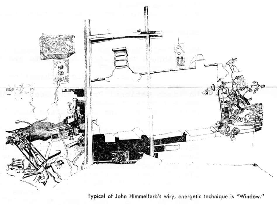
Art Lesson — photo caption, Chicago News Journal World (Feb 1974)
Art Lesson
PHOTO CAPTION:
Artist explains one of his paintings to a young visitor and a fan at the Rosary College art gallery, 7390 W. Division, River Forest. Himmelfarb shares the gallery with his mother and father who are also artists and whose work will be exhibited during February.
click thumbnail for larger image
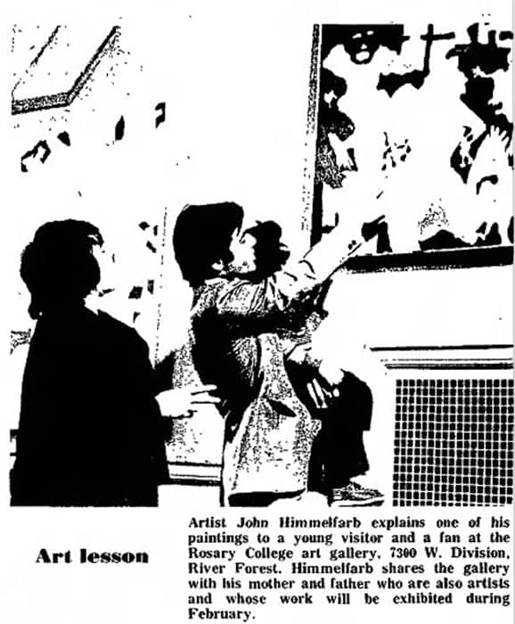
Peter M. Gallery: “Works on Paper” — Don Morrison, The Minneapolis Star (May 1974)
EXCERPT:
The Peter M. Gallery, 920 Nicollet Mall, which customarily handles the works of established artists, has departed somewhat from that policy with its current small show by a graduating student, of unusual photography and pen-and-ink drawings … In conjunction with this exhibition, the gallery is showing “Works on Paper” by seven other artists … John Himmelfarb crowds a sort of tropical forest (city?) with tangled shapes and faces suggesting birds, beasts and human beings.